
Product page
The website settings in the Product page tab let you configure the product page design and layout. This includes:
- Customization of the top section
- Layout and view configuration in the Details section + source selection
- Variant product list and product family variant list design
- Price design
Top section
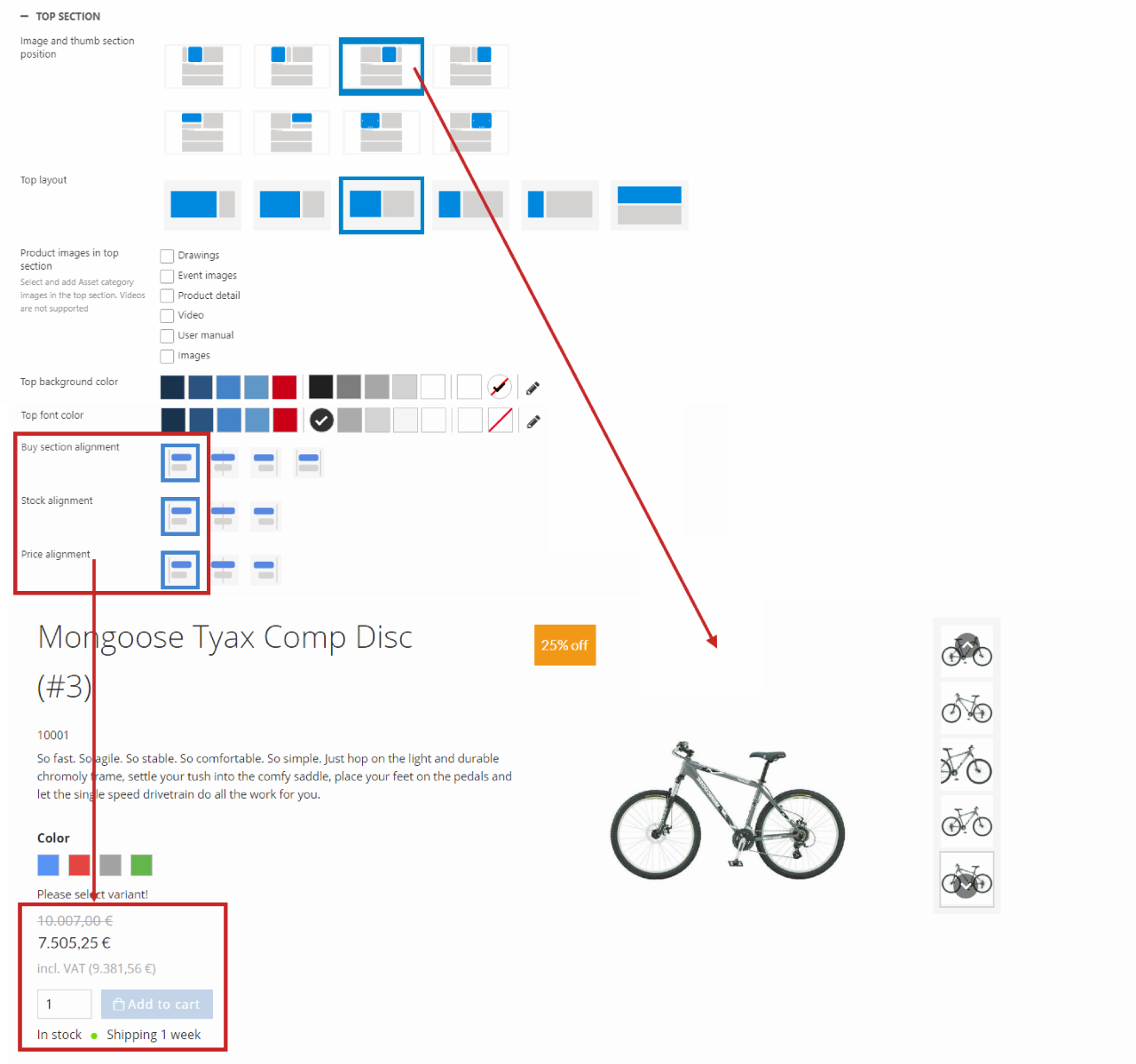
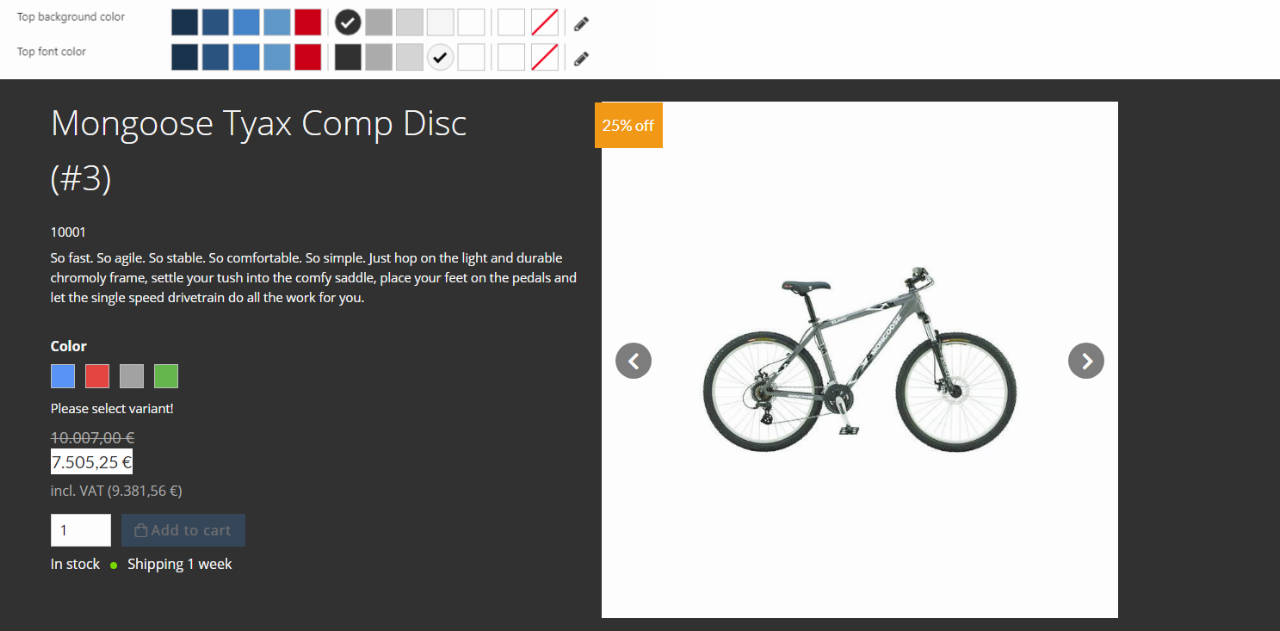
The top section includes the product name, teaser text, price, stock, buy section, product image and alternative product images.
Top section settings (Figure 2.1) let you change the:
- Image and thumb section position
- Top layout
- Different side by side options
- Split top / bottom option
- Product images in top section (add asset categories along with the default images - videos are not supported)
- Top background and font color (separate from the rest of the product page)
- Alignment for the stock status, price, and buy section
- Visibility of different product information, buttons, and the Downloads section (see further down)
The image & thumbnail section and the top layout can be changed independently. You can for example choose the split top / bottom top layout and the second option of the image & thumbnail section position and get the following frontend result (Figure 2.2).
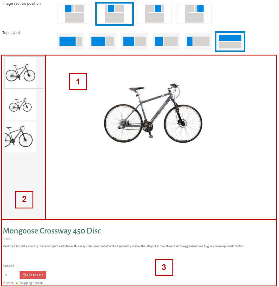
Here, you have the product image at the top (1) with the alternative product images (thumbnails) to the left (2), and the product name, teaser text and price/stock/buy section below (3).
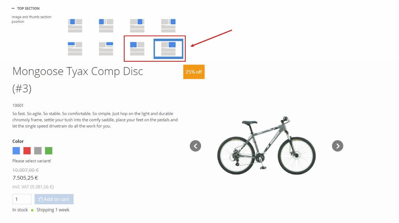
Using the Carousel options, you can hide the product image thumbnails and show an image carousel instead (Figure 2.3).
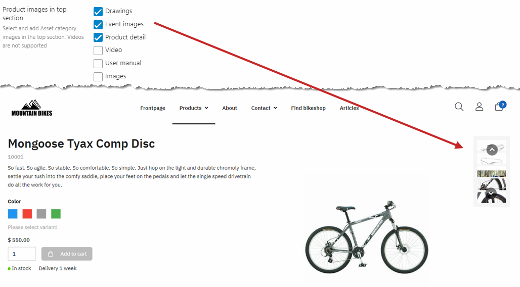
Using the Product images in top section, you can choose to show images from selected asset categories (Figure 3.1) along with the default Images category on the product page.
The image marked as default will still be shown as the main product image.
The top background color and top font color will change the colors for the top section only (Figure 3.2).
You can choose to hide the:
- Stock state
- Shipping
- Product number
- Favorite button
- Add to cart button
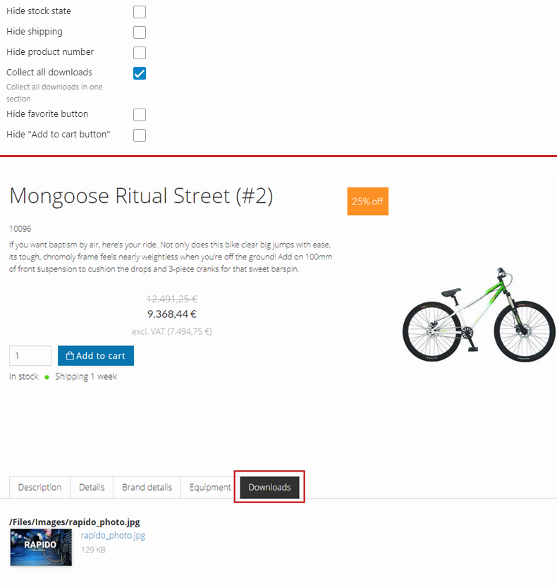
Enabling "Collect all downloads" will gather all image files from the product fields and product category fields in a new section called Downloads (Figure 3.3).
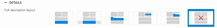
Details
The Details settings (Figure 4.1) let you customize the layout and view for different sections of the product details page.
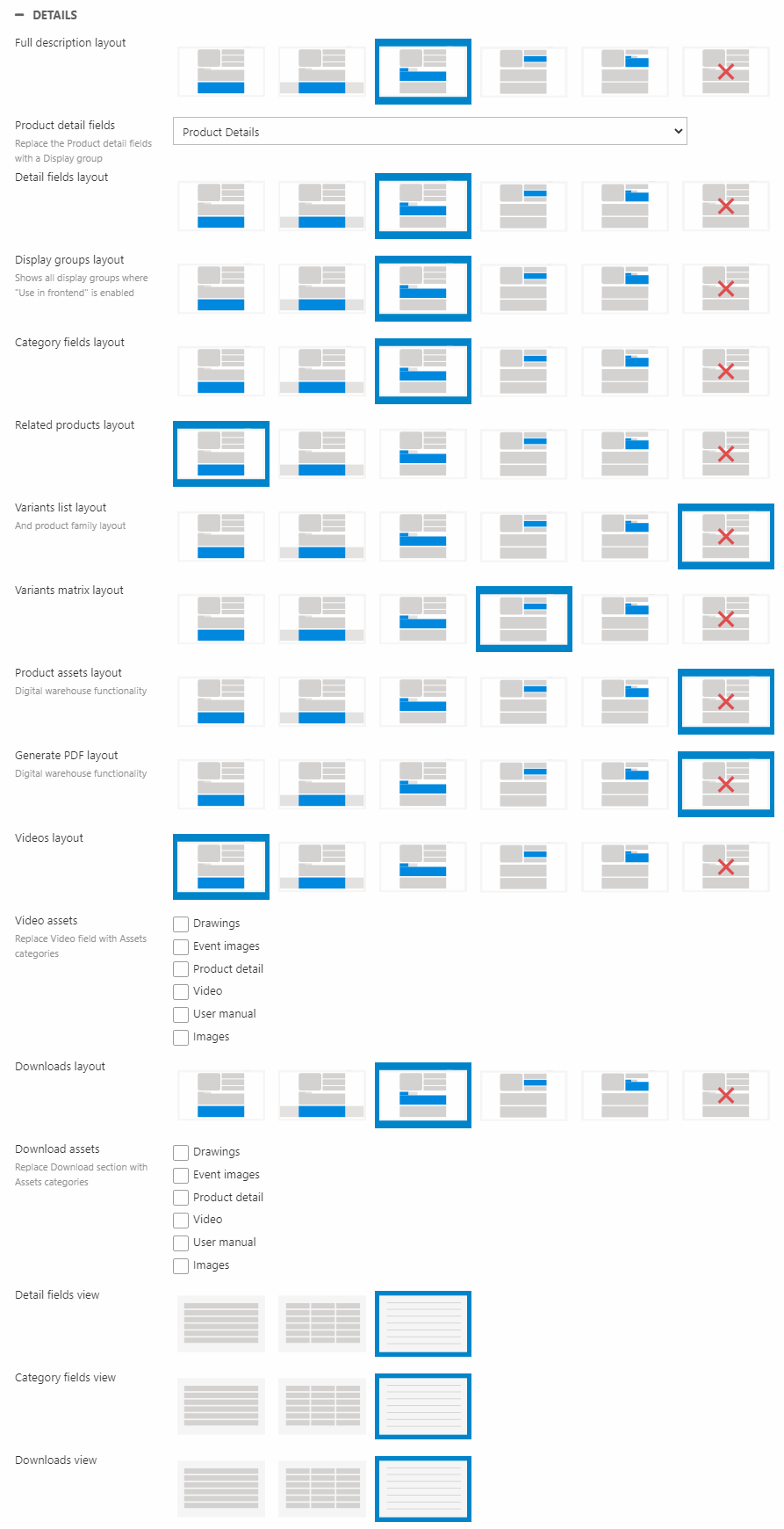
For the Detail fields, you can change which fields to get information from. Using the Product details field dropdown, you can choose to show the fields of a specific display group instead of showing the product fields.
Layout
You can change the layout for the:
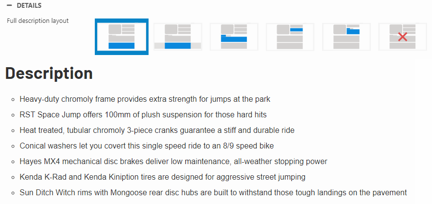
- Full description
- Detail fields (data gathered from the product fields or a field display group)
- Display groups (data gathered from all field display groups marked as Use in frontend)
- Category fields (data gathered from the associated product category groups)
- Related products
- Variants list and product family
- Variants matrix
- Videos (gets data from the Documents and files section (a standard product field) with embedded video links inserted as Details - Text or from selected asset categories using the Video assets section)
- Downloads section - only shown when Collect all downloads is enabled. Using the Download assets section you can switch to showing data from selected asset categories instead
- Product assets section (digital warehouse functionality)
- Generate PDF section (digital warehouse functionality)
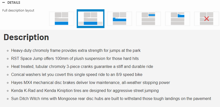
You can choose to show the information in a section (white background) (Figure 5.1).
You can choose to show the information in a ribbon (grey background) (Figure 5.2).
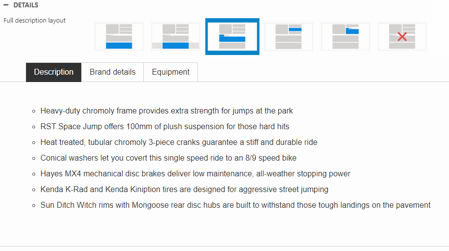
You can choose to show the information in a tab (Figure 5.3).
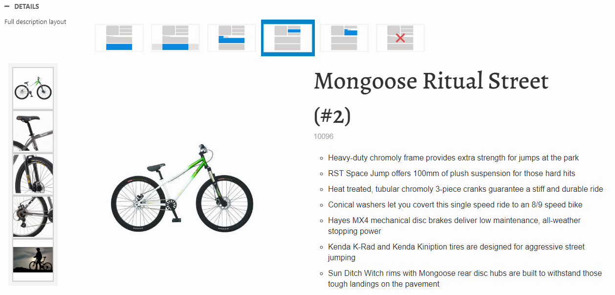
You can choose to show the information in the top section (Figure 6.1).
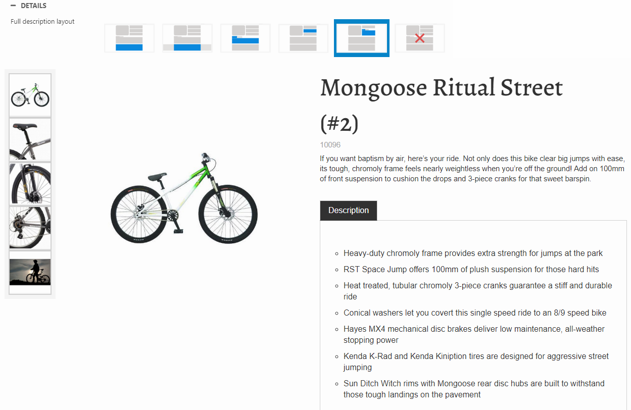
You can choose to show the information in a tab in the top section (Figure 6.2).
You can also choose to hide the information (Figure 6.3).
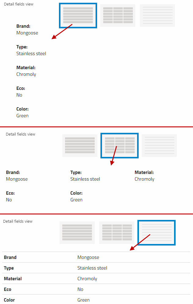
View
You can change the view for:
- Detail fields
- Category fields
- Downloads
You have the following three options: list, grid, and table (Figure 7.1).
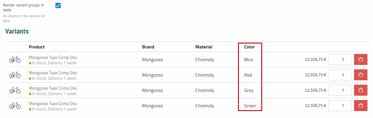
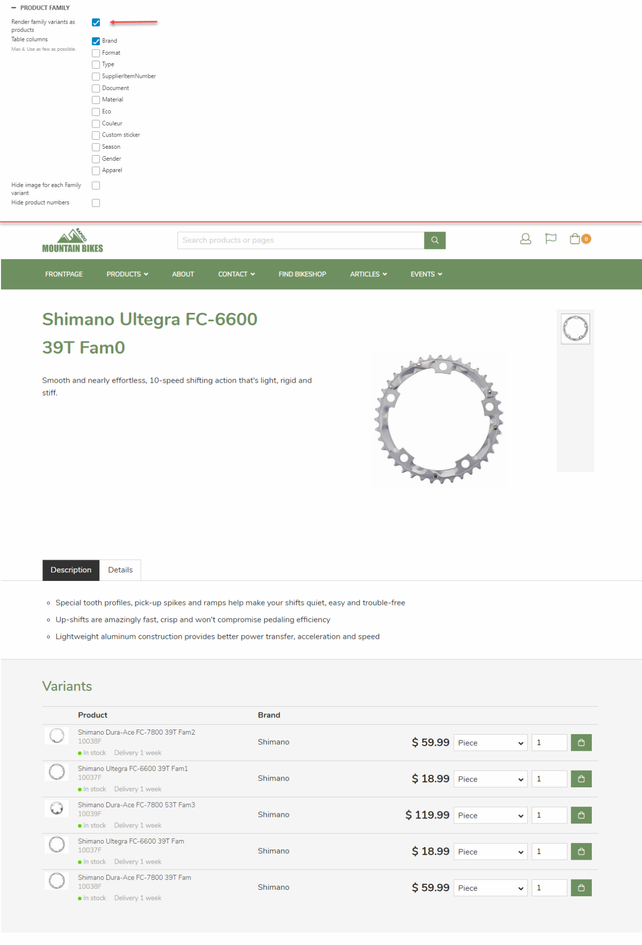
Variants as product list
The variants for a product can be shown in their own product list (Figure 8.1). Under Table columns, you can then select what product field information to include as table columns to the variant product list (maximum 4).

If Render variant groups in table is applied, another column will be added where the variant option information of the product will be displayed (Figure 8.2). In this case, the only variant group for these products is a color group where each bike then has a different color value in the list.
Variants as matrix
Variant groups are now rendered as a matrix. On the X-axis, the different sizes of the product are rendered, and on the Y-axis, the different colors of the product are present. The quantity field will be rendered for all the different variant combinations.
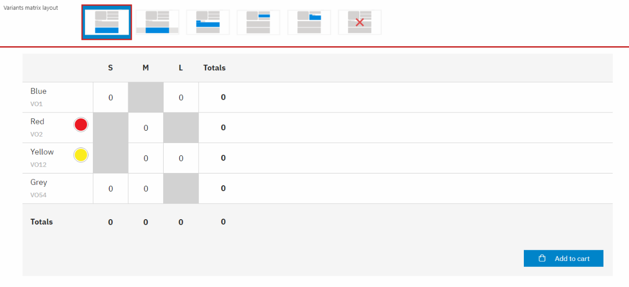
The users can then input the amount they wish to purchase, of all the different variant combinations available.
If one of the variant options is out of stock, the quantity field will be grey, and users will not be able to input the quantity in that field. After the user is done inputting all the quantities for the different variant options, it’s time to ‘’ Add all to cart ‘’. The combined quantity of the different products will then be added to your cart, so you don’t have to do it separately for each variant option.
Product family
A variant of a product family shows an add to cart button on the product page, while a Master product in a family can show a list of its variants on the product page.
A product family does not show any variant selector on the product list (not on the master product nor the variants).
To read more about setting up product families with the combine tool, click here.
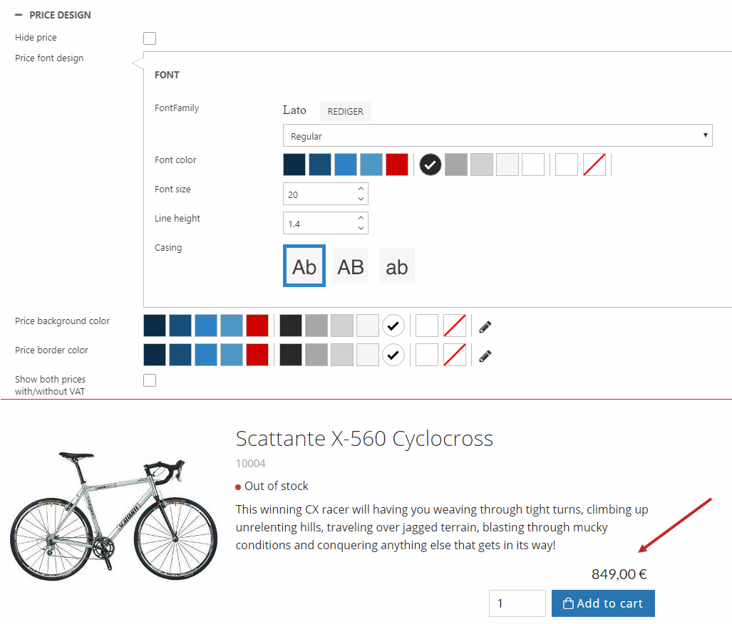
Price design
The price font design, background color and border color can be customized for the product details page (Figure 11.1). You can specify the:
- Font family, weight, color, and size
- Line height
- Casing (relevant for currency)
- Background color
- Border color
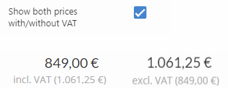
Below, you can check Show both price with/without VAT to show a grey label with the price incl./excl. VAT underneath the original price (Figure 11.2). This opposes to the Prices with VAT setting in Ecommerce website settings (in the ribbon bar). So if your prices already have VAT included, the label will show the price without VAT and vice versa.
You can change this setting seperately for the product list and product page.