
Standard paragraph 2
The standard paragraph 2 item type is used to create a column with an image background and text and buttons on top of it (Figure 1.1).

The icon for the standard paragraph 2 item type is shown in Figure 1.2.
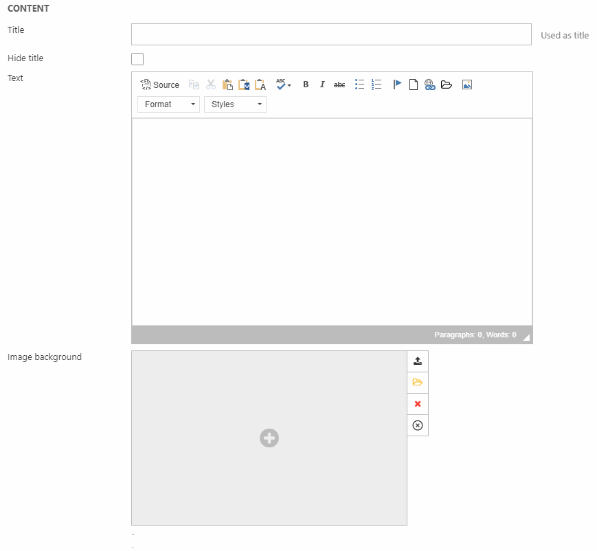
With the item type, you have the General section (Figure 1.3). Here, you can insert:
- A title (can be hidden from the frontend result)
- Text with the rich-text editor
- An image background
The image background can be tweaked using the Image settings section (Figure 2.1).
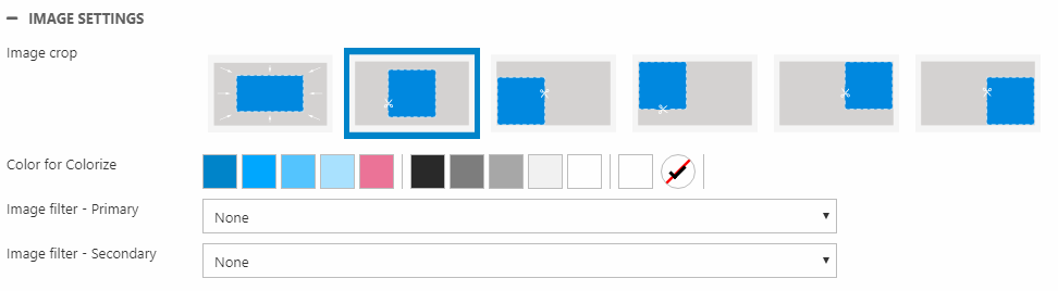
Here, you can:
- Change the crop mode
- Colorize and add image filter(s)
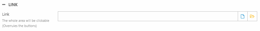
Using the Link section (Figure 2.2), you can apply a link covering the whole area of the column - including any buttons.
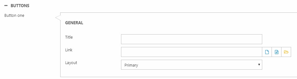
With the Buttons section, you can add up to three buttons. Use the settings shown in Figure 2.3 to add a title/text, link and a button layout for each button.
At the end, we have the Style section (Figure 3.1).
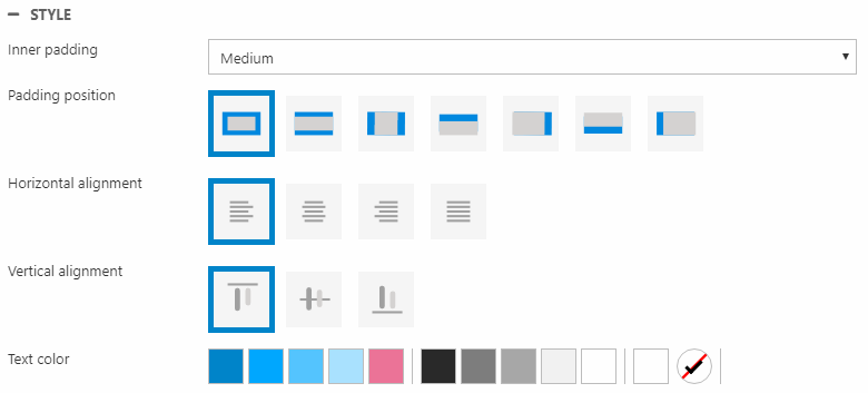
Here you can change:
- Inner padding size and position
- Horizontal and vertical alignment
- Text color