
Carousel
A carousel is used to create a column presenting a carousel of images (Figure 1.1). The carousel can include up to five images and each image can have text, link and two buttons on it.

The carousel item type has this icon (Figure 1.2).
When using the item type, you firstly have a Content section with settings for the whole carousel (Figure 1.3).
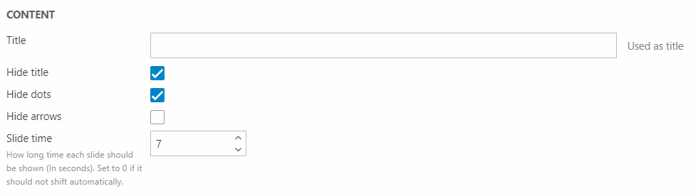
Here you can:
- Give the carousel a title (can be hidden from the frontend result)
- Choose to hide the dots at the bottom and/or the navigation arrows in the sides
- Determine the slide time in seconds (set it to 0 if the slides should not shift automatically)
Then, for each slide, you have these following settings: A General section (Figure 2.1), Text section, Buttons section and Style section.

In the General section, you can:
- Select a slide image
- Customize it using the crop mode, colorize function, and image filters
Then, you can add some text using the Text section (Figure 2.2).
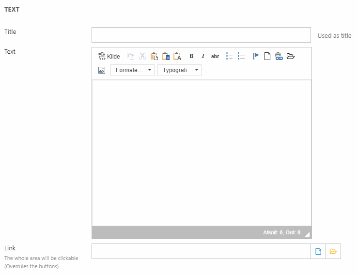
You can add a title, text and apply a link to the slide (also covering the buttons).
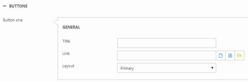
The buttons are added with the Buttons section (Figure 2.3). Here, you can add up to two buttons, each with a title, link and a button layout.
At the end, we have the Style section (Figure 3.1).
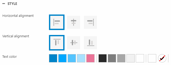
Here, you can change the:
- Horizontal and vertical alignment
- Text color