
Card paragraph
A card paragraph is used to create a column with a text box (a card) on top of a background image, as shown in Figure 1.1.

The icon for the card paragraph item type looks like Figure 1.2.
When adding a card paragraph item type, you have the following options:
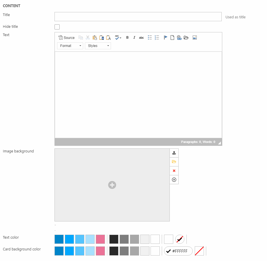
- Title (can be hidden from the frontend result)
- The text appearing on the card
- Image background
- Text and background color for the card
For the background image, you have some Image settings (Figure 2.1).
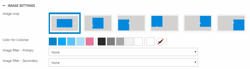
Here, you can:
- Change the crop mode
- Colorize and add image filter(s) to the background image
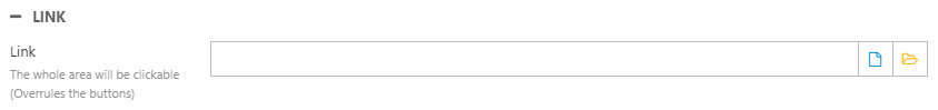
You can also insert a link, which covers the entire column (also the buttons). Just select or insert the link with the Link section (Figure 2.2).
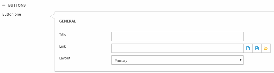
You can add up to three buttons on each card paragraph. Use the Buttons section to do so (Figure 2.3).
At the end, we have the Style section.
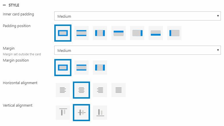
Here, you can change the:
- Inner card padding size and position (distance from text to edge of the card)
- Margin size and position (from the edge of the card to the edge of the column)
- Horizontal and vertical alignment