
Standard paragraph 1
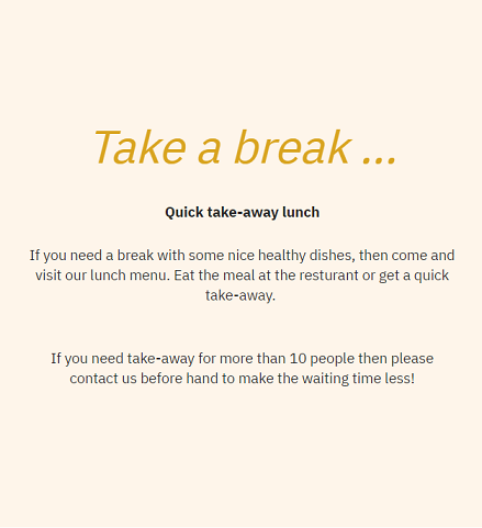
The standard paragraph 1 item type is used to create a column with a classic image - text - button design (Figure 1.1). An image is placed above the text, and one or more buttons are placed below the text.

You can also use it as a simple text paragraph with customizable background color (Figure 1.2).
The icon for the standard paragraph 1 item type looks like this (Figure 1.3).
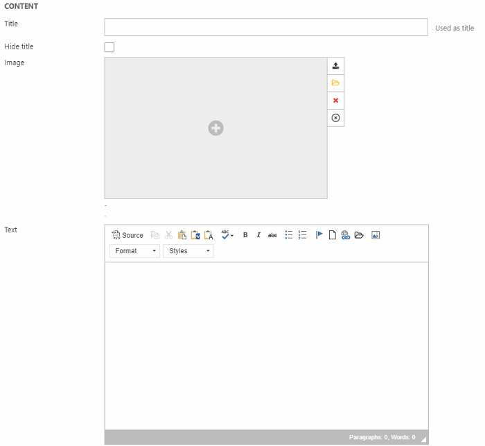
For the item type, you have these settings in the General section (Figure 2.1) where you can insert:
- A title (can be hidden from the frontend result)
- Image
- Text with the rich-text editor
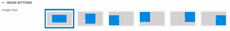
Then you have an Image settings section (Figure 2.2), where you can change the image crop mode.
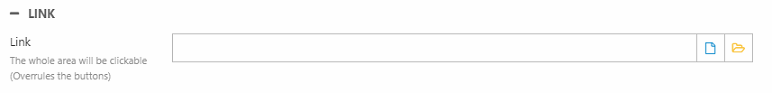
The Link section (Figure 2.3) can be used to apply a link to the whole area of the column - including any buttons.
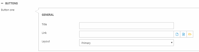
You can also add up to three buttons with the settings shown in Figure 3.1 - provide a title/text, link and button layout for each button.
At the end, we have the Style section (Figure 3.2).
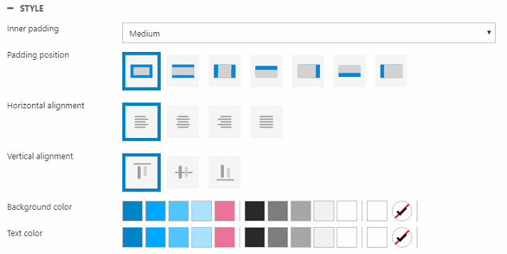
Here you can change:
- Inner padding size and position
- Horizontal and vertical alignment
- Background color
- Text color