Ecommerce
The Ecommerce tab includes settings regarding the general ecommerce. This includes:
- Customization of the variants layout & matrix, mini cart, checkout flow, and receipt
- Stickers
- Loyalty points color and enabling point shop
- Impersonation bar layout & color
- Configuring view settings for anonymous vs logged-in users
Variants/Variant matrix
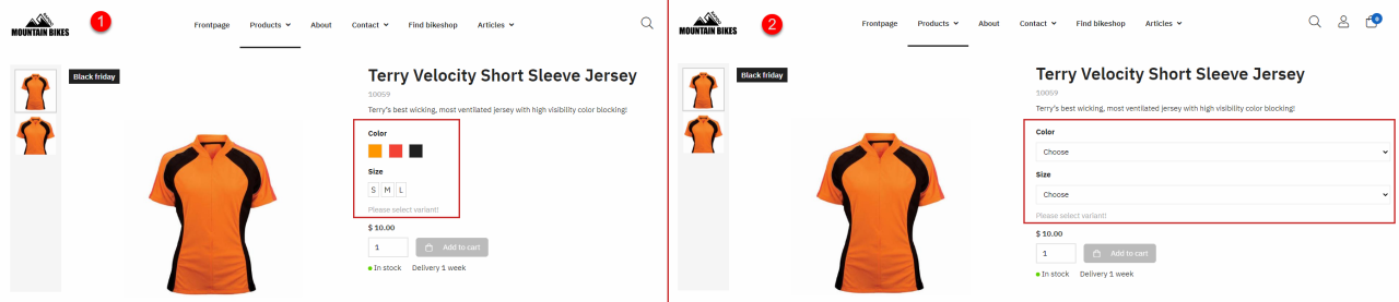
For the variant selector, you can choose between different layout options (Figure 2.1).
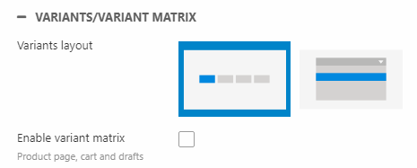
Choose between:
- A variant button selector (1)
- A dropdown (2)
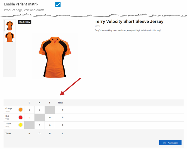
You can also enable the variant matrix to render the variants like in Figure 2.3. This only works for extended variants. Enabling the variant matrix will affect the product page, checkout, and order draft details.
Remember to display the variant matrix using the Product page tab settings!
Mini cart
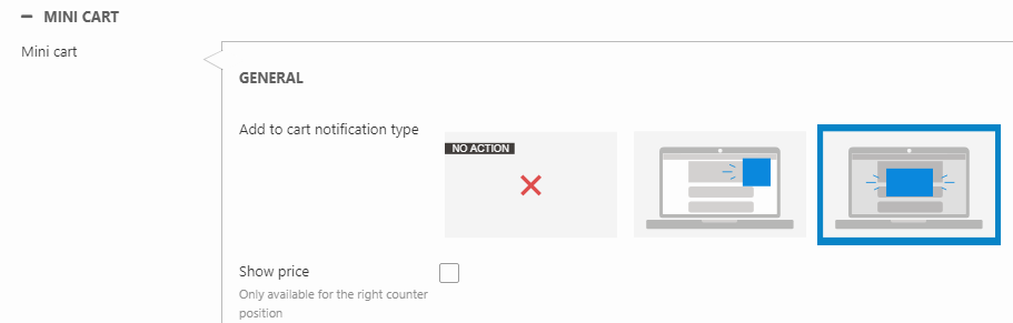
With the Mini cart website settings, you can customize the mini cart and change the type of notification when adding a product to the cart.
With the General settings, you can:
- Select an Add to cart notification type
- No notification
- Toggle, where the mini cart is briefly shown with the updated cart and disappears on its own
- Modal, saying "Product is added to the cart" and requires the user to click either Continue shopping, Proceed to checkout, or on the close icon before the modal disappears
- Show the total price instead of the total number of products in the cart (only when the counter position is set to the right)
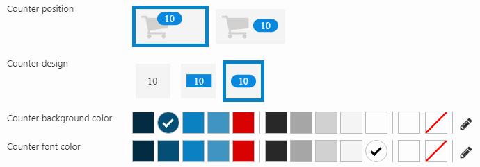
For the counter, you can configure the:
- Position and design
- Background and font color
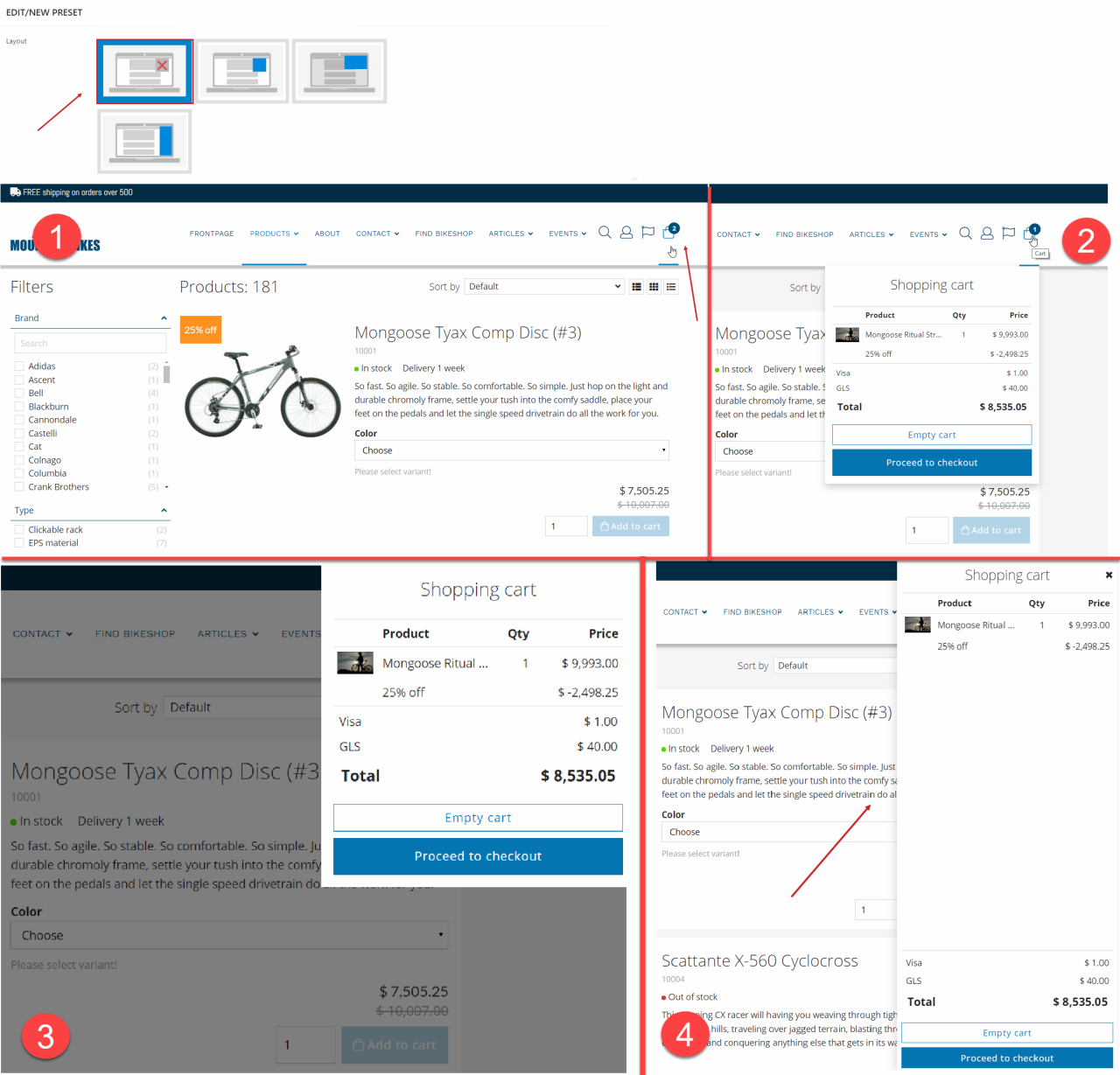
You can change the layout of the mini cart (Figure 3.3). You can choose between:
- No layout (1) mode where no mini cart will be shown - if a user clicks on the mini cart, they will be redirected to the checkout page
- Dropdown (2) that appears when hovering over the cart icon
- Modal (3) that pops up when clicking the cart icon, and creates an overlay over the rest of the page
- Panel (4) that pops up in the right side and on top of the page when clicking the cart icon
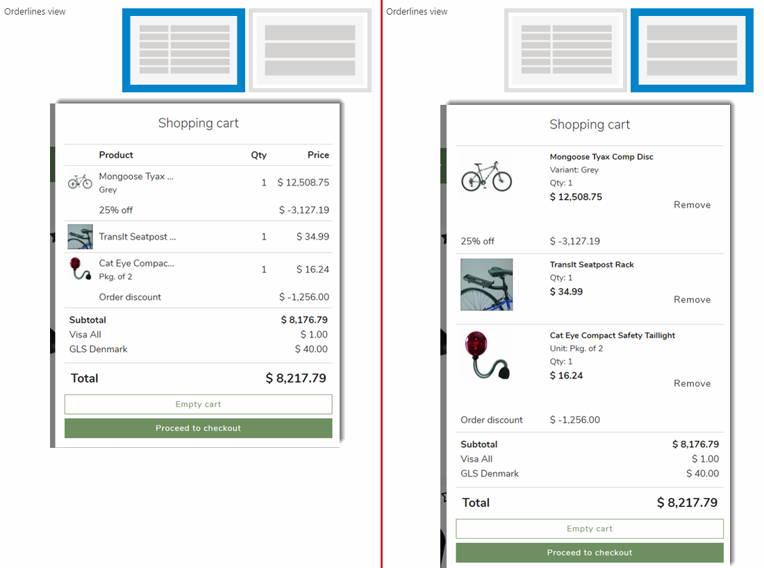
You can also change the display of products in the mini cart using the Orderlines view setting (Figure 4.1). You can choose:
- Table view (right-side option) where product image, name, quantity, price, and unit is shown, with discount information below each order line
- List view (left-side option) where product image, name, quantity, price, unit, and a Remove button is shown, with discount information below each order line
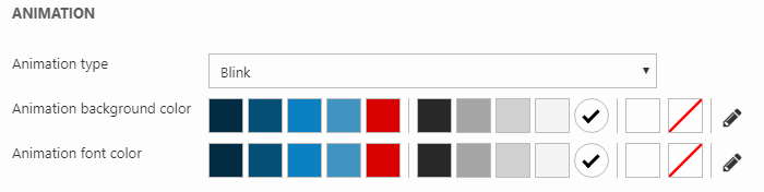
Using the Animation settings, you can configure the animation of the mini cart icon when adding a product to the cart:
- Select an animation type (make the background for the mini cart icon blink or choose an animation for the counter)
- Customize the background and font color for the animation
Checkout
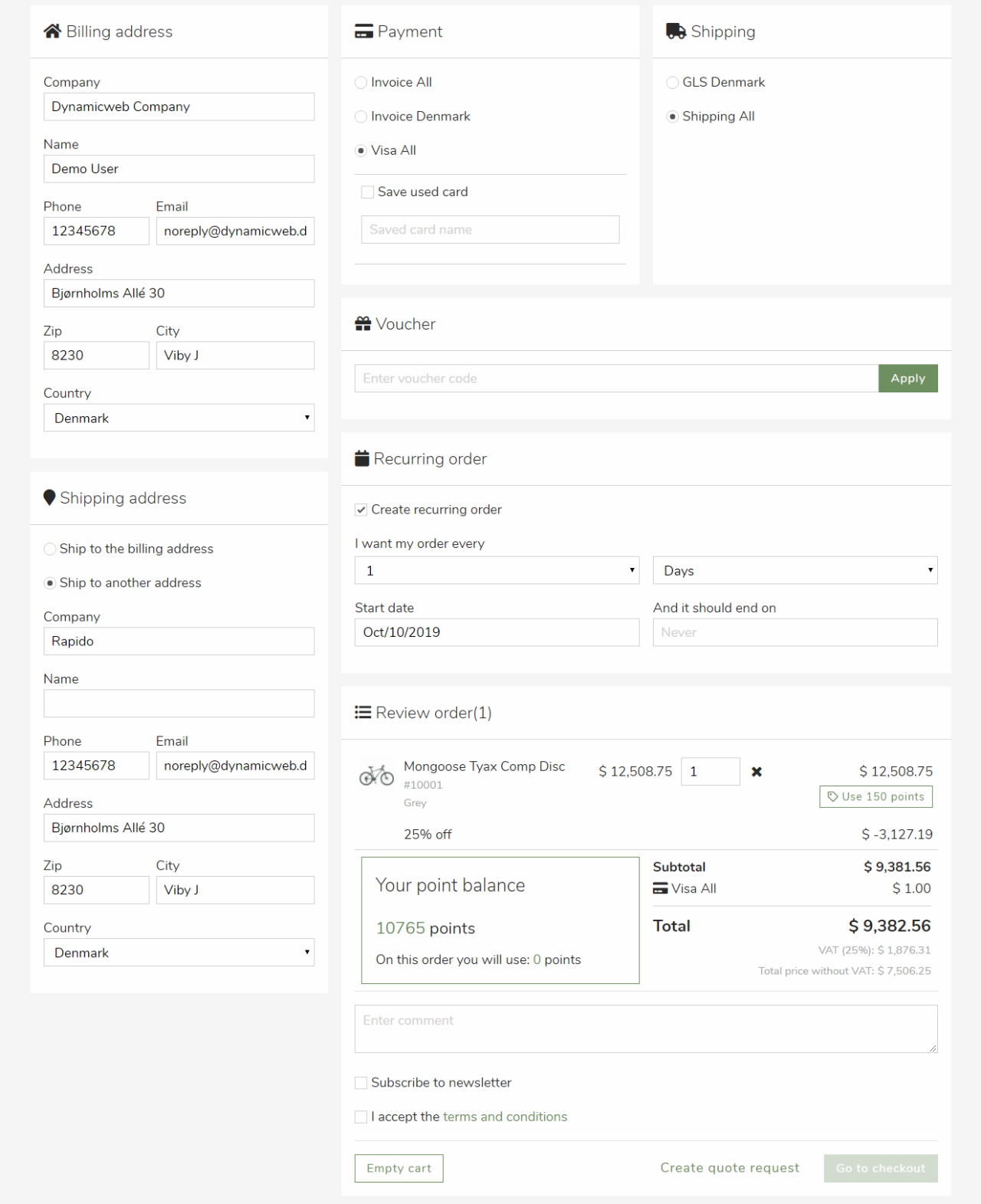
Rapido features a one-step-checkout (Figure 5.1) and a multi-step-checkout with a number of default elements.
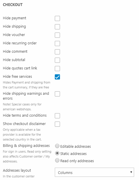
You can hide several of these elements using the Checkout website settings for both of the checkout flows (Figure 5.2):
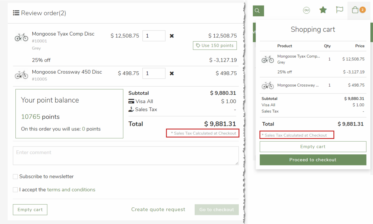
If you're using a tax provider that is dependent on the shipping address like Avalara or Vertex tax provider, you can show a checkout disclaimer saying that taxes and shipping will be calculated at checkout. The disclaimer is shown:
- When a tax provider is available for the selected billing country in the cart
- When a shipping address hasn't been specified
The disclaimer is visible on the checkout page and in the minicart (Figure 5.3).
For logged-in users, you can decide if the billing and shipping addresses should be:
- Editable - all address fields related to billing, shipping and my addresses can be edited
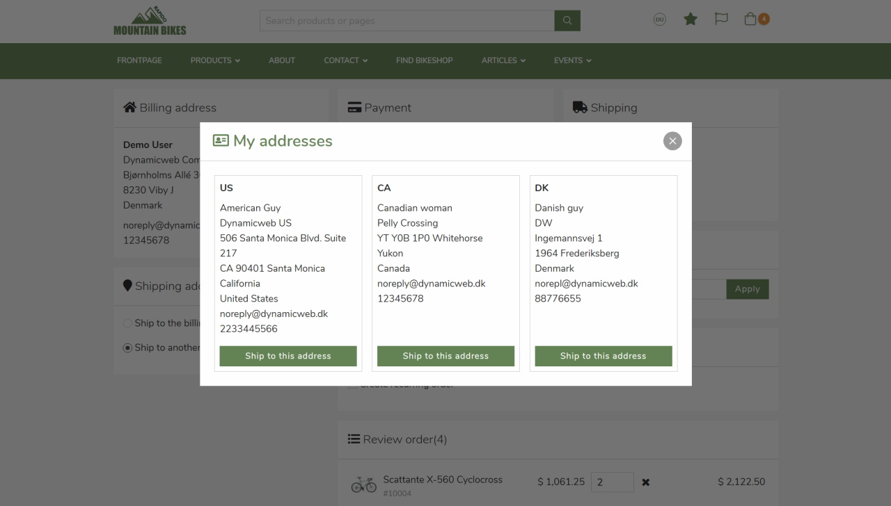
- Static (Figure 6.1) - billing address is fixed as the default address, and for the shipping address users can switch between their registered addresses from My addresses on the profile page and edit them live in the cart and on the My addresses page
- Read-only - same as static, but now users can only switch between their registered addresses, but they can't edit them - neither in the cart nor in My addresses
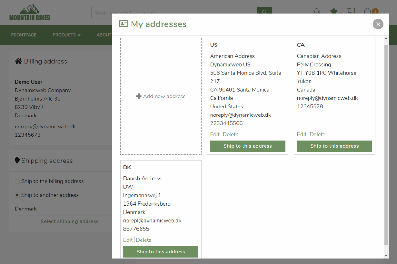
Below a preview is shown of My addresses with read-only enabled (Figure 6.2).
You can also change the layout of the addresses in My addresses. Of the two options Columns and Rows, rows is shown on both of these images.
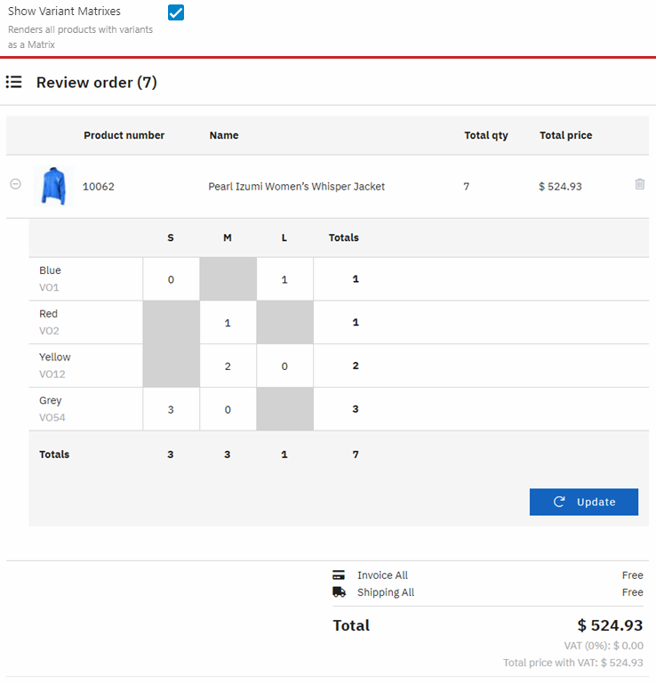
If you check Show Variant Matrixes, different variants of a product will be grouped together in the checkout, where the customer can expand it using the + button to show a variant matrix as shown on Figure 6.3.
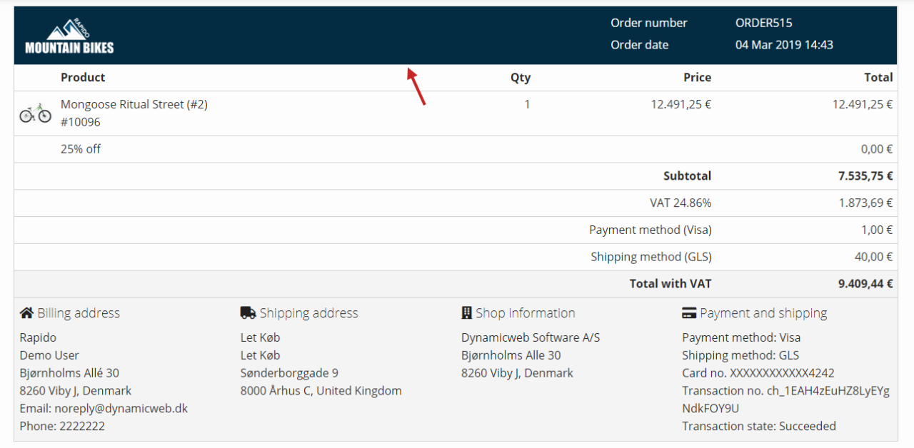
Receipt
With the Ecommerce receipt settings (Figure 7.1), you can change the:
- Logo image
- Header background color
- Header font color
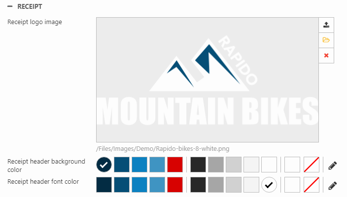
The above settings will produce the following layout of the Ecommerce receipt (Figure 7.2).
Sale sticker
You can enable sale stickers and customize the following:
- Type of content on the sticker
- Default "sale" text
- Name of the discount in Ecommerce > Discounts
- Amount and/or percentage discount
- Background color
- Font family, weight (the dropdown), color, size, line height, and casing
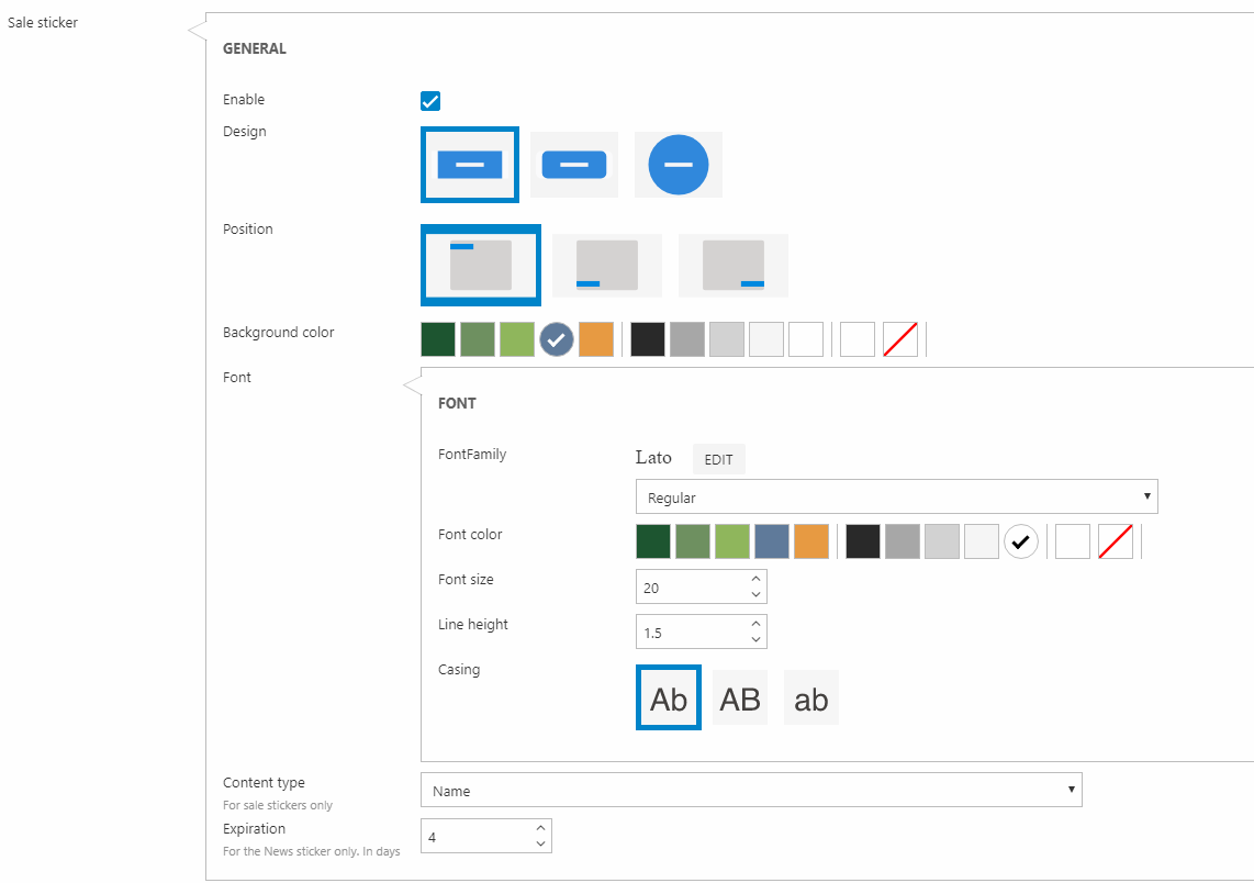
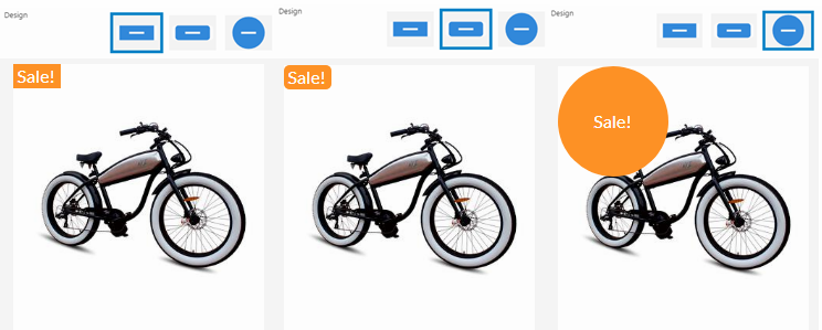
You can also change the design of the sticker (squared, rounded, or ball) as shown in Figure 8.2.
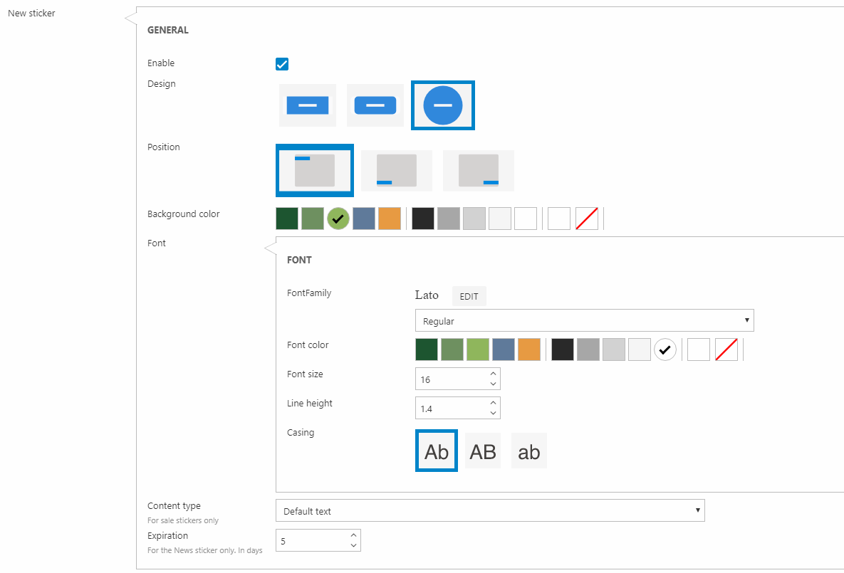
New sticker
You can enable New stickers and customize the following:
- Expiration for when a product no longer is "new" (in days)
- Background color
- Font family, weight (the dropdown), color, size, line height, and casing
You can also change the design of the sticker (squared, rounded, or ball).
Custom sticker
You can create custom stickers with a predefined layout and custom text. With the website settings, you can customize the following:
- Background color
- Font family, weight (the dropdown) color, size, line height, and casing
You can also change the design of the sticker (squared, rounded, or ball).
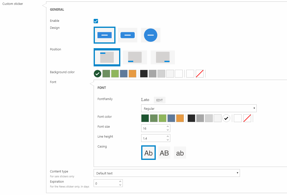
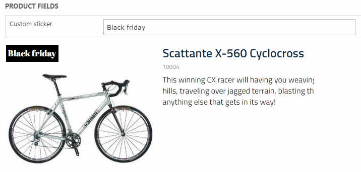
The text content of the sticker can be entered from a product's product fields (Figure 10.2).
Loyalty points
Rapido supports the use of loyalty points. With loyalty points, you can:
- Set up reward rules to reward users with loyalty points when they trigger a rule e.g. when they buy X amount of products or sign up for a newsletter
- Award loyalty points manually to users through the backend in the user management area
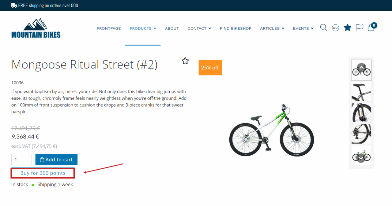
- Give products a price in loyalty points, so logged-in users can buy products with the loyalty points they have earned (Figure 11.1)
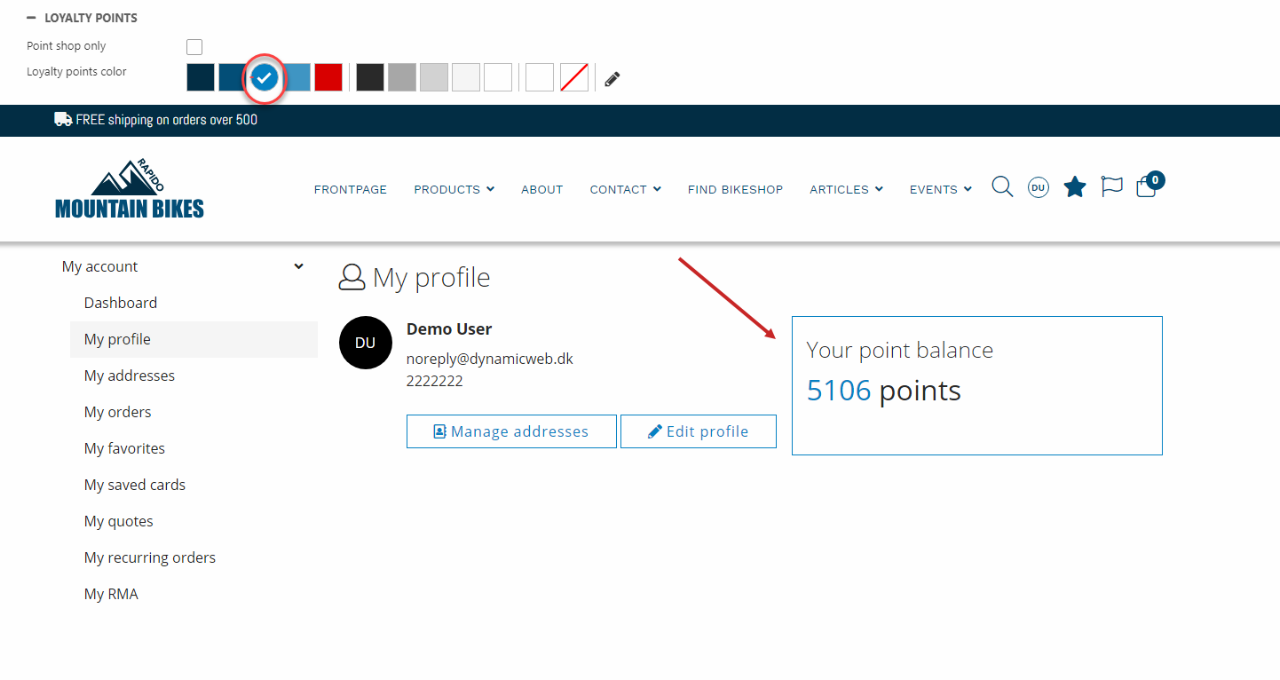
With the Loyalty points website settings, you can change the color of the loyal points as shown in the product card, shopping cart and in the Customer Center (my profile and the order list) (Figure 11.2).
You can read about the loyalty point feature in Rapido in this article.
For more information about loyalty points, see the general Dynamicweb documentation.
Impersonation
Rapido allows customization of the impersonation layout. This feature enables the developer to personalize this section on their solution. The settings that can be modified are listed below:
- Choose between three different layouts
- Bar (1)
- Right lower bar (2)
- Right lower box (3)
- Top bar (4)
- Change the background and font color
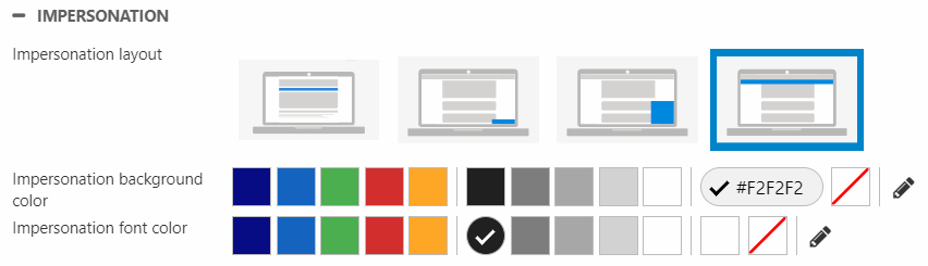
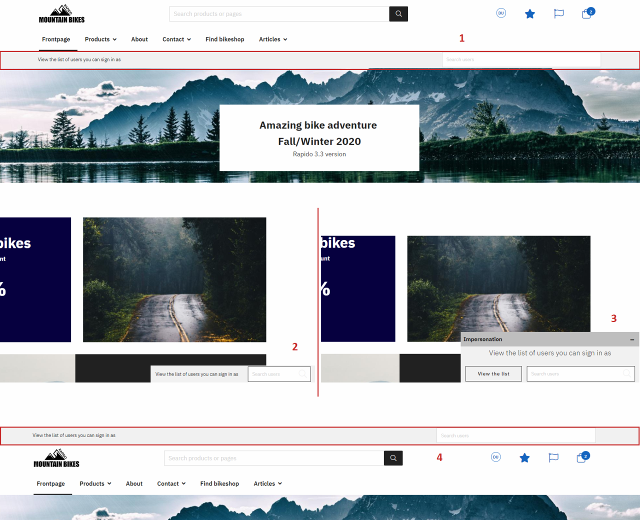
The three different impersonation layout options are visualized in Figure 12.2:
User view settings
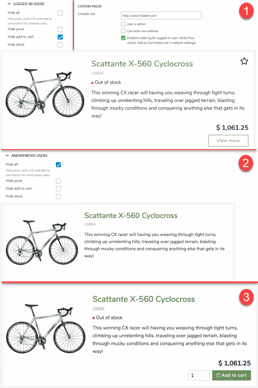
You can decide whether anonymous/logged in users are allowed to see the entire product catalog or just a preview.
Check the hide all checkbox to hide the price, stock information and the add to cart button.
You can also hide each element seperately.
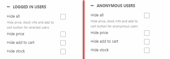
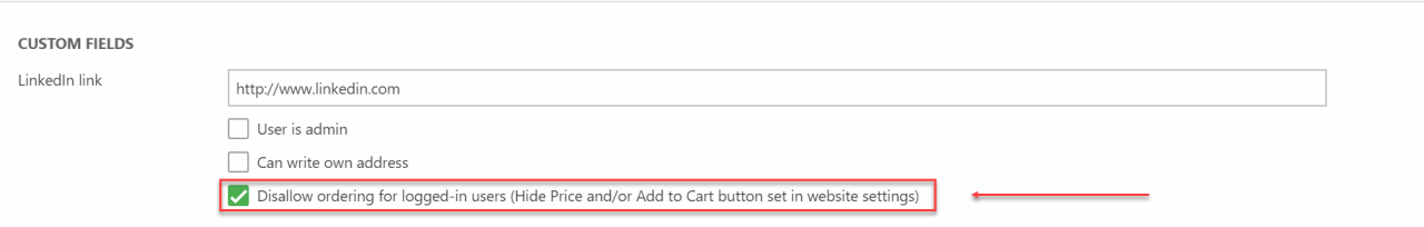
The logged-in user settings are not for all logged-in users, but only implies for specific users. It is dependent on the settings in Users area.
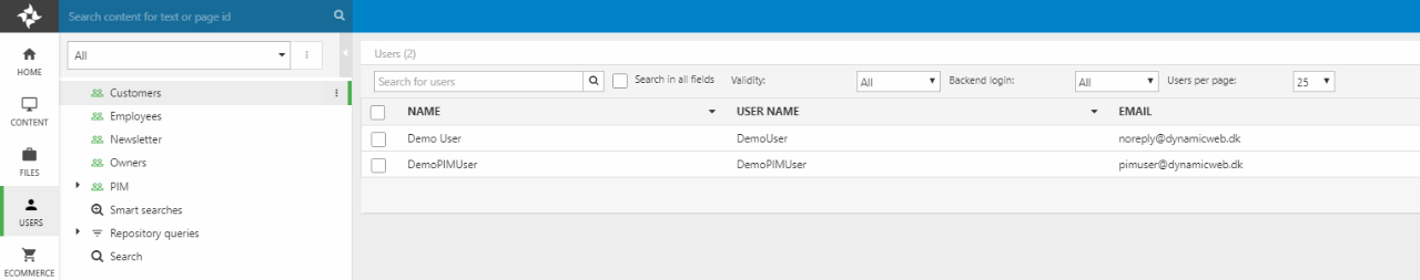
Locate the specific user and click on the account to enter the user settings. Scroll down to the custom fields settings, and make sure Disallow ordering for logged-in users is enabled.
Below three frontend examples are listed to demonstrate the different view options:
- (1) Is applied to specific users. Here add to cart is hidden, and replaced with the View more button instead. In the user area, the settings for the specific user in custom fields is modified. Here disallow ordering for logged-in users is enabled.
- (2) Hide all has been chosen for the anonymous users, which is configured in the website settings, ecommerce tab.
- (3) Lastly, the third options displays the default view for all logged-in users. This also shows that if the checkbox from option 1(disallow ordering for logged-in users) isn't enabled for the specific users, nothing will be hidden.
General
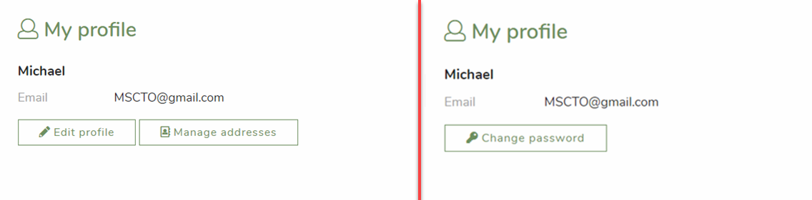
The Customer Center profile page allows for customization, and you can hide/show some buttons. To do so, please follow the steps listed below:
- Enter your website settings
- Scroll down and enter the Ecommerce tab
- Open the General settings
- Hide the "Manage address" and "Edit" buttons
- Show the "Change password" button
See Figure 15.1, for illustration of the feature.