
Buttons
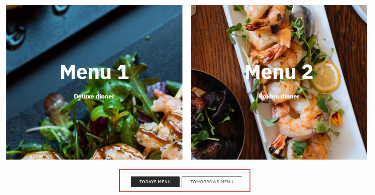
The buttons item type is used to create a column containing up to three buttons (Figure 1.1).
The icon for the buttons item type is shown in Figure 1.2.
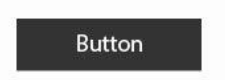
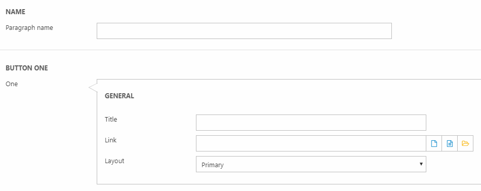
The settings are the following (Figure 1.3):
- Paragraph name (not shown in the frontend result)
- Configure up to three buttons each with a title/text, link, and a button layout
Below these settings, you have the Style section (Figure 2.1).
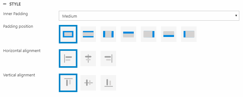
Here, you can change the:
- Inner padding size and position (distance from text to edge of the button)
- Horizontal and vertical alignment