Product list
The Product list tab contains websites settings for the layout of the product list. This includes product list views, facets layout and the promotion block design.
General
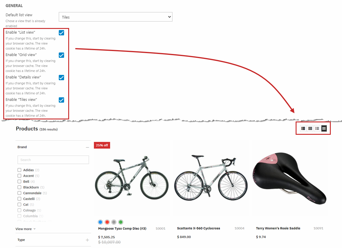
Rapido ships with four product list views:
- List view
- Grid view
- Details view
- Tiles view
All of these views are enabled by default, allowing the customer to change between product list views as they'd like. You can choose a default list view for your product list, and you can also remove some of the options by unchecking their specific checkboxes with the product list view settings (Figure 2.1).
Each product list view has a group of design settings and hovering settings. Read more about these below.
You can see an example of each product list view here.
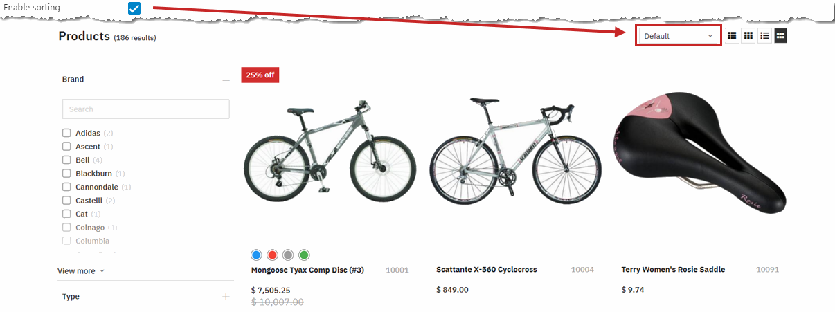
You can enable sorting (Figure 3.1). The product list can be sorted by Newest, Price ascending, and Price descending.
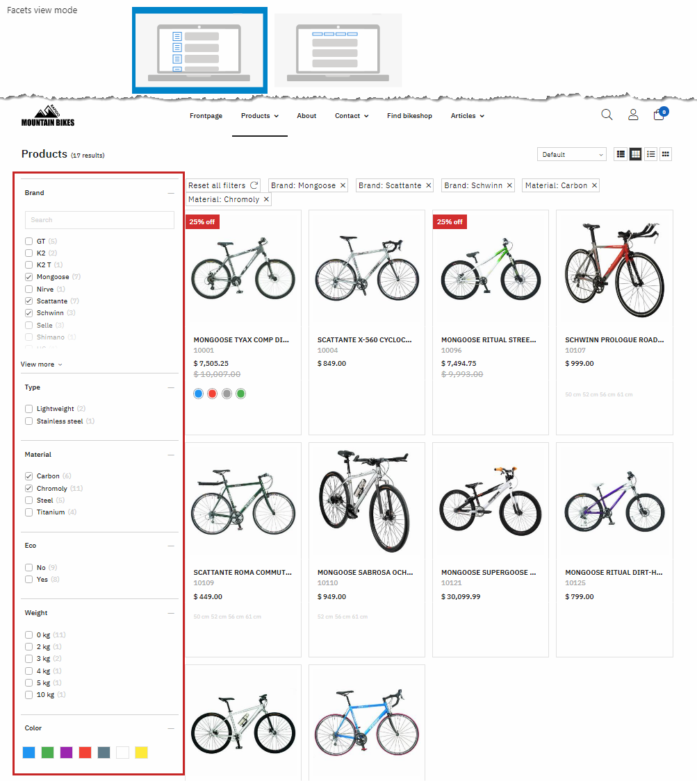
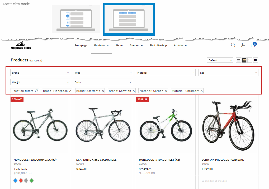
The facets view mode setting gives you access to two view modes – vertical facets and horizontal facets. Both vertical and horizontal facets render the selected facets as tags above the product list, from which they can be cleared individually or reset completely.
Vertical facets are rendered as in Figure 4.1.
Horizontal facets are rendered as in Figure 4.2.
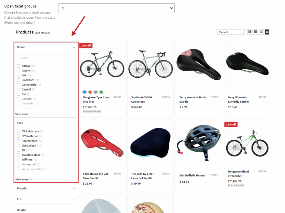
With the open facet groups settings, you can choose how many facet groups you want to have expanded by default in your Filtering section (Figure 4.3).
To change the layout of the left side facets, use the Facet settings further down in the Product list tab settings.
List view
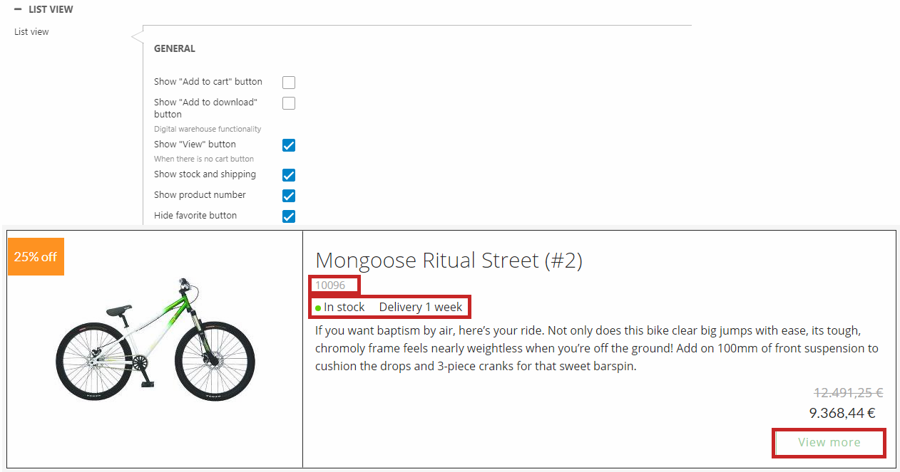
The List view settings controls the list and button layout for the List product list view.
You can customize the background and border color (Figure 6.1).
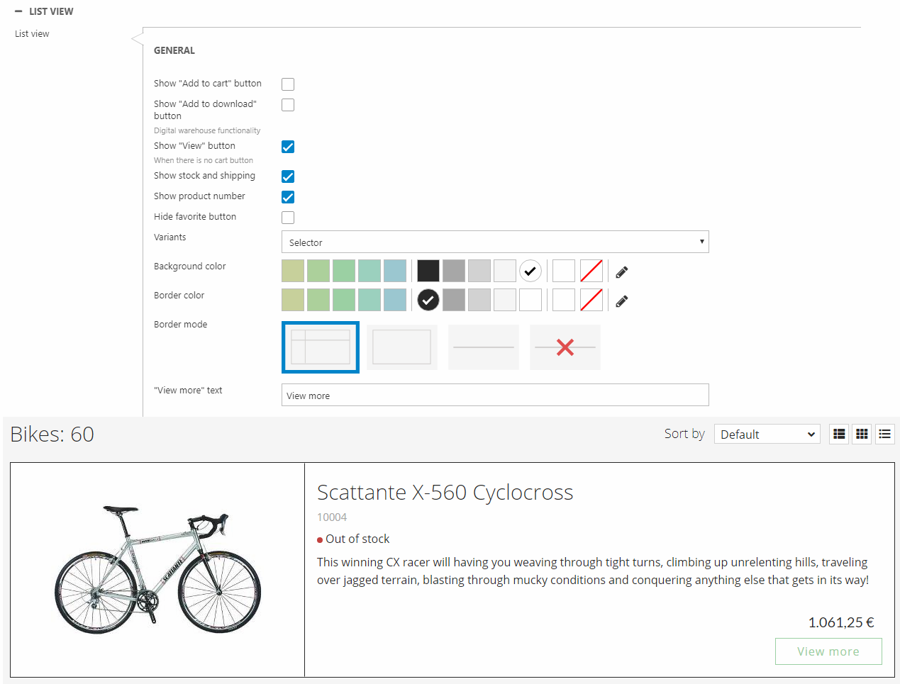
You can show/hide different elements (Figure 6.2):
- Add to cart button
- View button
- Stock and shipping
- Product number
- Favorite button
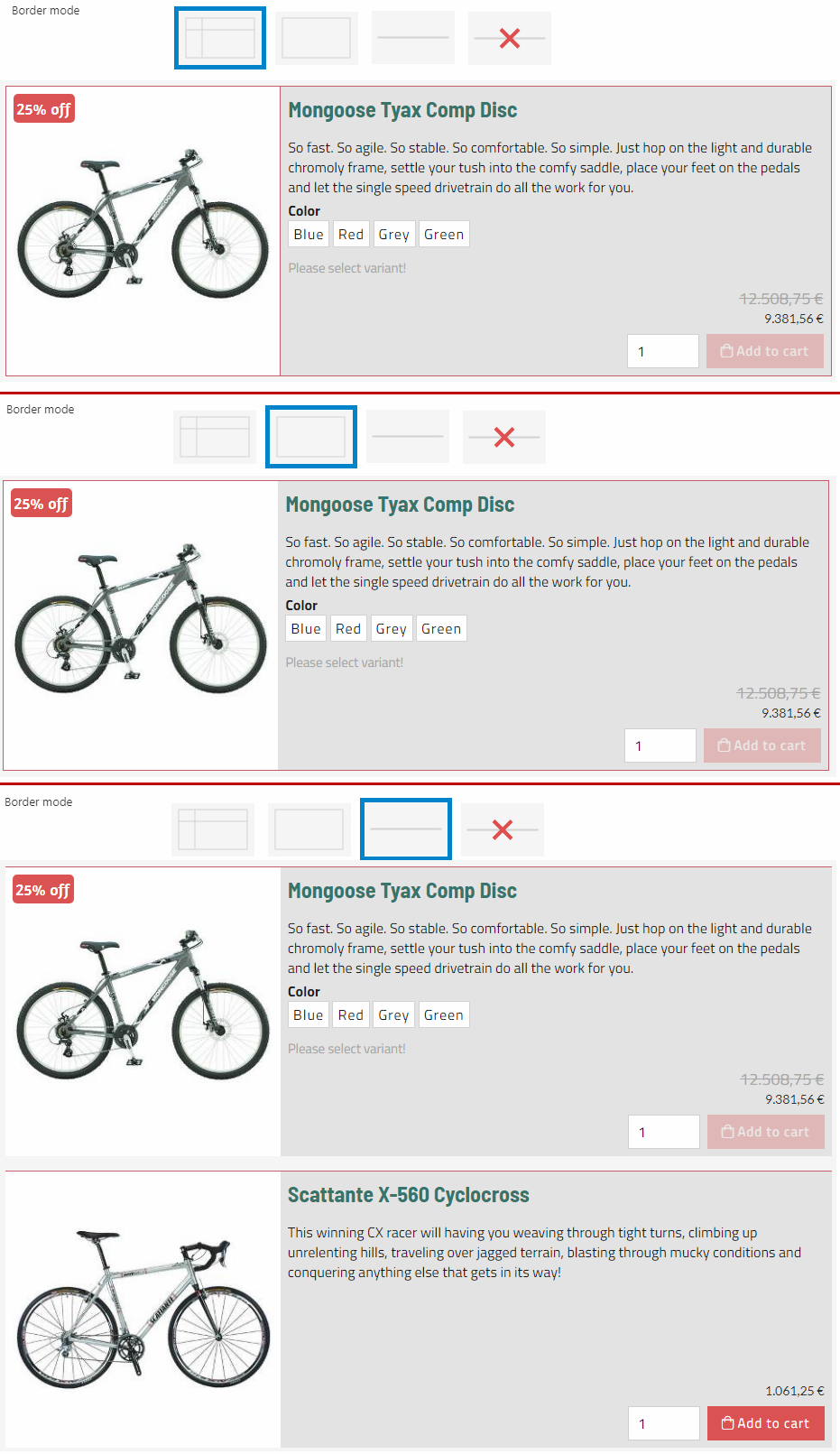
You can change the border mode (Figure 6.3):
- Frame lines
- Around
- Line
- None
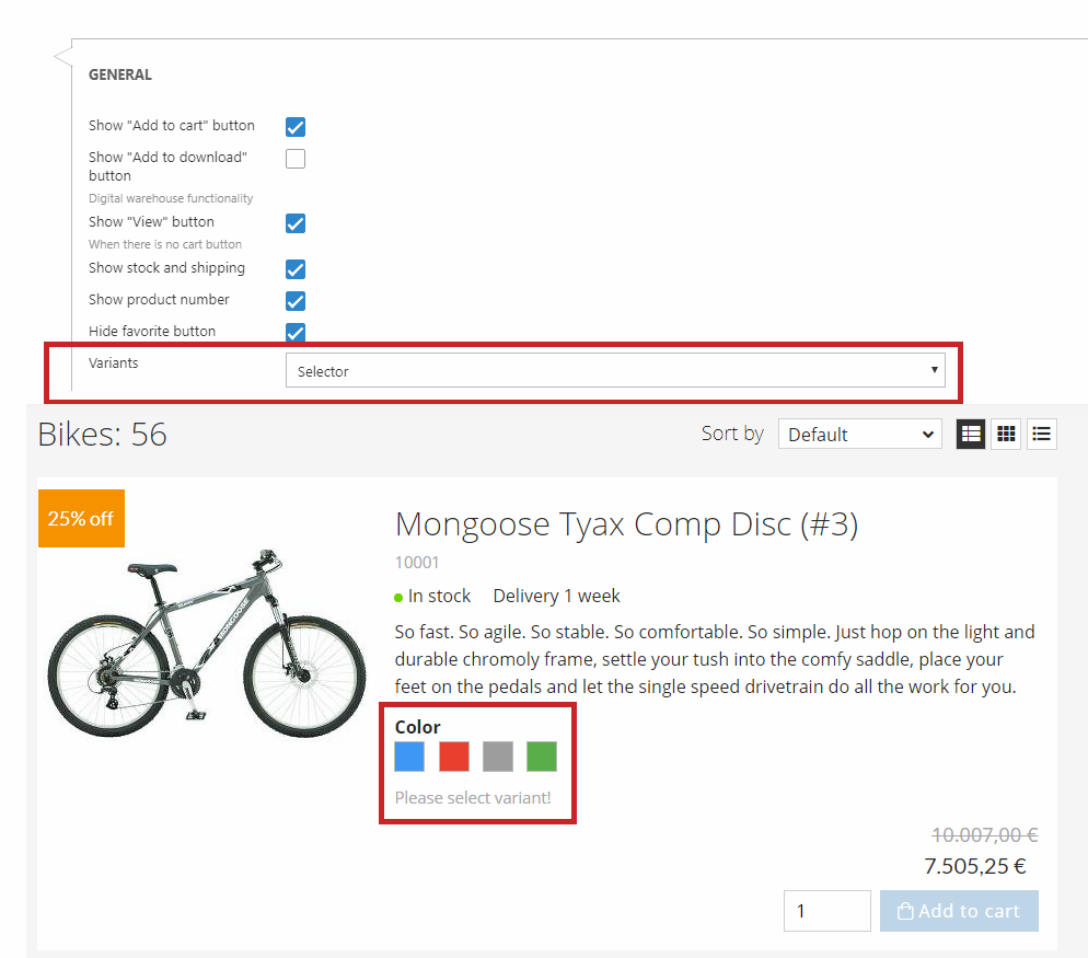
You can choose between the following two options in the variants dropdown:
- Static
- Selector
The dropdown is found under your general settings for your chosen view as shown in Figure 7.1.
If selector is chosen, you will be able to click on the different variants e.g. blue, red, green, and then get an updated product image, depending on the chosen variant (Figure 7.1).
The selector option is only available for products shown in list view.
If static is chosen, it will just display the options available as a non-clickable feature. For the static option, you can choose between small or large icons for the variant display.
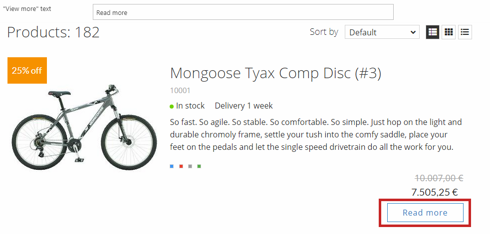
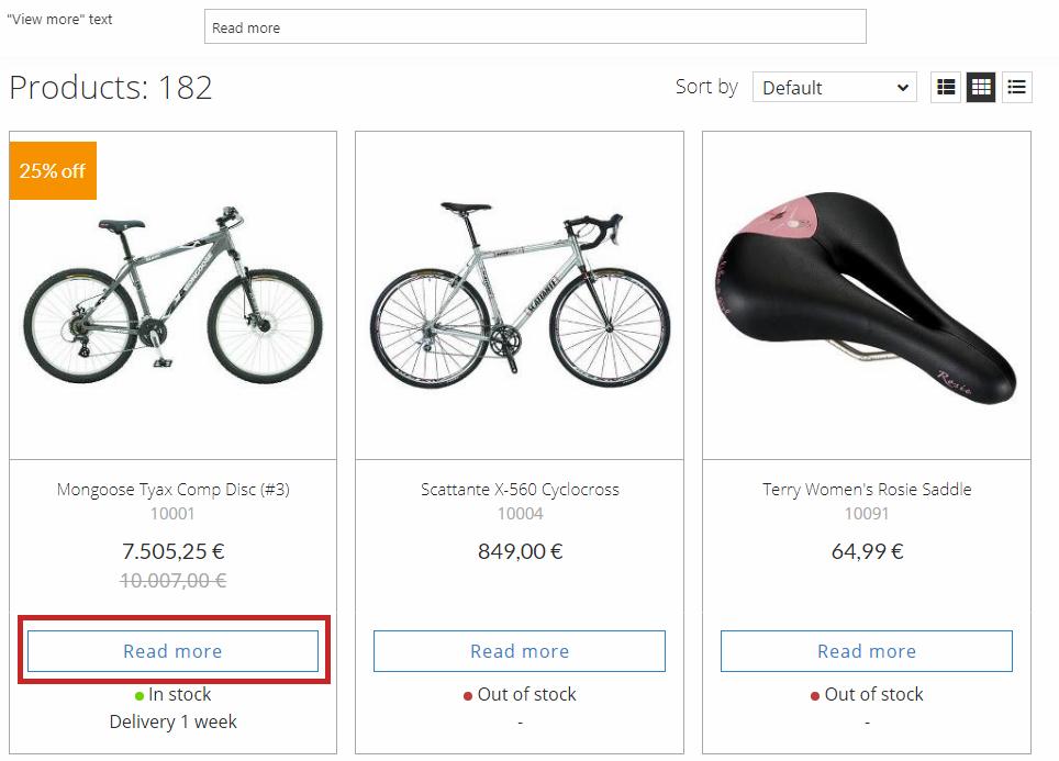
You can customize the text on the "View more" button (Figure 7.2).
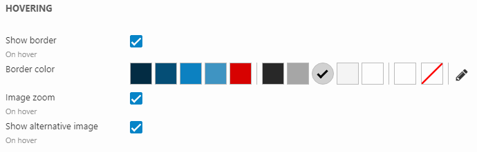
Using the hovering settings (Figure 7.3), you can change the layout for a product in the product list, when you mouse-over the product in frontend. You have the following options when mousing-over:
- Show outer border with a border color (the hover border is shown independently of what the general border settings are configured to and is placed on top of it)
- Zoom in on the product image
- Change product image to alternative image (the next one of the product's images)
Grid view
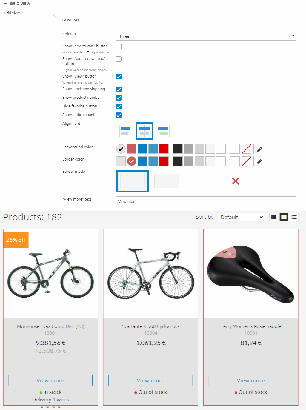
The Grid view settings (Figure 8.1) control the list and button layout for the Grid product list view.
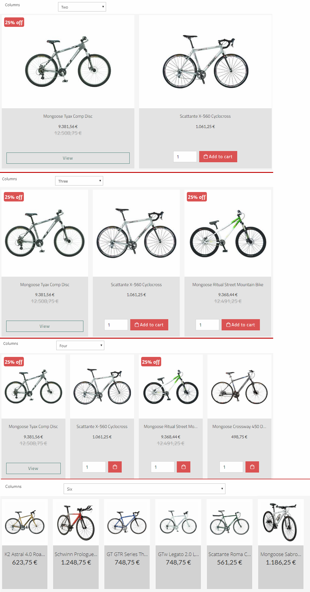
You can change the number of columns shown in the list (Figure 8.2). Choose between two, three, four, or six columns.
You can show/hide different elements (Figure 8.3):
- Add to cart button
- View button
- Stock and shipping
- Product number
- Favorite button
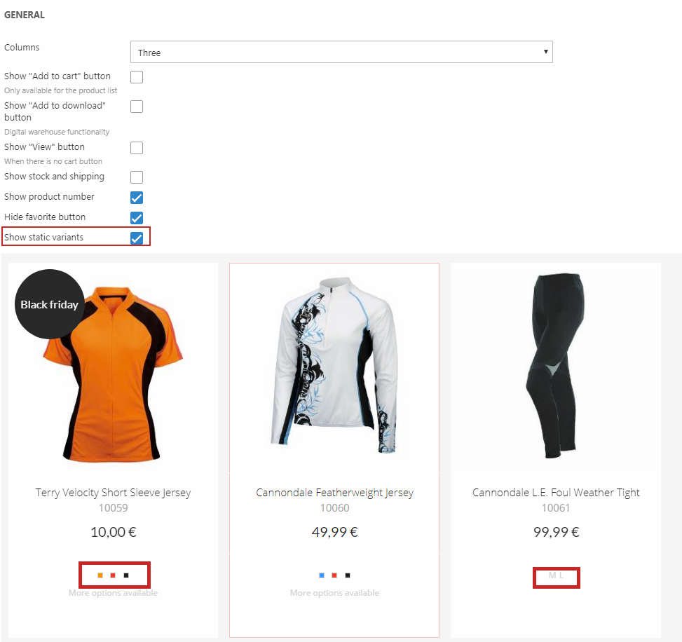
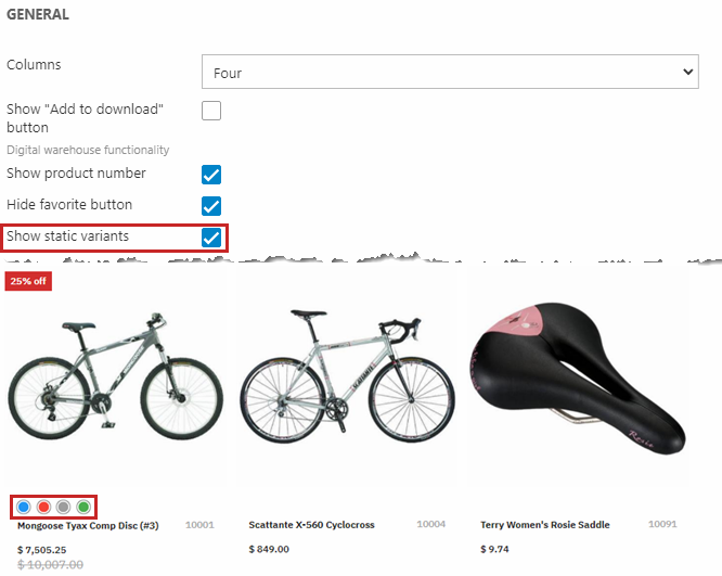
You can enable static variants (Figure 9.1). If the option is enabled, the various sizes/colors will appear beneath the price, and display the different variants of the product. You can also choose between small or large icons for the variant display.
Since the feature is static, it will just display the options available as a non-clickable feature.
You can change the border mode (Figure 9.2). Choose between:
- Frame lines
- Around
- Line
- None
You can customize the "View more" text (Figure 9.3).
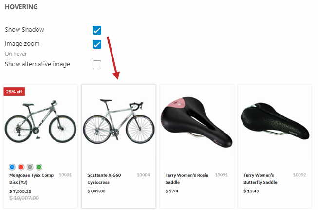
Using the hovering settings (Figure 10.1), you can change the layout for a product in the product list, when you mouse-over the product in frontend. You have the following options when mousing-over:
- Show outer border with a border color (the hover border is shown independently of what the general settings are configured to and is placed on top of it)
- Zoom in on the product image
- Change product image to alternative image (configured in the product's settings)
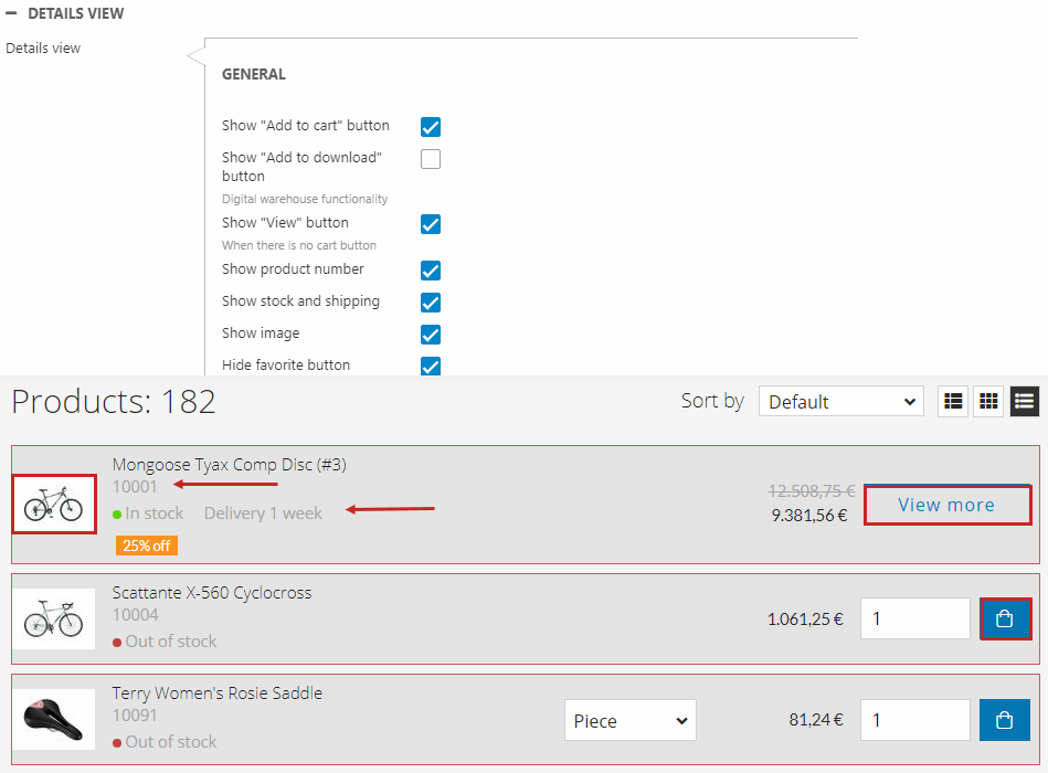
Details view
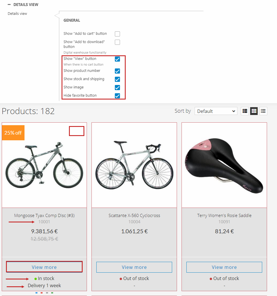
The Details view settings (Figure 11.1) control the list and button layout for the Details product list view.
You can customize the background and border color as shown on Figure 11.1.
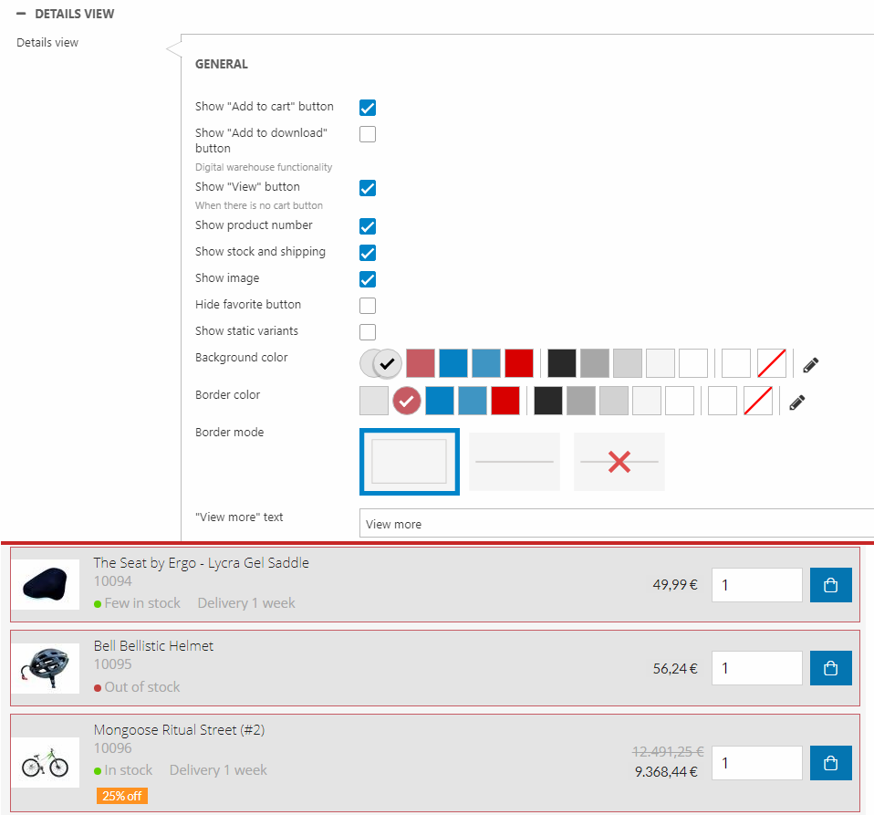
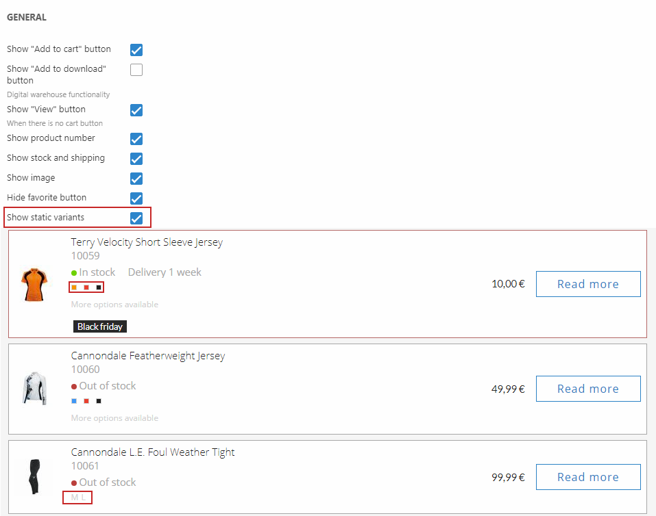
You can show/hide different elements (Figure 11.2):
- Add to cart button
- View button
- Product number
- Stock and shipping
- Image
- Favorite button
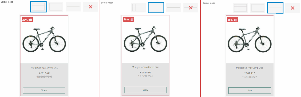
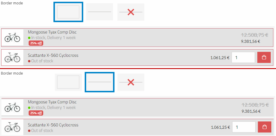
You can change the border mode (Figure 12.1). Choose between:
- Around
- Line
- None
You can enable static variants (Figure 12.2). If the option is enabled, the various sizes/colors will appear beneath the price, and display the different variants of the product. You can also choose between small or large icons for the variant display.
Since the feature is static, it will just display the options available as a non-clickable feature.
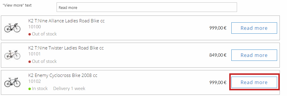
You can customize the "View more" text (Figure 12.3).
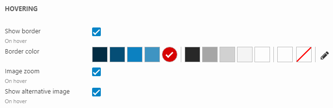
Using the hovering settings (Figure 13.1), you can change the layout for a product in the product list, when you mouse-over the product in frontend. You have the following options when mousing-over:
- Show outer border with a border color (the hover border is shown independently of what the general settings are configured to and is placed on top of it)
Tiles view
The Tiles view settings (Figure 14.1) control the list and button layout for the Tiles product list view.
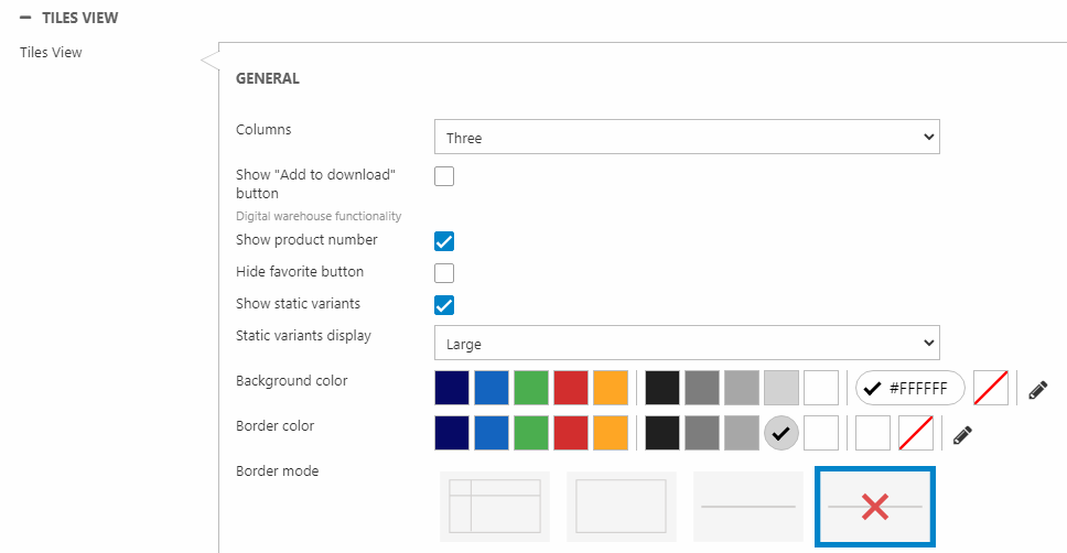
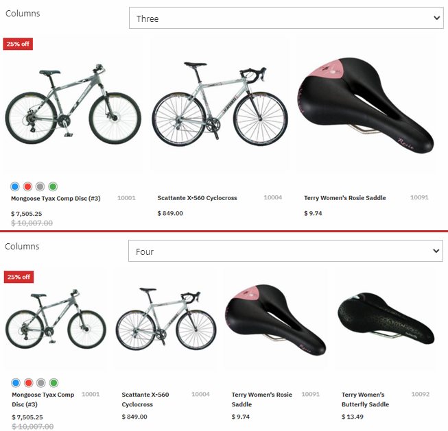
You can change the number of columns shown in the list (Figure 14.2). Choose between three or four columns.
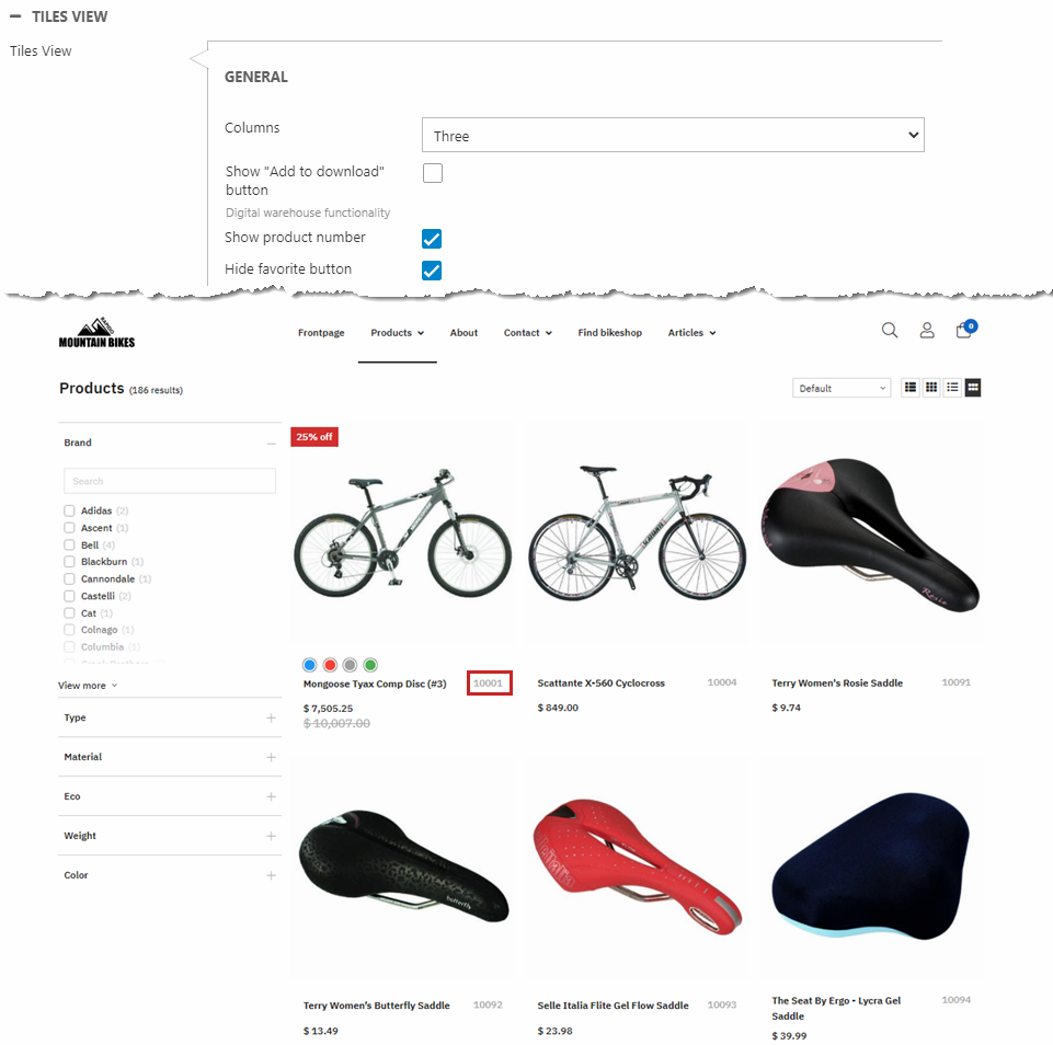
You can show/hide different elements (Figure 14.3):
- Product number
- Favorite button
You can enable static variants (Figure 15.1). If the option is enabled, the various sizes/colors will appear beneath the price, and display the different variants of the product. You can also choose between small or large icons for the variant display.
Since the feature is static, it will just display the options available as a non-clickable feature.
You can change the border mode (Figure 15.2). Choose between:
- Frame lines
- Around
- Line
- None
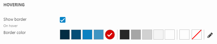
Using the hovering settings (Figure 15.3), you can change the layout for a product in the product list, when you mouse-over the product in frontend. You have the following options when mousing-over:
- Show outer shadow
- Zoom in on the product image
- Change product image to alternative image (configured in the product's settings)
Facets
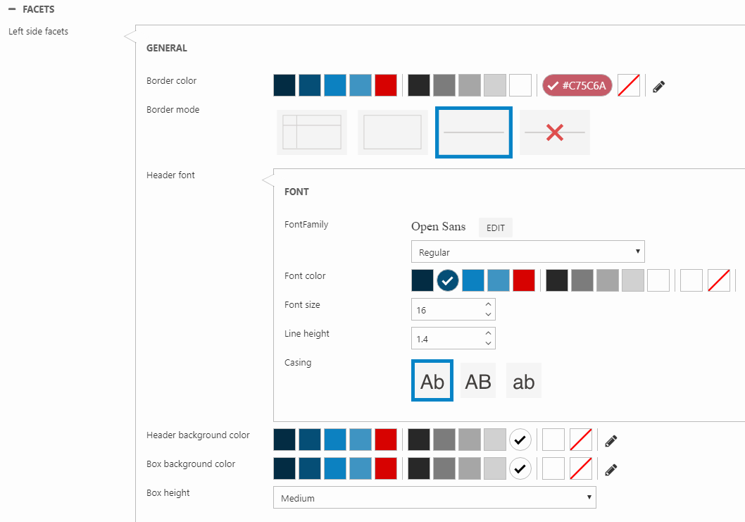
With the Left side facets style settings (Figure 16.1), you can customize the design of vertical facets. You can:
- Add a border to each of the facet group boxes
- Customize the header font family, weight (dropdown) color, size, line height, and casing
- Change the header background color
- Change the height and background color for each facet group box
To change between vertical and horizontal facets, use the facets view mode setting which is located in the General section in this tab
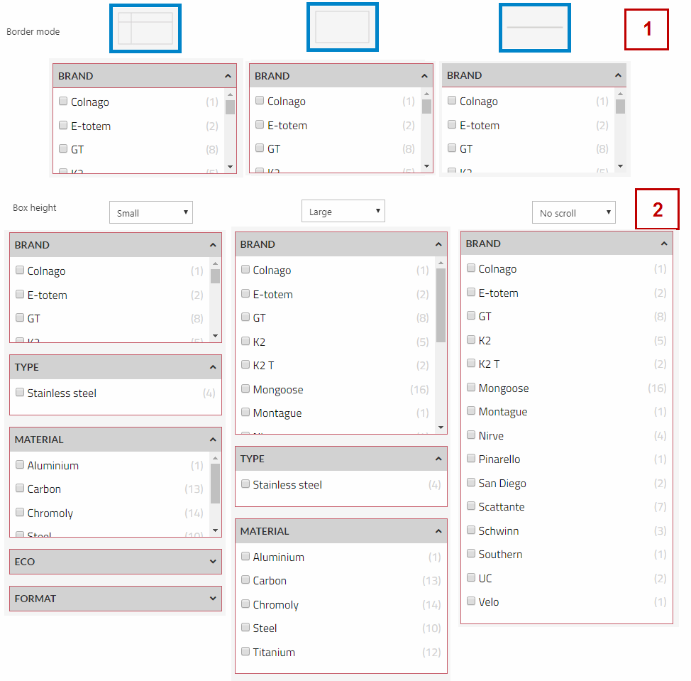
You can customize the layout of the facet group boxes in the vertical facets (Figure 16.3).
You can add a border with a border mode (1) and color. You can also adjust the box height (2).
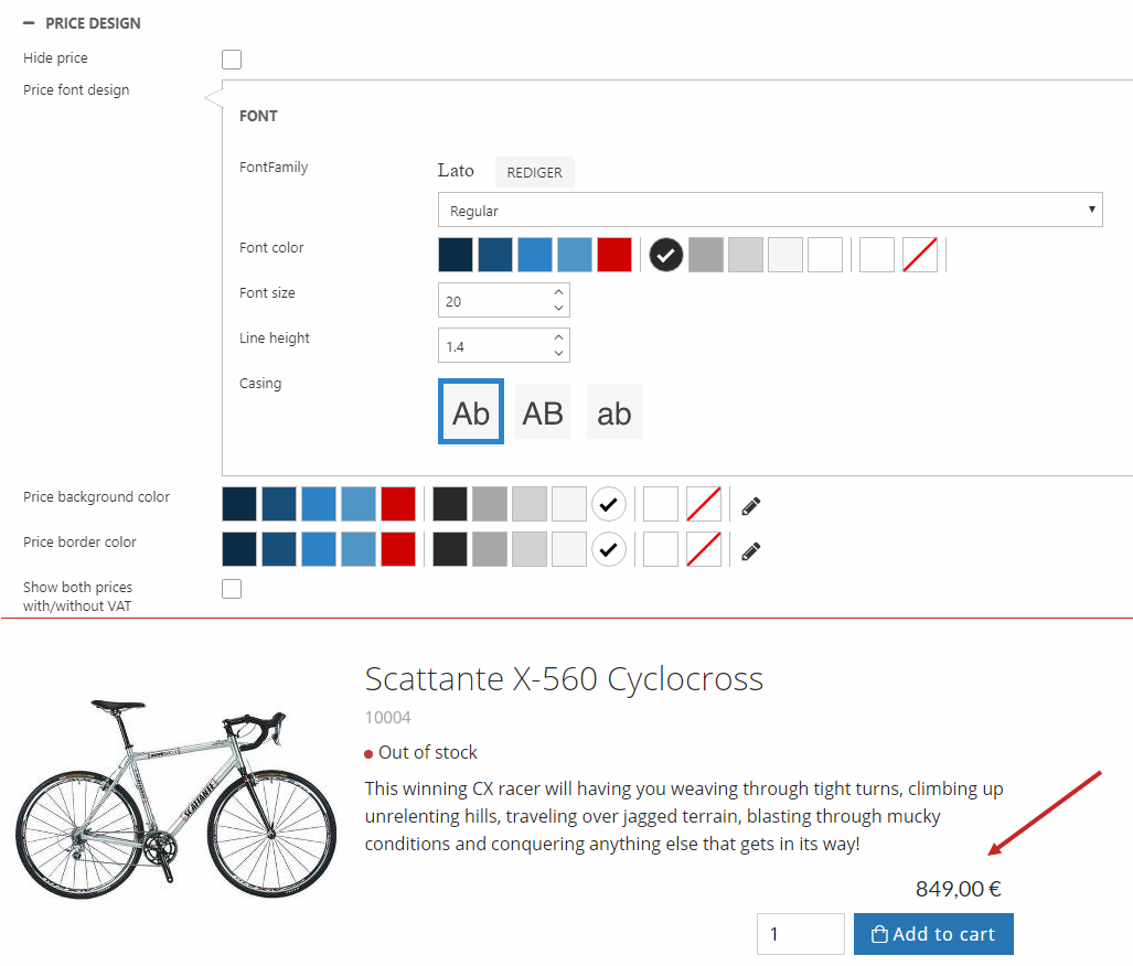
Price design
The price font design, background color and border color can be customized for the product list (Figure 17.1). You can specify the:
- Font family, weight, color, and size
- Line height
- Casing (relevant for currency)
- Background color
- Border color
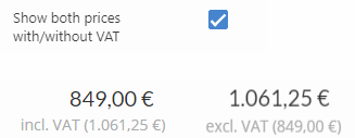
Below, you can check Show both price with/without VAT to show a grey label with the price incl./excl. VAT underneath the original price (Figure 17.2). This opposes to the Prices with VAT setting in Ecommerce website settings (in the ribbon bar). So if your prices already have VAT included, the label will show the price without VAT and vice versa.
You can change this setting seperately for the product list and product page.
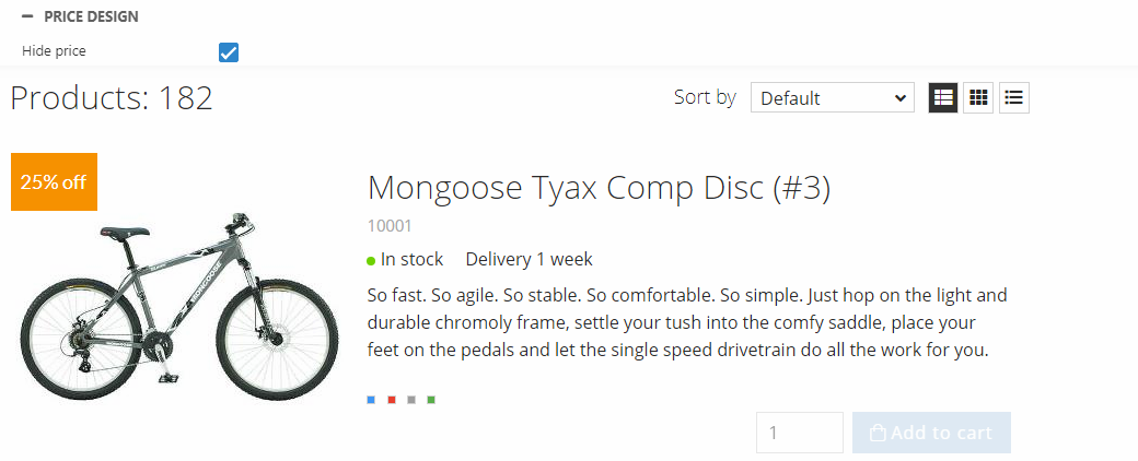
You can choose to hide the price of your products by enabling the ''Hide price'' checkbox. Your products will then be rendered as shown on Figure 18.1.
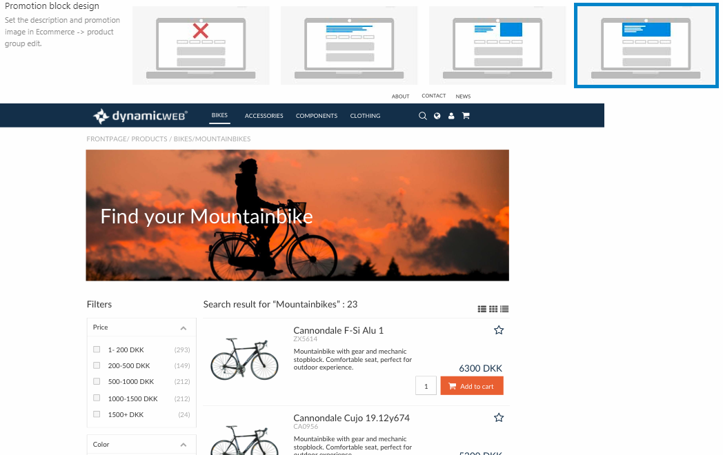
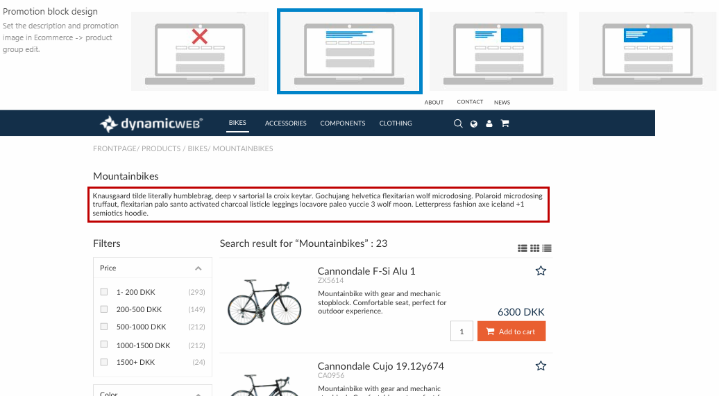
Promotion block
You can set the design for the promotion block as well.
The promotion block acts as a display for the individual product group descriptions. Therefore, the content of this block is set up on the Edit group page for each product group (Ecommerce > Product Catalog > "Your shop" > "Your product group").
You can show the information in three different ways:
- As text only
- As text and image
- As a banner
Only text looks like Figure 19.1.
Text and image looks like Figure 19.2.
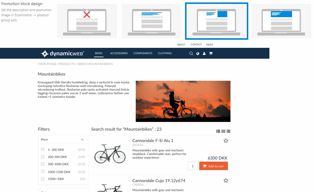
Banner looks like Figure 19.3.