Layout
The Layout tab includes website settings for:
- The basic page layout
- Logo and icons
- Header & navigation and footer
- Emails
- Mobile layout & navigation
Page layout
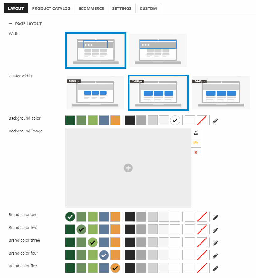
With the Page layout settings (Figure 2.1), you can control things like width and background color for the website. It is also in this section, you can configure up to five brand colors.
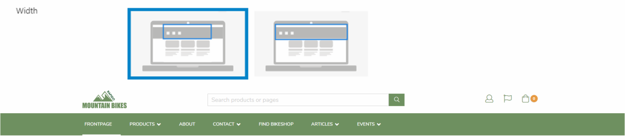
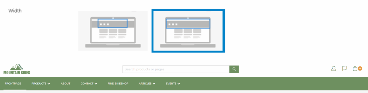
For the navigation and footer, the width setting can be set to either centered or full.
Centered looks like Figure 3.1.
Full looks like Figure 3.2.
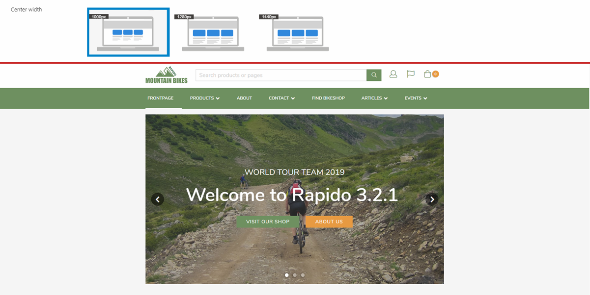
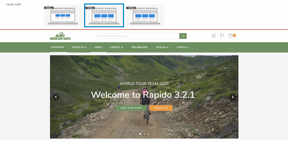
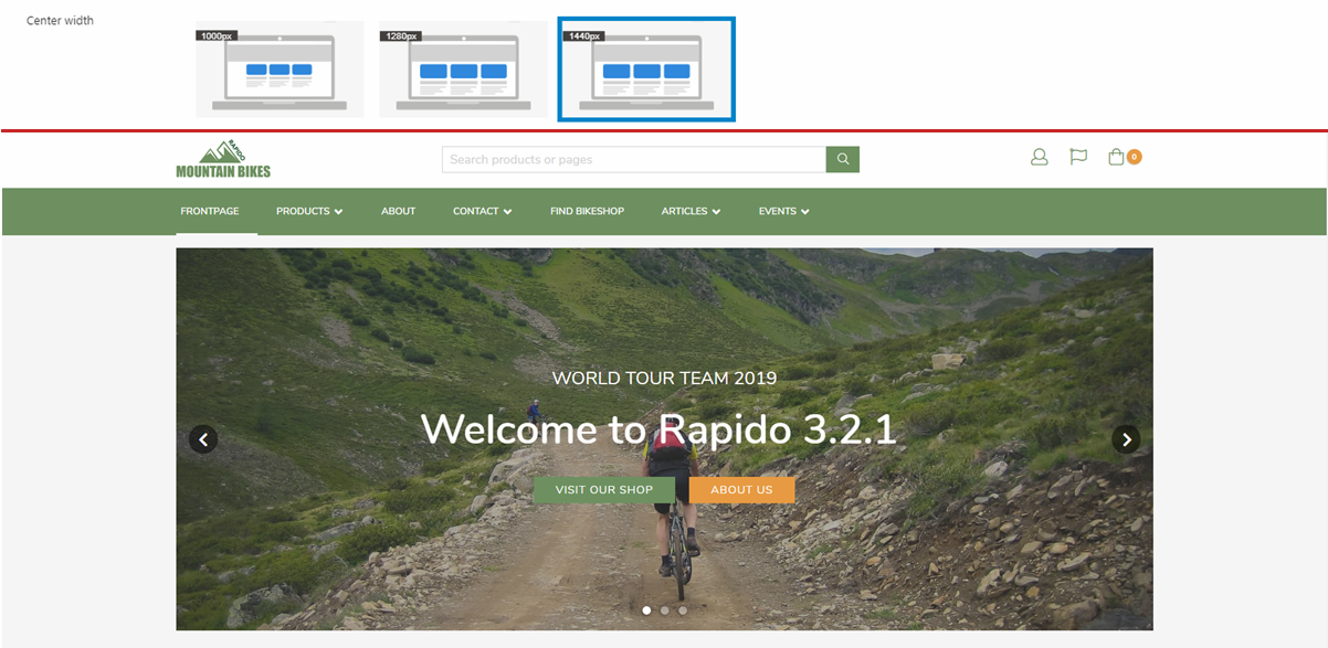
The center width setting lets you set the center width of the content to either 1000px, 1280px or 1440px.
A center width of 1000px looks like Figure 4.1.
A center width of 1280px looks like Figure 4.2.
Lastly, a center width of 1440px looks like Figure 4.3.
The background color setting affects the background for the website (Figure 5.1):

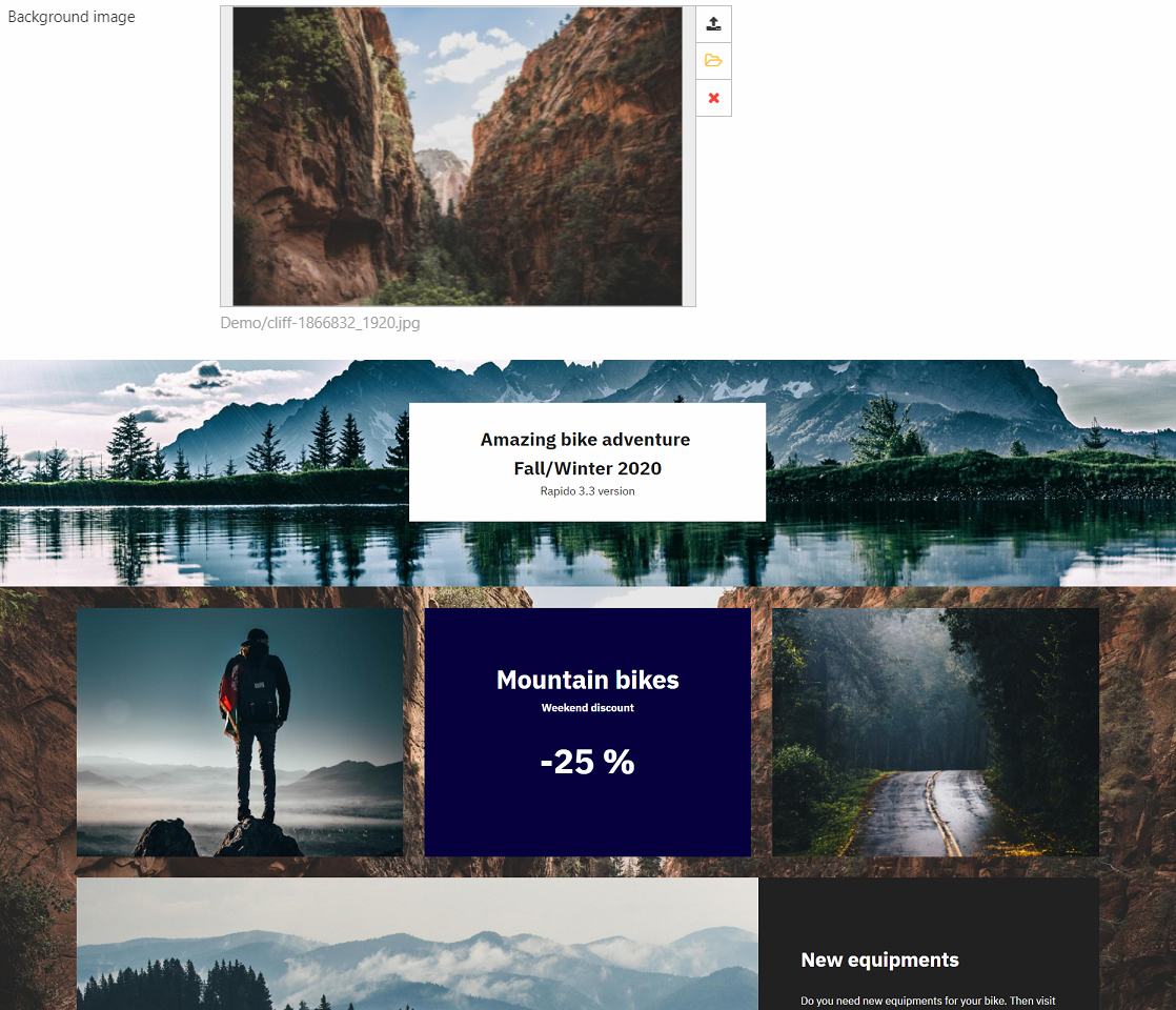
The background image setting sets an image as the background (Figure 5.2):
The brand color settings (Figure 5.3) let you select up to five colors. These five colors are saved in a color swatch, which is reused for all settings regarding colors, both in website settings and in content setup.
Read about the color swatch and all its settings here.

Separate background colors
You can define a seperate background color for a page. This overrides the website settings for background color and background image settings.
Go to the Content area and open your page. Click Properties in the ribbon bar (Figure 6.1).
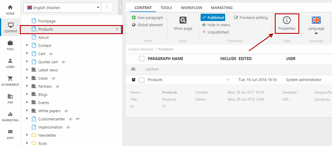
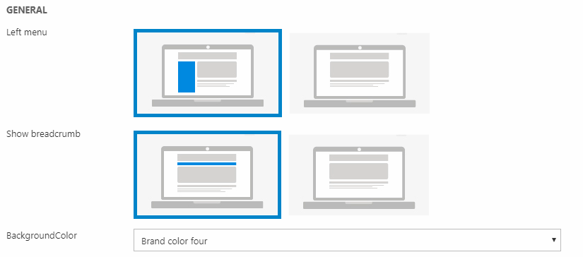
Stay under the Menu item tab and scroll down to the bottom. In the General section (Figure 6.2), you can:
- Enable the left menu (menu tree of the subpages or product groups)
- Show breadcrumb
- Change background color for the product catalog
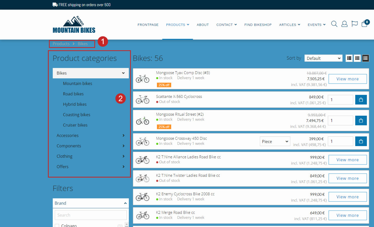
The settings above will produce the following layout for the page (Figure 6.3) - in this case for the product catalog page.
You have the breadcrumb (1) at the top, the left menu tree to the left of the products (2), and the background color is the preset brand color four.
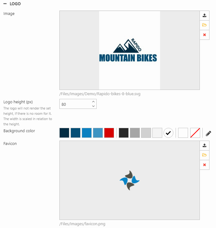
Logo
The logo settings (Figure 7.1) let you customize the logos used in the seven top layouts which will be covered in the Header section.
- Image is the logo
- Logo height is the height of the logo in the navigation bar
- Background color is the color used behind the logo
The Favicon is used in the browser tab.
Header
The Header section includes quite a lot of subsections of website settings. In the menu to the right, you can get an overview of the different sections inside Header (the names are the same as in the website settings).
With the settings in the Header section, you can configure things like:
- The top layout (and the Extra top area for selected top layouts)
- Tools menu
- Navigation type (dropdown / megamenu) & layout
- Sign in dropdown
General
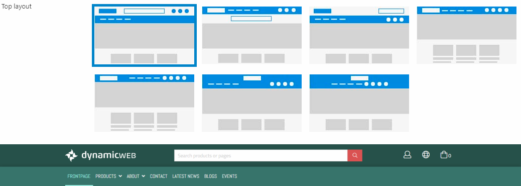
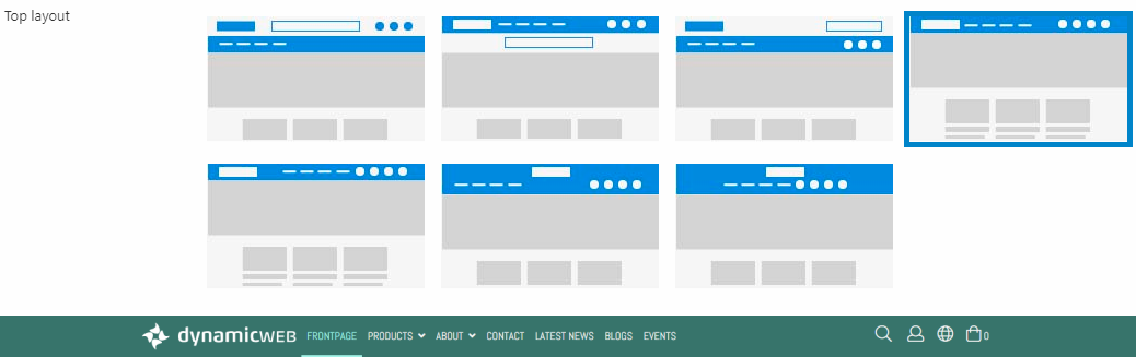
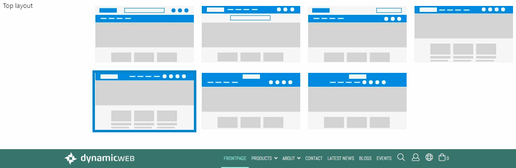
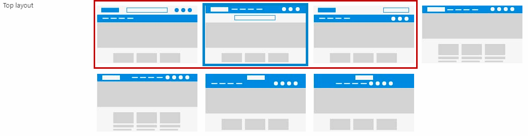
The top layout in Rapido has nine configuration options; normal, condensed, splitted, splitted centered, minimal, minimal centered, minimal right, two lines & two lines centered.
The normal top layout (Figure 9.1) consists of:
- Bar 1: Company Logo, search field, and icons - this is an extra top area which has separate color options
- Bar 2: The navigation menu
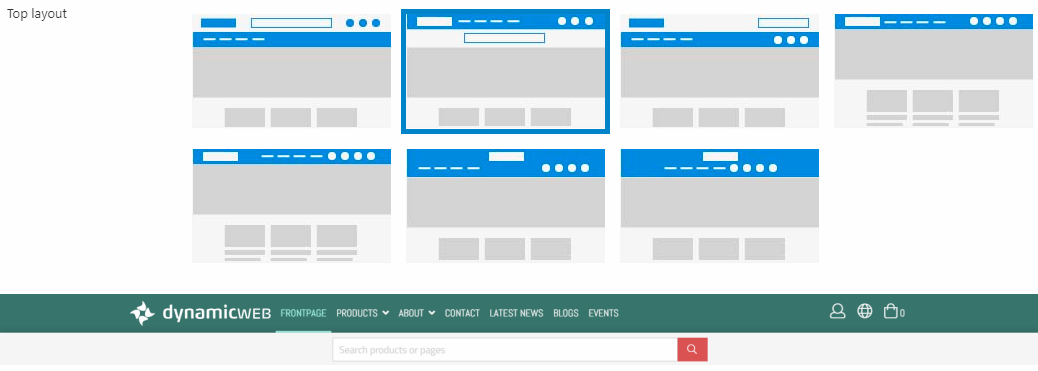
The condensed top layout (Figure 9.2) consists of:
- Bar 1: Company Logo, the navigation menu, and icons
- Bar 2: Search field
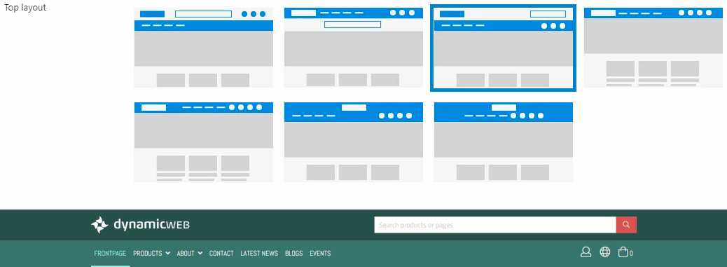
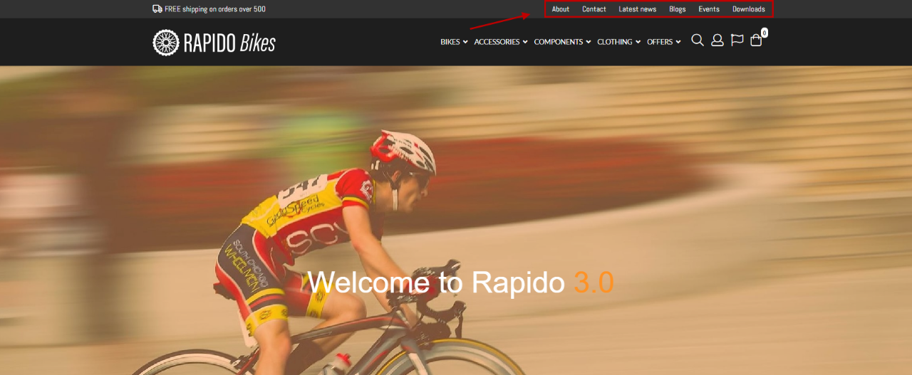
The splitted top layout (Figure 9.3) consists of:
- Bar 1: Company logo and search field - this is an extra top area which has separate color options
- Bar 2: The navigation menu, language, Sign in/Favorite, and mini cart
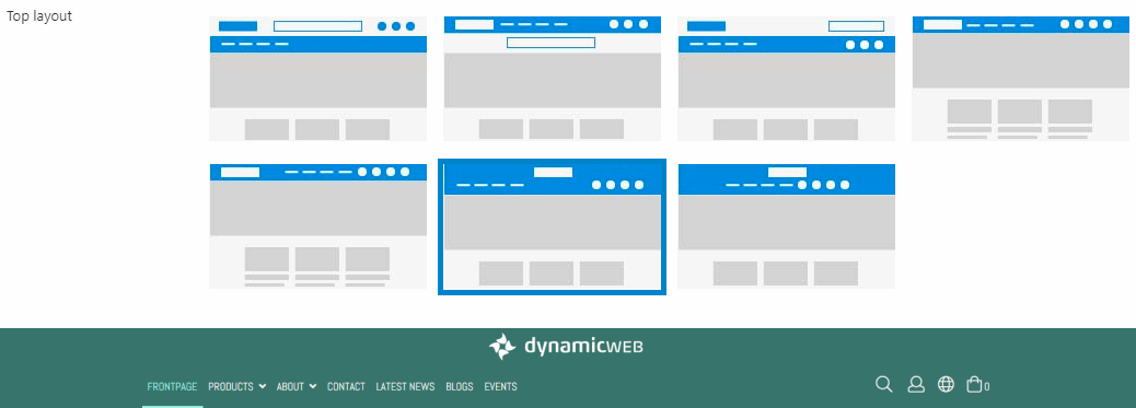
The minimal top layout (Figure 10.1) consists of:
- Bar 1: Company Logo, the navigation menu (left aligned), and icons incl. hidden search
The minimal right top layout (Figure 10.2) consists of:
- Bar 1: Company logo, the navigation menu (right aligned), and icons incl. hidden search
The two lines top layout (Figure 10.3) consists of:
- Bar 1: Company logo (centered)
- Bar 2: The navigation menu (left aligned) & icons incl. hidden search (right aligned)
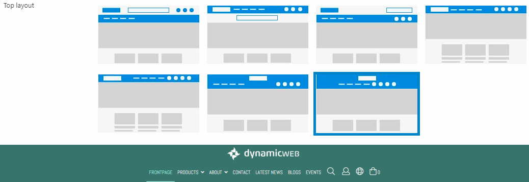
The two lines centered top layout (Figure 11.1) consists of:
- Bar 1: Company logo (centered)
- Bar 2: The navigation menu & icons incl. hidden search (centered)
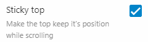
Sticky top
The sticky top checkbox (Figure 12.1) is used to control whether or not the top layout is sticky.
When Sticky top is disabled, the top (including the mini cart) will remain at the top of the page and disappear when scrolling down.
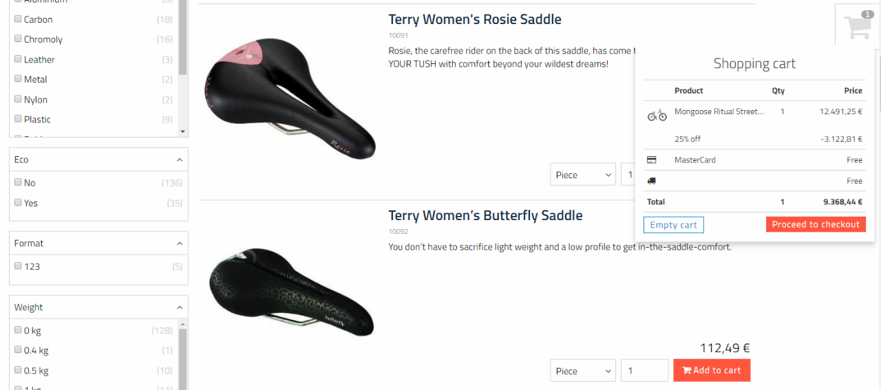
When scrolling down the product list, a new mini cart will therefore appear at the side on big devices (Figure 12.2).
Tools menu
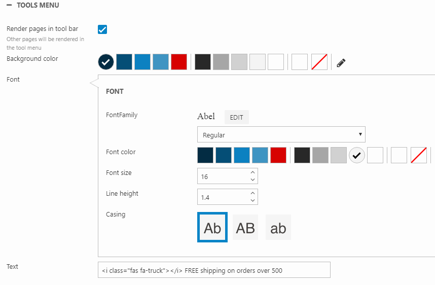
The Tools menu website settings enables you to render the website's pages in a bar at the top. The contents from the previous Product section then fills out the navigation bar (Figure 13.1). You can also add some toolbar text, which will appear to the left in the tools menu.
To enable the tools menu, you must check the Render pages in tool bar checkbox (Figure 13.2). You can then use the settings below.
You can set the:
- Background color for the toolbar
- Font family, weight (the dropdown), color, size, line height, and casing
- Additional toolbar text
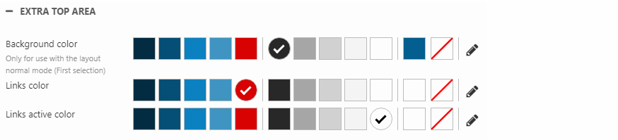
Extra top area
For two of the top layouts - the normal and the splitted top layouts - you will get an extra area at the top where you can have separate background and icon colors (Figure 14.1).
Using the Extra top area settings, you can customize the colors of this top bar (Figure 14.2). You can change the color of the:
- Background of the extra top area
- Icons and their active color
To change the rest of the colors in the top layout (including the navigation menu itself), you must use the Navigation website settings.
Navigation
The Navigation website settings allow you to configure the style and behavior of the navigation bar.
The first of the basic Navigation settings are shown in Figure 15.1.
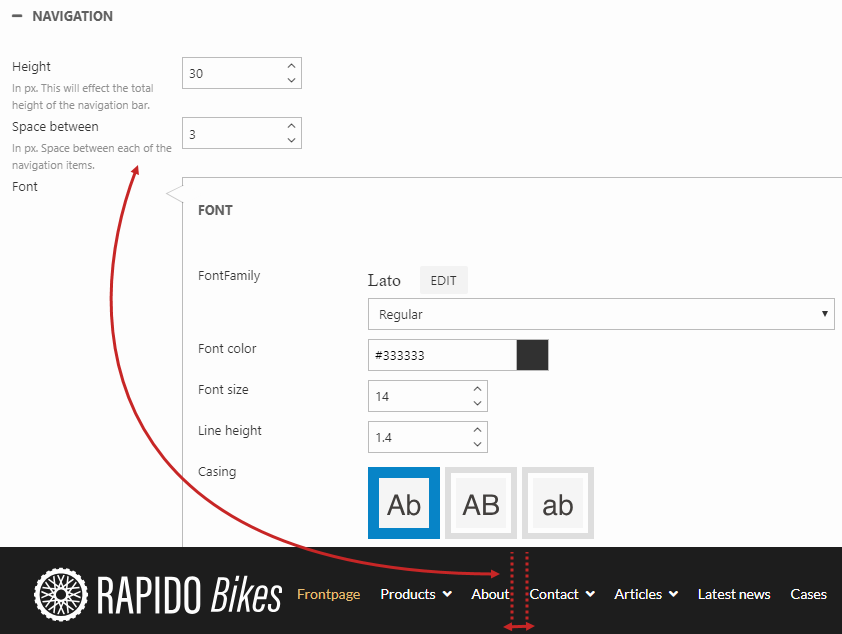
You can define the:
- Height (px) of the navigation bar
- Space between (px) the navigation items (pages and icons in the navigation bar)
- Font family, weight (the dropdown), color, size, line height, and casing
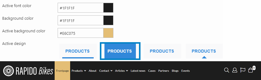
In the next settings, you can customize the colors and active behaviour of the navigation menu. Figure 15.2 shows one possible configuration of these settings and what the navigation menu would look like in frontend.
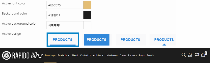
You can define the:
- Active font color
- Background color of the entire navigation bar
- Active background color (only visible with the second design option - Figure 15.3)
- Design for the active navigation item
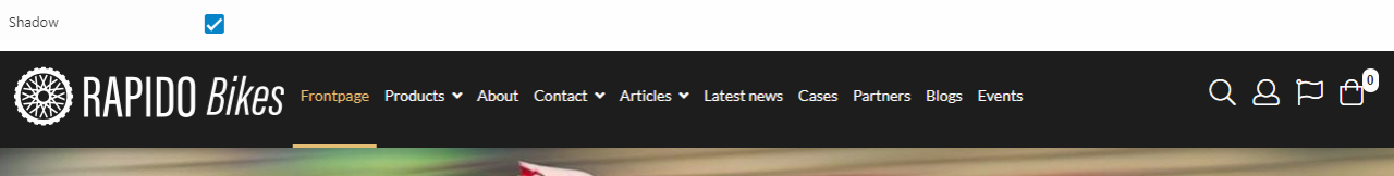
With the Shadow setting (Figure 16.1), you can add a shadow to the entire navigation bar.
Navigation items
The Navigation items settings control the layout regarding icons and buttons in the navigation bar (Figure 17.1). You can show/hide the icons for:
- Search
- Sign in
- Favorites
- Cart (also removes the mini cart functionality)
- Order drafts (hidden by default)
- Download Cart (Digital warehouse functionality - hidden by default)
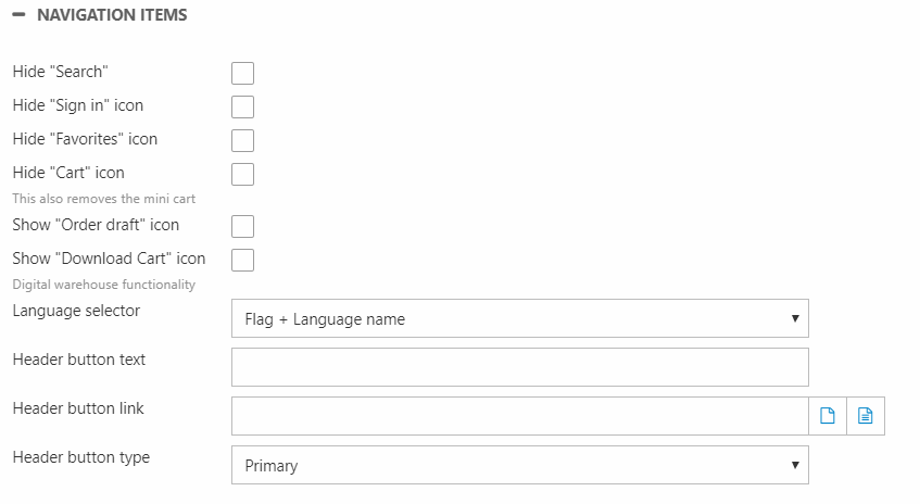
You can choose how to display different languages in the language selector on your website (Figure 17.2). You can view langauges with:
- Flag and language name
- Flag only
- Language name only
- Flag and culture
- Culture only
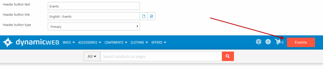
You can make a custom header button shown in the right side of the navigation bar (Figure 17.3). This button can be costumized to highlight a page or paragraph of your choice. You can:
- Write a button text
- Select a button link
- Choose the button type (primary, secondary, tertiary, or link - set up in the Content layout settings)
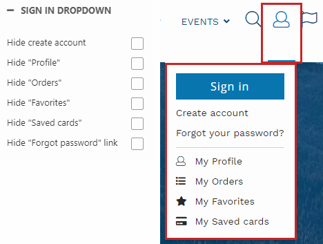
Sign in dropdown
With the Sign in dropdown settings (Figure 18.1), you can choose to hide different options in the sign in dropdown.
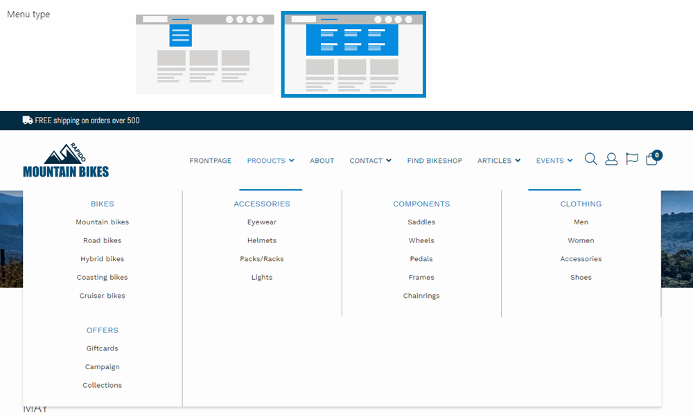
Megamenu / Dropdown
The Megamenu / Dropdown settings control whether a dropdown or a megamenu should be used – and how it should be styled.
The dropdown menu type looks like Figure 19.1.
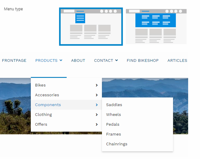
The megamenu menu type looks like Figure 19.2.
Using the style settings (Figure 19.3), you can customize the appearance of the dropdown / megamenu.
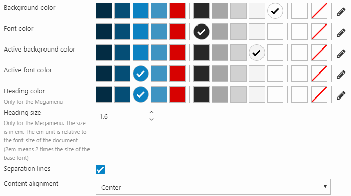
You can:
- Set the background color (active/passive) and font color (active/passive)
- Change the heading color & size (only accounts for the megamenu)
- Define the content alignment
- Add separation lines between the main pages (as shown above)
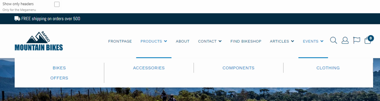
You can also choose to only show headers - only accounts for the megamenu (Figure 20.1).
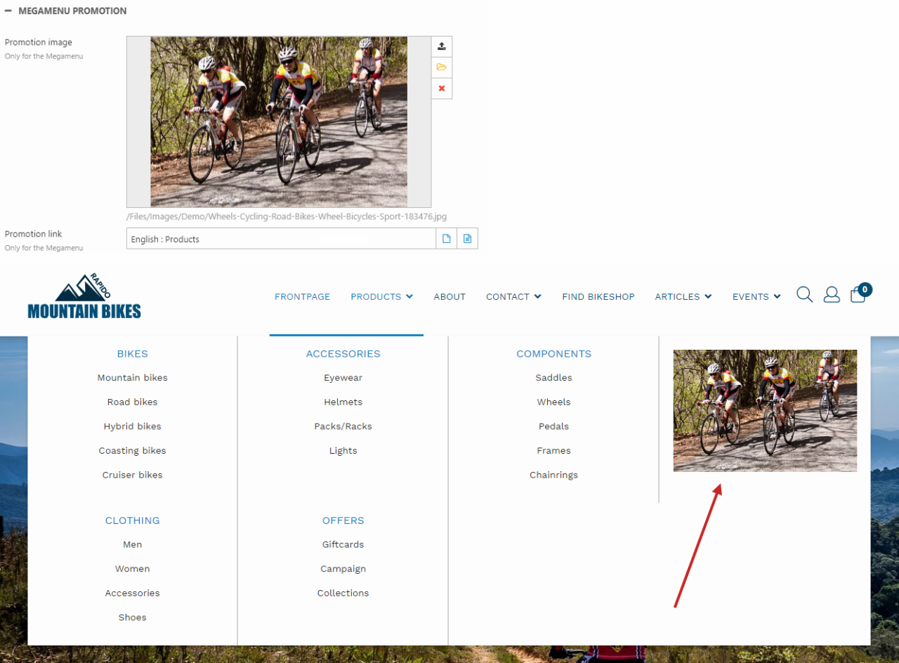
Megamenu promotion
You can also set a megamenu promotion image & promotion link (Figure 21.1). This is shown in the megamenu both when the tools menu is dis- and enabled. When the tools menu is enabled, the megamenu promotion images is placed below the product group promotion image, if these are configured.
You can read more about images in the megamenu in this article.
Search
With the Search settings, you can customize the search result page.
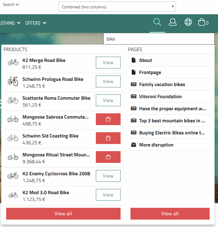
You can choose to either search in products, content, or both in a combined option (products and content are still separate) (Figure 22.1).
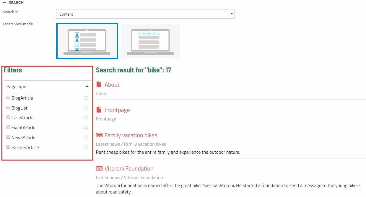
You can also change the placement of facets - this only applies for content search. In Figure 22.2, the vertical option has been selected.
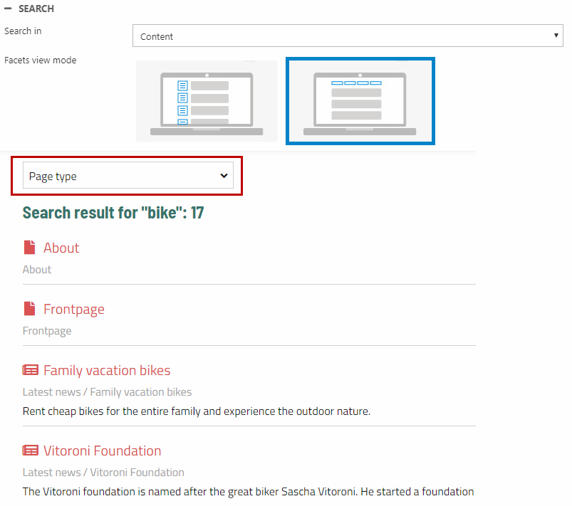
In Figure 22.3, the horizontal option has been selected.
Check the Show groups selector checkbox to show the category filter dropdown for Product and Combined searches (Figure 23.1). The search result will only contain products from the selected product group's query.
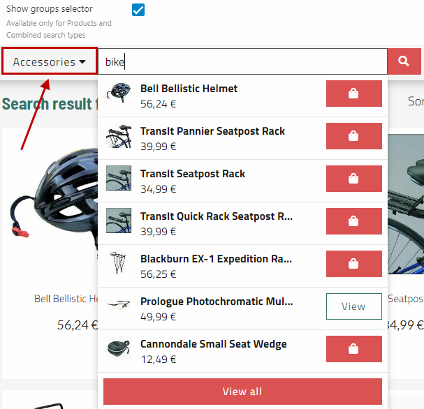
The groups selector is only visible with a full search bar and therefore only for the normal, splitted, and condensed top layout (Figure 23.2).
Icons
The Icons website settings (Figure 24.1) let you change the icons in the navigation menu. Some icons require that you have a Font Awesome Pro license. Use the checkbox at the top to (de)activate Font Awesome Pro.
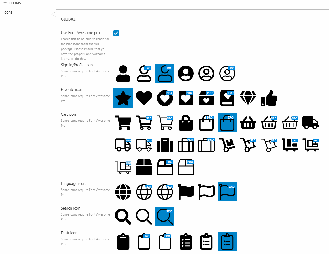
You can change the icons for:
- Sign in / profile
- Favorite
- Cart
- Language
- Search
- Order drafts
Fonts
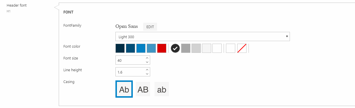
For H1, H2, H3 & body text content, you can configure the font family, weight (the dropdown), color, size, line height, and casing (Figure 25.1).
Buttons
Using the primary button, secondary button, and tertiary button settings (Figure 26.1), you can configure the:
- Background color
- Font color, size & weight
- Line height
- Button design
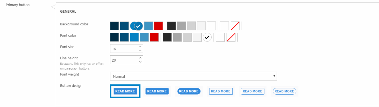
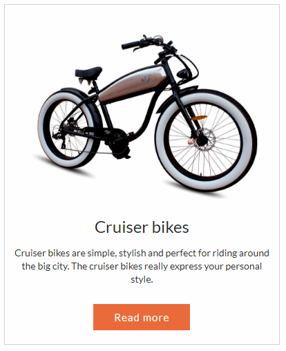
The configuration above results in a button design as in Figure 26.2.
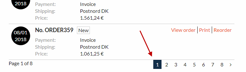
The link color and active link color settings (Figure 27.1) are used to set the color of links in content texts.
You can also change the background color of the active page in the pagination.
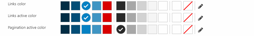
The above settings produce the following layout for the pagination (Figure 27.2).
Footer
The Footer website settings let you configure the footer layout and behavior.
You can define the background color and font color (Figure 28.1).
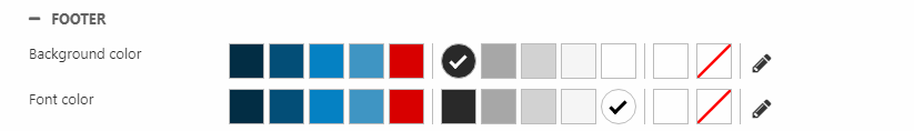
The above settings produce a black footer with white text (Figure 28.2).
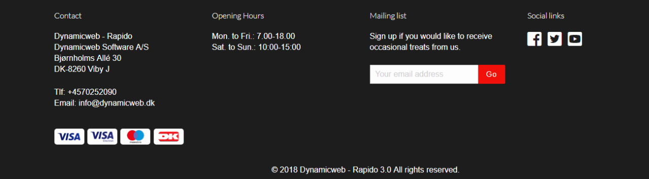
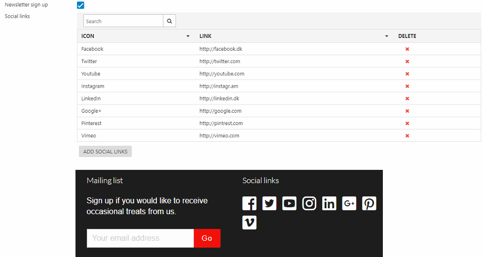
You can enable Newsletter signup and use the social links section to add social media icons (Figure 28.3).
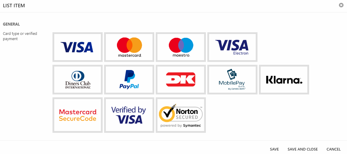
You can also display your site's supported card types and verified payments in the footer. Click Add card type and verified payment to add one card type/verified payment at a time.

Select your card type/verified payment and click Save and close.
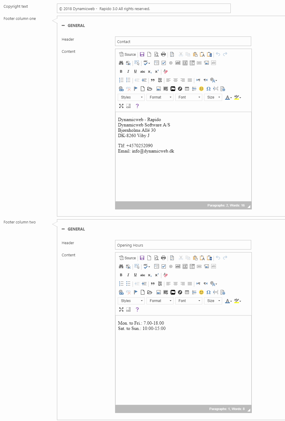
You can configure up to three custom columns in the footer. Each column has a header and content/text.
You can also add copyright text (Figure 29.3) which is shown below the rest of the footer content.
The Email website settings (Figure 30.1) control the layout of emails and newsletters.
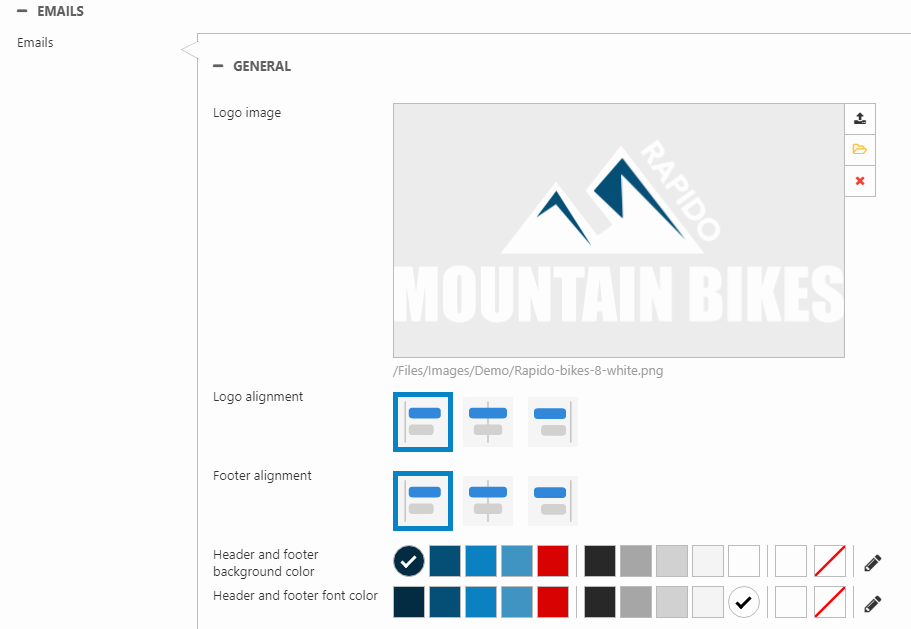
You can:
- Upload an email logo image
- Set the alignment for the logo and footer separately
- Costumize the background and font color for the header & footer
The email and phone number rendered in the email footer originate from the Business settings.
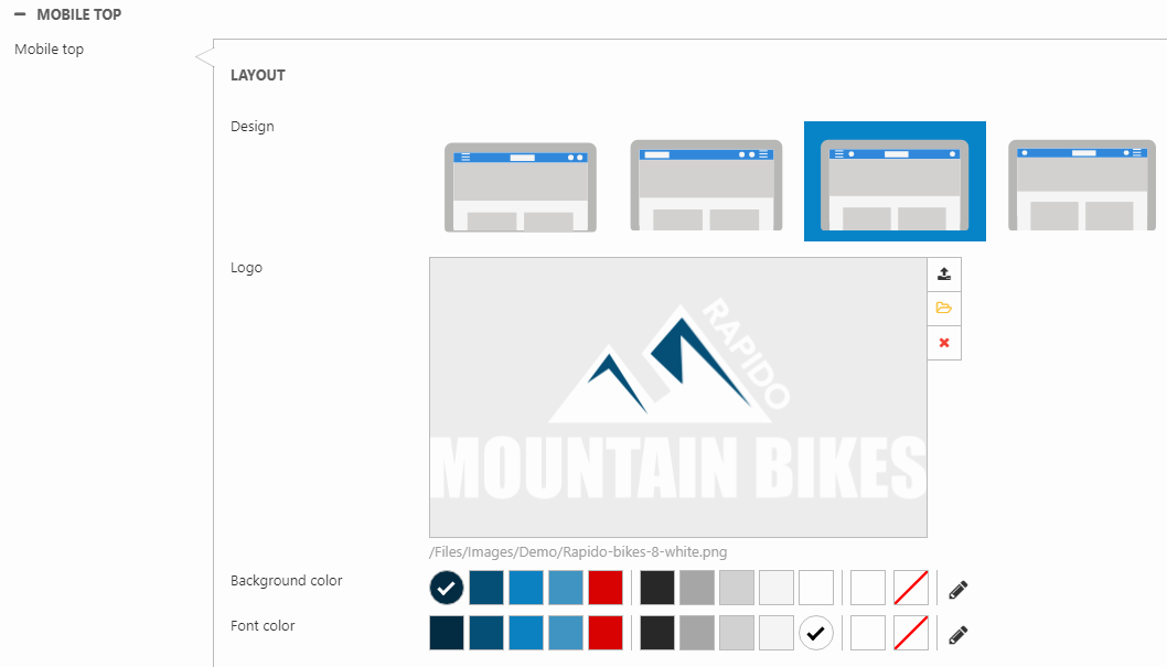
Mobile top
With the Mobile top settings (Figure 31.1), you can customize the top layout for mobile devices.
You can:
- Customize the mobile logo
- Choose the background and font color
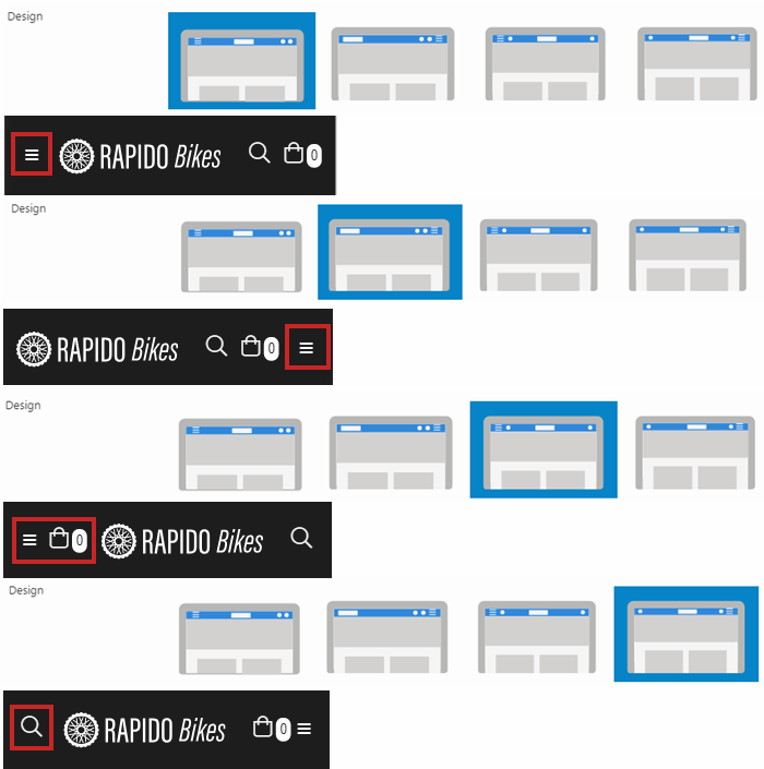
You can also customize the placement for the navigation menu and search (Figure 31.2).
- The first option (Nav left) places the navigation to the left
- The second option (Nav right) places the navigation to the right
- The third option (Nav+cart left) places the navigation and cart to the left
- The fourth option (Search left) places the search to the left and navigation to the right
Mobile navigation
In Rapido, the mobile navigation is separate from the regular navigation – and does not use the same configuration settings.
Instead, you use the mobile navigation settings (Figure 32.1) to control the styling and behavior.
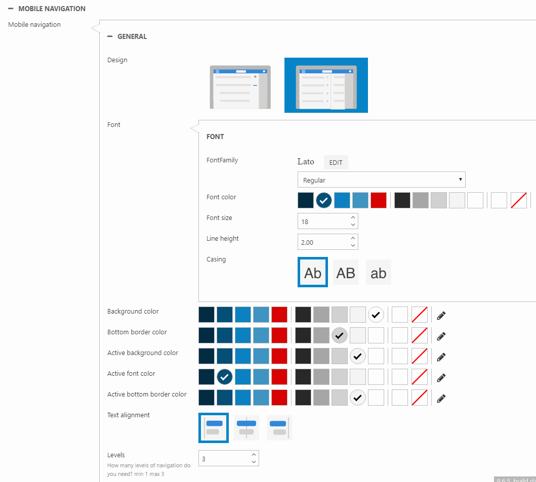
You can specify the:
- Font family, weight (the dropdown), color, size, line height, and casing
- Menu colors
- Background and bottom border color for passive pages
- Background, font and bottom border color for active pages
- Text alignment (left, center, right)
- Levels rendered (1-3)
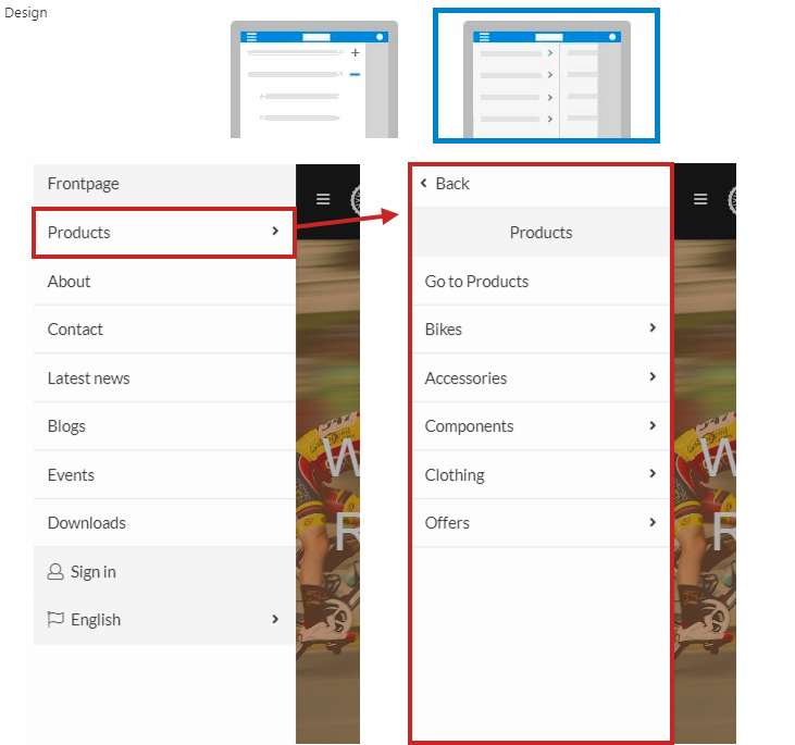
You can also select the mobile navigation design. The expandable option will produce a menu as in Figure 32.2.
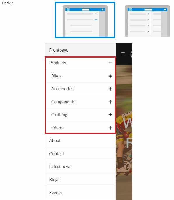
The slides option will produce a menu as in Figure 32.3.
On mobile devices, the customer center and language selector is accessed at the bottom of the navigation for both of the navigation designs.