Content Columns
These items are only compatible with Rapido 3.2 or earlier versions.
You can use the Rapido Content Model to create similar types of content.
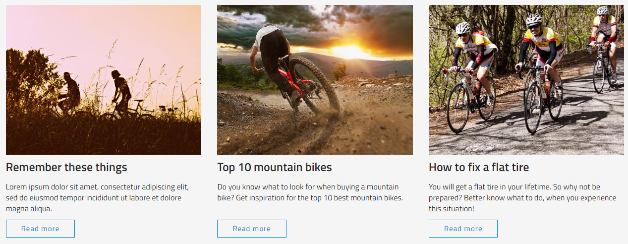
Another currently popular layout type is content columns (Figure 2.1) and they are very easy to create and style using the pararaph container item type.
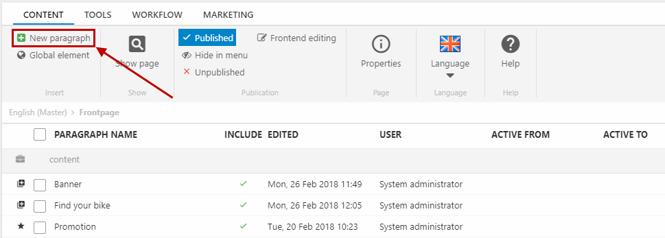
To create content colums, you must create a new paragraph (Figure 2.2).
And choose the paragraph container item type (Figure 2.3).

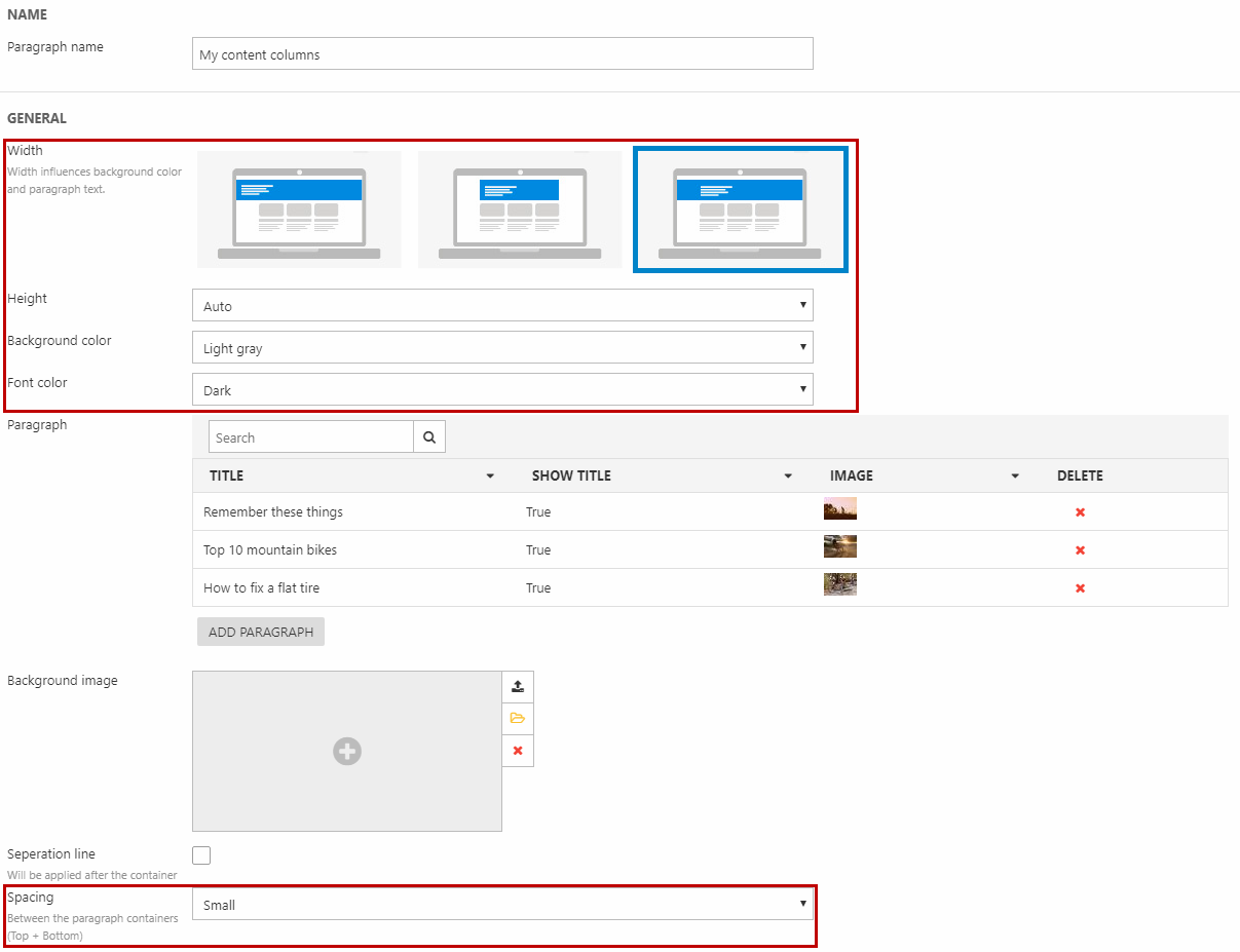
Then, in the General section (Figure 3.1):
- Set the preferred width, height, background color, font color, and spacing around the container
You can also choose a background image (for the container itself) and apply a seperation line after the container.
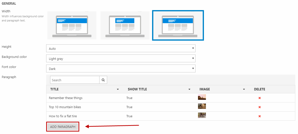
You add content columns as paragraphs using the Add paragraph button under Paragraph in the General section (Figure 3.2).
Using the paragraph settings including the Layout settings, you can set the width, content position, and image style.
Different combinations can create different looking content columns, some of which are presented later in this article.
Image, text, and button
You can create content columns with 3 columns at a time each with an image, some text, and a button like the one in Figure 4.1.

You must set each paragraph in your paragraph container up like this (Figure 4.2):
To start with:
- Fill in the title (remember to use the Show title checkbox) and the text
- Select an image
- Create a button in the Link section:
- Select the destination page/paragraph
- Fill in the button text
- Choose a button design
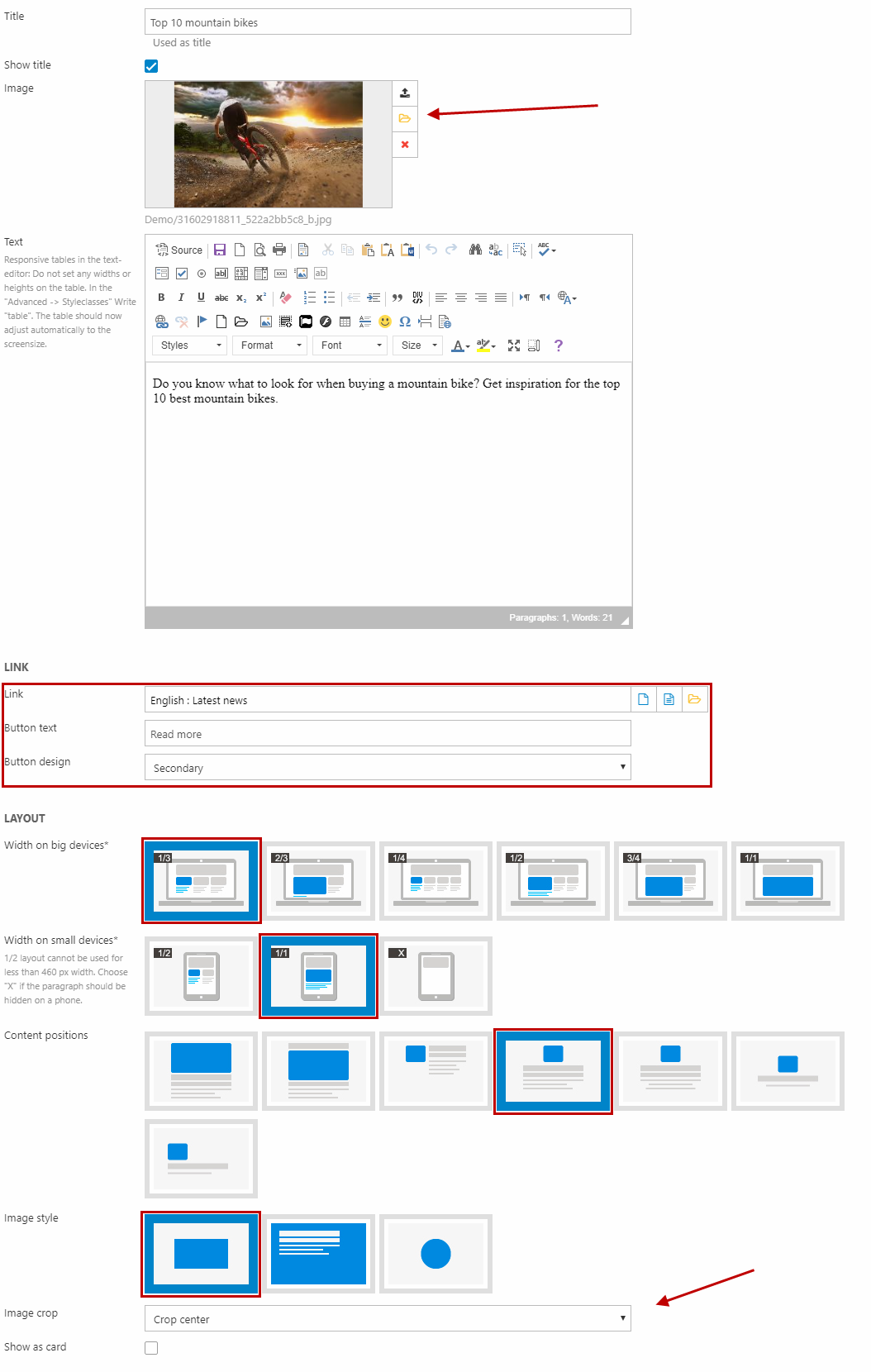
Then, under Layout, you must:
- Set the width to 1/3 (and 1/1 on small devices)
- Select a content position
- Set the image style to square
- Select your preferred crop mode
Remember to save and close each paragraph and then save your paragraph container.
Round images and headlines
You can create content columns with 4 columns at a time each with a round image and a headline like the one in Figure 5.1.

You must set each paragraph in your paragraph container up like this (Figure 5.2):
To start with:
- Fill in the title that will be the headline (remember to check the Show title checkbox)
- Select an image
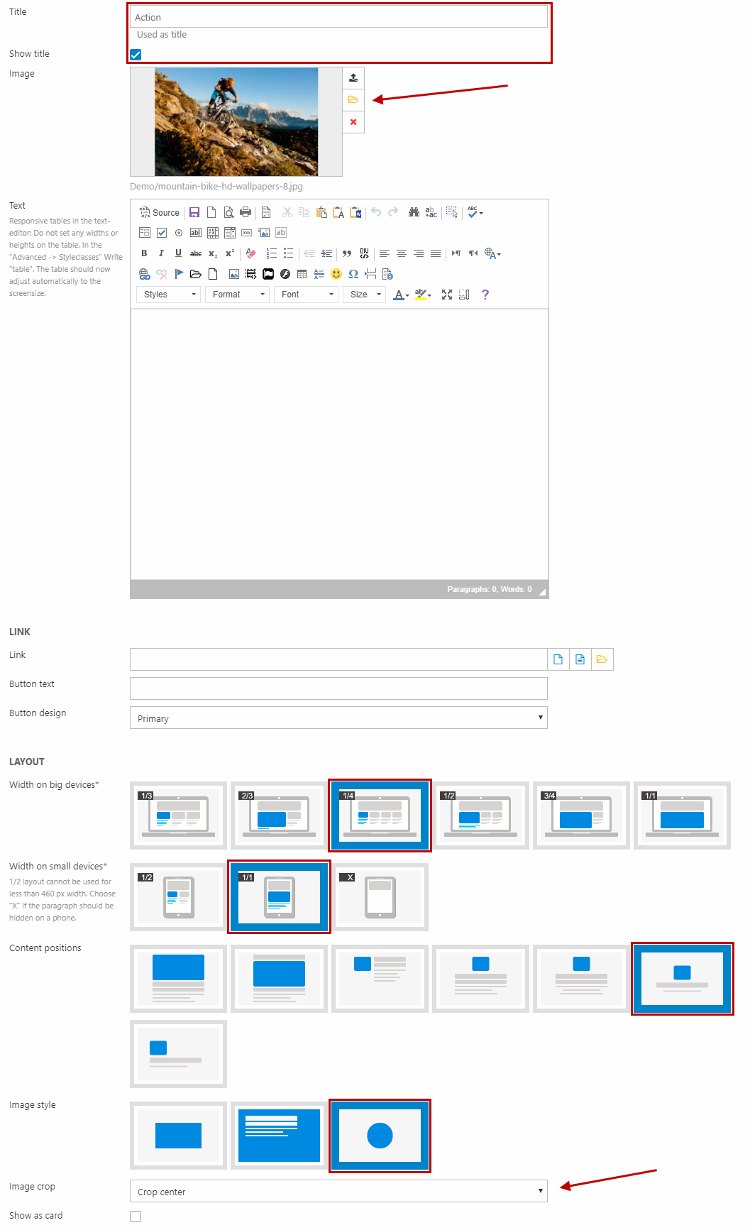
Then, under Layout, you must:
- Set the width to 1/4 (and 1/1 on small devices)
- Select the content position to center the image and text
- Set the image style to round
- Set the crop mode to crop center
Remember to save and close each paragraph and then save your paragraph container.
Icon bar
You can create an icon bar as content columns e.g. with 4 columns at a time each with an icon and title like the one in Figure 6.1.
You must set each paragraph in your paragraph container up like this (Figure 6.2):
To start with:
- Fill in the title (remember to check the Show title checkbox)
- Select an image as the icon
Then, under Layout, you must:
- Set the width to 1/4 (and 1/1 on small devices)
- Select the content position to image left, text right (no. 3 option)
- Set the image style to square
Remember to save and close each paragraph and then save your paragraph container.
Centered columns
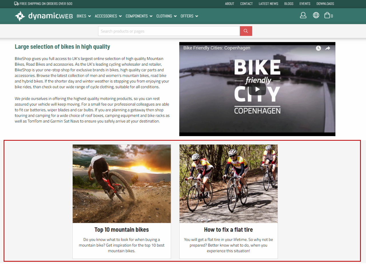
For paragraph containers with fewer or narrower columns to fill out the whole page width, the paragraphs are by default placed to the left side. Using the general settings for the paragraph container, you can choose to center the columns instead (Figure 7.1).
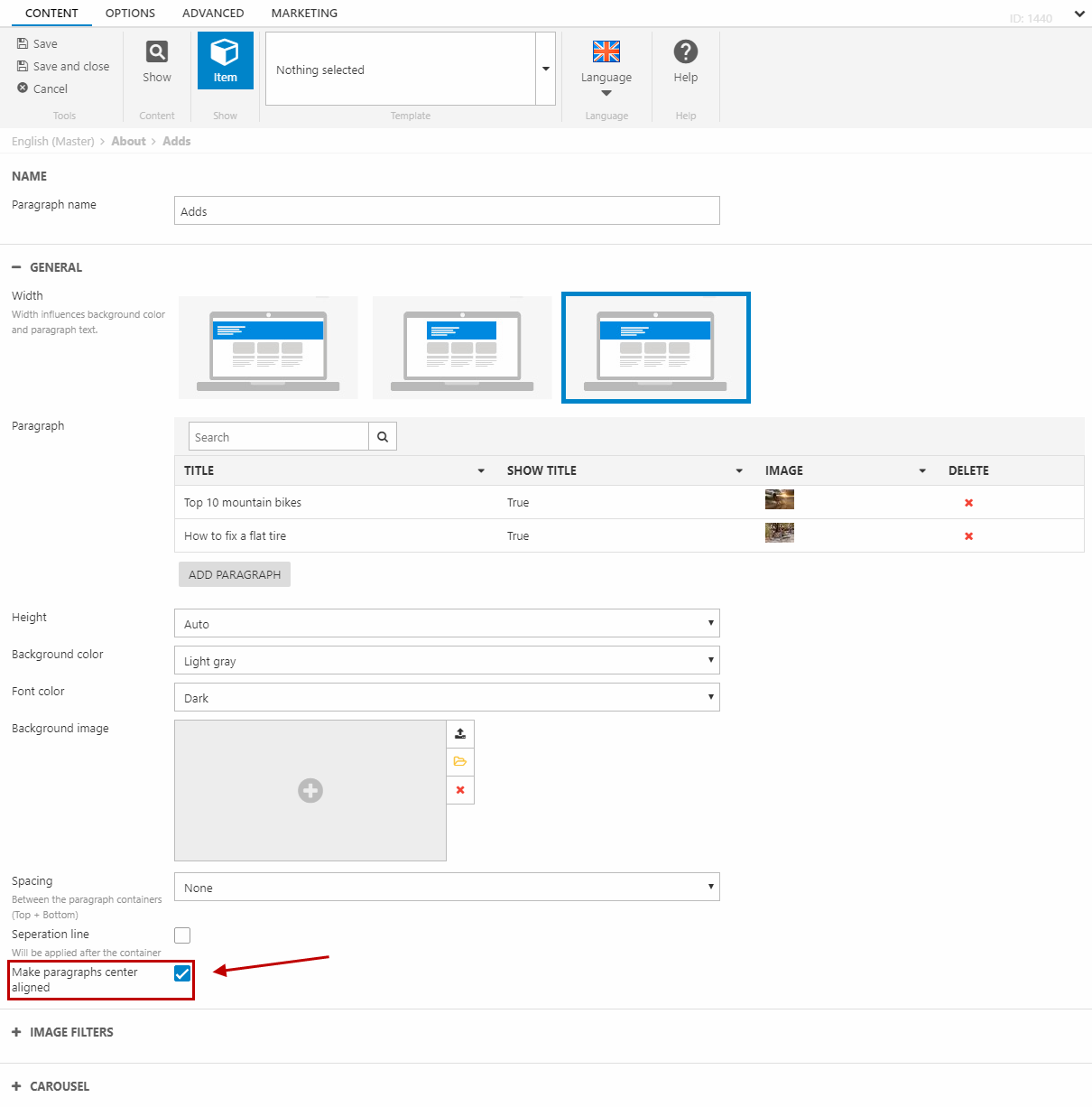
To center the content of a paragraph container, go to the settings for your paragraph container. At the bottom of the general settings, check Make paragraphs center aligned (Figure 7.2).
Save and close the paragraph container. The columns inside the paragraph container will now be center aligned.
