
Item field types
An item type consists of a number of item fields - generally speaking your options are:
- Text fields are for rendering various input fields for text
- Link fields are for linking to folders, files and items
- Select box fields are for letting people select users or products, or for creating lists on the fly
- Number and date fields are for specifying number or dates
- List fields are for letting users select values from various types of lists (with static or dynamic options)
Additionally, you have access to all the HTML5 input fields - and a number of cool-but-unique fields (like the color field and the geolocation field) grouped under the other fields label.
Text fields
Text fields render input fields for text - these are your options:
|
Field type |
Description |
Parameters & Comments |
|
Long text |
Renders a multi-line input field for text |
Use the extra parameters to control the size of the field in rows and columns |
|
Rich text |
Renders a text field and a rich text editor. |
An extra parameter lets you select a custom editor configuration - if none is set the system checks if one has been set for the user, and finally defaults to the default configuration defined in Settings > Editing > Editor Configurations. |
|
Text |
Renders a simple input field for text (255 character limit). |
None |
|
Hidden field |
“Renders” a hidden field for passing on values not entered by the user |
If you make the field required and does not give it a default value or assign a value automatically to it, the user will not be able to save the item. So don't. |
|
Password |
Renders a text field where input is rendered as dots (rather than characters) |
None |
Link fields
Link fields make it possible to link to various types of content - internal and external pages, items, files and folders:
|
Field type |
Description |
Parameters & Comments |
|
Link |
Renders a control for selecting an internal page on the solution or a file from the file manager. |
The extra parameters let you control what can be selected; pages, paragraphs or files.
You can also choose to only return the page or paragraph ID (rather than an URL). This field cannot be edited from frontend. |
|
Link to item |
Renders a control for linking to an item-base page or paragraph. |
You can access the item fields of the selected item by using the Item.[LinkToItem].Fields loop. |
|
Folder |
Renders a file folder selector – the contents of the selected folder can then be rendered in frontend. |
You can specify a search pattern in the field settings to only show files matching this pattern, e.g. *.xlsx to match all Excel files, or 2015-* to match files starting with 2015. Cannot be edited from frontend. |
|
Renders a file selector |
You can set the default folder and the selectable file extensions using the extra parameters in the field settings. You can also allow file upload and select a max number of files for editors to upload. |
Select box fields
The select box fields let user select product or users when creating an item - you can then render user or product details in the frontend when the item is published. You can also let users create custom lists on the fly.
The select box field are:
|
Field type |
Description |
Parameters & Comments |
|
Select users and user groups. |
You can specify whether the user can select users or user groups |
|
|
Product |
Select one or more products or product groups.
Basic tags & loops are available for rendering the selected products/groups in frontend.
|
Select a paragraph with a product catalog which will be used to render the content in frontend. Specify whether products, product groups, or both may be selected using this field.
Inactive products can be selected, but will return a blank page in frontend.
For ViewModels, use the Product Catalog field instead. |
| Product Catalog |
Select one or more products or product groups. This field returns a ProductListViewModel which can be used to render the product data in frontend. |
Use in place of Product field type on solutions using ViewModels |
| Select product groups & render information about them in frontend. | ||
|
Editable list |
Renders an input box for creating custom lists when creating the item. |
Content can be added quicker by entering them in a comma-separated format. They will look a little bit wonky until you save the item type. |
Number & Date fields
You have access to the following fields for adding number and date/datetime fields to your item types:
|
Field type |
Description |
Parameters & Comments |
|
Decimal |
Renders an field for specifying decimal numbers |
Number formatting depends on your backend language; a Danish backend will have comma as the decimal mark and point as a thousands separator, whereas a US backend will have point as the decimal marker and comma as the thousands separator. |
|
Integer |
Renders a field for specifying integers (non-fractional numbers) |
Number formatting depends on your backend language; a Danish backend will have point as a thousands separator, whereas a US backend will have comma as the thousands separator. |
|
Renders a date selector |
To get current date preselected enter NOW as the default value in the field settings. |
|
|
Renders a date/time selector |
To get current date preselected enter NOW as the default value in the field settings. |
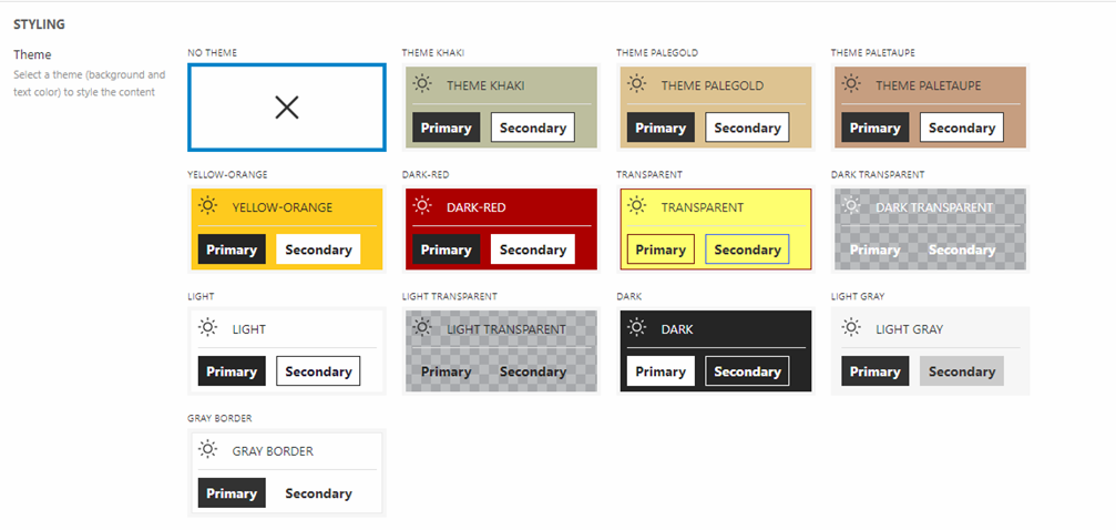
List fields
List fields are used to add lists of options to an item type. An editor can then select something when creating an item, for example a theme (Figure 6.1)
The following field types are available:
|
Field type |
Description |
Notes |
|
Checkbox list |
Renders a list of checkboxes |
Typically used to make editors chose one or more options when creating an item |
|
Dropdown list |
Renders a dropdown list |
Typically used to make editors chose a single option when creating an item. Often used instead of a radio button list if you have many options. |
|
Radio button list |
Renders a radio button list |
Typically used to make editors chose a single option when creating an item |
Parameters
Each of these types come with a set of parameters which are almost identical for all three lists field types (Figure 7.1).
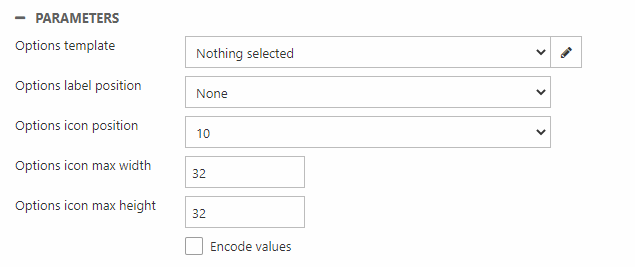
These parameters are used for two things:
- To show options in a non-standard manner – as icons or by using an options template
- To tweak standard behavior
Here are the parameters you can encounter:
|
Parameter |
Used to |
Notes |
|
Options template |
Select a template for styling list options |
|
|
Options label position |
Change position of the label relative to an icon |
|
|
Options icon position |
Set how many icons to show per row (1-10) |
|
|
Options icon max width |
Set icon max width |
px |
|
Options icon max height |
Set icon max height |
px |
|
Encode values |
Encode list values |
Checked by default for compatibility reasons, but we recommend that you do not encode list values, as this makes it difficult to index and search for or facet on them |
|
Allow options sorting |
Allow editors to sort list options when using the item type to create an item |
The sort IDs will be available in frontend, so you can use them to do stuff in templates.
Only Checkbox list |
|
Do not include ‘nothing selected’ option |
Removes the default nothing selected value from the list options. Instead the first list option is preselected. |
Only Dropdown list |
If you’re using the options template to style list options, you can create a ViewModel-based template inheriting a ListEditorViewModel – see example templates or Swift for inspiration.
If you want to show list options as icons you must:
- Specify how many icons to show per row using the options icon position setting
- Set max width and max height
- Add options using the Folder setting
List options
To add options to a list you click the pencil-icon next to the Type field of the item type (Figure 8.1).
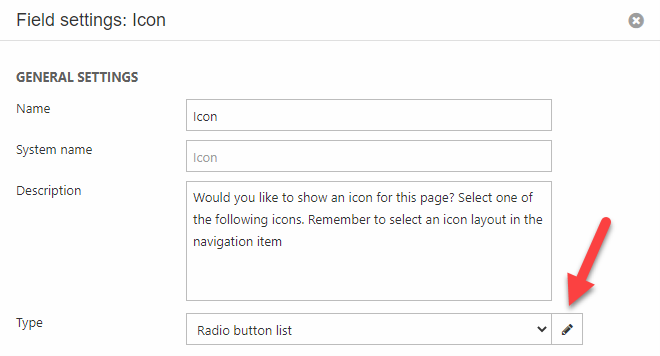
This opens a field options modal where you can manage the options – there are four possible source types:
- Static – you manually add options with a label and a value
- SQL – you use an SQL statement to fetch rows from the database and use row values as label/value (e.g. fetch users and use Name and ID as the label/value)
- Item type – you select an item type, a label/value pair from the item fields, and a place to select items from. Then all items of the type in that location are used to generate an option.
- Folder – you select a folder, the files inside this folder are then used to generate list options. If the files are images of the types .svg .png .jpg or .gif, the images are rendered as icons, with a width, height and in a grid as specified using the field parameters. Otherwise, the file names without the file type will be used as the list options and the full URL to the file as the value.
HTML5 input fields
HTML5 introduced new input types, and most of these are all available for item types. Please be aware that not all browsers support all the input types – if a browser does not support a field type, it will default to type text.
These are the available HTML5 input field types:
- color
- date
- datetime
- datetime local
- month
- number
- password
- range
- tel
- text
- time
- url
- week
Selecting an HTML5 input field comes with extra parameters (Figure 9.1) for controlling the type and styling of the field.
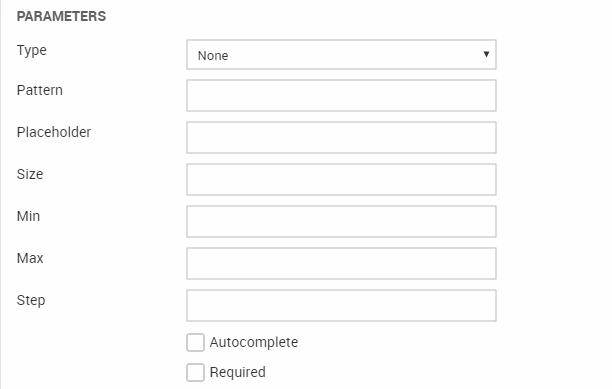
You can:
- Select the type of control from the dropdown menu
- Specify a regular expression pattern to check the input element’s value against – works with input types text, url, tel, email and password
- Specify a short placeholder, describing the expected value of an input field – e.g. 70252090 for a Danish telephone number. Works with input types text, url, tel, email and password
- Specify the size (width in characters) of an input element – use a non-negative integer greater than zero as value
- Specify a minimum and maximum value of an input element. You can use a floating point number as the expected minimum and maximum values. Works with input types number, range, date, datetime, dagtetime-local, month, time and week.
- Specify the legal number intervals (step) for an input element. You can insert a positive floating point number to specify the value granularity. Works with input types number, range, date, datetime, dagtetime-local, month, time and week.
- Activate or deactivate autocomplete on the input field – works with input types text, url, tel, email, password, datepickers, range, and color
- Specify, that the element is a required part of the submission
You can read more about input types and attributes at w3.org.
Other field types
In addition to the field types described above, you have access to the following field types:
|
Field type |
Description |
Parameters & Comments |
|
Renders a control for adding lists of references to other items of a particular type, e.g. ‘Related News’ based on a News-item. |
With the extra parameters you specify the item type selectable, sort by and sort order |
|
|
Renders geo-location coordinates (format: 56.108145, 10.209894) based on values in other fields on the item |
First, create address fields (e.g. Street, ZIP, City, etc.) on the item type where you want to use the geolocation field. Then enter a comma-separated list of the fields you want to use to look up the geolocation in the parameter field on the geolocation field - e.g. street,zip,city. The values entered in the address fields will then be used to look up and render a geolocation. |
|
|
Renders a color selector which lets you select a color, enter a color code or select a preset color |
Preset colors are defined in item field settings using the ‘Presets’ field. |
|
| Color swatch |
Sets a global color scheme for a website - mirrored by all other color swatch fields. Choose between 11 colors - 5 brand colors, 5 neutral colors, and 1 custom (non-global) color. |
Use pencil-icon to generate colors from a base color, an image, or a predefined business palette. Intended use is to extend website settings - used on Rapido. |
|
Checkbox |
Renders a check box |
None |
|
Renders fields from another item type within this item type. |
This field type lets you create little content blocks and reuse them again and again when building item types. Click Enable presets to make it possible to create various pre-configurations of the underlying item fields. See Rapido website settings for examples. |
|
| Item tab | Select another item type - the fields from this item type are rendered in a tab | Allows you to group & organize your website properties - used extensively on Rapido. |
| Google font | Allows you to select a Google Font family and font weight | You must provide a Google Fonts API key under Settings > Control panel > Item settings to use this - read more here |