
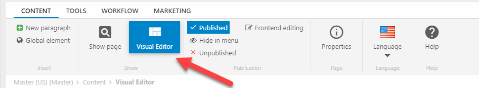
Visual Editor
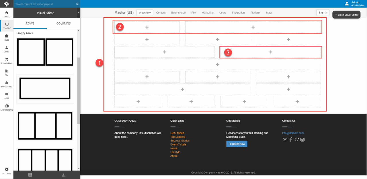
Visual Editor is a tool in Dynamicweb empowering the user to create content in a visual way, by having the page as the workplace (3) and then dragging different building blocks – predefined rows (1) and columns (2) – onto it. In this way, the user can immediately see what the finished page would look like in frontend.
At the bottom of the leftside panel (4) you can Show the page in frontend, Switch to another responsive preview or Select another page.
You should be aware that the Visual Editor is a tool for creating content in a visual manner – it is not a tool for designing the website and changing lots of styles & fine details, this is handled by the design itself.

The Visual Editor function as a special view inside the Dynamicweb administration (backend), available on all pages using a template which has been configured to use the visual editor. In a way you can consider it as an alternative view of the paragraph list we’re all used to working with (Figure 1.2).
Some basic concepts of the visual editor are illustrated in Figure 1.3:
- A grid (1) is the overall design of a page – it consists of a collection of rows which can be added via the visual editor
- A row (2) is a component inside a grid. Rows consist of multiple columns - usually 1-12 – which contain the content
- A column (3) is a subdivision inside a row - each column can have content which comes from an item-based paragraph
Please note that the Visual Editor does not work with the following other Dynamicweb features:
- Drafts & Versioning
Grids & Rows
To use the visual editor, your design must be configured for it – which means:
- You must use the PageViewModel to render content in your master and page templates
- In the page template, use the Grid-method where you want to render content from the grid
A very simple page template could look like this - please note that the master file referenced must also use the page viewmodel or you will see errors in frontend and inside the visual editior:
As you can see in the API documentation, the Grid-method takes 4 parameters. The last parameter – gridTypeId – refers to a folder which must be named after the type and located under Templates/Designs/[YourDesign]/Grid containing:
- Row definitions inside a file called RowDefinitions.json
- Row templates in a /RowTemplates subfolder
The contents of RowDefinitions.json could look like this:
As you can see, a row is defined using the following properties:
- Id – sets a unique identifier
- Name – sets the display name shown when hovering above the row in the visual editor
- Template – sets the template used to control the row layout, must refer to a template in the RowTemplates folder for the grid type
- ColumnCount – sets the number of columns in this row – how exactly they are spaced & shown is controlled using the row template
- Thumbnail (optional) – sets the image shown for the row in the visual editor row list
- ItemType (optional) – sets the item type used to extend this row with additional properties, must refer to an item type enabled for Rows
A simple row template could look like this:
As you can see, you must still use grid-based column definitions befitting the design framework in addition to the ColumnCount parameter.
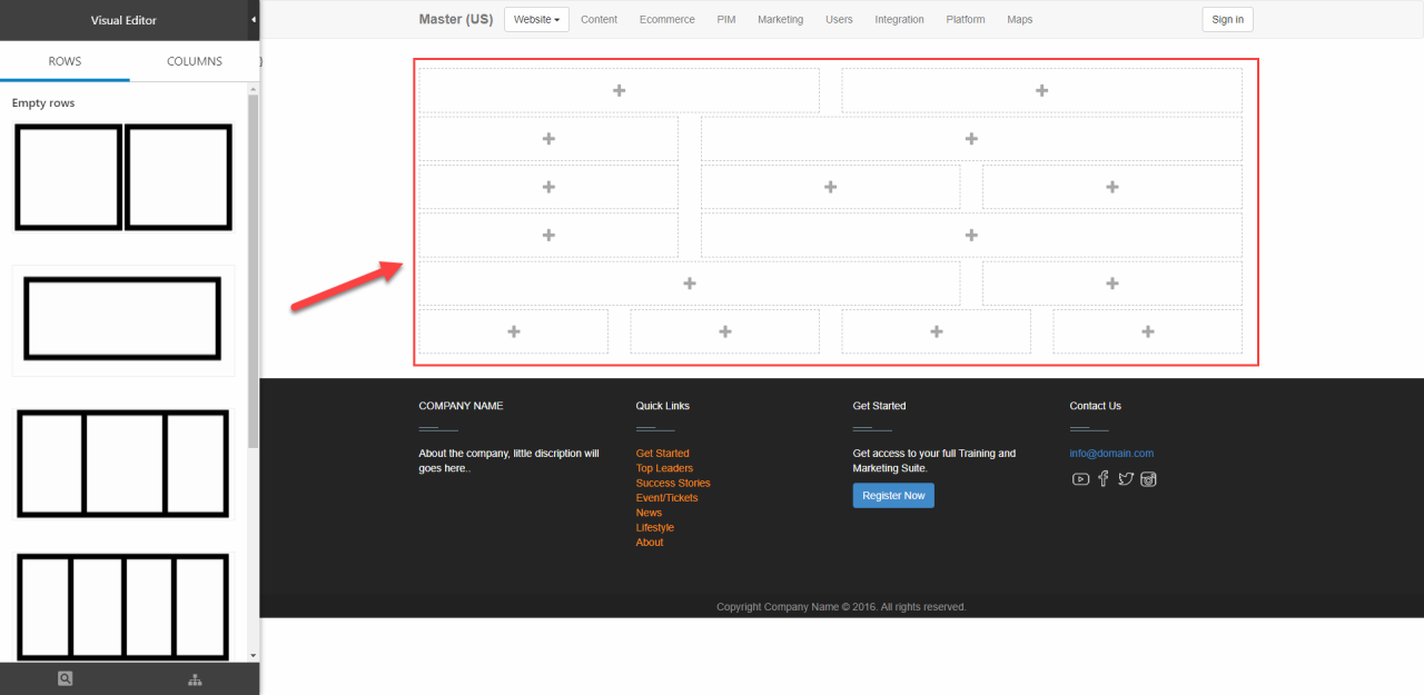
When the rows & row templates are defined you can open the Visual Editor and drag and drop some rows onto a page (Figure 4.1). The rows are empty, of course – so let’s talk content.
Columns
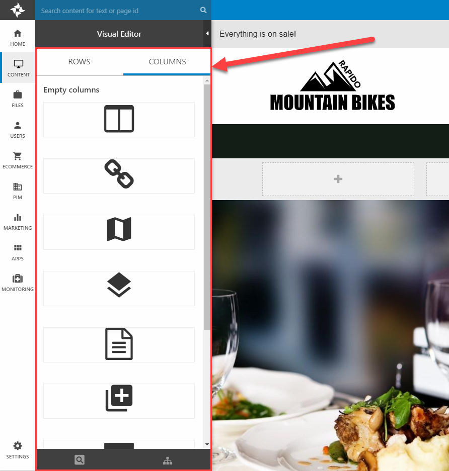
Content is created by dragging and dropping columns onto the grid – basically an item-type enabled for paragraphs. All paragraph item types available in the context where the Visual Editor is used will show up in the Columns panel (Figure 5.1).
As soon as you drop an empty column onto a space in the grid, the item type fields will be shown in an edit column view (Figure 5.2) – then you just use the item type like always.
For Rapido, this use is covered under the Creating content section of the configuration guide – but it is 100% dependent on the content model for a particular design.
Too many paragraph items?
You can limit the number of item types available in the Visual Editor by making the page itself an item type which only accepts some item types as children, see Rapido 3.3+ for inspiration.
Context menu
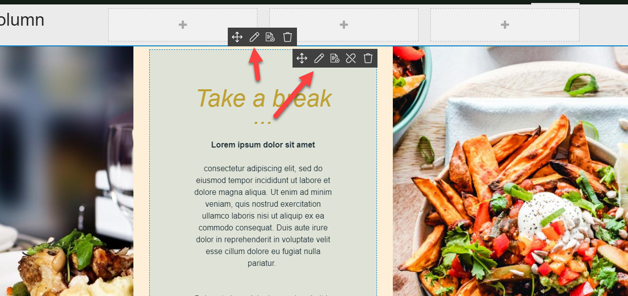
If you hover over an existing column or row, a context menu appears (Figure 6.1).
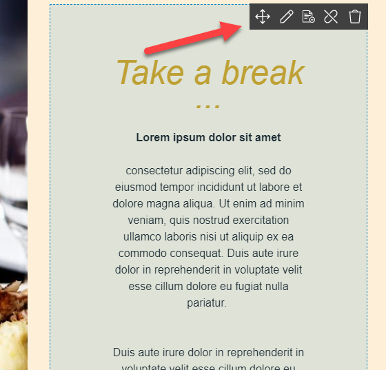
The context menu can be used for the following, from left to right:
- Drag the row/column to another place in the grid
- Edit the row/column content – see below
- Save row/column as template (preset)
- Link paragraph or Unlink paragraph (admin & administrator only, and only available for columns)
- When linking a paragraph, a modal will appear with all your currently unlinked paragraphs. Clicking one will insert it on the row and remove it from the list in the modal.
- Delete the row or underlying paragraph
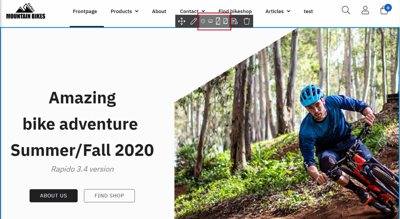
Furthermore for rows, icons for the following things are also shown in the context menu if they are set:
- Publication period
- Hide row for phones / tablets / desktop
Editing content
Both rows and columns are edited by clicking the Edit button in a context menu (Figure 7.1).
For columns, the edit button opens a modal with all the item fields of the underlying item type.
For rows, the edit button opens any fields added to the row definition via an item type – here’s an example from Rapido (Figure 7.2).
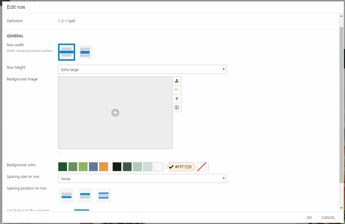
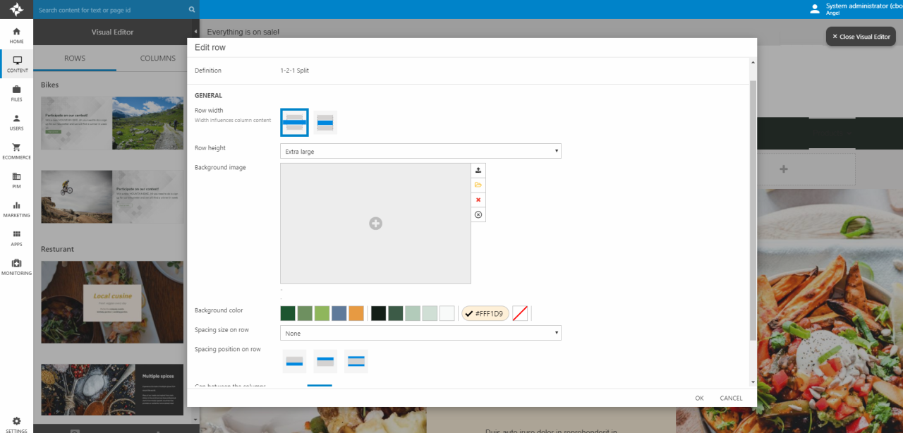
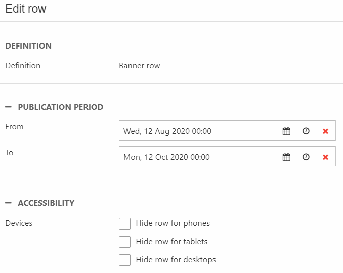
For all rows, you also have these sections (Figure 7.3):
- Definition area at the top with the row template name
- Publication period where a from and to date and time can be set
- Accessibility where the row can be hidden from phones, tablets and/or desktops
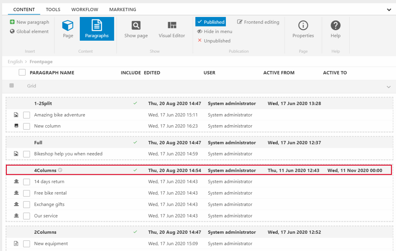
The paragraph list
The paragraph list for content pages looks a bit different and you have some new options. First off, the content is divided into their individual rows and each row is bordered with dashed lines. For each row, you have a greyed-out line at the top with row information displaying:
- The row definition/name
- Icon if publication period is set
- Row is published/unpublished
- Edited date
- User information
- Date where the row is active from and to (can be set using the publication period)
The row marked with red in Figure 8.1 shows all the available information.
Right-clicking a row or its columns will open the context menu (Figure 8.2) which now has some different options. You can:
- Edit row
- Copy row (here)
- Unpublish/Publish row
- Delete row - including the columns
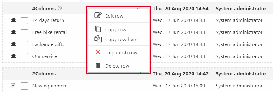
Notice how the context menu only account for rows and not columns. For columns, you can either:
- Edit one by clicking on it in the list
- Delete columns by marking them and clicking Delete in the ribbon bar