
Dropdown list
The Dropdown list item type is another item that is useful in many different scenarios. It renders a dropdown, as the name states, and the user can then pick one of the different options.
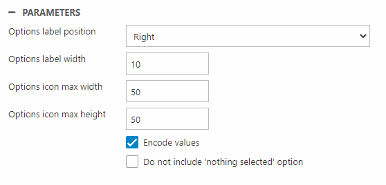
The parameters have the following uses:
| Parameter | Function | Comment |
| Options label position | Change position of the label relative to the icon | |
| Options label width | Change width of the options dropdown | In px |
| Options icon max width | In px | |
| Options icon max height | In px | |
| Encode values | Encode list values | Checked by default for compatibility reasons, but we recommend that you do not encode list values, as this makes it difficult to index and search for or facet on them |
| Do not include 'nothing selected' option | Remove default Nothing selected value in the dropdown and preselect the first list option |
The icon file you wish to use can be added with the source type settings.
NOTE: The parameter settings only apply when using the static source type.