Emails
The email concept allows you to customize several types of emails using the Visual Editor. The email concept is based on linking headers and footers to emails, meaning it will be easier to have a design theme through different emails.
Through this article it will be explained how the concept works and how to manually setup everything properly. We have designed a variety of content columns to be used when creating footers, headers, and emails. These are presented and explained at the bottom of the article along with examples of emails created in Swift.
The Swift email concept
The concept is based on three levels (Figure 2.1). The first level consists of an email folder (1). This will help keep your emails sorted and organized. Due to restrictions, this folder can only contain email related pages. The next level is called an email settings page (2). Email settings pages are organizing pages that will help sort your emails. This means that you can easily organize emails in different kind of newsletters, system emails, etc. The last level is footers, headers, and emails (3).
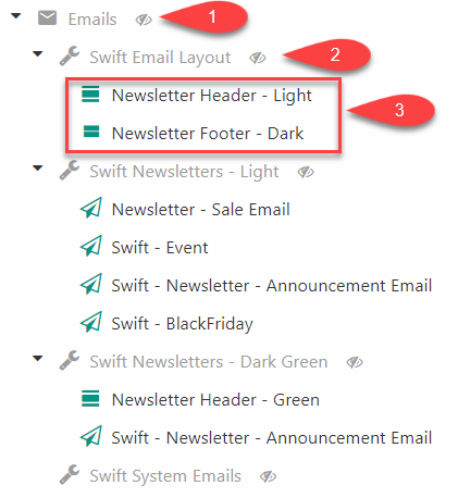
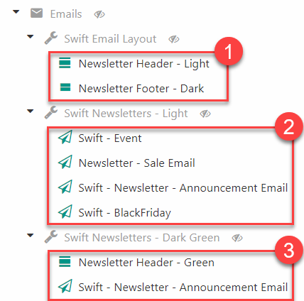
In the example below (Figure 2.2) “Swift Email Layout” (1) is meant to be the default header and footer design. “Swift Newsletters – Light” (2) is linked with the default header and footer. Meaning that emails created here will have the footer and header from “Swift Email Layout”.
In the last email settings page “Swift Newsletters – Dark Green” (3) we have designed a custom green header while the footer from the default footer (1) is linked to the email settings page. Meaning that the emails created here will have the custom green header from “Swift Newsletters – Dark Green” and the default footer from “Swift Email Layout”.
This is just one example of how to use the Swift email concept to ease the process of creating emails for customers. If it still seems a bit confusing, we recommend reading the manual setup guide, as this hopefully will help you understand how the concept works.
Manual setup
The email setup should be ready as default on your Swift solution. If not – or if you would like to see a walkthrough of how things work – you can follow this setup guide.
We will start from the top level by creating an Email folder
- Click the three dots next to your website name in the content tree
- Create a new page and choose the Emails folder
- Name it something like “Emails” and make it hidden in menu
As mentioned above, all email related elements can only be added inside this folder due to the default restrictions. This makes it easier to keep everything organized, as you will know where to look for the email related elements.
Next, we will add an email settings page. All email settings pages need to be linked with email headers and footers. When you create emails as subpages to the Email settings page the emails will automatically have the email headers and footers linked to the email settings page. However, email settings pages can link to headers and footers created in other email setting folders. While this may seem confusing it means that you are able to create an Email settings page containing a default header and footer and then link those to other emails settings folders. This means that you can use the same headers and footers for your newsletter, system emails, etc. even though they are not placed in the same email settings pages. Take a look at our examples at the end of this article to get a more visual explanation.
Next, we will create the Email default layout page.
- Create new page in the Emails folder
- Choose an Email settings page as the new page and name it “Swift Email Layout” and make it hidden in menu
Now, you will have to create a header and footer to link to the email settings page. We will start with the header:
- Create a subpage to the “Swift Email Layout” page
- Choose an email header as the subpage
- Name it “Newsletter header - light” and make it public
- Enter the properties of the email header and go to “layout” in the top menu bar.
- In the empty dropdown menu choose the “Swift: Swift Email” template
- Hit Save and close
Now do the same steps to create a footer:
- Create a subpage in the “Swift Email Layout” page
- Choose an email footer as the subpage
- Name it “Newsletter Footer - Dark” and make it public
- Enter the properties of the email footer and go to “layout” in the top menu bar
- In the empty dropdown menu choose the “Swift: Swift_Email” template
- Hit Save and close
The next step will be to link the email settings page with the new email header and footer. This is important to do before trying to design your header and footer. Otherwise it will result in an error.
- Click on the Emails settings page in the content tree.
- Scroll down to the Components section
- Link the Default header to the header field
- Link the Default footer to the footer field
- Hit Save and close
When you have linked your header and footer to the emails settings page you can start designing the pages.
As mentioned, this email settings folder will work as the default layout folder, meaning that other email settings folders can link to the default header and footer contained inside to keep the design aligned through different emails.
We recommend that if you want to create newsletters, you simply create a new email settings page called “Swift Newsletter - Light” which is then linked to your default header and footer. You can then place all your newsletter emails in this email settings page as shown in the example in Figure 2.2
Should you want to create something more campaign specific like an all-black email layout for e.g., Black Friday or yellow/green for easter you can create a new email settings page containing the custom header and footer. You then create the related email(s) in this email settings page so they will have the right header and footer.
Look at our examples at the end of this article to get a more visual explanation.
Email content columns
The columns used in the Swift emails are specifically designed for emails. They will be presented below.
Article
The article column can be used in different ways, as you can link it to both pages, product groups and products. It can then both be a teaser about a full article the customer can read on the website or a short article about a product or something third.
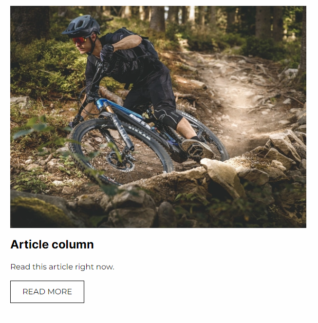
The article column comes with the configuration options shown on Figure 5.2:
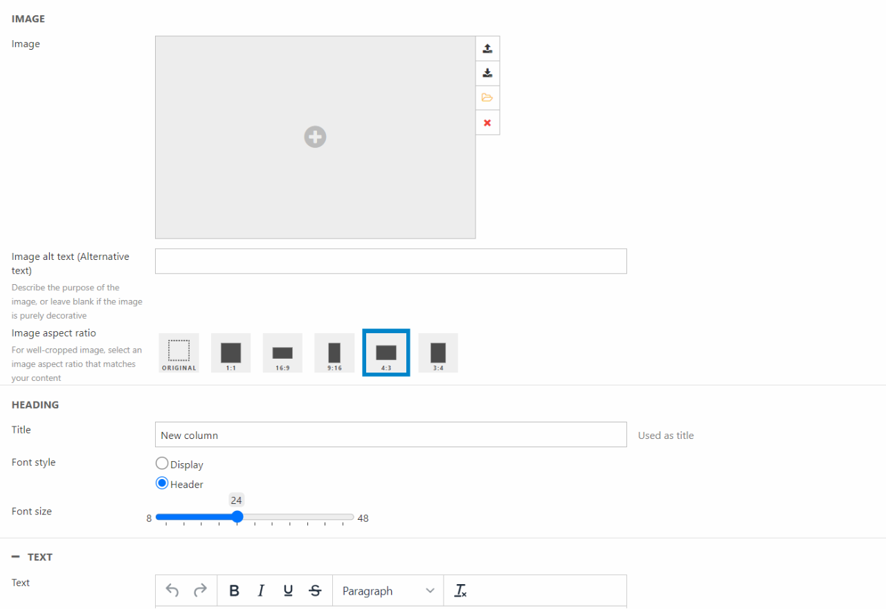
Using these options, you can:
- Choose an image for the article and set an Image alt text
- Select the Image aspect ratio
- Write a title and choose the style and size of the font
- Add the text of the article
- Write a link label and choose where to link I to
For styling options, you can:
- Set the padding for the column
- Choose the alignment
- Choose the line height of the text
- Select the theme for the column
- Set borders and border thickness
Button
Buttons has the purpose of linking the email with either pages, product groups or products.
The button column can be configured for pages, products or system commands:
The button column editor lets you:
- Write a link label
- Choose the link type and where the button should link to. Depending on what you choose here, new section will appear
- Page - A field for at page link will appear
- Product group - A box for product group selection will appear
- Product - A box for product selection will appear
- System command - A dropdown for system commands will appear. This could be used for verifying an account or resetting a password
For styling options, you can:
- Set the padding for the column
- Choose the alignment of the button
- Select the theme
- Set borders and the border thickness
Heading
The heading is a simple column, which lets you design a heading.

The heading column comes with the following configuration options:
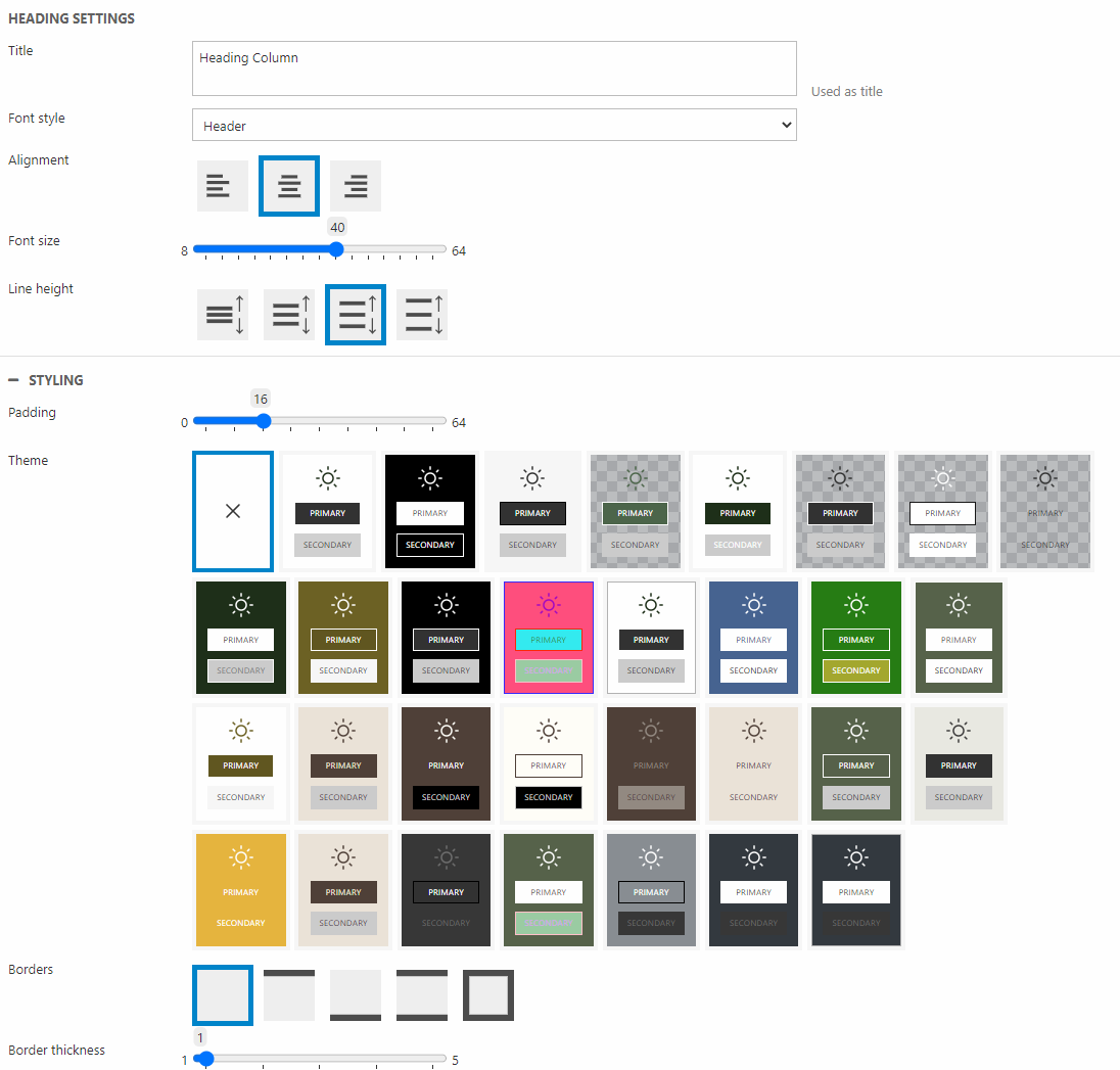
In the column settings you can:
- Write a title
- Set the font style, alignment, and size
- Select a line height for the heading
For styling options, you can:
- Choose a padding for the column
- Select a theme
- Choose borders and the thickness of these
Icon
With the icon column you can display different icons, which can work as only images or as links to internal or external pages. The icon supports different filetypes, however some mail services support more filetypes than others. If you want a full list of which services support what files, you can search the file types at www.caniemail.com.

The icon column has two kinds of settings pages, the general setting page, and the setting page of each icon item.
The general icon column settings are:
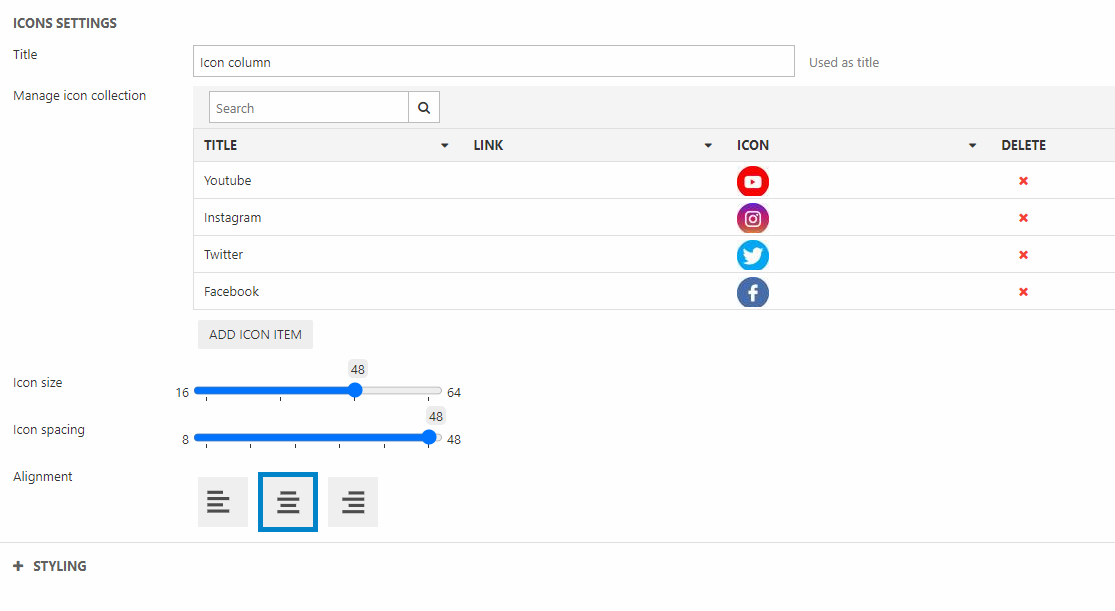
On the column settings page you can:
- Write a title of the column
- Manage the icon collection (create or delete icon items)
- Choose the icon size, spacing and alignment
For styling options, you can:
- Set the padding of the column
- Choose a theme for the column
- Choose borders and the border thickness
As mentioned, this column also has a settings page for each individual icon item:
On the icon type settings, you can:
- Choose the icon – as mentioned not all file types are supported by all email services, find out which supports which here
- Write a title for the icon – the title will not be visible in front end, but is for you to easier locate it in the icon collection on the general settings page
- Choose if and where the icon will link to – if it is external write the URL, if it is internal use the blue icon on the right
Image
The image column is used to display an image. It can also be linked to a page, product group or a specific product.

The image column comes with the following configuration options:
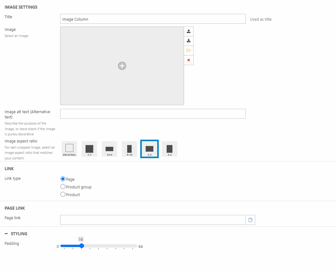
Here, you can:
- Write a title for the column
- Choose an image
- Write Image alt text
- Choose the Image aspect ratio
- Choose a link type and where to link to
For styling options, you can:
- Set the padding for the column
Menu
The menu column is like the page content column navigation. The column is a collection of links that can be placed either vertically or horizontally.
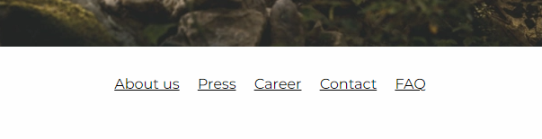
When using the menu column, you have the following settings:
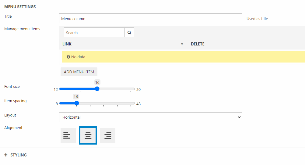
In the settings you can:
- Write a title for the column
- Manage the menu items (create or delete menu items)
- Choose the font size
- Set the item spacing
- Choose if the layout should be horizontal or vertical
- Set the alignment of the menu items
For styling options, you can:
- Set the padding of the column
- Choose the theme for the column
- Choose borders and the border thickness
Product catalog
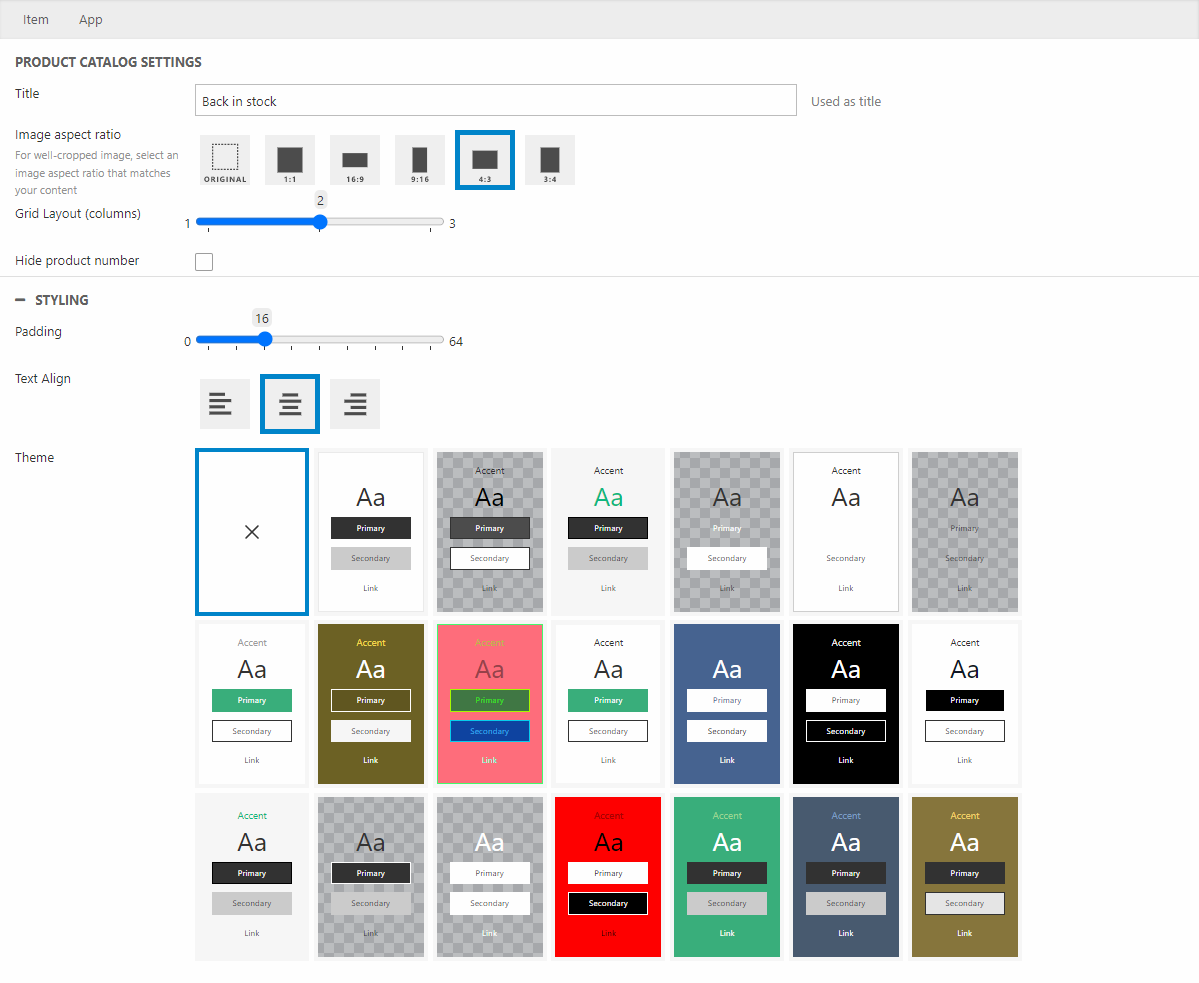
The product catalog column lets you display specific products to the customer in the email. The products are linked, meaning that the customer will be brought to the product details page by clicking it. That way you can combine the message of the email with a product.
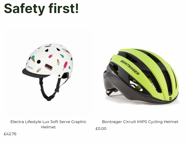
The product catalog column has the following configuration options:
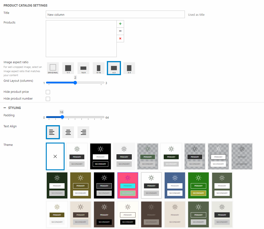
You can:
- Write a title for the column – this will not be displayed
- Choose which product(s) should be displayed on the column
- Set the Image aspect ratio
- Select the grid layout – choose if it should be 1, 2 or 3 columns of products
- Choose to show/hide the product price and/or the product number
For styling options, you have the following options:
- Set the padding for the column
Spacer
A spacer is a simple column made to help create the right design for your emails. Sometimes you want a certain distance between content columns in your emails – the spacer is the solution for that.
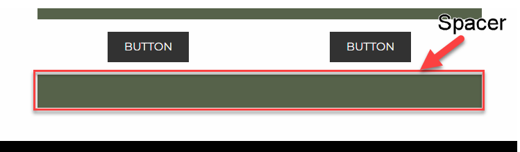
The spacer column does not have any configuration options other than one:
You can:
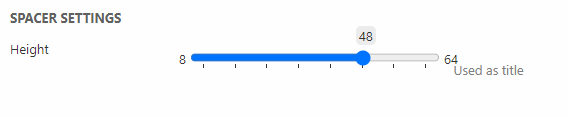
- Set the height of the spacer
You do not have any styling options for the spacer. If you want the spacer to have a color, like the one in the example above, you will have to change the theme on the row.
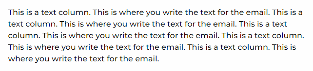
Text
The text column is the where the actual message of the email is written.
The text column has some configuration:
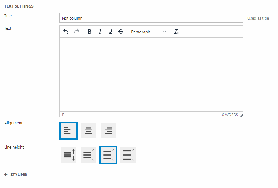
In the text column settings you can:
- Write a title for the column – this will not be displayed
- Write the text for the column
- Set the alignment
- Choose the line height
For styling options, you can:
- Choose the padding for the column
- Select a theme for the column
- Select borders and border thickness
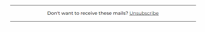
Unsubscribe link
This column should often be used at the bottom of the emails. It is a link for the receiver to unsubscribe the emails.
In the settings you have a few options:
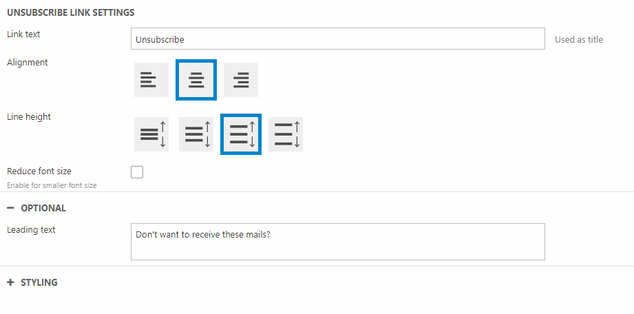
You can:
- Write a link text
- Choose the alignment
- Set a line height
- Choose to reduce the font size or not
- Write a leading text – this will be displayed before the unsubscribe link
For styling options, you can:
- Choose the padding for the column
- Select a theme for the column
- Choose borders and border thickness
View in Browser
The view in browser column is, as the name suggest, giving the readers an opportunity to open the email in a browser instead.

The column has the following configuration
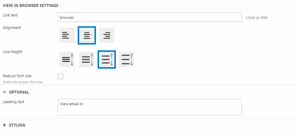
In the settings you can:
- Write a link text
- Choose the alignment
- Set a line height
- Choose to reduce the font size or not
- Write a leading text – this will be displayed before the unsubscribe link
For styling options, you can:
- Choose the padding for the column
- Select a theme for the column
- Choose borders and border thickness
System Emails
System emails are built using our already existing columns for email. This way building system emails for welcoming new users, order confirmation, or receipts will be just as easy as building regular emails. Meaning you can build system emails visually and easily implement your own custom email elements.
The main different feature in system emails is the use of template tags. This helps generalize the emails. Below will follow an example of the setup of an system emails, how it can be used and a table of some of the different template tags.
How to use system emails
System emails are mainly used instead of existing templates. If we keep the verification email example above, this should be linked in the in the Extranet.
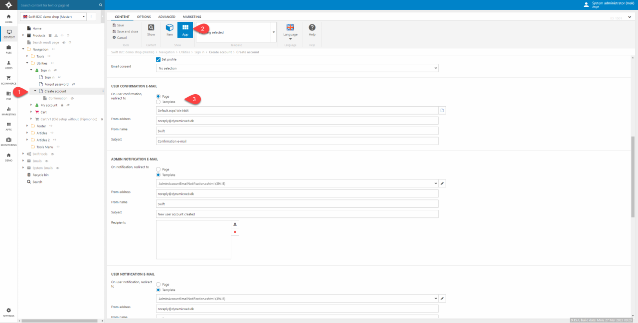
- Locate the create account page. In the default Swift solution this is found at:
Navigation/Utilities/Sign in/Create account. On this page click the Extranet app. - Enter the app settings of the Extranet app on this page
- In the User Confirmation E-mail section toggle “Page” as the redirection on user notification.
This lets you choose the designated email.
This is pretty much the process for all other system emails. For user creation scenarios this includes Admin Notification Emails and User Notification Emails.
Columns for system emails
Beneath we've listed the columns typically used for system emails. You can still use the "normal" email columns to style system emails, but the columns listed here are used to create unique emails as they e.g. can use our template tags.
It is a pretty short list, as we've mainly added features to already existing columns. As of now, the only "system email only" is the Back in stock notification column. Other columns that contains system email features are:
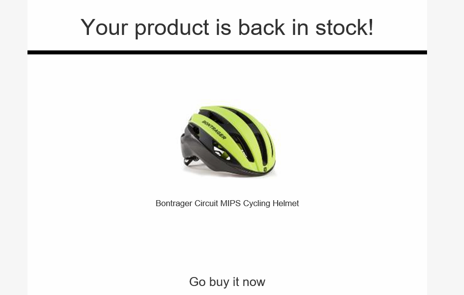
Back In Stock Notification
The Back In Stock Notification email column is used when a user has subscribed for a notification when a product is back in stock. Meaning this email column is tightly coupled with the product component column.
In the settings you can:
You can:
- Give the column a title
- Set the image aspect ratio
- Choose the grid layout
- Show/Hide the product number
In the styling section you can:
- Set the padding for the column
- Choose the text alignment
- Choose the theme
This column do need some app configuration as well. To do this enter the app part of the settings.
- Choose the Product Catalog (eCom) app in the ECOMMERCE section
- Choose to show "Products (context)"
- In the Templates section:
- In the List dropdown choose "ProductList.cshtml"
- In all other dropdowns choose "Nothing selected"
Now the app setup is done. For the notification system to work properly you have to configure the marketing part. We've documented that here.
Template Tags
Template tags are the main feature for making the system emails as generic as possible. As the tags are often used in a simple text column we use curly brackets to differentiate. To call a template tag, this could be the username, you type:
{{UserManagement:User.Name}}
Below will follow a table with some of the template tags to show how to use them:
| Output | Template tag |
|---|---|
| Username | {{UserManagement:User.Name}} |
| User email | {{UserManagement:User.Email}} |
| Password recovery link | {{DWPasswordRecoveryUrl}} |
| Shipping method of an order | {{Ecom:Order.ShippingMethod}} |
If you want to know more about template tags you can read our documentation here.
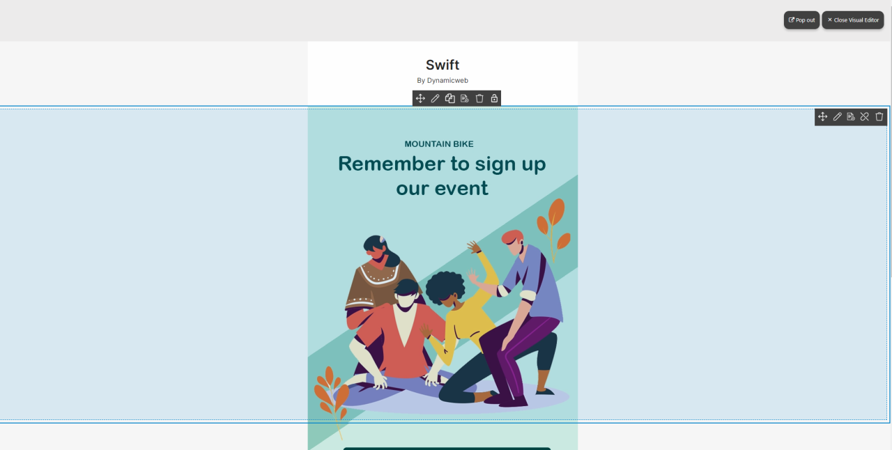
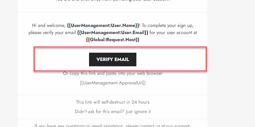
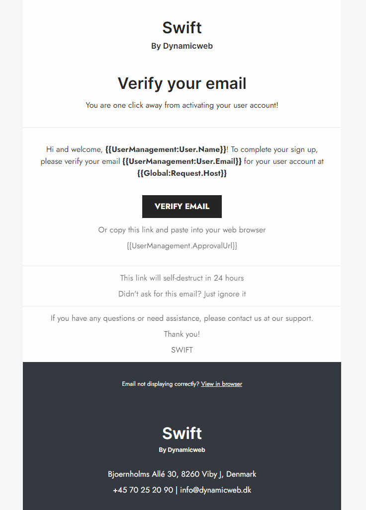
Email verification example
This example will be based on the verification email sent to newly created users, which is shown just above. All the columns used have been documented in the content column section.
In the same way as all other emails, this email uses a predesigned header and footer, meaning the only thing to design is the actual content of the email.
Instead of walking through every row and column used in this verification email we will highlight the features important for system emails. Generally speaking, as this is a system email, we’ve kept it rather simple and used only text-based columns.
Text column
One of the obvious things to show is the template tags in the actual message part of the email. This isn’t some fancy new column but just a text column using the template tags((1) on Figure 23.1). Template tags will be explained below – alongside a table containing some of the different template tags. For this walkthrough we will highlight that it is just an ordinary text column used. Same goes for the link containing text column below the button (2).
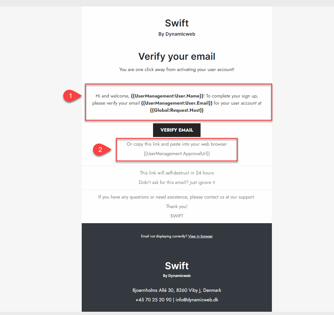
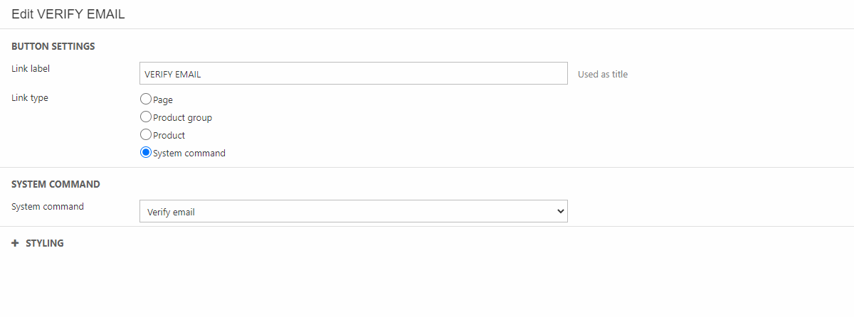
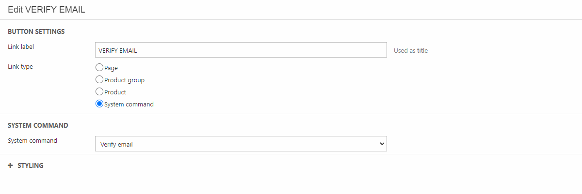
Button
Another neat feature for system emails is buttons. In this example it is used for verifying an email. This button uses the “System command” Link type. In the System command dropdown “Verify email” is chosen (Figure 24.1). Again, this is just using an ordinary column and not some “Special-System-Email-Button-Column”.