Content Columns
Content Columns define the type of content on your page. The types of columns available depends on what content you are about to create. Some are available when you create your header, others when you create your footer and landing page. The following column types are available:
- Accordion
- App
- Article list
- Blockquote
- Carousel
- Employee
- Feature
- Image
- Location map
- Poster
- Product groups slider
- Product slider/Grid view
- Search field
- Section header
- Simple map
- Slider
- Text
- Text Advanced
- Text and Image
- Vertical Navigation
- Video Player
- Video Poster
You can read more about each column type below.
Accordion (FAQ)
Accordion is often used when making a FAQ site. This allows you to structure a big piece of text by dividing it into pieces with suiting headers. This will make it less confusing for the reader.
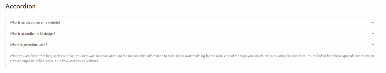
The accordion column comes with the configuration options shown on (Figure 2.2).
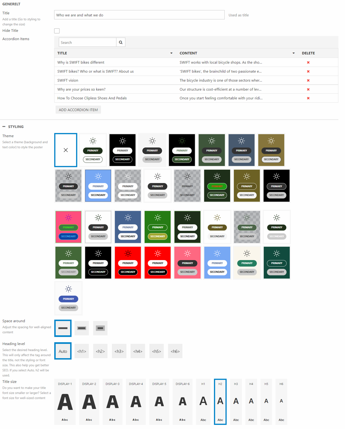
Using these options, you can:
- Change the title of the accordion
- Decide whether to hide the title or not
- Add, edit or delete accordion items
For styling options, you can:
- Chose the theme of your accordion
- Set the space around the accordion
- Choose the heading level of the tag around the title. This will help on your SEO. You can read more about this in our SEO documentation.
- Change the title size.
App
The App column is used to create a column with an app attached:
- A product catalog app is used to publish product data to frontend
- A forum app is used to add a discussion forum to a website
- A query publisher app is used to publish query results
This column type is used to create the product list and product details pages in the examples shops (Figure 3.1).
In general the app column is used during the design phase to add more advanced features to a website. It is not typically used for day-to-day operations.
When added, this column features two tabs (Figure 3.2).
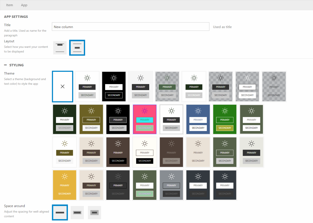
On the first tab you can:
- Write a title
- Choose a theme
- Add space around the column
On the second tab you can:
- Select an app
Article list
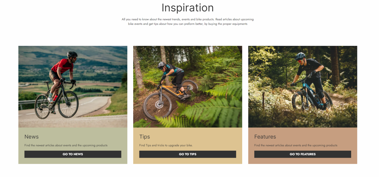
The article list column is used to display a list of written articles on your site. It can display either articles or article list pages. On Figure 4.1 it’s used to display three different article list pages, that will lead the reader to articles from those three categories. For examples on the different use of this column, check this example guide.
The article list column can be designed in various ways.
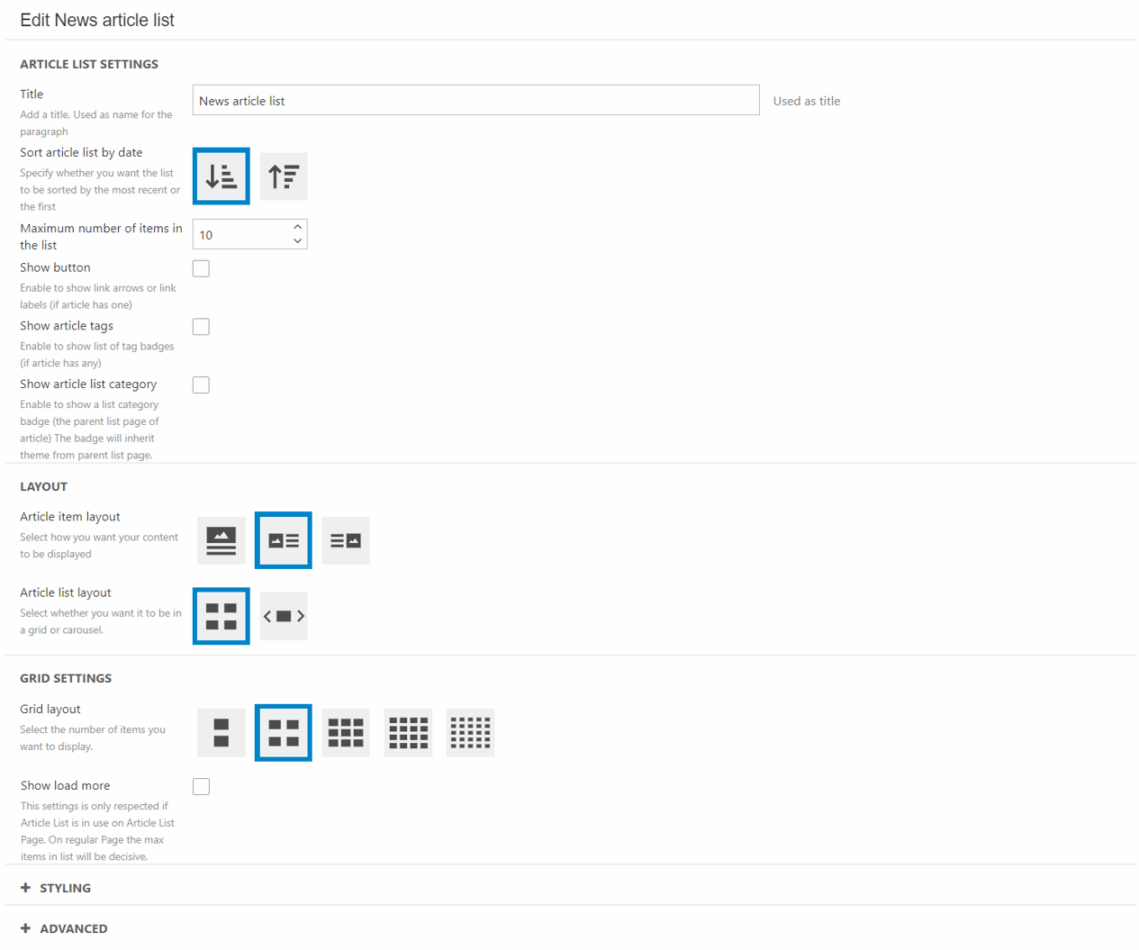
In the column settings you can:
- Give the column a title
- Choose how the article will be sorted
- Set the maximum number of items in the list
- Show/Hide the button
- Choose the layout for each item in the list
- Select the layout for the list.
- Depending on the choice on the layout of the list (grid or slider) a specific settings section will show. In this case the Grid settings.
- Grid settings:
- Choose the grid layout
- Show/hide load more
- Slider settings - Choosing this setting will also open a section called "Advanced slider settings"
- Choose number of visible items in the slider
- Reveal/Hide slides before and after
- Gap/No gap between slider items
- Choose the arrow style and placement
- Select the indicator style
- Grid settings:
The layout on mobile devices will align with the design choices made for the desktop users. Meaning if you choose a grid layout for desktop, it will show as grid on mobiles as well.
You can also set the image aspect ratio in the section of the same name.
In styling, you can:
- Choose the item shape
- Set the title size for the items
- Choose a theme for the column
- Choose a theme for the items only
It’s also possible to change the theme individually on each item in the list as shown in the example above. This is done in the styling section on the page content of each specific article/article list page.
The most important thing to change in the column settings are in the advanced section. Here you’ll need to set a list source. This can either be the folder your article list pages are placed in or the article list page your articles are placed in.
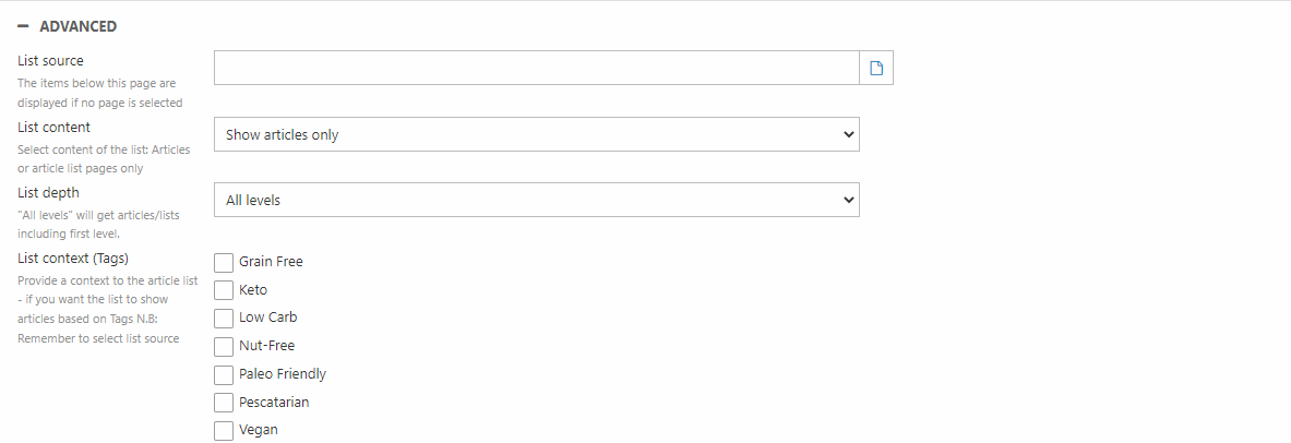
In the advanced section you can:
- Choose the content of the list - Show articles or other lists
- Set the depth of the list - should it show all levels or just the first level
- Select the context of the list - This uses tags to choose what articles to show
Related articles
The article list column can be used to display related articles. As an example let's say the article is a recipe on a dish containing eggs. The reader might like to read other recipes using eggs.
Using the same structure as the default Swift solution all recipes are placed in a parent article list page called "recipes" with subpages below dividing the recipes into breakfast, lunch, dinner, and so on.
In this case you choose "Recipes" as the List source. As we want the article list to contain related articles based on the tag "Egg" across the categories, we make sure to set the List depth to "All levels".
In the List context section, you choose the "Egg" tag. This way, the article list will contain all other articles in the recipe folder with the tag "Egg". Using this List context will also filter out the article the list is placed on as it is not related to itself.
Blockquote
The block quote column is a way to highlight and style a quote. It is especially helpful when working with our articles, as it makes it easier to highlight words from the article in a stylish way.
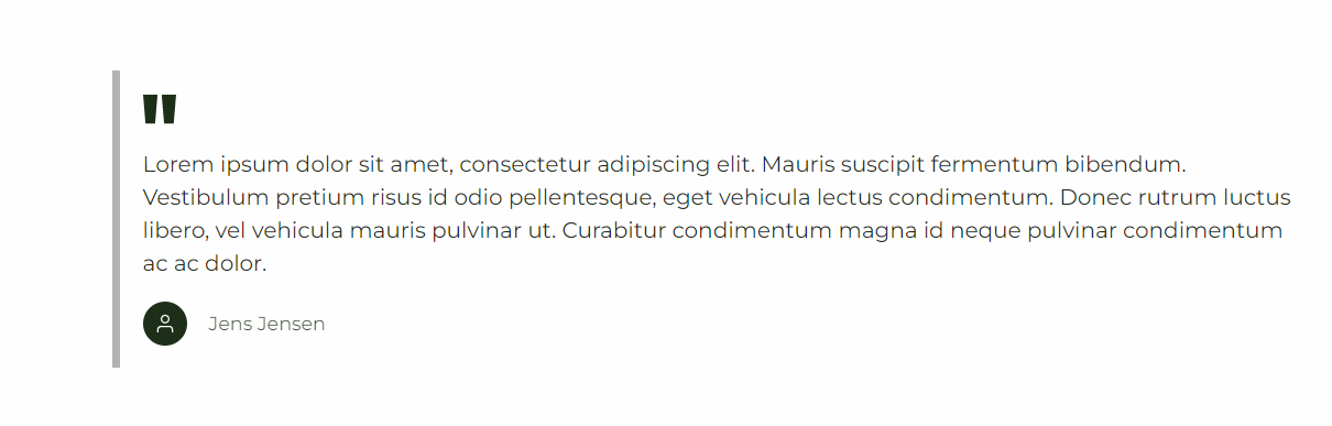
The blockquote column comes with the following configuration options:
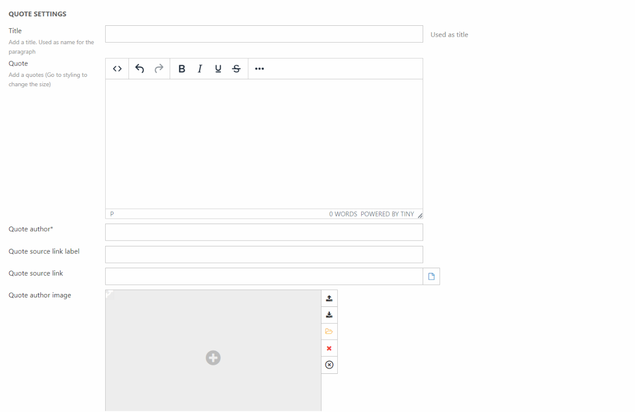
The column editor lets you:
- Give the column a title
- Write the quote to highlight (this field is a required field)
- Name the quote author (this field is a required field)
- Write a quote source link label
- Write/select a quote source link. This can be either an internal or external link
- Choose a quote author image to be displayed alongside the quote
- Select the layout of the theme
For styling you have the following options:
- Select a theme for the quote column
- Set the space around the content
- Choose the font size of the quote
Breadcrumb navigation
The breadcrumb navigation can be used to let customers keep track of their location on the website.
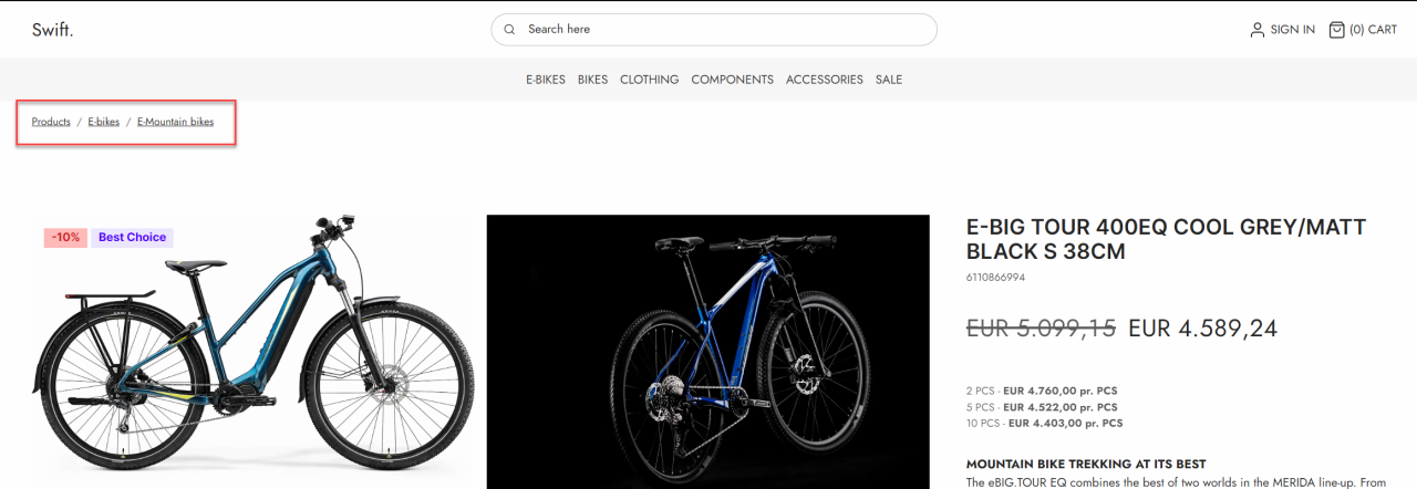
The breadcrumb navigation column does not have many options for the configuration.
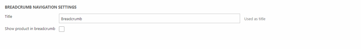
In the breadcrumb navigation column you can:
- Give the column a title
- Show/hide the product in the breadcrumb navigation - If toggled on a details page, the product will show in the navigation path. It will not be clickable
The breadcrumb navigation column can be used on content pages, product list pages, and product details pages
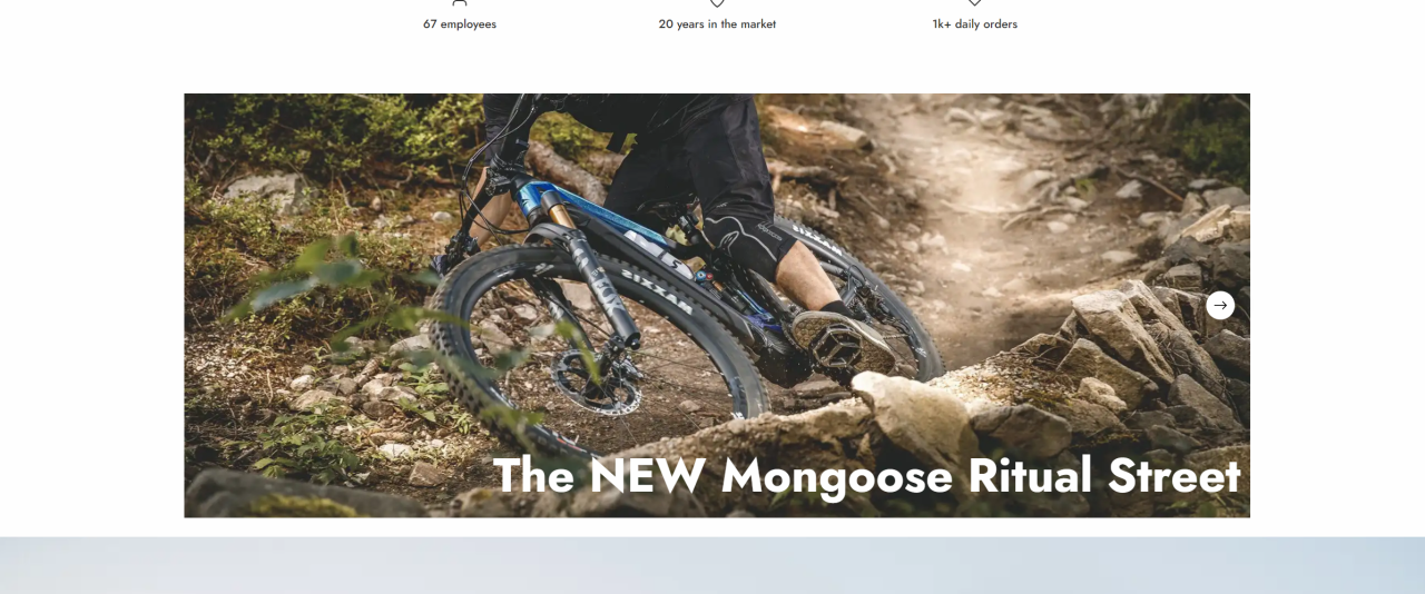
Carousel
The carousel column can be used as a tool to display new items or campaigns (Figure 9.1). It allows you to display various items without needing the ekstra space on the page.
The carousel column lets you customize both the general settings of the carousel and options for each carousel items. In the general settings (Figure 9.2) the following options are possible:
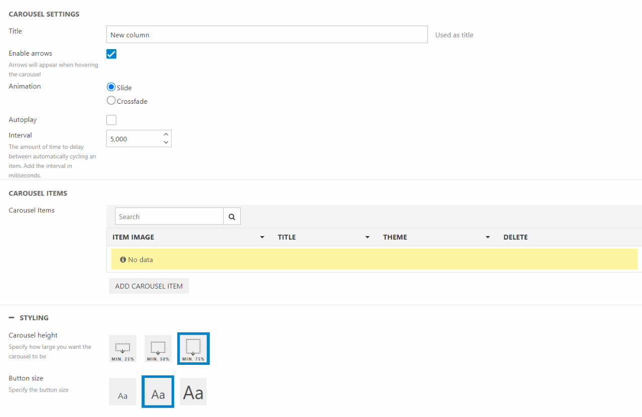
In the options you can:
- Give the column a title
- Customize how the items are displayed. This includes arrows, animation, autoplay and interval
- Add, edit or remove the items of the carousel.
The editor also lets you style the column. This can be done by chosen different image sizes, button sizes and more.
The options for each individual column item (Figure 9.3) are the following:
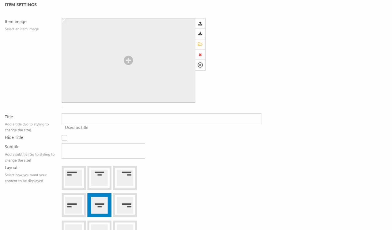
- Select the image for the item
- Choose a title and subtitle, these can be hidden should you want that
- If you want a title and subtitle displayed, you can choose where you want it displayed on the image
- If you want a button, choose what text you want displayed on the button and where you want it to link the customer to
Additionally, you can also set the theme of the item and choose what kind of styling the button should follow. You can also toggle image filter and text readability on/off.
Employee
The employee column is an easy way to display employees along side their details, such as email, phone number, social media profiles and much more. All the information displayed on the column is added in the editor of the column.
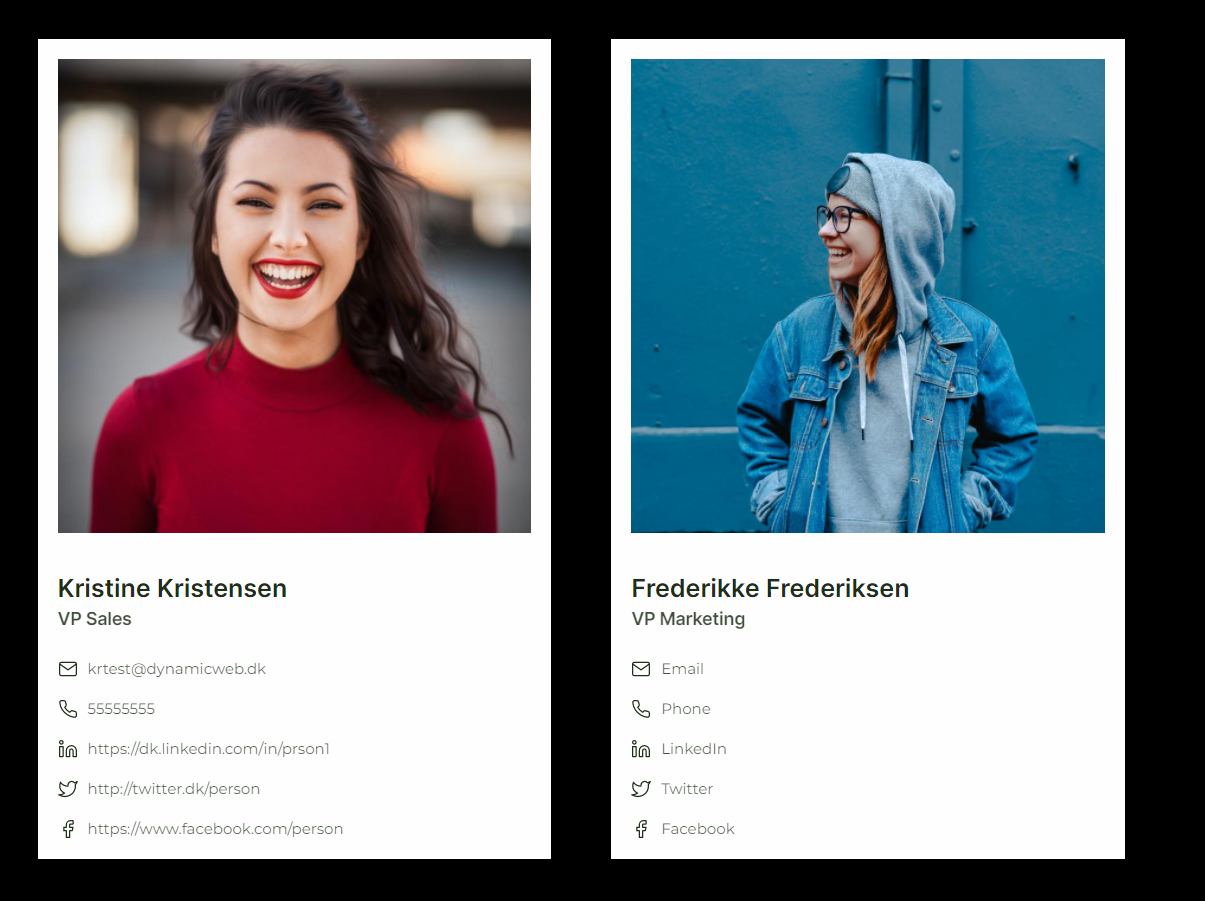
The employee column comes with the following configuration options:
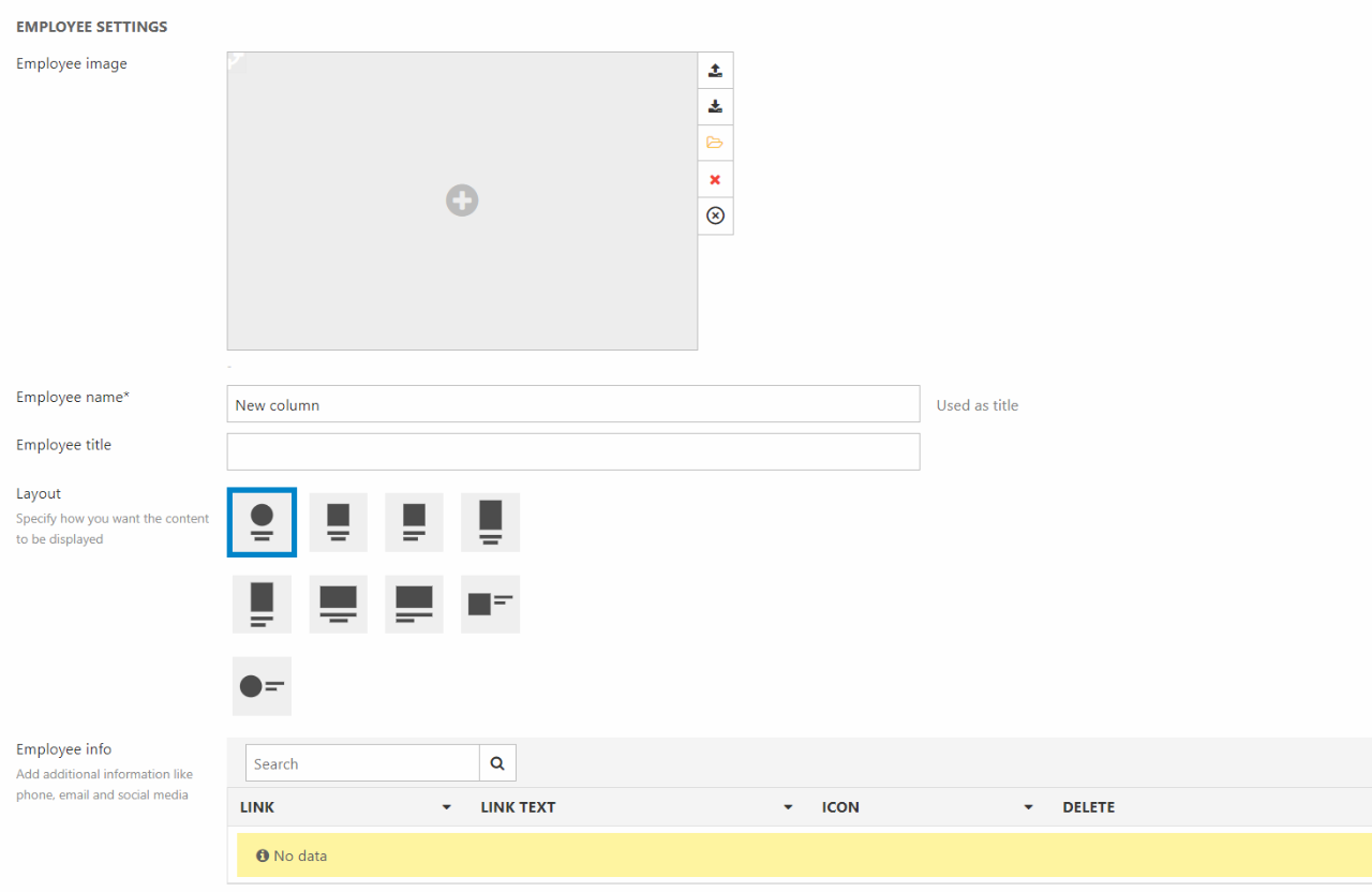
As general configuration you can:
- Choose an employee image
- Write the name and title of the employee
- Choose the layout
- Choose the alignment for the employee info
You are also able to add info about the employee such as phone number, email, etc. When you add new information, you can:
- Choose a link for the listed info. This can be either internal and external links as well as emails and phones. If a phone number should work as link, you need to use the prefix "tel:".
- Write the displayed text for the link
- Select and icon for the listed info
You can sort the order of the information by drag and drop.
For styling options you have a couple of options:
- Choose a theme for the column
- Set the space around the content
- Choose the heading level of the tag around the title. This will help on your SEO. You can read more about this in our SEO documentation
For styling you can choose a theme for the column as well as the space around the content.
Feature
A feature is a type of content featuring (heh) an icon or an image alongside some text. Features are often arranged in columns like in Figure 12.1 but there are many variations over the same theme goin on.
The feature column comes with the following configuration options (Figure 12.2)
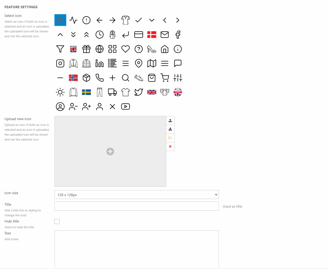
When configurating the Feature column you can:
- Select an icon or upload an image
- Specify an alt-text for accessibility and SEO purposes
- Choose the size of the icon
- Provide a title and a text
- Add a link
- Select a layout
This column type also comes with a number of styling options:
- Select a theme
- Set space around
- Choose the heading level of the tag around the title. This will help on your SEO. You can read more about this in our SEO documentation
- Set the title size
For the icon, title, and text you can choose:
- Color. Choosing foreground will select a color based on the chosen theme. Accent will create an accent color based on the theme
- Opacity - Choose between 100%, 85%, and 75% opacity
Image
The Image column is built for adding an image to a row (Figure 13.1), here combined with a Poster column left.
The Image column comes with the configuration options in Figure 13.2.
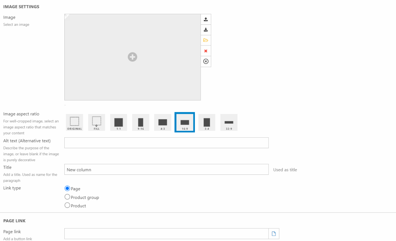
When configurating the Image column you can:
- Select/upload an image
- Set a focal point on the image
- Set the image aspect ratio
- Specify an alt-text for accessibility and SEO purposes
- Write a title (for the paragraph, not shown in frontend)
- Choose the link type and destination
The location map column can be used to show the location of various things. Most often it’s used to show the location of shops, warehouses, or dealers.
Using the location map column, you’re able to display some information about the selected user group. You can display:
- Name
- Address
- State/Region
- Phone number
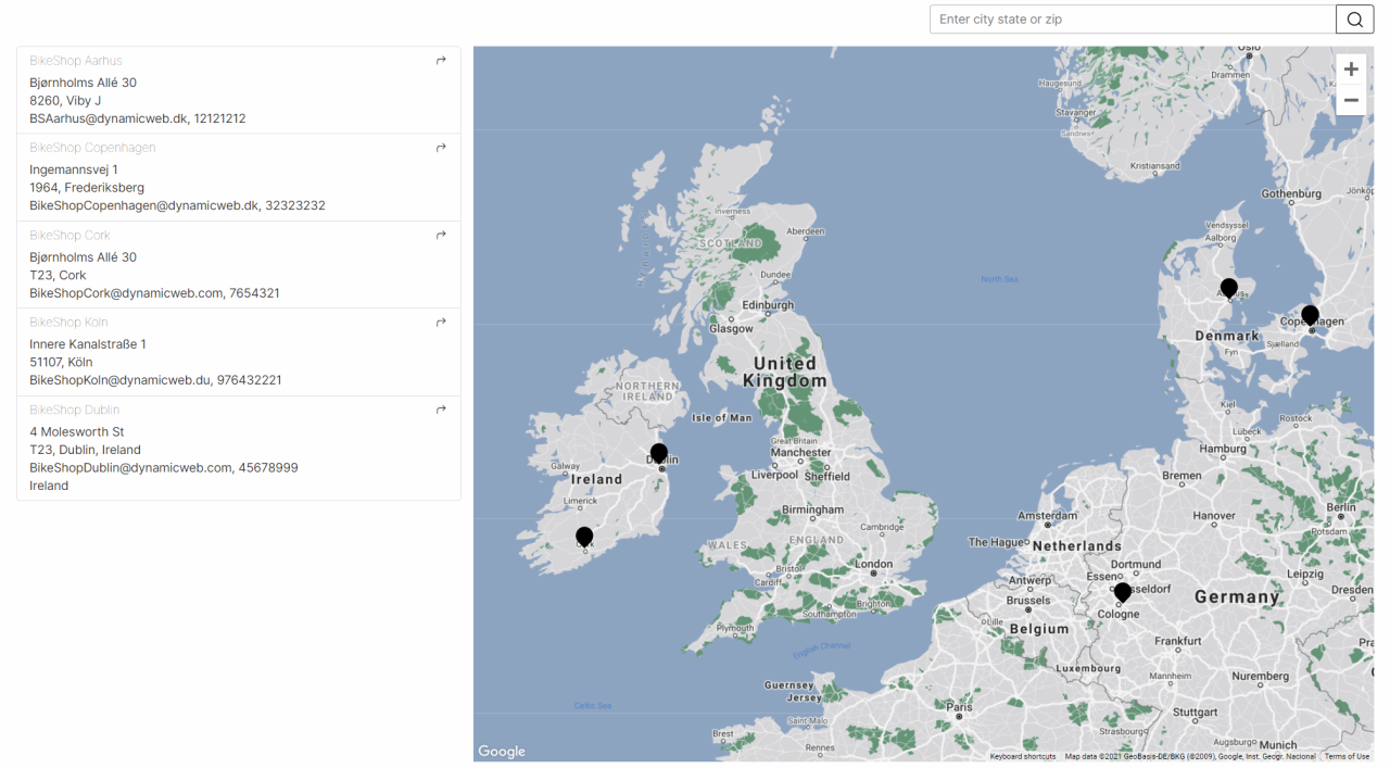
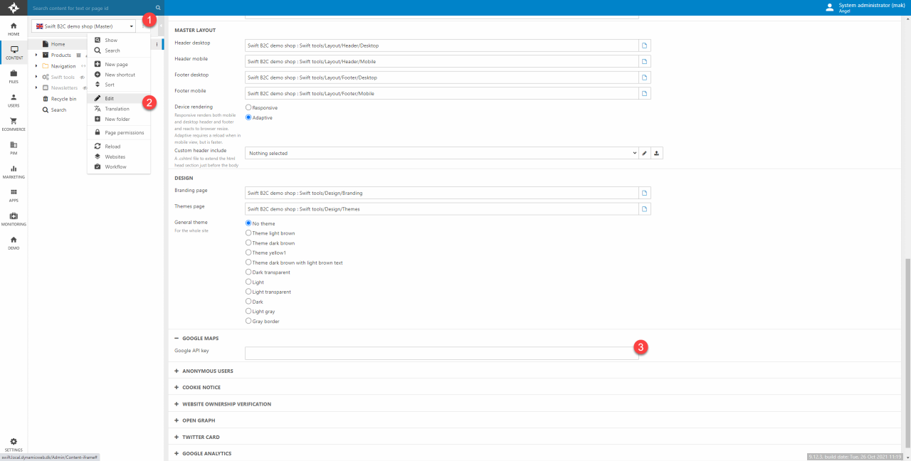
The location map column is built using Google Maps, which is why you must add a Google API key to your website settings (Figure 15.2). To do this, you’ll need to:
- Click the three vertical dots next to your webpage name.
- Click Edit in the dropdown menu.
- Scroll down and locate the Google Maps section. Add your Google API key to the empty box.
- Remember to hit save before leaving the page.
The following configurations are possible in the location map column (Figure 15.3):
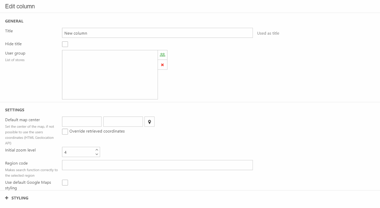
You can:
- Add a title
- Choose which users to be displayed on the map
-
In the settings section you can:
- Choose the default map center
- Set the initial zoom level
- Choose the region code
- Choose the style of the map
In styling, you can:
- Choose the heading level of the tag around the title. This will help on your SEO. You can read more about this in our SEO documentation
- Select a theme for the column.
-
The most important thing to change in the settings is the default map center. If the “Override retrieved coordinates” box isn’t checked, then the map won’t work. Clicking the pin icon will open a map that will help you set the correct default map center.
Navigation
The Navigation column is a column type available in footers & headers - as the name implies, it is used to create navigations (Figure 17.1).
This column is often used when designing headers and footers, that why the documentation is placed there.

Poster
The Poster column is used to create posters, which is a content type normally consisting of an image with text on it, and a button that links to either an internal or external page (Figure 18.1).

The Poster column comes with the following configuration options (Figure 18.2):
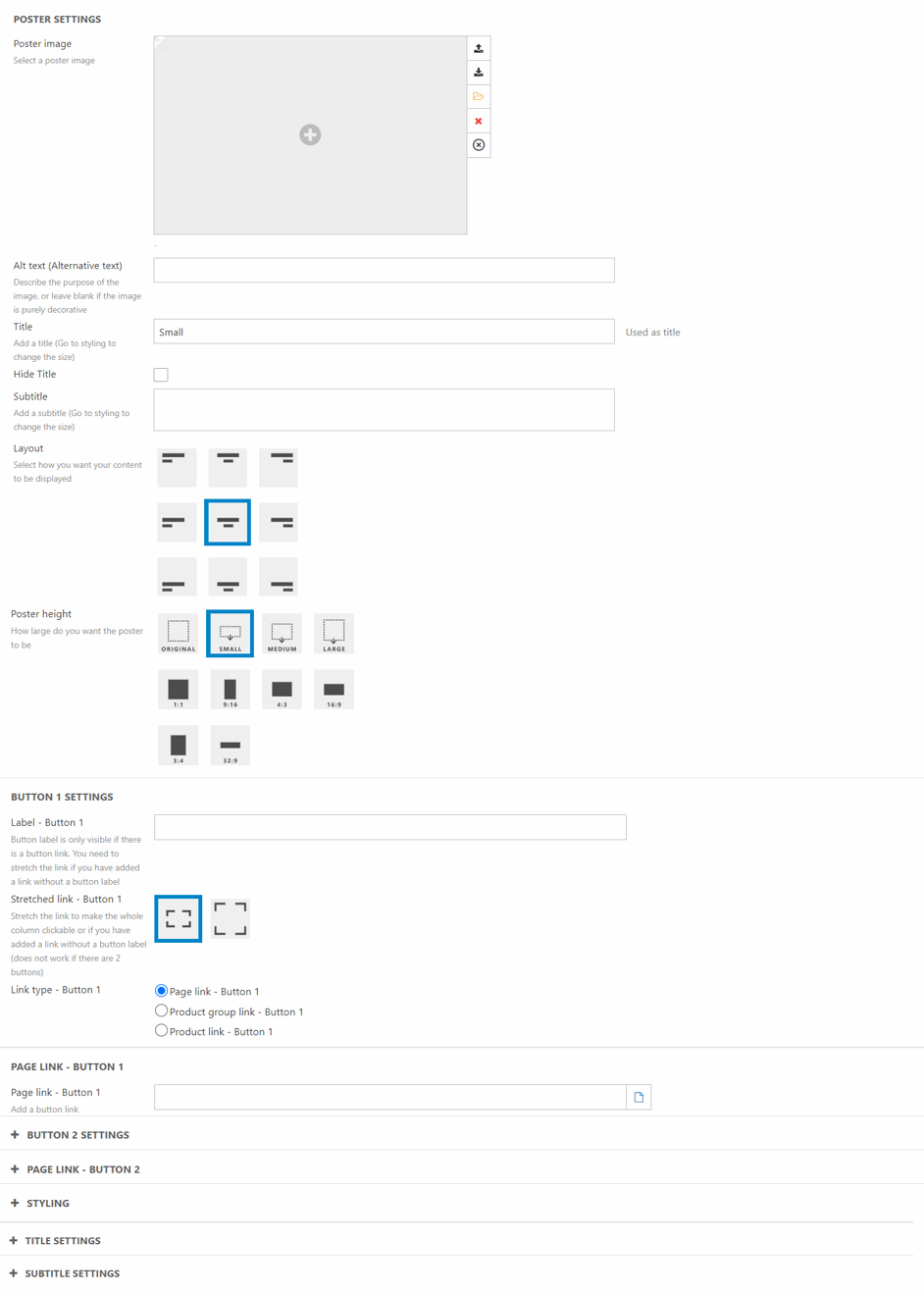
You can:
- Select the poster image
- Specify an alt-text for accessibility and SEO purposes
- Set a title and a subtitle
- Select a layout
- Choose the poster height
You have the option of adding either one or two buttons to the Poster column. If you want to add a button you must write both a button label and a button link. If you want to add two buttons, you must write the button label and link for both, otherwise only one button will show.
The poster column also comes with styling options:
- Select a theme for the column
- Set the image filter on/off
- Choose the button style for each individual button
- Choose the button size of both buttons
- Set space around
- Toggle/Untoggle text readability
In the settings there is a section for specific title and subtitle settings. These are:
- Title:
- Choose the heading level of the tag around the title. This will help on your SEO. You can read more about this in our SEO documentation
- The size of the title - Choose from Display-1 to H6. The H1 to H6 are not to be confused with the heading level explained above. The title size setting ONLY controls the size of the title NOT the heading level
- The Color of the title. Choosing foreground will select a color based on the chosen theme. Accent will create an accent color based on the theme
- Title opacity - Choose between 100%, 85%, and 75% opacity
- Subtitle
- The size of the subtitle. Choose between FS-1 to FS-6
- The Color of the subtitle. Choosing foreground will select a color based on the chosen theme. Accent will create an accent color based on the theme
- Subtitle opacity - Choose between 100%, 85%, and 75% opacity of the subtitle
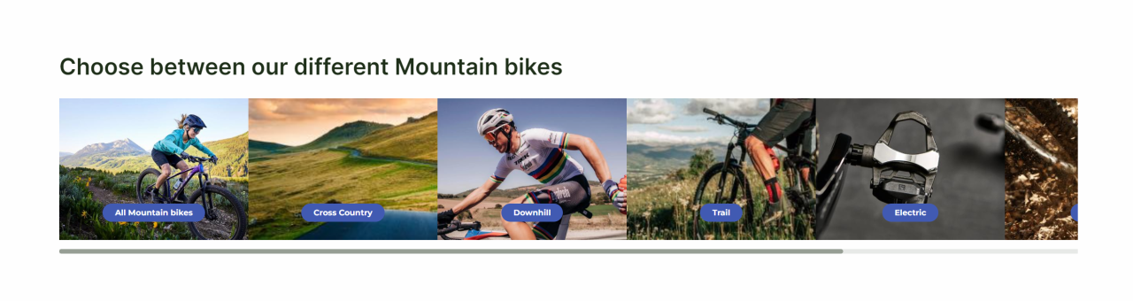
Product group slider
The Products group slider is based on the Swiffy slider, which is why you will see many of the same features and settings as in our Slider column. Though instead of creating slides to be displayed, you select groups or subgroups of products to be displayed.
The product group slider column allows you to do the following configuration:
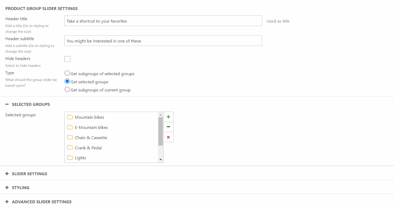
In the column editor you can:
- Write a header title and subtitle – and choose to hide them
- Choose what type group you want the slider to be based upon
- Choose between subgroups of selected groups, selected groups, and subgroups of the current group the customer is located in.
In the Slider settings section, you can:
- Choose how many slider items that should be visible
- Choose the ratio of the slider
- Specify if slides should be revealed before and after
- Specify if there should be gaps between slider items
- Select an arrow style and placement
- Choose the indicator style
In the Styling section you can:
- Choose a theme for the column
- Choose a theme for the group displayed
- Select the button alignment, style, size and if the link should be stretched or not
- Set a Title and subtitle size
- Set the Text readability to max width on or off
In the Advanced Slider Settings, you can focus on the smaller details of the slider:
- You have a variety of different smaller settings you can tick on or off
- Choose if there should be an animation of each slide item
- Choose if you want Autoplay and how long the interval should be
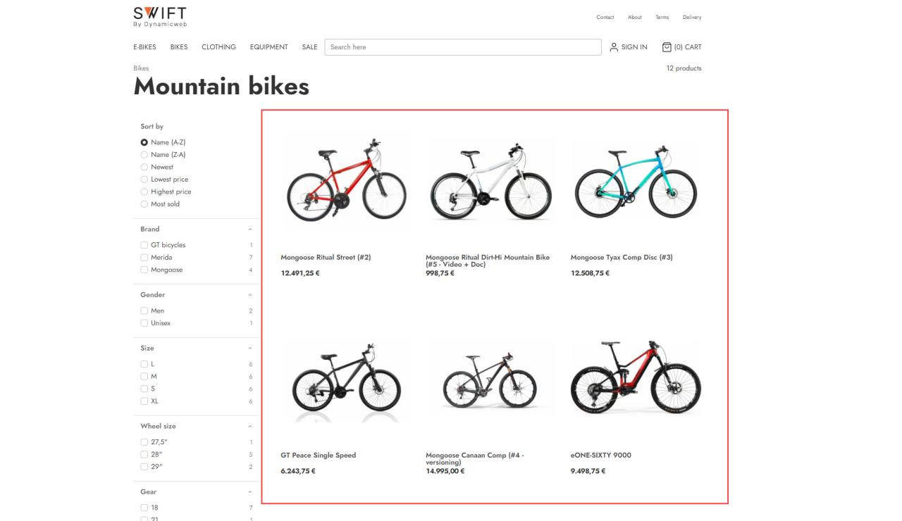
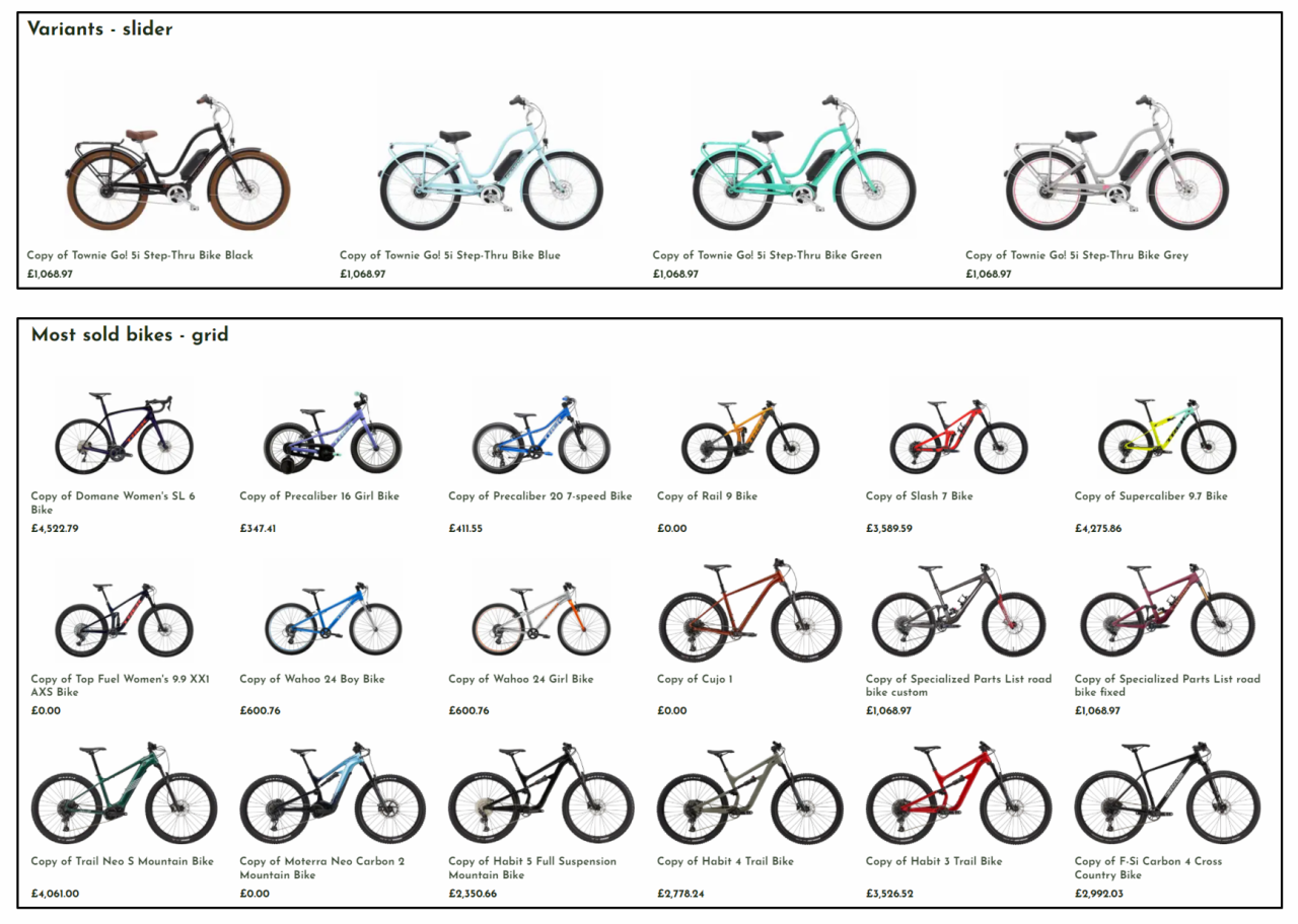
Product slider/Grid view
The product slider/Grid view column is used to create a product slider in frontend – typically to promote specific products, list trending products, and so on (Figure 20.1).
The product slider/Grid view column comes with the following configuration options:
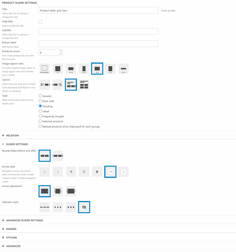
You can:
- Set a title, a subtitle, and a button label
- Specify the product count – the number of products to show in this slider
- Set the image aspect ratio
- Choose the layout of the slider/grid
- Select the type of product to show
- Variants
- Most sold
- Trending
- Latest
- Frequently bought
- Selected products
- Related products (One slider/grid for each group)
The relation section is used to relate the slider to e.g. a group or a product – see the table below for details:
|
Type of slider |
Type of relation |
Notes |
| Variants | Product |
This type of relation shows the variants of the product. Leave blank if used on a product details page |
|
Most sold |
Group |
This type of slider shows the most sold products in one or more groups – you select which groups here. |
|
Trending |
Group |
This type of slider shows trending products in one or more groups – you select which groups here. |
|
Latest |
Group |
This type of relation shows the latest add products in the specific group |
|
Frequently bought |
Product |
This type of slider shows products which are frequently bought alongside a specific product – you select which product here. Leave blank if used on a product details page. |
|
Selected products |
Specific products |
This type of slider shows specific products. Select the products here. |
| Related products | Product |
This type of relation shows products related to the original product. Leave blank if used on a product details page |
In the Slider Settings you can choose the surrounding details:
- Choose if slides should be revealed before and after the displayed slides
- Select the arrow style
- Select the arrow placement
- Choose the indicator style
In the Advanced Slider Settings, you can focus on the smaller details of the slider
- You have a variety of different smaller settings you can tick on or off
As this is a slider/grid consisting of products, you also have the option to display ecommerce badges on the products. This is done in the Badges section.
- Select the new badge
- Choose the sale badge and what type of sale to display
- Choose the campaign badges that needs to be displayed
The product slider/grid column also comes with styling options:
- Select a theme (general, product, image) and a button style
- Set space around
- See the title and subtitle size
- Text readability - toggle max width on/off
You can use the advanced settings to override which pages the product slider directs a user to see setting descriptions for default values.
Search field
The search field column is used to create a search field, typically in a header or footer (Figure 21.1).
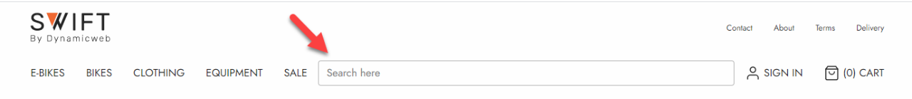
The search field column comes with the following configuration options:
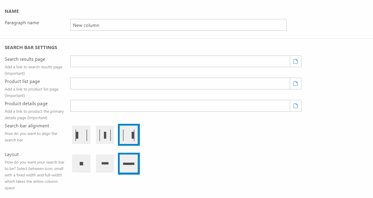
You can:
- Set the paragraph name
- Select the pages related to displaying search results:
- Search results page
- The results shown in the search field depends on which service page you link to. Read more about that here.
- Product list page
- Product details page
- Search results page
- Select a search bar alignment
- Select a layout
Section header
The Section Header column is used to, well, create a section header (Figure 22.1).
The section header column comes with the following configuration options:
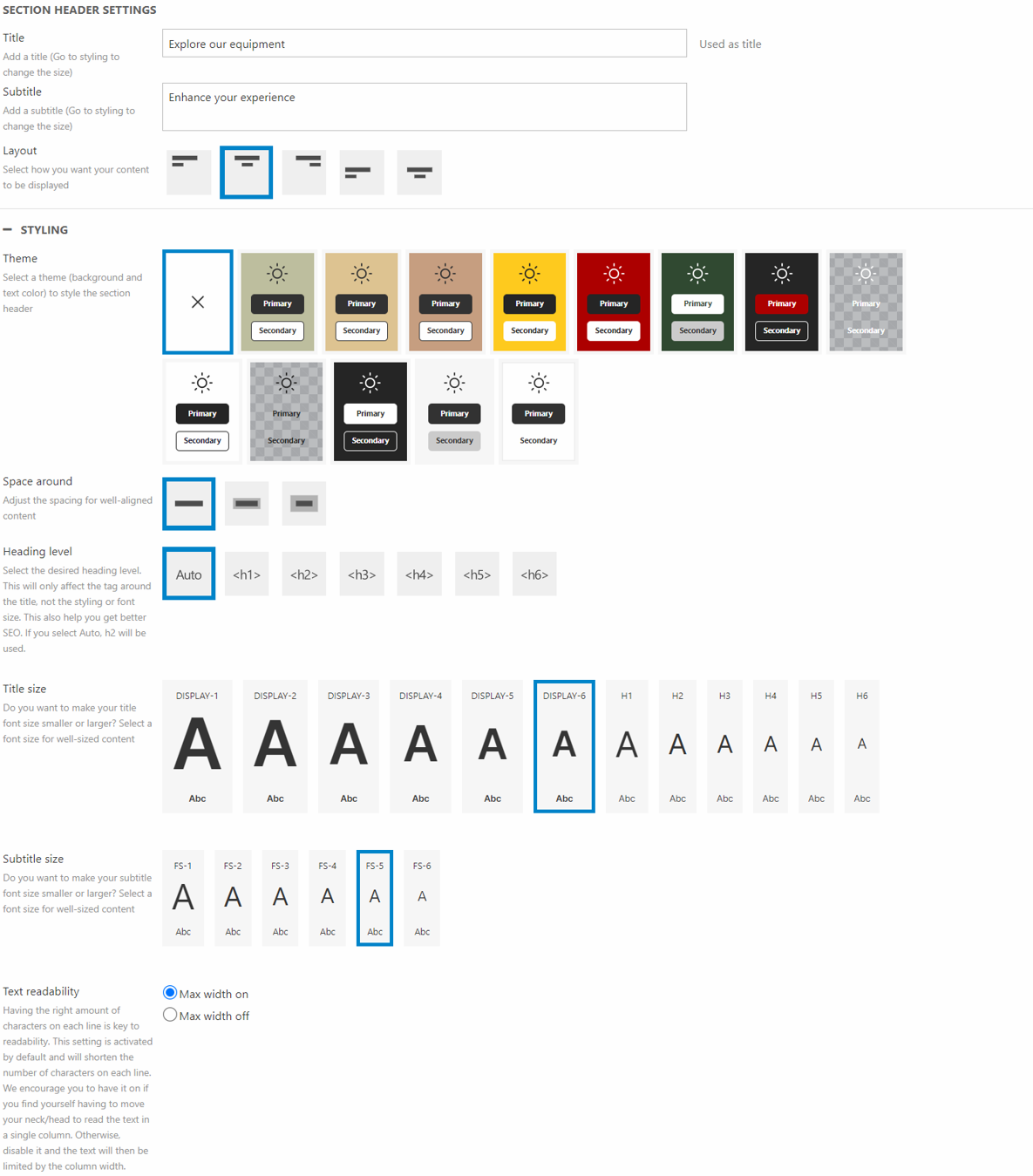
You can:
- Specify a title and a subtitle
- Select a layout
This column also comes with additional styling options:
- Select a theme
- Set space around
- Choose the heading level of the tag around the title. This will help on your SEO. You can read more about this in our SEO documentation.
- Set the title size and subtitle size
- Toggle/Untoggle the text readability
For the title and subtitle you can choose:
- Color. Choosing foreground will select a color based on the chosen theme. Accent will create an accent color based on the theme
- Opacity - Choose between 100%, 85%, and 75% opacity
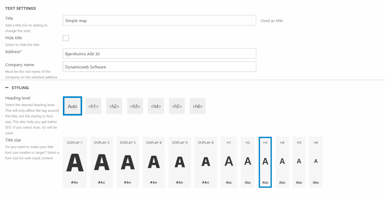
Simple map
A simple map is used to show only one location on the page. As an example, it could show where your HQ is located (Figure 23.1).
The simple map has no customization options and only lets you add one location. The upside is that you can use this column without a Google API.
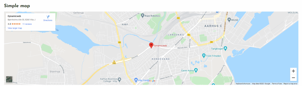
As mentioned, you have no styling options when using the simple map. Which is why you only have the following configuration options:
You can:
- Give the column a title and choose to show it or not
- Add an address as the focal point for the map - this is important for the map to work
- If you want to display the location of your company, you can enter the company name on the selected address
For styling options you can:
- Choose the heading level of the tag around the title. This will help on your SEO. You can read more about this in our SEO documentation
- Set the size for the title
You can only use company names registered on the written address. If you write a company name, that doesn’t exist, the map won’t work.
If you leave the company name field empty, the written address will be shown instead.
Slider
The Slider column let you create different slides and displays them in a carousel. The slider column comes with a lot of different design and styling options, meaning that you can customize the slider to your likening.
The slider column comes with the following configuration options:
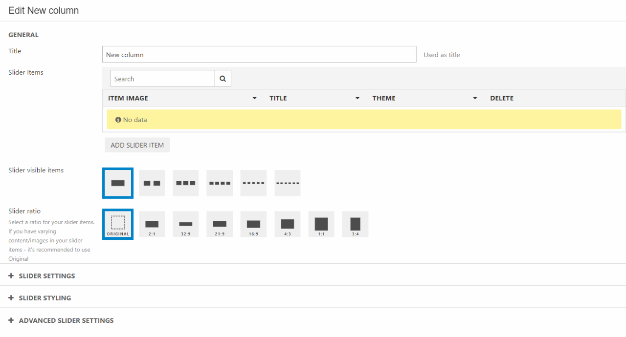
The settings are divided into different section:
In the General settings:
- Give the column a title
- Add and manage slider items, this will be explained later in the documentation
- Choose how many slider items that are visible
- Choose the slider ratio
In the Slider Settings you can choose the surrounding details:
- Choose if slides should be revealed before and after
- Choose if there should be gaps between items
- Select the arrow style
- Select the arrow placement
- Choose the indicator style
The Slider Styling is about theme and text styling
- Choose the button size
- Set the Space around
- Select the Title and subtitle size
- Choose the theme for the column
In the Advanced Slider Settings, you can focus on the smaller details of the slider
- You have a variety of different smaller settings you can tick on or off
- Choose if there should be an animation of each slide item
- Choose if you want Autoplay and how long the interval should be
The slider obviously only works with Slide items to display. In the Slide item options you have the following options:
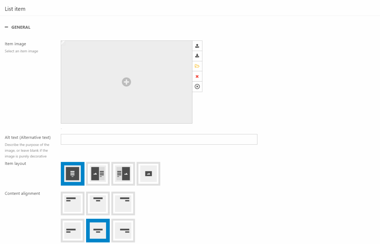
You can:
- Select and image for the item
- Write an alt-text for accessibility and SEO purposes
- Choose the item layout
- Please note that the last layout option is meant for displaying logos and other small images. Using this layout on larger images will result most likely affect the image quality. For larger images we recommend using one of the first three layout options.
- Choose the content alignment
- Write a title, subtitle, and text
- If you want a button displayed, write a button label
- Choose between a stretched link or not
- Choose the link type and where it will link to
For styling options, you can:
- Choose a theme for the item
- Select the button style
- Toggle text readability on/off
Text
The Text column is used to create text & optionally add a button under the text (Figure 27.1).
The text column comes with the following configuration options:
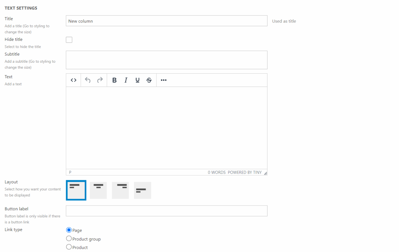
You can:
- Provide a title, a subtitle, and a text
- Select a layout
You also have some button settings. If the button fields are left empty, no buttons will appear on the column. This means that to get buttons on the column, you must enter information about only button 1 or both button 1 and 2 depending on the number of buttons you want.
This column type also comes with additional styling options:
- Select a theme and a button style
- Set space around the content
- Choose the heading level of the tag around the title. This will help on your SEO. You can read more about this in our SEO documentation
- Set the title size and subtitle size
- Toggle max-width on or off
For the title, subtitle, and text you can choose:
- Color. Choosing foreground will select a color based on the chosen theme. Accent will create an accent color based on the theme
- Opacity - Choose between 100%, 85%, and 75% opacity
Text Advanced
The Text Advanced is, as the name suggest, a more advanced version of the Text column. This means that you will have additional features alongside the features known from the Text column.
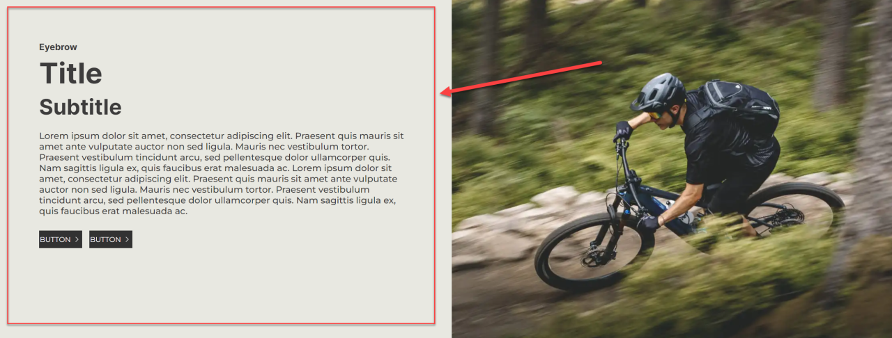
The Text Advanced column has a lot of different features allowing you to configurating the column to your likening.
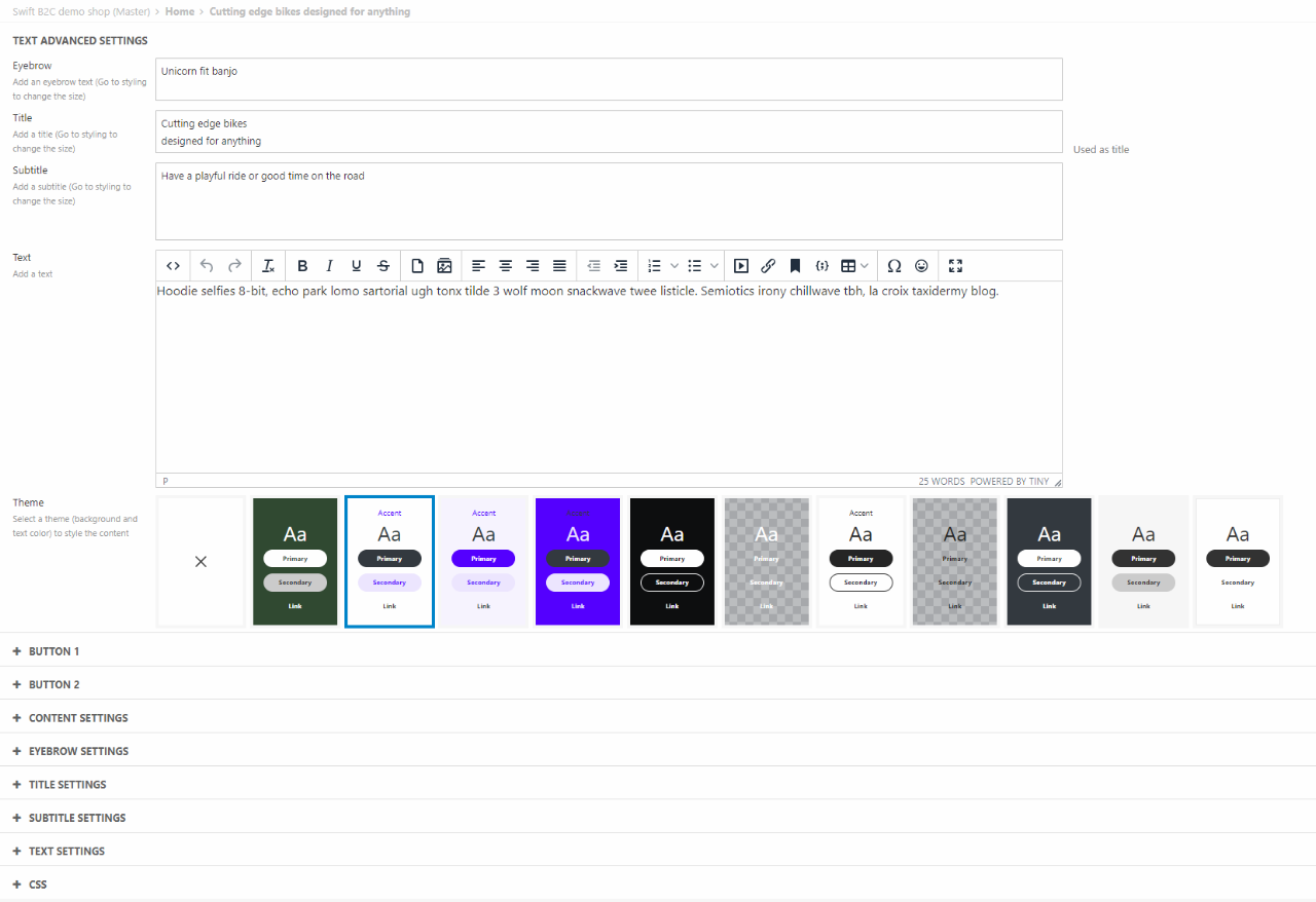
As general settings you can:
- Write an Eyebrow text, Title, Subtitle, and text
- Choose a theme for the whole column
For button settings you can add and edit two buttons:
- Give the button a label
- Choose where it should link to
- Select an icon and the icon position in relation to the label
- Choose the style of the button
To add buttons to the Text Advanced column you must fill out the label and link fields. Otherwise, the buttons will not be added to the column.
In the content settings section, you can:
- Choose the content, and text alignment
- Set the spacing around the content. This can be individually configured for each side and for different devices
- Add Css classes to the content
The eyebrow, title, subtitle, and text settings are similar. In these sections you can:
- Choose the heading level of the tag. This will help your SEO. You can read more about this in our SEO documentation
- Choose the text size, color, and opacity. The text color is based on the theme chosen.
- Set the bottom spacing. This can be set differently for different devices.
The Text Advanced also allows custom CSS. This uses your CSS collections. You can read more about those here.
In the CSS section in these settings, you can assign the relevant CSS collections to this Text Advanced column.
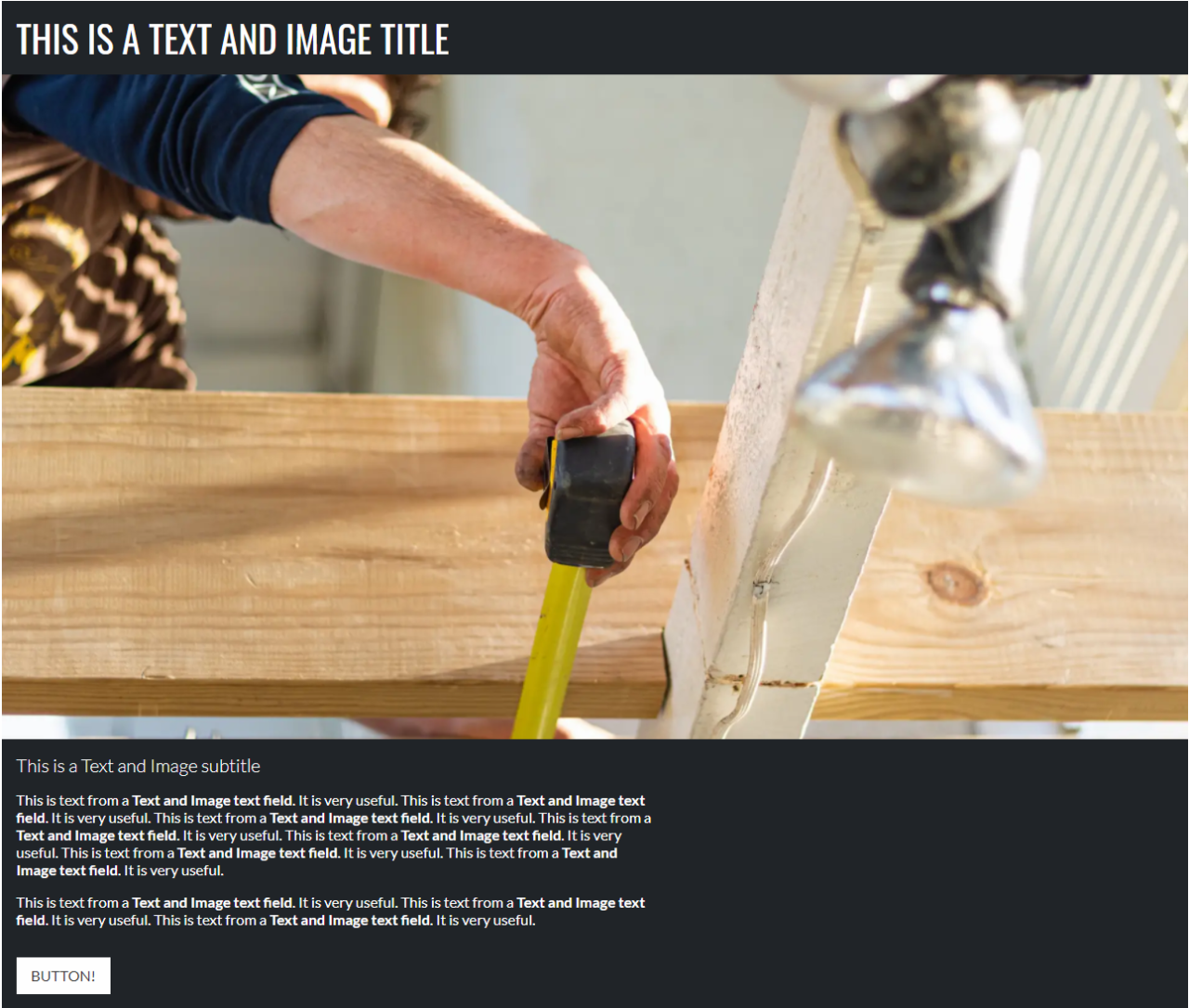
Text and image
The Text and image column is a content type typically used to create text-heavy content, e.g. blog posts, newsletter sections, case presentations, etc.
This column comes with the following configuration options:
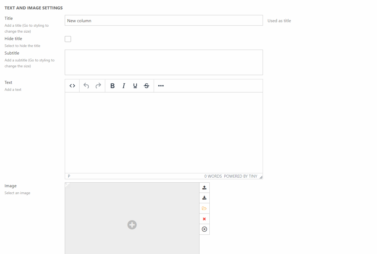
You can do the following:
- Provide a title, a subtitle, and a text
- Select an image - and set the image aspect ratio
- Specify an alt-text for accessibility and SEO purposes
- Select a layout for the column
You also have some button settings. If the button fields are left empty, no buttons will appear on the column. This means that to get buttons on the column, you must enter information about only button 1 or both button 1 and 2 depending on the number of buttons you want.
This column type also comes with additional styling options:
- Select a theme
- Choose the button style for each button
- Set image resize and fit setting to either clip or resize
- Set space around the content
- Choose the heading level of the tag around the title. This will help on your SEO. You can read more about this in our SEO documentation
- Set the title size and subtitle size
- Toggle/Untoggle text readability
For the title, subtitle, and text you can choose:
- Color. Choosing foreground will select a color based on the chosen theme. Accent will create an accent color based on the theme
- Opacity - Choose between 100%, 85%, and 75% opacity
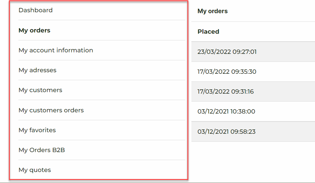
Vertical Navigation
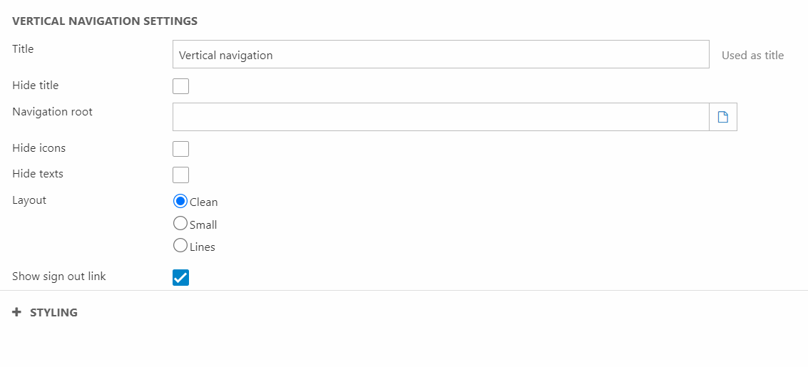
The vertical navigation column is used to create a vertical navigation (Figure 30.1).
The Vertical navigation editor let you configure a few things:
Video Player
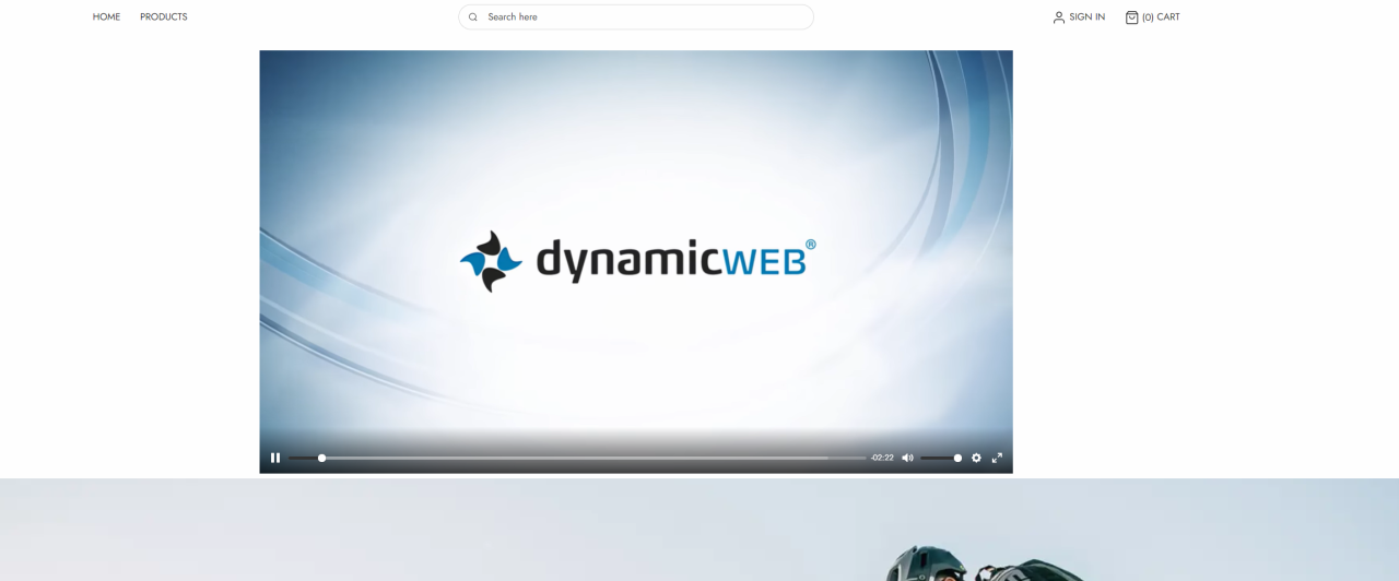
The Video Player column (Figure 31.1) is mainly used when you want to display smaller (on-screen size) videos as part of your page content.
The editor of the Video Player (Figure 31.2) allows you to customize the following things:
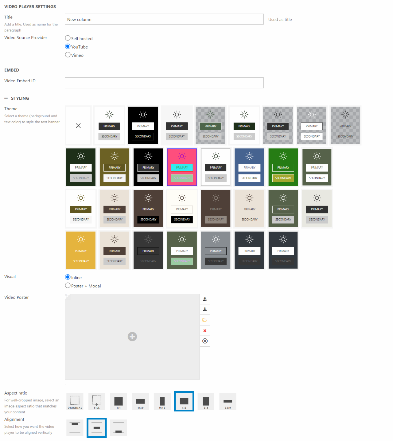
You can:
- Give the column a title
- Choose the Video source provider
The editor also allows you to style the column with a theme and set the Aspect ratio of the video.
You can choose to display the video inline or with a Video Poster and Modal display.
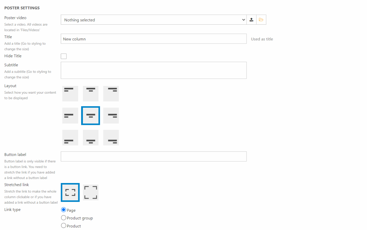
Video Poster
The Video Poster column (Figure 32.1) is often used at the top on the landing page. This way it will work as an eye-catching poster, that will keep the customers on the page. It can also be used to guide customers to new products or campaigns shown in the video. The video displayed in a Video Poster column will be looped - keep this in mind when choosing what to display.
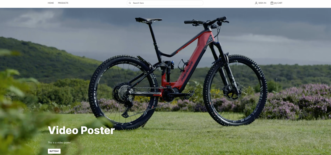
The different options for the Video Poster column (Figure 32.2) are the following:
In the editor you can customize the following things:
- The source for the video poster.
- The title, subtitle, and button label.
- The layout of the video
- How wide you want your clickable area to be and where you want your video to redirect your customers to
As additional styling options you can choose:
- The theme for the column
- Toggle poster image filter on/off
- The style and size of the button
- The poster height
- Set the space around the content
- Choose the heading level of the tag around the title. This will help on your SEO. You can read more about this in our SEO documentation
- Set the size for the title and the subtitle
- Toggle/Untoggle text readability