
Header & Footer
Headers and footers help you keep the theme of your site. They will be constant in design no matter what page the customer is on. By keeping them clean and organized the header and footer becomes helpful tools for your customer to navigate through your site.
The header and footer pages are placed in the swift tools folder called layout in the backend. You’re able to make headers and footers specifically designed for either desktops or mobile platforms, as some column will work better on a wider screen while others are made for smaller screens. As an example, mega menu’s needs a mouse to hover above the icons, while off-canvas navigation makes more sense on smaller screens such as phones or tablets.
The design of headers and footers are very dependent on the chosen branding and theme. To learn more about the concept of branding and themes we recommend you to check our guides about them.
Columns
Some columns are created for headers and footers only, while other columns are unviable for them. Some columns, such as impersonation bar and mega menus, are only for headers, just as features only are available for footers. For now, the following columns are available to use on only headers, only footers, or on both pages:
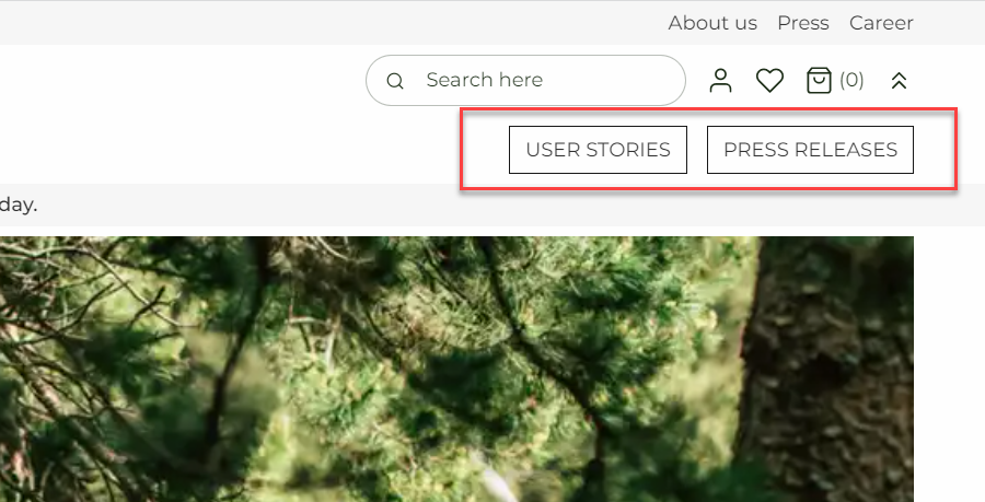
Button
On our other columns the buttons are accompanied by either text or images, as seen on poster, text and image, text, etc. The button column is a way to create CTA buttons without other elements while it also makes it easier to choose the preferred links.
This column allows you to create to buttons. If you only need one, you can just leave the fields for button 2 empty.
With the button column editor, you can:
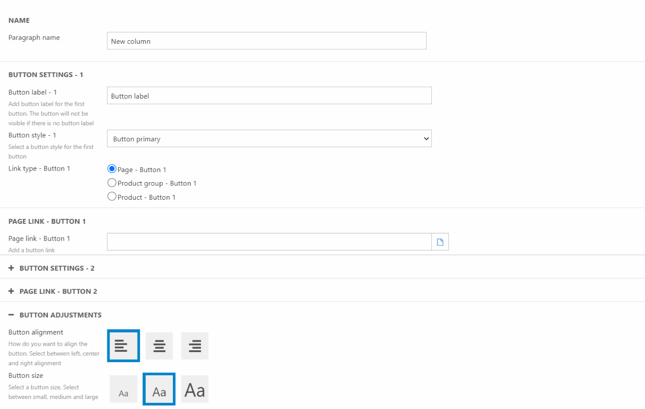
For configuration options you have:
- Write a paragraph name
- Set label, style, link, and link type for button 1
- Set label, style, link, and link type for button 2
- Choose the button adjustments
- Set the button size
- Choose a theme for the buttons
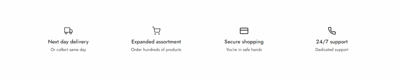
Feature
The feature column is also available for use on content pages. That’s why we’ve already made some documentation about it, which you can read here.
Impersonation bar
The impersonation bar is mainly used in a B2B scenario. We’ve made a guide on how to use the impersonation bar in a customer impersonation situation here. Please note that this column will only show if you're logged in.
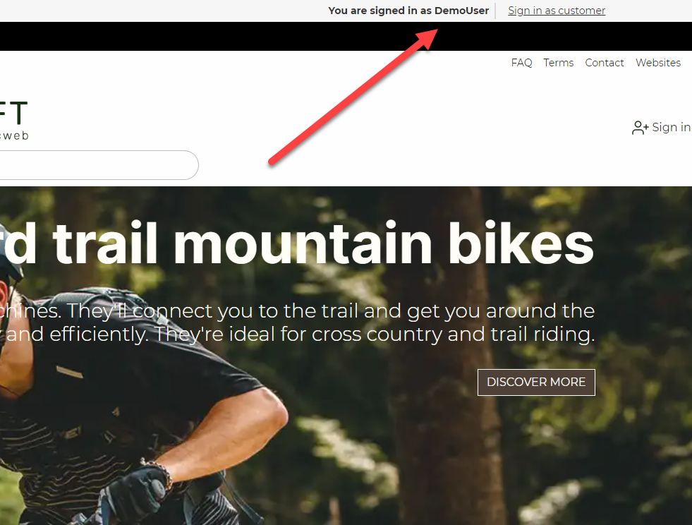
The impersonation bar column doesn’t let you do much:
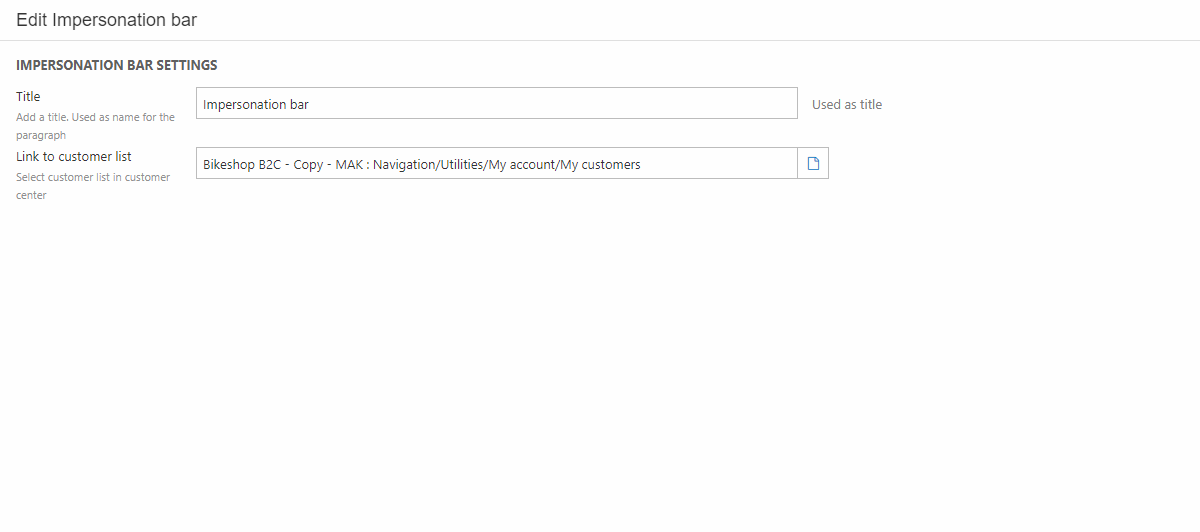
You’re able to give the column a title and link to the customer list. Styling is only available in the row settings.
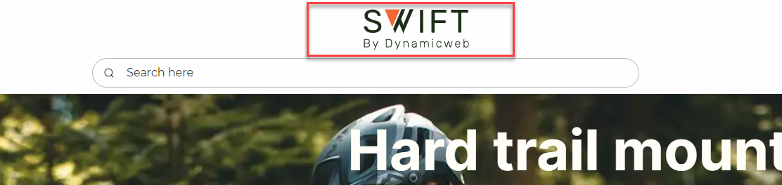
Logo
The logo column is used to add a logo or text to a header (Figure 6.1). It’s recommended that you use a SVG file, as these are scalable and support theming.
The logo column has the following settings (Figure 6.2)
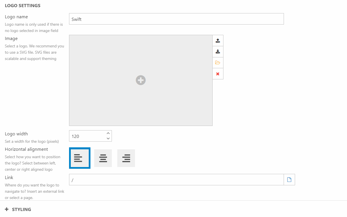
You can:
- Write a logo name or select a logo image
- Set the logo width
- Select a horizontal alignment
- Choose where to link to when clicking the logo
For styling options, you can choose a theme for the column.
Mega menu
The mega menu is a tool to help your customers navigate through your site. On hover it will enlarge menus allowing your customers to specify their destination. That way it gives your customer a lot of information without making the header look messy.
The mega menu consists of many different elements which means it has a lot of options when configuring:
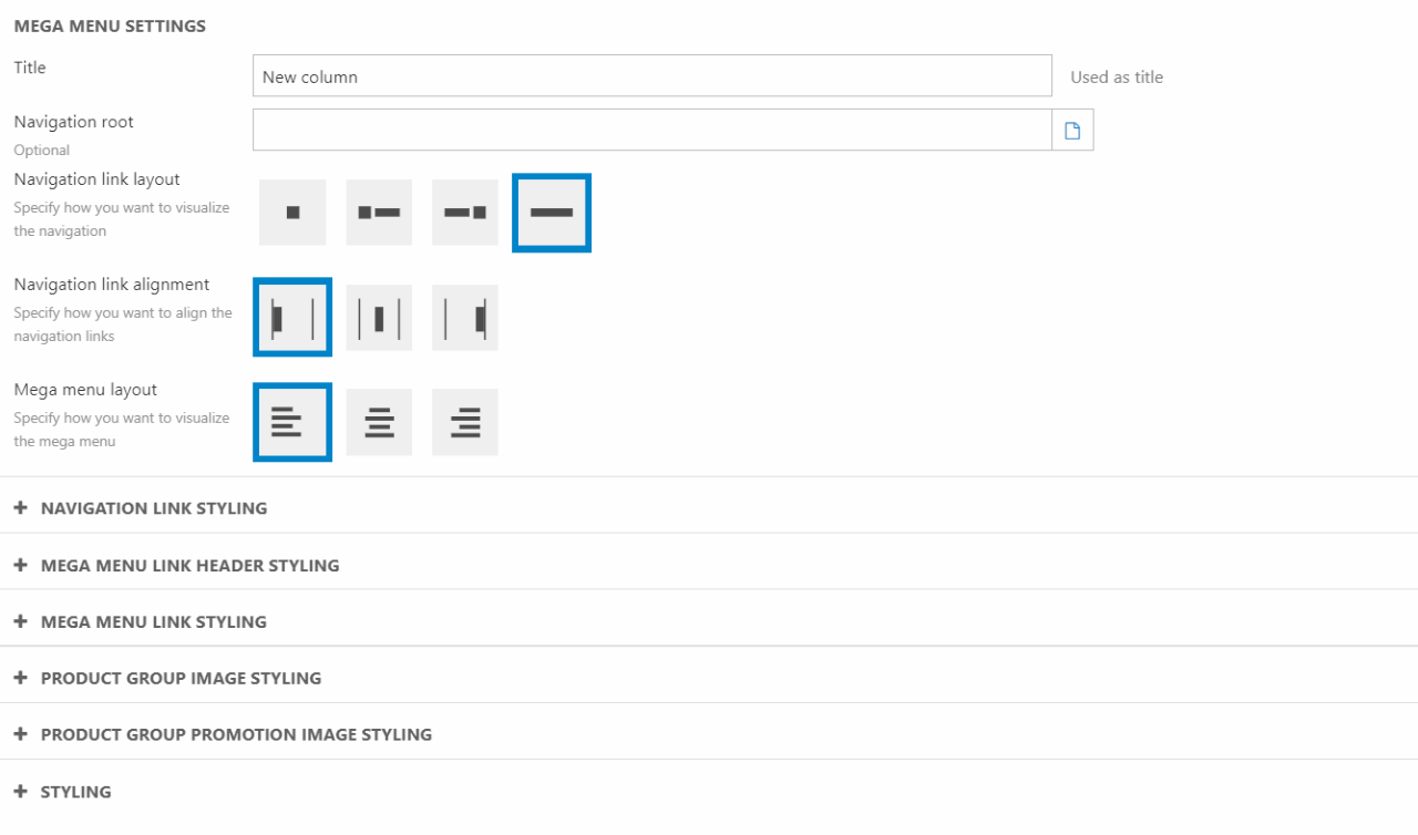
For the more general mega menu settings you can:
- Give the column a title
- Set the navigation root of the menu
- Choose the layout
- The alignment of the navigation
- The alignment of the mega menu
You also have some options for styling the different links. The different styling options for navigation link, mega menu link header and mega menu link are the same, but are set individually:
- Choose the link font weight
- Select a link casing
- Select a link font size
The mega menu also allows you to display product group images and product group promotion elements. For these to work, you will have to configure it in Ecommerce. You can read more about it here.
In the column editor you have the following options:
- Product group image styling
- Select the image layout
- Select the product group image shape
- Choose the size of the product group image
- Product group promotion image styling
- Show/hide the product group promotion image
- Select the image aspect ratio
- Choose a theme for the product group promotion image
For other styling options you can choose the theme for the mega menu column.
Navigation
Navigation is a collection of links placed either vertically or horizontally. Links can be displayed as icons, text, or both (Figure 8.1). Earlier we've made a guide on how to customize the links shown in a navigation column, you can find that guide here.
When using the navigation column, you’ll have the following settings:
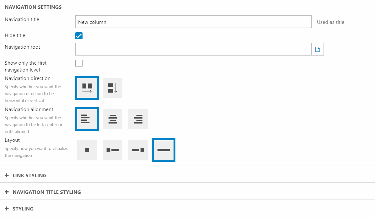
In the editor you can:
- Write a navigation title and choose whether to show/hide it
- Choose a navigation root to be displayed
- Set the orientation of the navigation
- Select the navigation alignment
- Select the layout of the navigation list
For styling options, you can style both the links and navigation title in the same way:
- Choose the font weight
- Set the title casing
- Set the font size
Additionally, you can style the column by selecting a theme for the dropdowns in the navigation.
Off-canvas navigation
An off-canvas navigation column mainly used for smaller screens to save on-canvas space. When clicking on the off-canvas icon the customer will be shown a choosen collection of navigation columns (Figure 9.1).
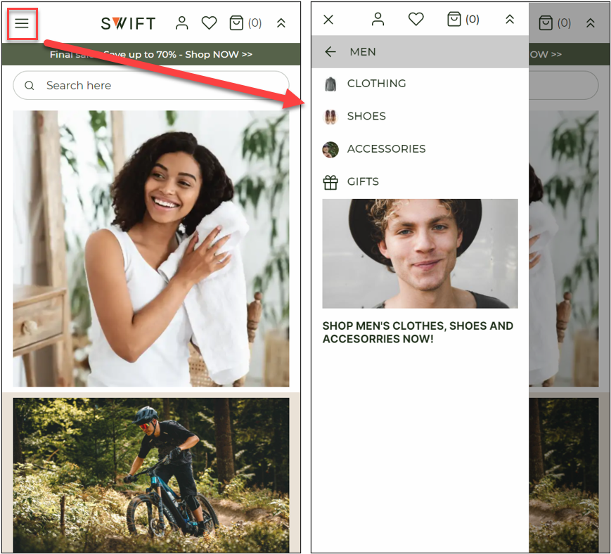
The off-canvas navigation column has the following settings:
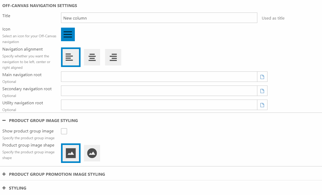
You can:
- Give the column a title
- Choose an icon for the column
- Choose the navigation alignment
- Select a main navigation root – These are the nodes shown first in the navigation
- Select a Secondary navigation root – These nodes are shown after the main navigation root nodes
- Select a Utility navigation root – These nodes are shown at the top of the off-canvas navigation panel
Besides the general settings, you also have some options about the product group image and product group promotion image. These will require some Ecommerce configuration, which you can read more about here.
Product group image styling:
- Show/Hide the product group image
- Choose the shape of product group image
Product group promotion styling:
- Show/Hide the product group image
- Choose the image aspect ratio
- Product group promotion image theme
For styling you can set a theme for the ON-canvas column, a different theme for the OFF-canvas page and choose the off-canvas direction.
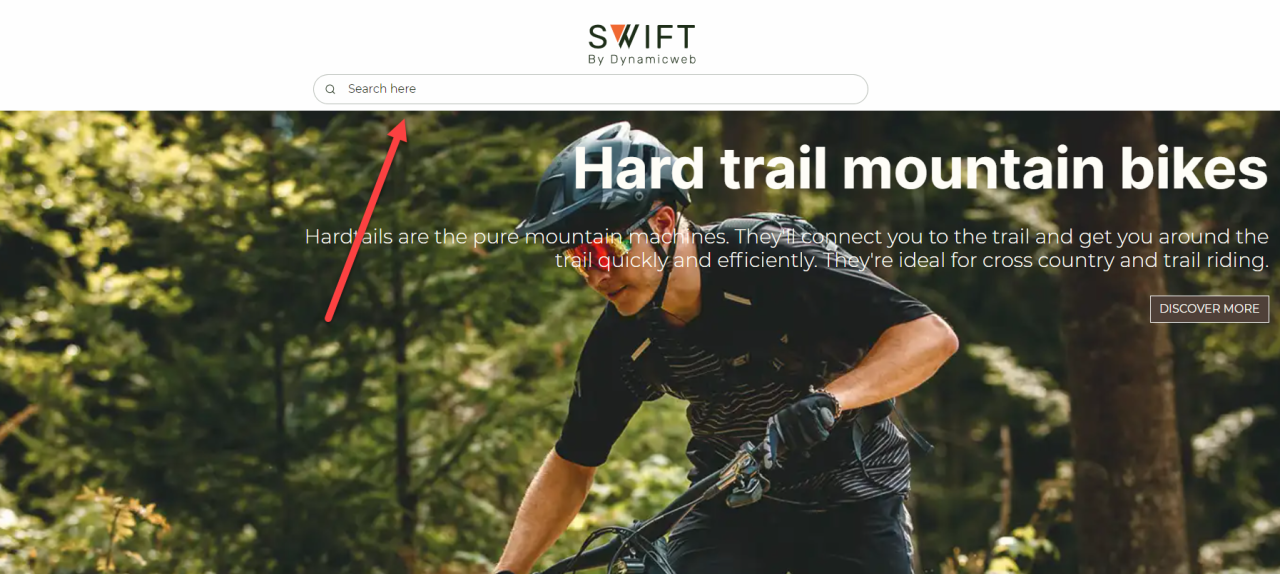
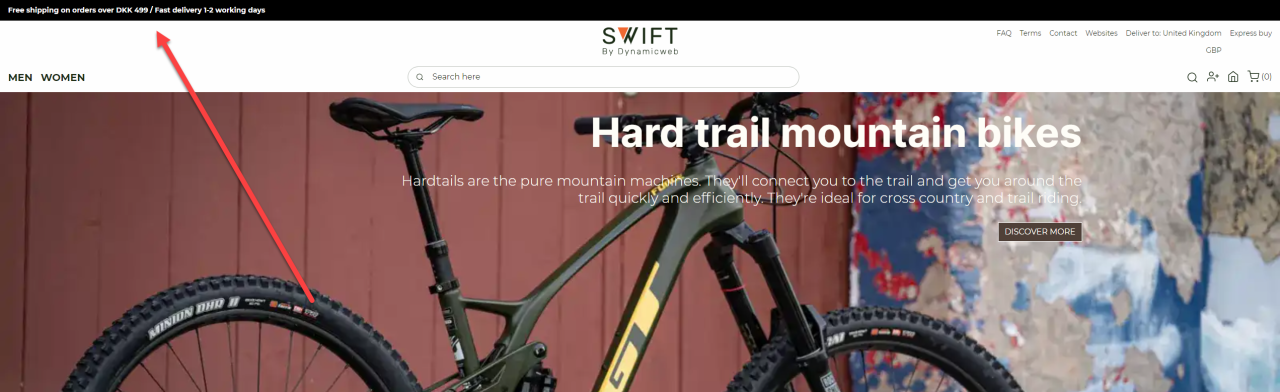
Search field
A search field is helpful for the customer to quickly locate the items they need. In Swift they can be wide, medium or icon based.
This column is also available on normal pages, which is why we already have documentation on it. You can find it here.
Text
The text column is also available for use on content pages. That’s why we’ve already made some documentation about it, which you can read here. The use of the column on a footer can be seen in the footer examples below.

Text banner
The text banner column can be used for many different things. One example could be to inform about new campaigns or offers (Figure 12.1).
The column has the following configurations options:
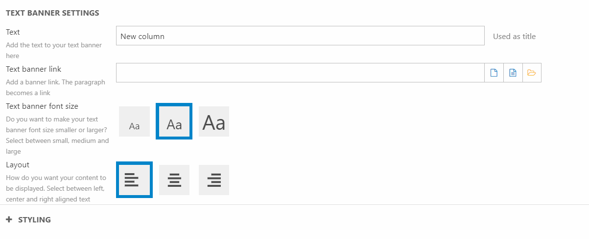
You can:
- Write the text you want displayed on the text banner
- Choose if and where you want your text banner to link to
- Set the text banner font size
- Choose the layout for the column
For styling options, you can select a theme for the column.
Rows
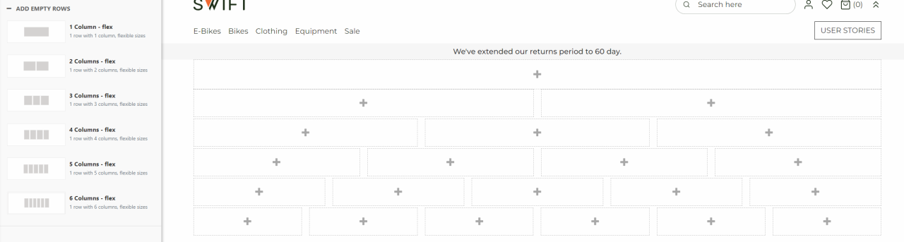
Knowing the different rows and how to control them will help you in the design process. Rows can vary in size on a lot of different parameters, i.e. width, height and space between. For now, the rows available for headers and footers are:
- 1 Column – flex
- 2 Column – flex
- 3 Column – flex
- 4 Column – flex
- 5 Column - flex
- 6 Column - flex
The main difference between rows available for headers and those used on the pages are the flexible sizes of the individual columns.
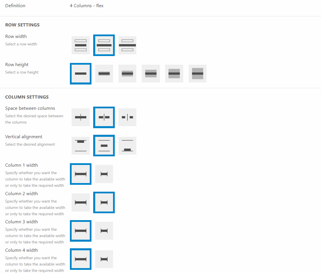
In the row settings you have different options:
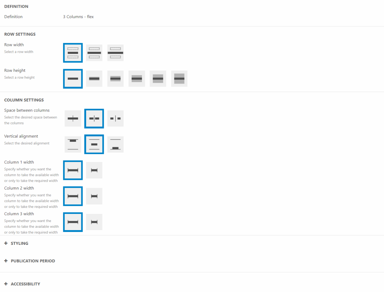
You can:
- Set the row width
- Choose the row height
- Choose the space between columns
- Set the horizontal alignment
- Choose the column width for each individual column – counting from left to right
For styling you can choose a general and alternative theme. As an example, alternative themes are used when header are placed on top of pages. In that case you might want to have a transparent background but a specific color for the text.
In styling you’re also able to control if a row should hide on scroll or not. This tool lets you collapse part of the header when the customer scrolls, meaning that an information rich header will minimize as the customer starts scrolling (Figure 13.3).
The publication period lets you choose when the row will be active. You can read more about the publication period tool here.
Accessibility allows you to hide rows for either phones, tablets, or desktops.
Header examples
We've made some different headers, both desktop and mobile. These can be used as inspiration, but are also to show how you can use row settings and column settings in different ways, to create the design you want. The examples will consist of an image of the header along with a short and precise describtion on which columns and rows are used.
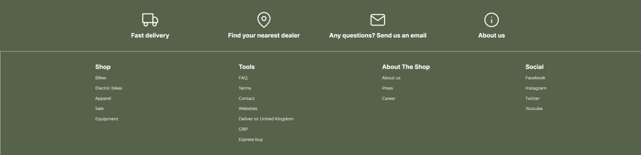
Desktop example: Simple header with navigation
This header is made of three rows of the same type: 2 column row – flex. The row settings haven’t been touched much, it's only the theme that has been changed. The main configuration is done in the column editors.
We’ll start with the first row:
- Add a text banner to the first empty column
- Write a text to be displayed
- Choose a banner font size and the layout
- Add a navigation column to the other empty column
- Add a navigation root – in this case a tools folder
- Set the navigation orientation and the layout
The second row consists of a logo and navigation.
- Add a logo column to the first empty column
- Choose an image
- Set the horizontal alignment
- Choose where the logo will link to
- Add a navigation column to the other empty column
- Choose the navigation root – in this case a utilities folder consisting of a cart
- Set the navigation alignment and the layout
The last row is made of a navigation column and a search field column
- Add a navigation column to the first empty column
- Choose the navigation root – in this case it’s the product list page
- Set the navigation alignment and the layout
- Add a search field column to the other empty column
- Make sure to link all the fields to the right pages
- Choose the search bar alignment and the layout
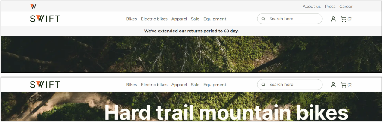
Desktop example: Above content header
This is a simple header, as it consists of only one row. The row in use is a 4 column row – flex.

We’ll start with adding and editing the columns.
- Add a logo column to the first empty column
- Choose an image
- Set the horizontal alignment
- Choose where the logo will link to
- Add a navigation to the second empty column
- Choose the navigation root – in this case it’s the product list page
- Set the navigation alignment and the layout
- Add a search field to the third empty column
- Make sure to link all the fields to the right pages
- Choose the search bar alignment and the layout
- Add a navigation to the fourth empty column
- Choose the navigation root – in this case it’s a utility folder
- Set the navigation alignment and the layout,
Now all the elements are added. You only need to configure the row settings (Figure 16.2).
- Change the row width to medium wide
- Change the width on column 1, column 3 and column 4 to narrow
- Change the alternative theme to a transparent theme with bright color font
In this example the header is placed above the content on the front page. To do so:
- Enter the properties of the front page
- Locate the section called Page settings and choose the “place above content” option
- Hit Save and Close
Mobile example: Logo, search icon and off-canvas
This example is for a mobile header. Mobile headers often use icons instead of titles, that way it keeps the layout simple and easy to use.
This header consists of two rows: a 3 column row – flex and a 1 column – flex.
- Add a 3 column row – flex to your header
- On the first empty column add a logo
- Choose an image as logo
- Set the logo width – for mobile headers you might want to keep the logo small
- Set the horizontal alignment
- Choose where the logo will link to – often that would be the frontpage
- Add a search field column to the second empty column
- Make sure to link all the fields to the right pages
- Choose the search bar alignment and the layout
- Add an off-canvas navigation column to the last empty column
- Set the navigation alignment
- And link the fields to the pages you want shown on the off-canvas navigation
- In styling, choose the wanted off-canvas direction
To make the columns on the header align like this example, you’ll have to enter the row settings.
- Set the width of column 3 to narrow.
- Choose a theme for the row
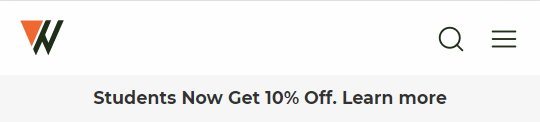
The last row of the header is a simple text banner column on a 1 column row – flex. We’ve changed the theme and linked to a term page explaining the student discount, but that’s that. Additionally, you can choose to hide on scroll.
Mobile example: Off-canvas, logo, utility, and search bar
This header consists of a lot of different columns placed on three rows.
The header is using one 3 column row – flex and two 1 column row – flex.
- Add a 3 column row – flex to the header
- Add a off-canvas navigation to the first empty column
- Set the navigation alignment
- And link the fields to the pages you want shown on the off-canvas navigation
- In styling, choose the wanted off-canvas direction
- Add a logo column to the second empty column
- Choose an image for logo
- Set the logo width – for mobile headers you might want to keep the logo small
- Set the horizontal alignment
- Choose where the logo will link to – often that would be the frontpage
- Add a navigation column to the third empty column
- Choose the navigation root – in this case a utilities folder
- Set the navigation alignment and the layout
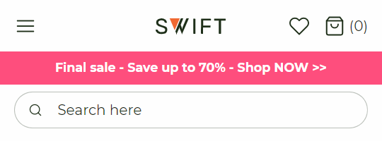
The second row, a 1 column row – flex, only consists of a text banner column.
- Add a text banner to the empty column on the second row
- Write a text
- Choose a banner font size and the layout
- Additionally, you can add a link to the column. In this example we’ve linked to the product list page
- As this is a banner about a sale, we’ve changed the theme to a bright pink color.
The last row, again a 1 column row – flex, consists of a search bar column as the only column.
- Add a search field column to the second empty column
- Make sure to link all the fields to the right pages
- Choose the search bar alignment and the layout
Footer examples
In this section footers for desktop and mobile are displayed for inspiration. We’ve made short guides of each footer, so you can learn how to use both the row settings and the column settings in different ways, to create the design you want.
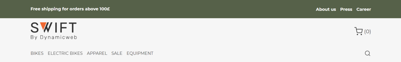
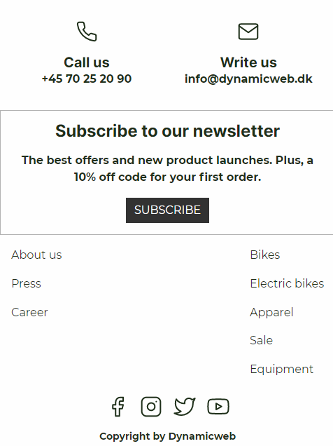
Desktop example: Text, text banner, and navigation
This footer has a dark tone (Figure 20.1). It has different font colors, and some rows even have borders. This is due to varying use of themes. This footer is made of four rows: three 1 column row – flex and one 3 column row – flex.
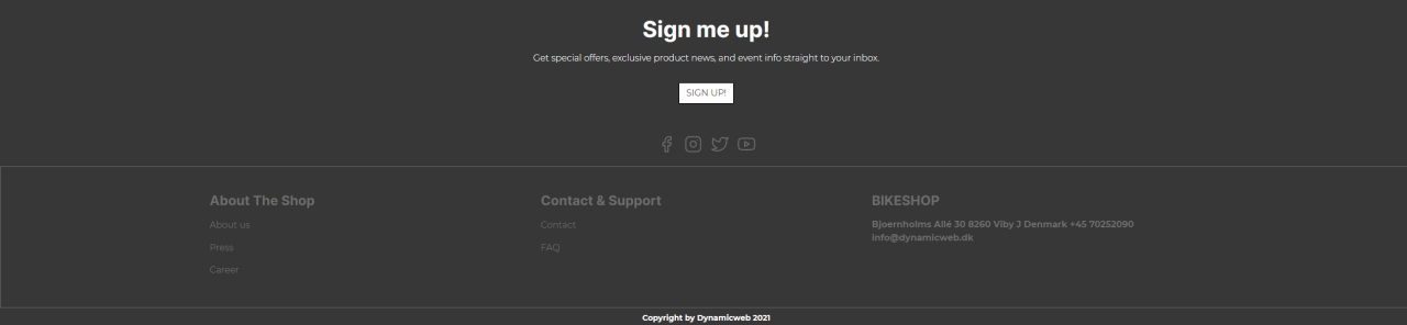
The first row two rows are 1 column row – flex.
- Add a text column to the first 1 column row – flex
- Write a title and subtitle
- Choose the layout for the column
- Write a button label and choose where you want the button to link to
- Add a navigation column to the second 1 column row - flex
- Choose a navigation root – in this case a social folder - you can read more about how to customize the content of a navigation column here.
- Set the alignment and layout for the column
The next row is a 3 column row – flex. The column used are navigation and text columns.
- Add a navigation column to the first empty column
- Write a title for the column
- Choose a navigation root
- Set the styling for both the links and the navigation
- The next column is a navigation column as well, so add a navigation column to the second empty column
- Write a title for the column
- Choose a navigation root
- Set the styling for both the links and the navigation
- Add a text column to the third empty column
- Write a title for the column
- Write a text for column
- Chose the layout
- In styling, set the title size
The last row is a 1 column row – flex with a text banner column
- Add a text banner to the row
- Write a text that will be displayed
- Set the font size and the layout
Desktop example: Feature and navigation
This footer is relatively simple and only consists of two 4 column row – flex.
The first row is a 4 column row – flex. All the columns are feature columns so we’ll show the guide for one only.
- Add a 4 column row – flex to the footer.
- Add a feature column to the first empty column
- Choose an icon or upload a new one
- Select an icon size
- Write a title and set a layout
- In styling, choose a title size
- Do the same steps for the next three feature columns
The next is also a 4 column row – flex that consists of the same four columns. On the second row it’s the navigation column. Again, we’ll show how to setup one column.
- Add a 4 column row – flex for the first empty column
- Add a navigation column to the first empty column
- Write a title
- Choose a navigation root and a navigation orientation
- Set the navigation alignment and the layout
- Do the same steps for the next three navigation columns
In the last row, you need to do some changes in the row settings to make the columns spread out evenly on the page.
- Enter the row settings
- Change the width of Column 4 to narrow
- Hit OK
This should make the columns spread out evenly on the page.
Mobile example: feature, text, and navigation
This header is made for mobiles and smaller screens. It consists of five rows, three 1 column rows and two 2 column rows.
- Add a 2 column row – flex to the footer
- Add one feature column in each of the two empty columns
- For each feature column:
- Select an icon or upload a new one
- Choose the icon size
- Write a title and text
The next row is a 1 column row with a text column in it
- Add a 1 column row – flex
- Add a text column to the empty column
- Write a title, text, and button label
- Select a layout
- Choose a link type and where the button will link to – In this example it’ll link to a newsletter subscription page
The third row is a 2 column row – flex with two navigation columns in it.
- Add a 2 column row – flex
- Add a navigation column to each of the empty columns
- For both navigation columns:
- Choose a navigation root
- Set the navigation orientation, alignment, and layout
- In the row settings set the width of Column 2 to narrow
The last two rows are both 1 column rows.
- Add two 1 column row – flex to the footer
- Add a navigation to the first of the two rows
- Choose the navigation root – In this case it’s a social folder with redirections to the company’s social media pages
- Set the navigation orientation, alignment, and layout
- Add a text banner to the last row
- Write a text to be displayed
- Choose the font size and layout
Mobile example: Logo, text, and navigation
This mobile footer is kept simple and aligned left. It consists of a three 1 column rows.
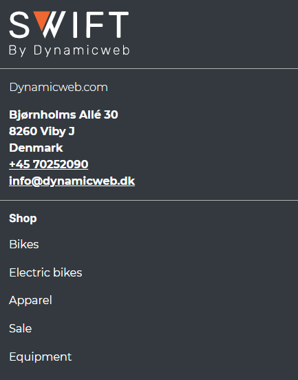
- Add a 1 column row - flex to the footer
- Add a logo column tot the empty column
- Write a logo name or add an image as logo
- Set the logo width and the horizontal alignment
- Choose where the logo will link to
- Add a 1 column row - flex
- Add a text column to the empty column
- Write a title, subtitle or text
- Choose the alignment
- Add a 1 column row – flex
- Add a navigation column
- Write a navigation title
- Choose a navigation root, orientation, and alignment
- Choose a layout