Presets & Building Blocks
The Swift content model uses Dynamicweb's Visual Editor to create preconfigured blocks of content – presets – which are used by editors to create content on a website. Swift provides you, the designer, with a set of building blocks (rows & columns) for creating the presets – they can be used to create many different types of designs with a look and feel matching the customer’s desired look.
The overall concept is therefore that during the project phase, the design team creates an appropriate set of finished building blocks that fits the client’s brand, business needs, and aesthetic profile for the end-users to use when creating content.
These presets will help the end user to:
- Create content faster
- Keep new content aligned with the design
- Focus on creating great content instead of fiddling with design details
With the right set of presets, an editor will simply drag a preset onto a page, make some minor modifications, and… that’s it! Great looking content in only a tenth of the time it would take them to set it up from scratch. If for some reason the customer does not have an appropriate preset available, they can use rows & columns to create content from scratch – but we do strongly recommend that you help them out by providing them with presets matching their business needs and line of business.
The Swift demo-website features a set of page, column, and row presets appropriate for a bike shop – you can use these as an inspiration for what can be done using the different content elements.
Below you will find example presets for a landing page. A good landing page can stand alone and can introduce the customer to the brand and the business. It should contain a visual presentation of both the brand but also the product being sold, as this helps convert visitors to paying customers. Some of the presets which are often useful for editors on a landing page are:
- Product slider – highlight specific products, e.g. most sold or trending products
- Showcase product – showcase a specific product alongside some cool text, images, and a link to the product details page
- Showcase news elements – a preset which shows off 3 news articles
- Showcase product categories – a preset showing off 3 product categories
Here’s an example of how to build these presets.
Example: Product Slider
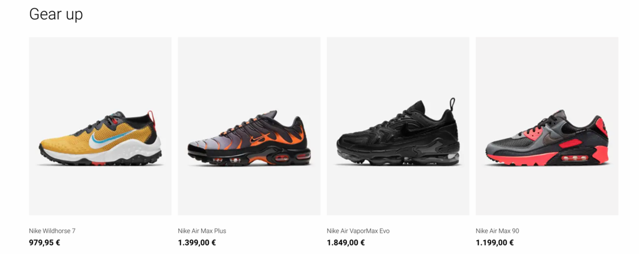
A Product Slider shows off specific products, e.g. most sold or trending products (Figure 2.1).
To create a product slider:
- Add an empty row of the type 1 Column to the page
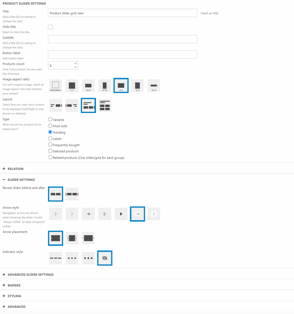
- Add a Product Slider column to the row – then configure it (Figure 2.2)
- Provide a title and check/uncheck hide title as appropriate
- Select a layout
- Select a type and add a relation
- Take a screenshot of the row as it looks in the visual editor/frontend
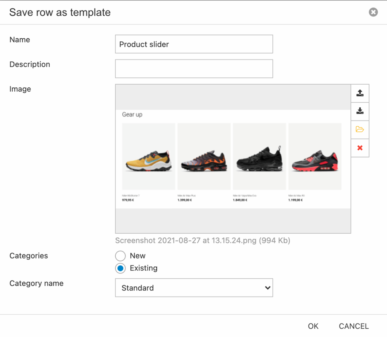
- Hover over the row and click Save row as template (Figure 2.3):
- Name the preset
- Insert screenshot of the preset
- Select/create a category
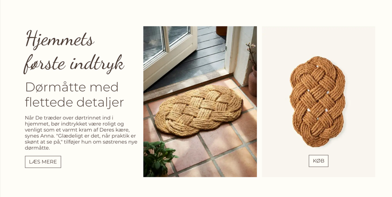
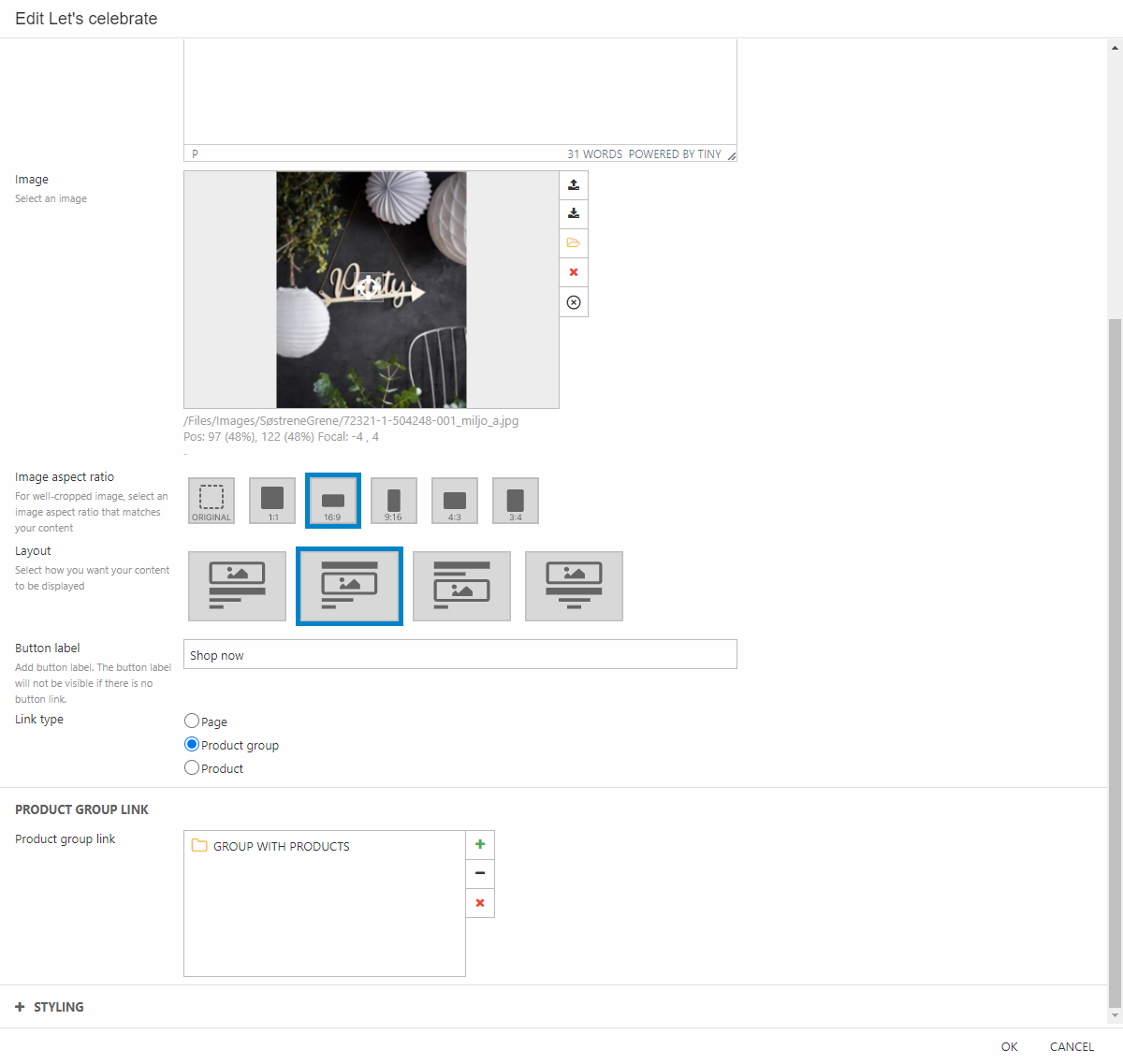
Example: Showcase product
A showcase product preset is used to highlight a specific product – in this case it features some cool text, images & a link to the product details page (Figure 3.1).
To create a preset like this:
- Add an empty row of the type 3 Columns
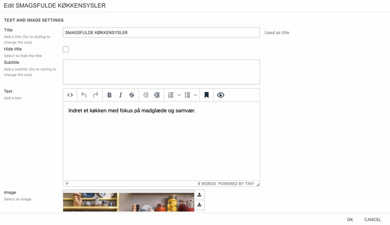
- In column 1 add a text – then configure it (Figure 3.2):
- Write a title, subtitle, and text
- Add a button label
- Select a link type – and link to something
- Style the column to match the wanted style

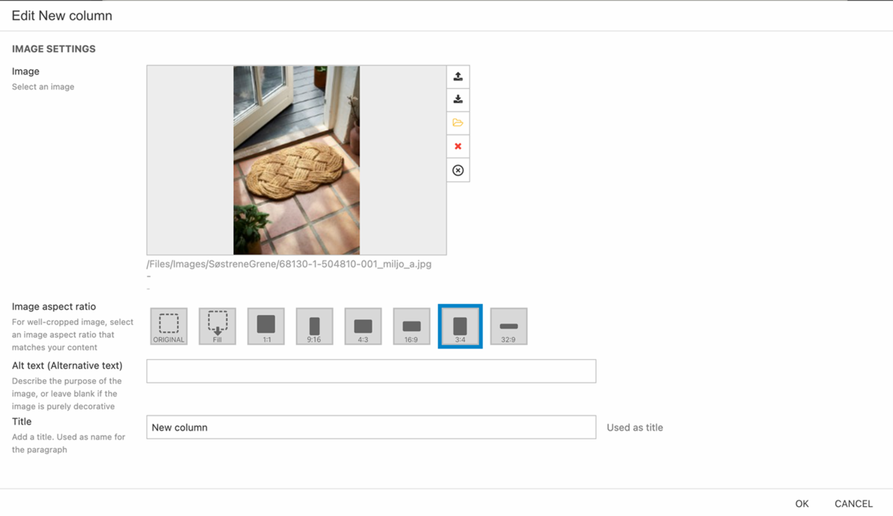
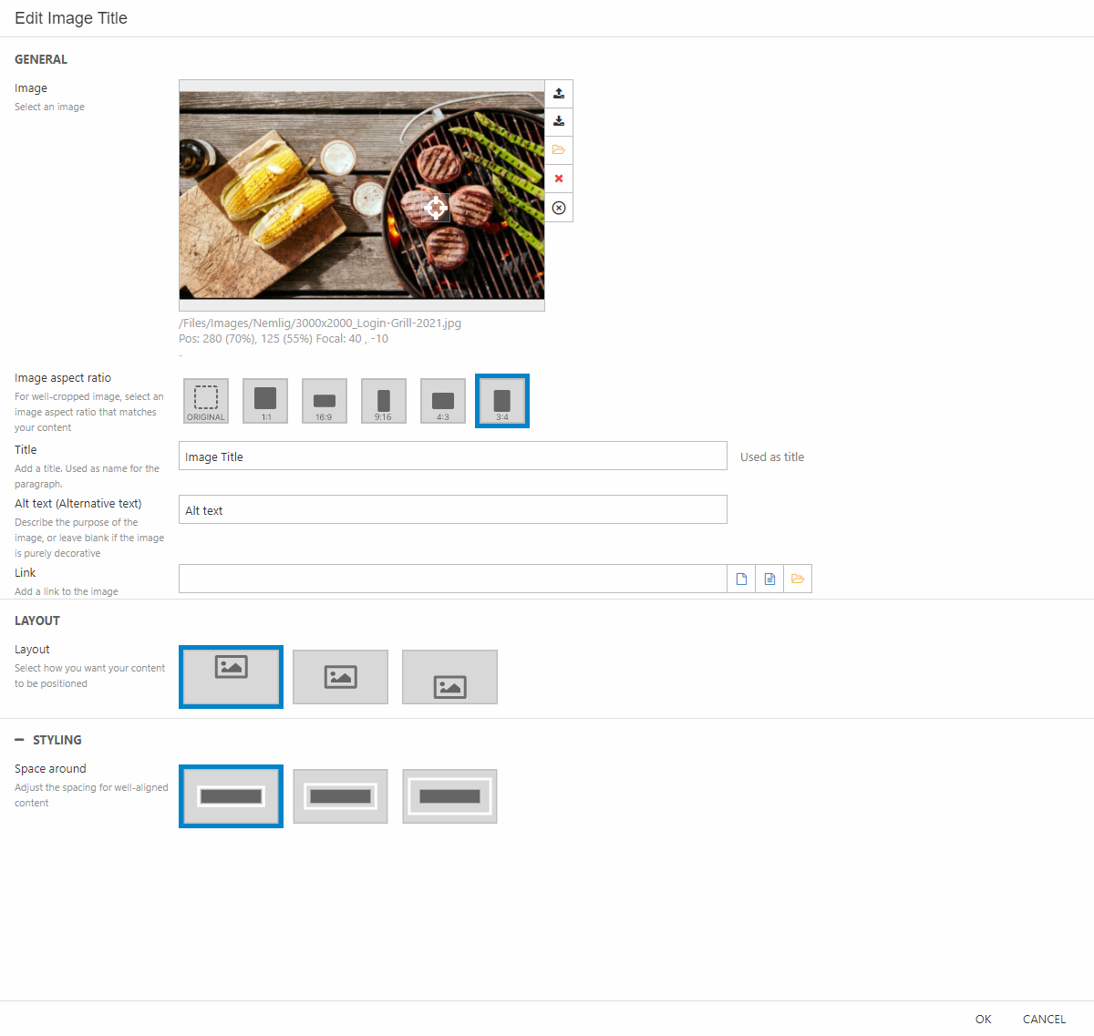
- In column 2 add an image column – then configure it (Figure 3.3):
- Insert an image
- Set the image aspect ratio to 3:4
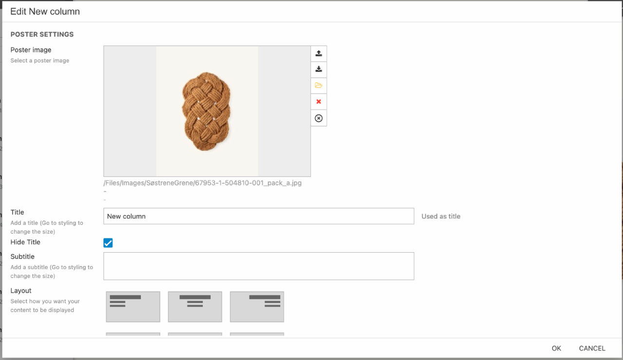
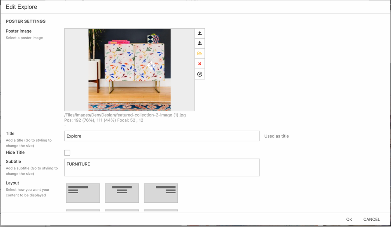
- In column 3 add a poster column – then configure it (Figure 4.1):
- Insert an image
- Check Hide title
- Write a button label
- Set link type to product and add link to the product
Once you’re happy with the look and feel of the preset you should save the row as a preset:
- Hover over the row and click Save row as template
- Name the preset
- Insert screenshot of the preset
- Select/create a category
Example: Showcase news elements
Often customers spend a great deal of time creating content marketing articles – and they typically want to show off some of the most popular or relevant of these on a frontpage (Figure 5.1).
To create this preset:
- Add an empty row of the type 3 Columns
- In each column add a text and image column – then configure it (Figure 5.2):
- Provide a title and text
- Add an image
- Add a button label
- Set the link type to Page and link to the appropriate page
Once you’re happy with the look and feel of the preset you should save the row as a preset:
- Hover over the row and click Save row as template
- Name the preset
- Insert screenshot of the preset
- Select/create a category
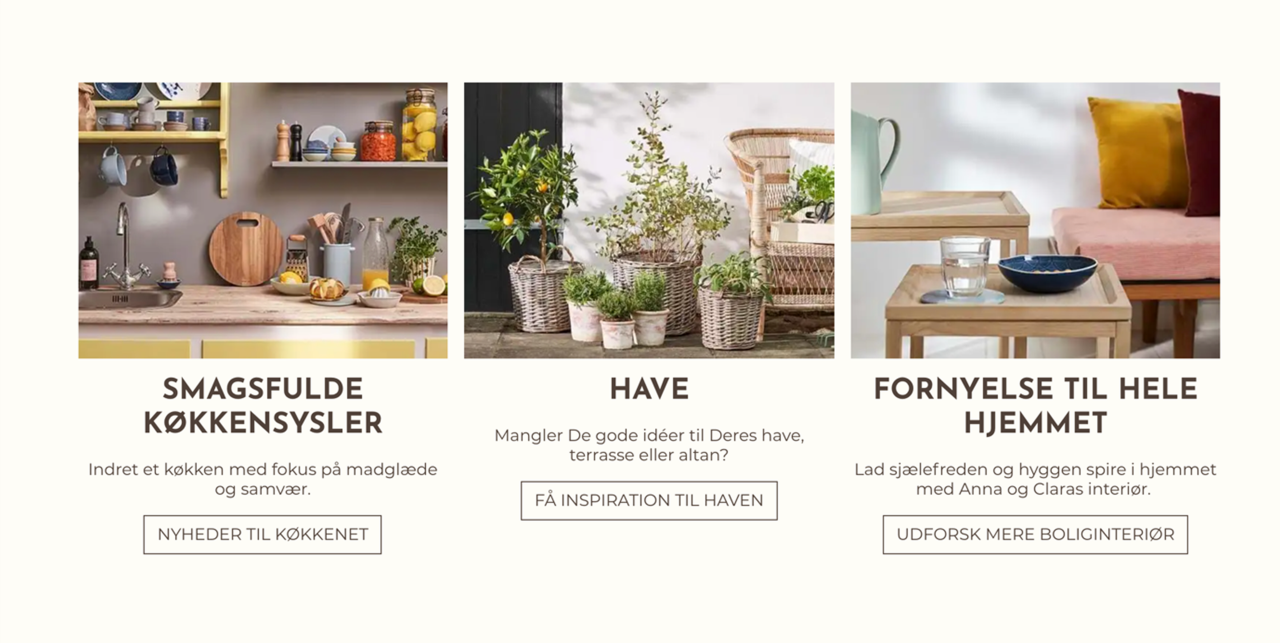
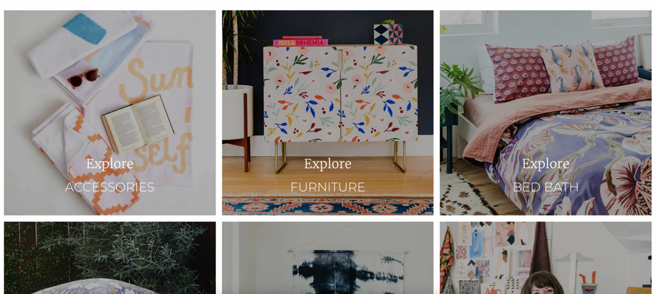
Example: Showcase product categories
In a similar vein an editor also often has a need to highlight select product categories (Figure 6.1) – e.g. seasonal categories or just best-selling categories.
To create a preset for this:
- Add an empty row of the type 3 Columns
- In each column add a poster column element – then configure it (Figure 6.2):
- Insert an image
- Provide a title and a text
- Set layout to center bottom
- Set the link type to Product group and link to the appropriate product group
Once you’re happy with the look and feel of the preset you should save the row as a preset:
- Hover over the row and click Save row as template
- Name the preset
- Insert screenshot of the preset
- Select/create a category
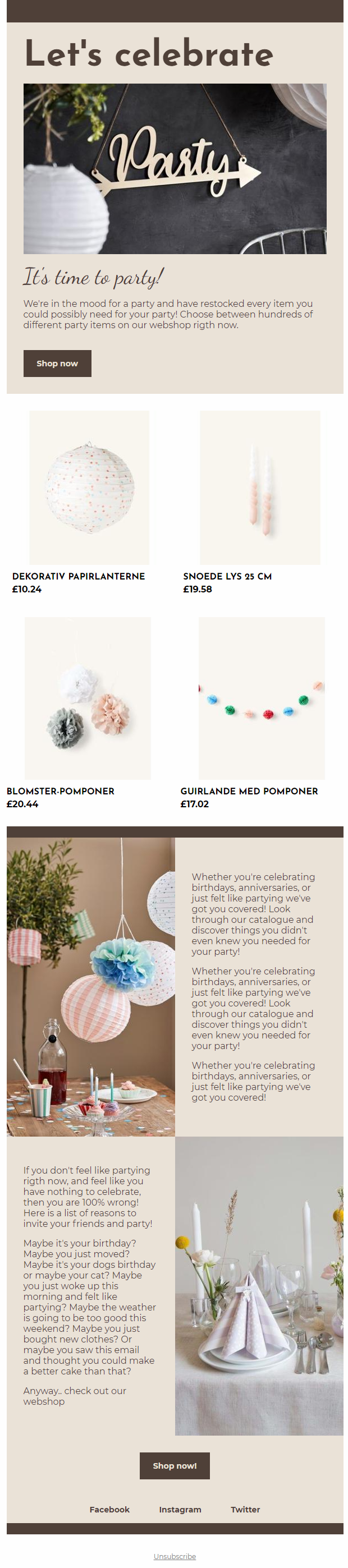
Example: Newsletter Campaign
A newsletter is a powerful tool to use when informing customers about new campaigns (Figure 7.1).
To create a new newsletter, hover the folder “Newsletter” in the content tree on the left. Either click the three vertical dots or right click on the folder. Click “new page” and in the “Add empty page” section click “Newsletter”. Give it a suiting name and hit “Ok”.
The dark brown lines, that are used as section dividers are just empty headers with a dark brown theme. To replicate this:
- Add the empty row called 1 Column Row to the newsletter.
- Add a section header column to the row and choose a theme.
- Delete what’s written in the title section and leave it empty.
This column isn’t customized that much. The main thing to look at is the “Space around” in the column settings. This will change the height of the section divider.
To make the editor process as smooth as possible we suggest that you make presets of the different rows. The “section divider” row would be ideal to make a preset of as the editor might not figure this one out themselves. To create a new preset, follow these steps:
- Hover over the row and click Save row as template
- Name the preset
- Insert screenshot of the preset
- Select/create a category
If you need more information about making presets, we recommend you check out our guide about presets.
The next thing in the newsletter is the column Text and Image. This is also placed in a 1 column Row:
- Add a new empty 1 Column Row to the newsletter.
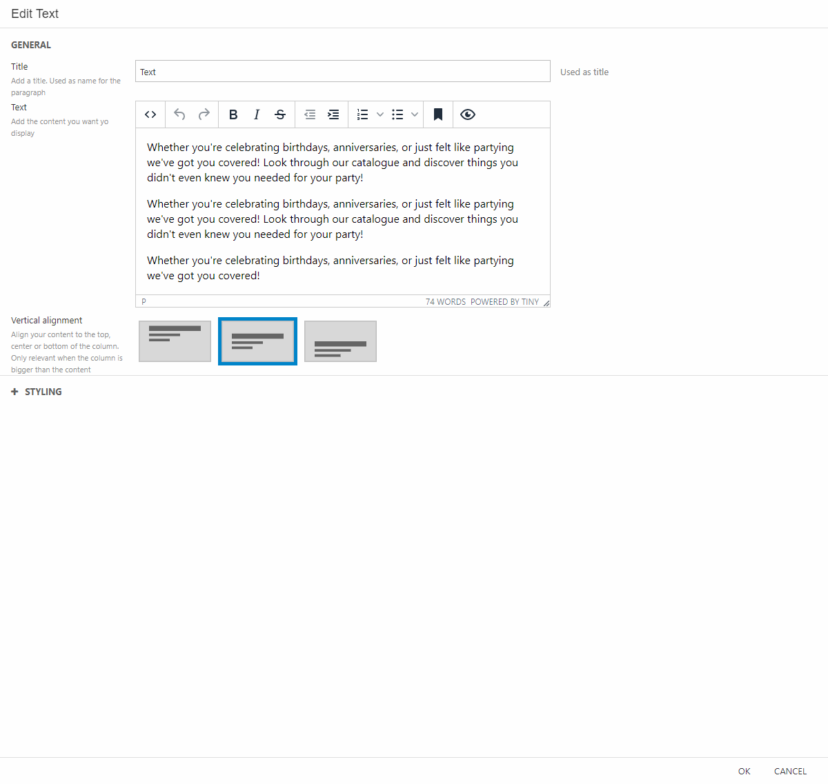
- Add the column called Text and Image, and configure it as shown in Figure 7.2.
- Give it a title, subtitle, and a text.
- Choose a suiting image. If it’s a tall image, remember to set the focal point.
- Add a button label and choose where the button should link to.
- Again, for styling the main thing to focus on is “Space around”. In this is example we’ve chosen maximum space around.
In the third row we want to display some of the products involved in the campaign.
To make something like this:
- Add the empty row called 1 Column Row to the newsletter.
- Add the Product Catalog to the row. The way we’ve customized the column (Figure 7.3) is:
- Adding a title (this will not be shown on the newsletter)
- Picked out four items involved in the campaign and where the customer will be linked when clicking the items.
- For styling we’ve chosen no theme and chosen medium space around.
After the product catalog we’ve added another section divider. This is done the same way as the first empty section header explained earlier in the example.
The next two rows are based on the same principle and are combinations of text and a picture. These two will require customization in both the row settings and the column settings.
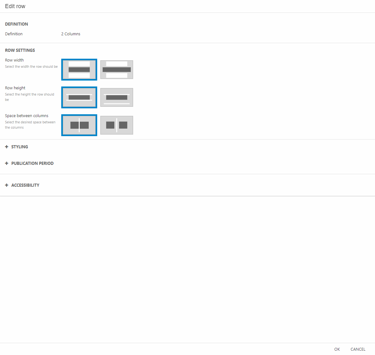
- Add an empty 2 column Row to the newsletter.
- In the row settings (Figure 8.1) make sure to leave no space between the columns and no space between the rows
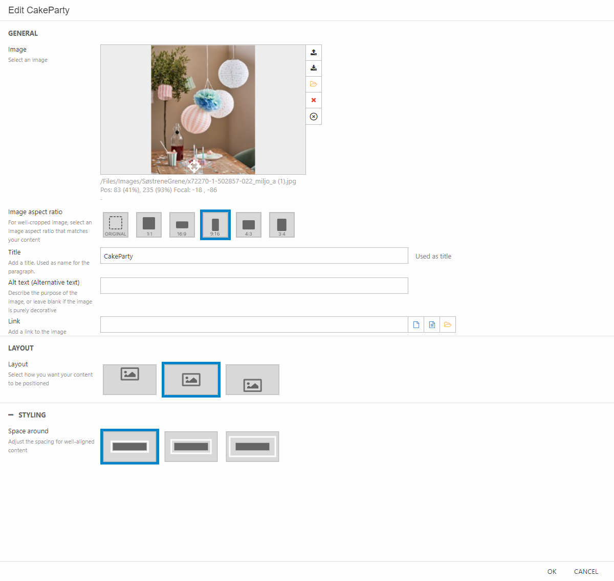
For the image column settings (Figure 8.2) do the following:
- Add an image column to the first empty column section.
- Choose the image and set the focal point. Set the image aspect ratio to 9:16.
- Make sure to set the space around to no space around.
For the next empty column section in the row follow these steps:
- Add a text column to the column section.
- Give it a title (This will not be shown in the newsletter) and write some text.
- Set the vertical alignment to centered.
- For styling we’ve matched the theme of the newsletter. Set the Space around to the maximum space around.
The next row is made in the same way. You just add the text column to the first column section in the row and the image to second column section.
To guide the customer to the shop, we’ve added a button column. To match our styling do the following:
- Add the empty row called 1 Column Row to the newsletter.
- Add the button column to the row.
- Give the button a label and a link, for layout we’ve centered the button both vertical and horizontal.
- Set the space around to max.
The last interactive thing we’ve added to our newsletter is some navigation. We’ve used it as a kind of footer with links to our social media pages.
To replicate this as shown in Figure 9.1 follow these steps:
- Add the empty row called 1 Column Row to the newsletter.
- Add the navigation column to the row.
- Give the column a title (This will not be shown in the newsletter). Set the navigation root to your social media folder.
- Make the horizontal alignment centered.
As a last row, we’ve added a “section divider”. Again, this is done in the same way as explained earlier in the example.
And there you have it. That’s one way of doing a nice-looking newsletter. As a concluding point we’ll remind you to make presets of the different rows in your newsletter to help the editor.
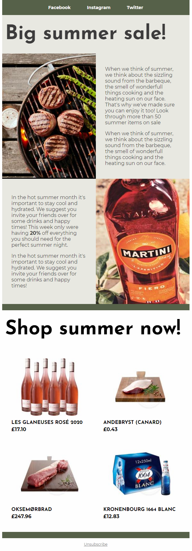
Example: Newsletter Sale
Newsletters are often used to inform customers about upcoming event. In this example the company has an upcoming sale and want to both inspire the customer and display items on sale.
As mentioned in the newsletter campaign example above, we recommend making presets for the editors to use, when they need to make new newsletters. To create a new preset, follow these steps:
- Hover over the row and click Save row as template
- Name the preset
- Insert screenshot of the preset
- Select/create a category
If you need more information about presets, you can read more about them here.
First thing we’ve added in this example is a kind of header. The header is displaying links to different social media pages of the company.
To replicate our header, follow these steps:
- Add a 1 column row to the newsletter.
- Add a navigation column to the empty row.
- Give the column a title (This will not be shown in the newsletter) and choose the right navigation root. In our case that’s the social folder.
We’ve added a section header to inform the customer about the subject of the email. This is done by:
- Add a 1 column row to the newsletter.
- Add the section header column to the row.
- Give the header a title and decide how the layout should be. We’ve made it align left, but vertically centered.
For the next two rows we’ve used the same styling but changed the combination. We’ll show how to the first row, and then you should be able to replicate the other.
- Add a 2-column row to the newsletter.
- Change the row settings, so it’ll have no space between the rows and no space between the columns. (Figure 10.3).
Using this setting for both rows will give you the same pattern as in our newsletter example. Next up you need to add the columns.
- Add an image column to the empty column section in the row.
- Choose an image, set the focal point, set the image aspect ratio to 3:4. In the Styling section, make sure to have no space around. (Figure 11.1)
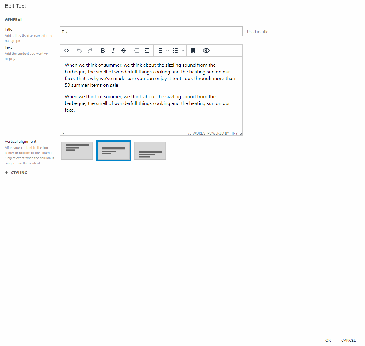
Next, we’ll add a text column (Figure 11.2):
- Add the text column to the last column section of the row.
- Write your text in the text area of the settings and make the vertical alignment centered.
- For styling make sure to set it for maximum space around.
To close the text area and make a border between the introduction part of the email and the displayed products, we’ve made a kind of “section divider”. This is made by an empty section header with a different colored theme – we’ve matched it with the theme of the header. To make one yourself, follow these steps:
- Add an empty 1 column row to the newsletter.
- Add the section header column.
- Delete what’s written in the title area and leave it empty.
- Choose a theme that would create the same border illusion.
- If you want to adjust the height of the “section divider” this is done by changing the space around in the Styling section.
The “section divider” row would be ideal to make a preset of as the editor might not figure this one out themselves.
For the next part of our newsletter, we want to display the products on sale. First, we’ll start with a section header. So once again:
- Add an empty 1 column row to the newsletter.
- Add the section header column.
- Give the header a title. For layout we’ve chosen the bottom-left corner.
- In Styling give it medium space around.
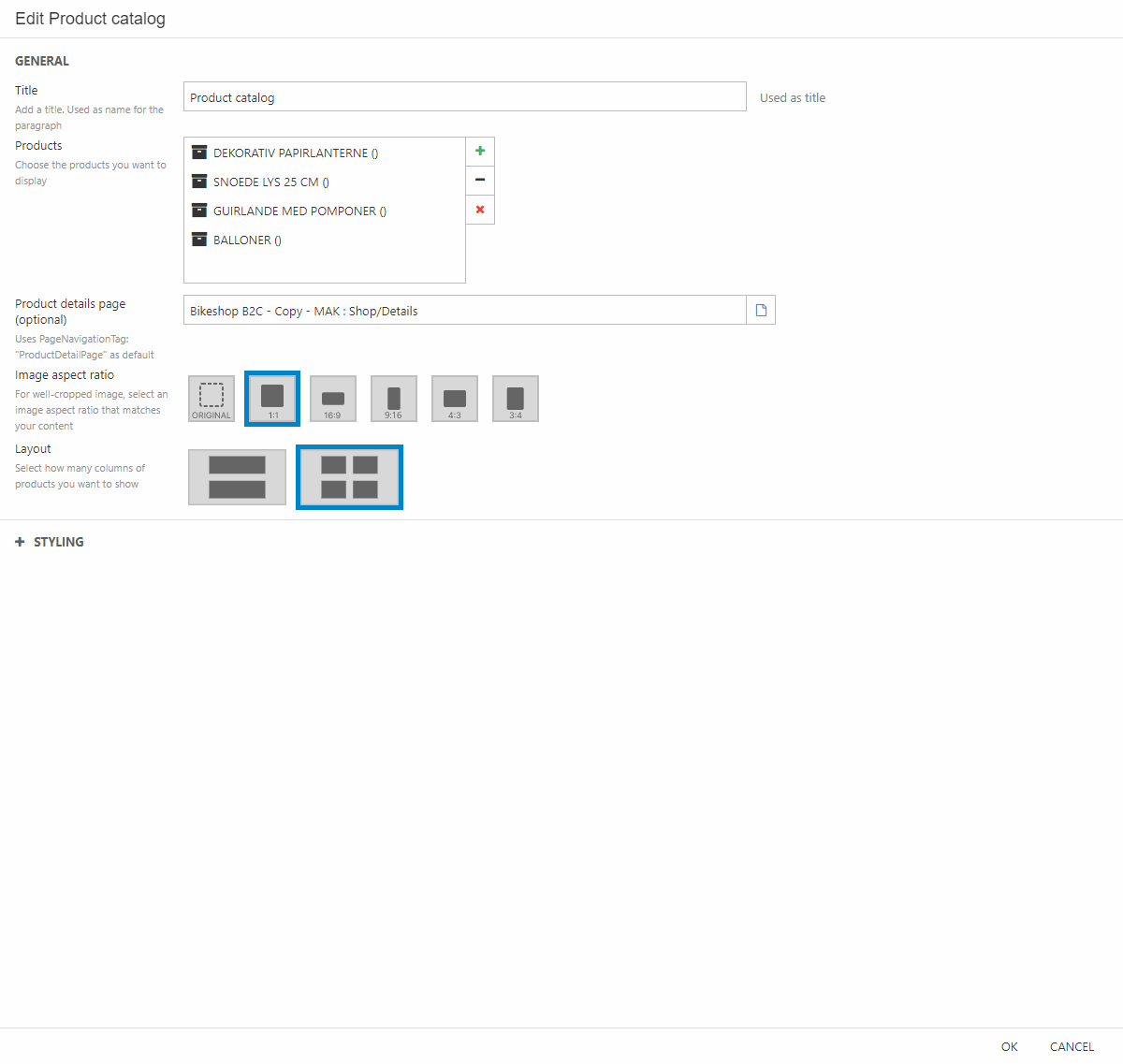
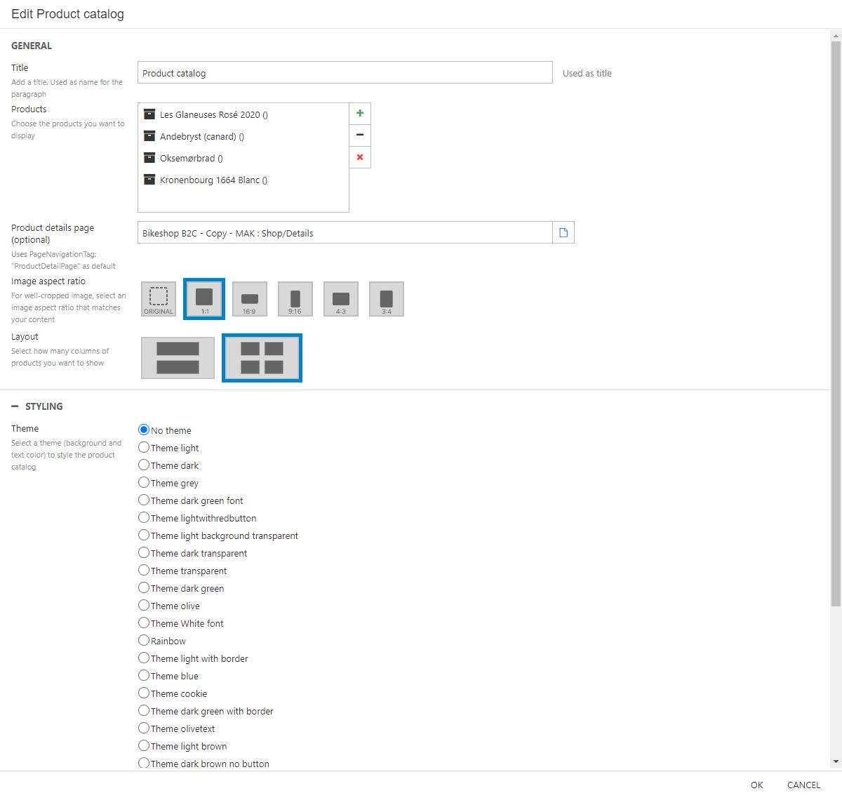
Now we want to display the actual products (Figure 11.3).
- Add an empty 1 column row to the newsletter.
- Add the product catalog column to the row.
- Give the column a title (This will not be shown in the newsletter). Select four of the products on sale and choose where the products will link to, when the customer clicks them. You probably want that to be “shop/Details” as shown in Figure 11.3.
- Set the image aspect ratio to 1:1 and the layout to two columns per row.
- For styling make sure to choose “no theme” and have maximum space around.
As the last thing we’ve added a “section divider” again. This is done in the same way as shown earlier in this example.
When that is done, you’ve made a newsletter informing your customers about an upcoming sale, well done!
Example: FAQ page
A FAQ page is an easy way to give some general answers to questions often ask by the customers.
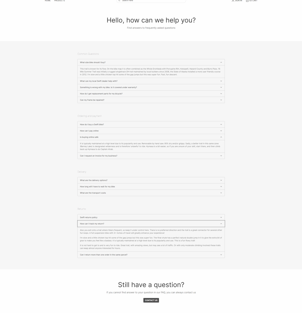
We’ve started the FAQ page with a greeting to the customer. This is made by a simple text column with a title and a subtitle.
Beneath the header we’ve used four accordion columns to group the FAQs into different subjects.
To replicate these rows, do the following:
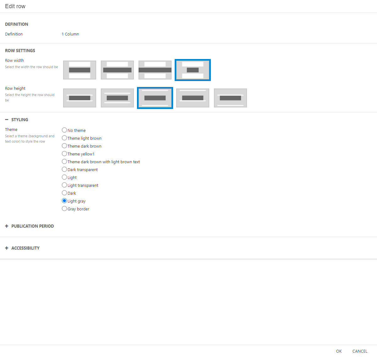
- Add an empty row beneath your header.
- In the row settings (Figure 13.2) change the row width to the narrowest and the row height to the one with max space above and beneath the row.
- Additionally, you can change the theme to create the same design as ours.
When all the row settings are done, it’s time to add the accordion column:
- Add the Accordion column and give it a suiting title. (E.g., “Common Questions” or “Delivery”).
- Enter the FAQs and answers related to the subject and hit OK. Your answers are written in the text editor, and can contain images, links, headers, etc.
To replicate our example, do the same steps as above again, though with different subjects and answers, to answer as many FAQs as needed.
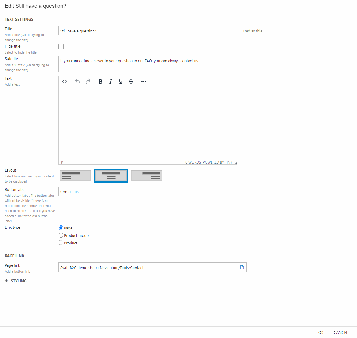
At the bottom we’ve made a button which will guide the customer to the contact page. This is for questions not answered by the accordions.
To make this button:
- Add an empty 1 column row at the bottom of the page.
- Set the same settings as the other rows (row width and height), though set the theme to “no theme”.
- Add a text column and give it a title and subtitle (Figure 13.3)
- Write a label for the button and choose where to link it. As mentioned, we linked it to the contact page.