
Rows
You can use rows to decide the amount and layout of the columns before content is added. Rows can consist of multiple columns depending on how you want your content to be showed. Below you can see which row types you can choose between, when you are about to place and structure your content.
Some row types are available when you create your header, others when you create your footer and landing page. Below you can see a list of row types (Figure 1.1).
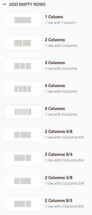
A row consists of 12 columns divided into sections (confusingly also called column). The following column configurations exist:
- 1 column
- 2 columns
- 3 columns
- 4 columns
- 6 columns
- 2 columns 8/4
- 2 columns 3/9
- 2 columns 9/3
- 2 columns, flexible sizes (only available for footer)
- 3 columns, flexible sizes (only available for footer)
- 4 columns, flexible sizes (only avaiable for footer)
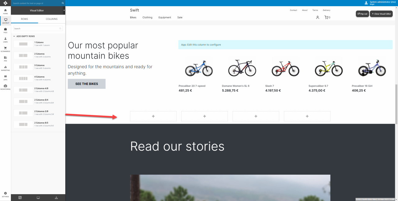
When you add a row to a page, it shows up in the visual editor with a placeholder for each column - here 4 columns (Figure 1.2). You can then drag & drop columns onto the placeholder to create content.
Row settings
Hover over the row and click the pencil-button to open the row settings (Figure 2.1).
The row settings allow you to tweak, style and customize the behavior and design of the row.
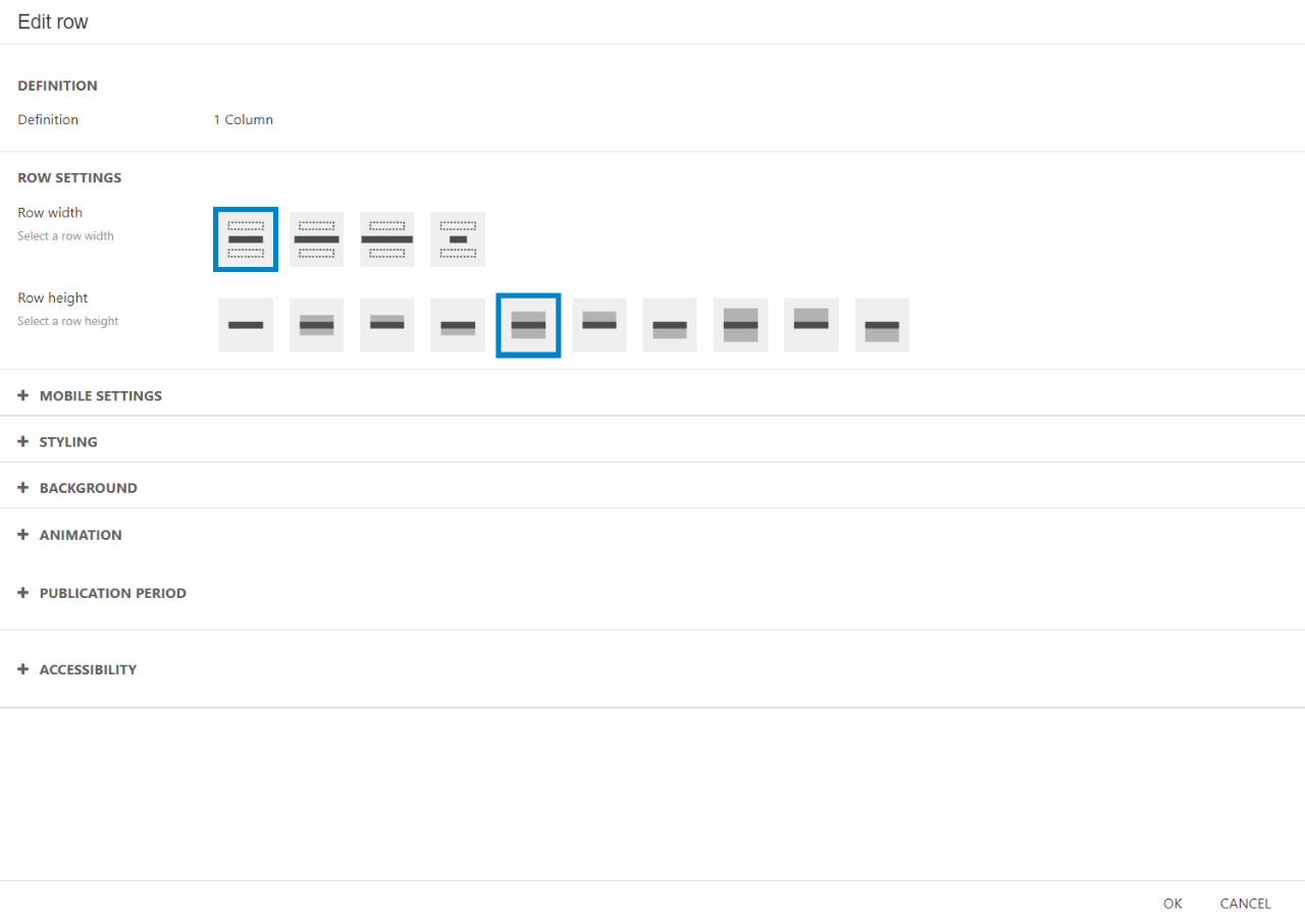
In the Row settings section you have some styling options:
- Row width - This selects how wide you want each individual row to be. As the viewport can vary in width depending on the screen size (mobile vs. monitor) you have the option to configure the width of the breakpoints. This is done in the website settings as shown in this documentation.
- Row height - Select the height of the row. Choose between no height, small, medium or large height.
- Space between columns - Choose how close the columns in the row should be placed.
Beneath will follow a walkthrough of the other setting sections in the row settings.
Mobile settings
The Mobile settings section is for you to control how the row should behave when shown on smaller screens such as mobiles. These can either inherit behavior from the Row settings section or individually configured.
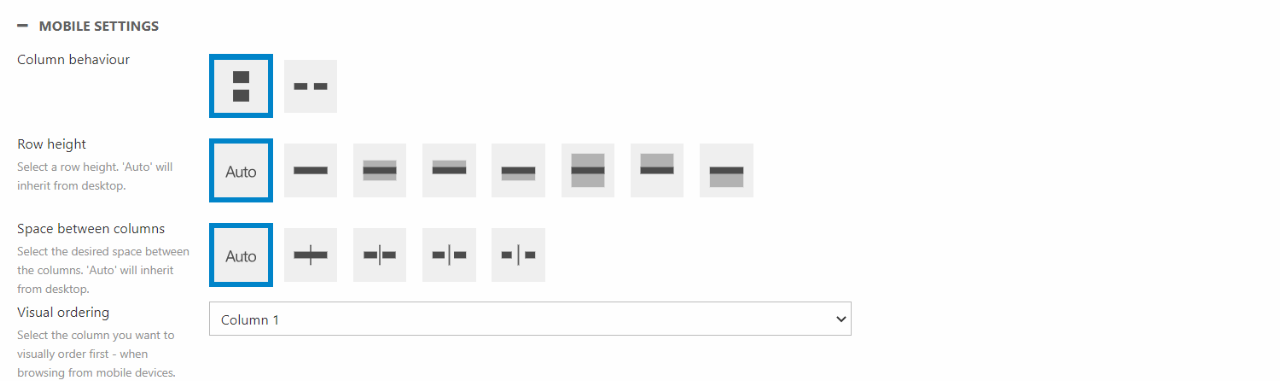
In the Mobile settings section you have the following setting options:
- Column behaviour – This is only available on rows with more than one column. It specifies how rows will split on smaller screens. It can either be rows of one column or rows of two columns.
- Row height – Row height controls how much free space there will be above and/or beneath a row. “Auto” means the mobile settings will inherit the settings from the desktop settings.
- Space between columns – As the name suggest, this controls the space between columns. Even though the icons of this setting shows it as the horizontal space, it also controls the vertical space between the columns.
- Visual ordering – The visual ordering tool allows you to prioritize one column in front of the others. If you want the third column to be shown above the others, you can select “Column 3” in the dropdown. The other columns will still follow the original order. The order will then be “3, 1, 2, 4”.
Styling
The styling section only controls the theme of the row. This is mainly used to choose the style of the row but is also relevant for other row settings such as Background.
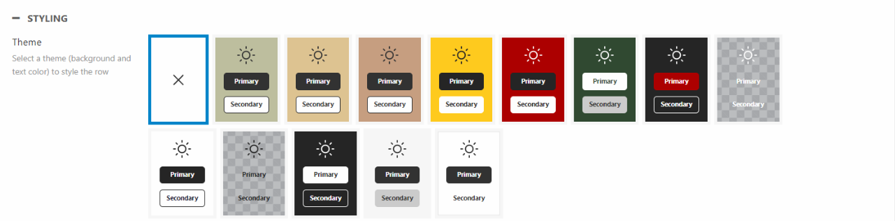
Themes are an essential part of styling the appearance of the rows and therefore the whole website. Existing themes can be edited to suit your purpose or new themes can be created if you should need that. You can read more about this in our Themes documentation.
Background
The row background section contains settings for background image and gradient for rows. This means that you can add an image, icon, or color as a background inside the row. You can still place whatever column you want on top of it.
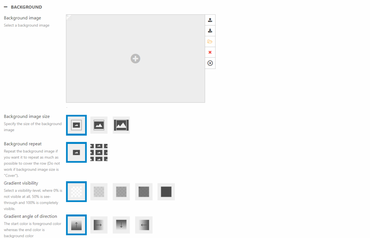
You can create various designs when combining images and gradient or using them separately. Instead of explaining every design possible, we will highlight some of the main features to help explain the tool.
- Gradient
- The color of the gradient is controlled by the theme of the row. The starting color is the chosen foreground color and the ending color is the chosen background color of theme.
- If No Theme is selected, the gradient will be white
- The gradient tool can be combined with an image if the gradient visibility is set to 25%, 50%, or 75%
- Background image
- If the background image doesn’t fit the row, the focal point will help display the important part of the image
- Choose between original, contain, and cover for the image size
- The height of the row is decided by the column displayed on the row
- Background repeat only works with the contain background image size
- Whether the repeated images will be shown horizontally or vertically is decided by the height of the row and the height of the background image
Animation
Animation on scroll lets you create visually impressive pages where columns fade in from either top, bottom, left or right.
The section is found in the row settings and are controlled through the following menu:
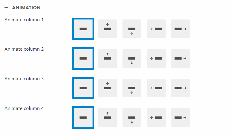
As shown on the image above, each column can be controlled individually and works indepentently from the other columns.
Publication Period
The publication period tool to control when a specific row is public.
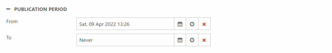
The publication period tool allows you to choose a From date and timestamp and a To date and timestamp. The tool has been explained in our Publication period documentation.
Accessibility
Accessibility allows you to choose what kind of devices the specific row will be available for.
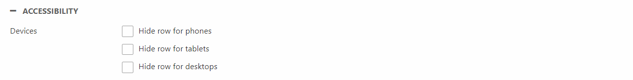
In the Accessibility settings you can choose to hide the row for phones, tablets, and/or desktops.
CSS
Rows are elements which allows customizing CSS. Using our Swift CSS collections you can assign CSS classes to rows. This will allow you to design your site exactly how you want it to look.
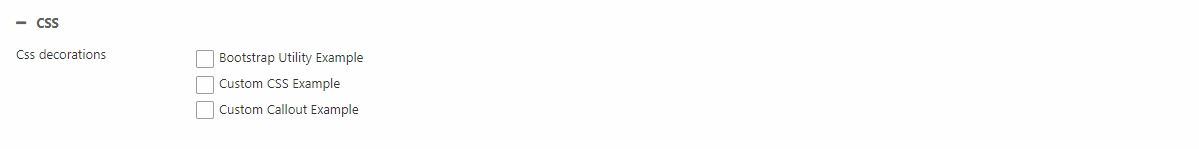
The main thing to do in this section is assigning collections to the row. If you want to know more about CSS collections and how to create them you can read about it here.