
Product Components
The product component tool is a tool that will help you customize the product list and product details pages. With this tool you will be able to design elements of the product list area, the product list card, and elements for the product details page. The tools consist of a components folder, a product list component area, and a product card component.
Through this documentation we will explain the concept of product components, the manual setup, a walkthrough of the content columns and their uses, and some examples to help explain the concept.
The product components tool
The purpose of the product components tool is to allow an easy customization of elements on the product list page and the product details page. Until now, the design of each card in the product list and the product details info column has been predetermined by our design team. As the tool has a lot of different opportunities, we recommend checking out our examples at the bottom of this guide, as these will help explain the different ways the tool can be used.
The tool consists of three elements. The component folder helps keep the pages organized and sorted. The Product list area component is for designing elements for the product list page. The product card component is both for designing product cards for the product list, but the same type of page is also used when designing elements for the product details page.
As Swift is based on a grid as seen in our Visual Editor (Figure 2.1), you previously couldn’t have vertically overlapped columns. This gave some design restrains.
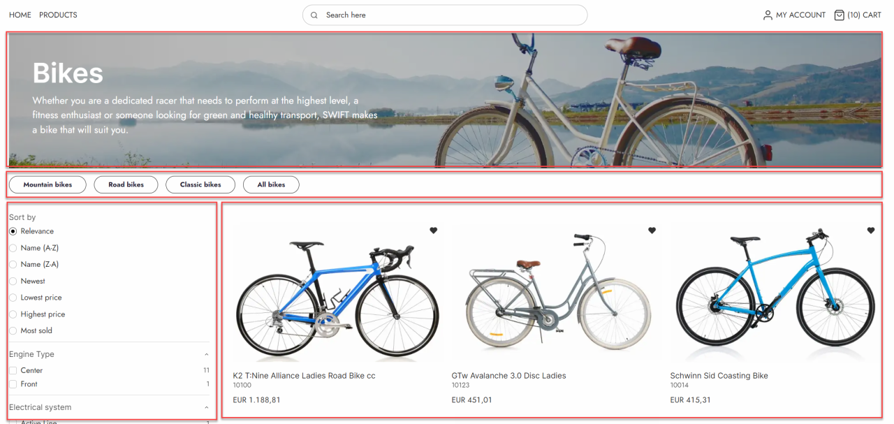
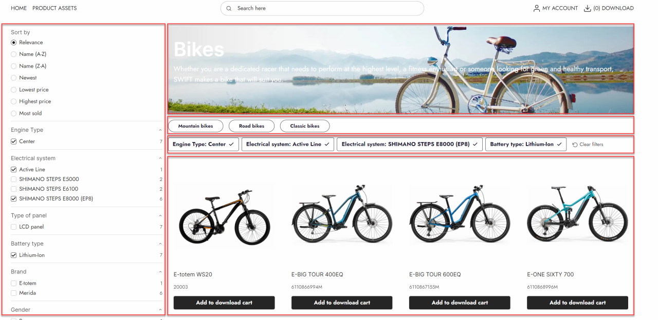
With the product components tool, you can design a new custom component column consisting of different content columns. As an example, this means that you can place a Group product poster, Group list, Selected facets, and Product list item component repeater in the same column on the product list page (Figure 2.2).
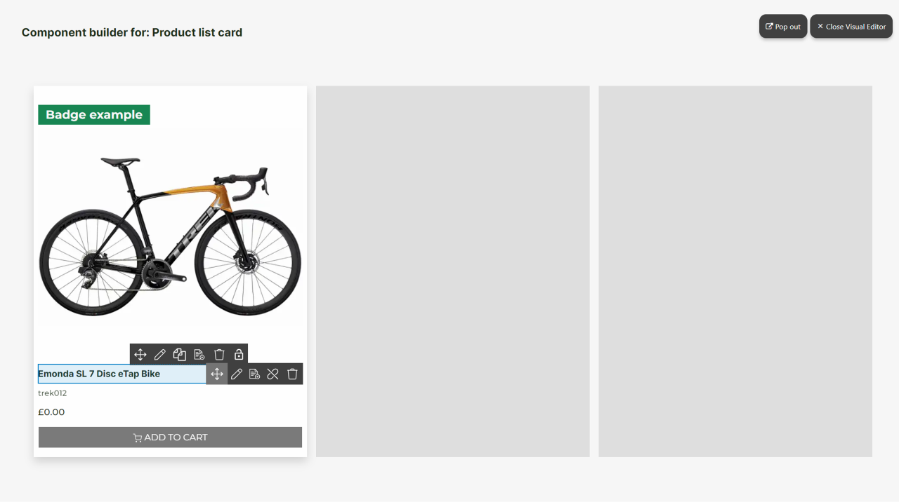
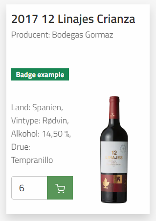
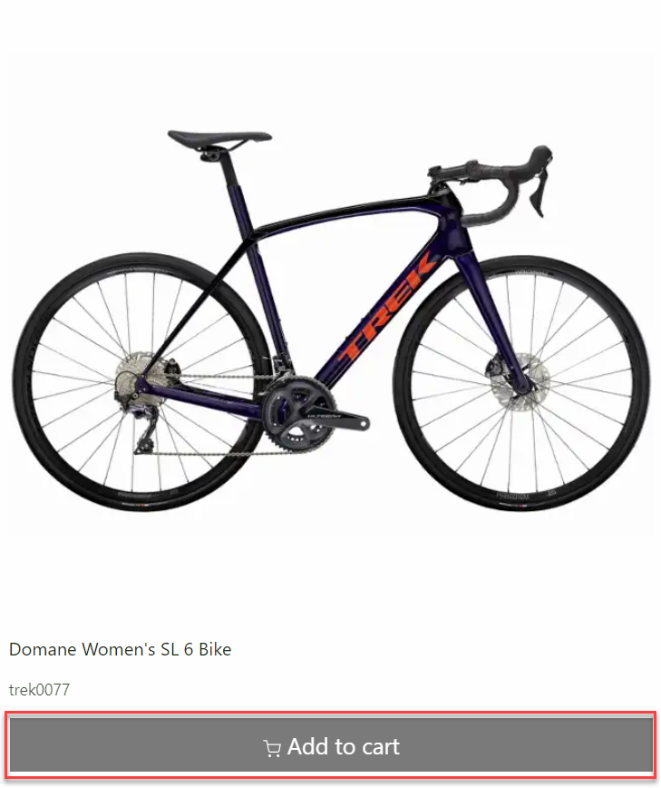
This is also possible on the product list card. Maybe you sell products with tall product images, like wine bottles, and want the product image to be next to the information instead of above or beneath it, which would make the product card taller. With the component tool you can create a custom component column that could consist of the badge column, specifications, and add to cart column. This custom component column can then be placed next to the product image as shown on Figure 2.3. This example is explained in the example section at the bottom of the page.
Product component pages configuration
The product card component and the product list area component has some simple configuration. When clicking on the pages in the content pane and clicking the page icon in the top menu bar, you can enter the page settings of the pages. On both pages you should choose a dummy product or product group. This is the product (or group) shown in the Visual Studio, when editing the component. The product list card component also allows you to select how the grid should look in the Visual Studio. This does not affect how the real grid is shown on the online shop, as this is controlled in the product list item repeater.
You can also choose a default theme for the component. This works the same way as choosing a default page theme for “normal” pages like the frontpage.
As the product card component will act as a column when chosen by the components column, you can set the Space around settings in the page settings of the product card component. This is done at the bottom of the settings page. Remember to hit save and close.
Manual setup
The product component tool should be ready as default on the newest Swift solution, however if it is not or if you want a walkthrough of how to set it up manually – here is the guide.
The first step is to create a component folder. This should be done in the Swift tools folder.
- Add a new page to the Swift tools folder.
- Choose the components folder and call it “Components”. Make it hidden in menu.
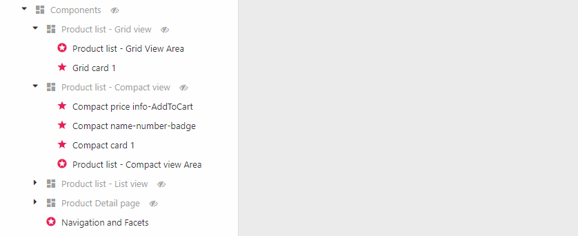
The component elements: product list area component and product card component can only be created in the component folder. You can, however, also create component folders. These can help you to structure your compont pages. An example of the use of component folders can be seen on Figure 4.1.
The folders are entirely structrural and doesn't change any settings or layout of the different component pages. We do recommend using these folders when creating component pages.
Product list area
We will start by creating the product list area component.
- Create a new page in the component folder
- Choose the Product list are component and name it “Product list area”. Make it public.
- On the Page edit page, choose a dummy product group.
- Hit Save
- Go to the Paragraph edit page and enter the Visual Editor.
- Create the design you want for the product list area component. You can look at our examples at the bottom of the page to get some inspiration.
When all this is done, you have created the product list area component. To get this integrated with your current product list design you will have to use the column called Component instead of the ecommerce column you were using to display your product list (Product list: Compact view, Product list: Grid view or Product list: List view).
Product list card
As mentioned, you might also want to design the product list card for the product list page. The product list card is the individual item in the product list. This is done by using the other type of component page: product card component.
- Create a new page in the component folder
- Choose the Product card component and name it “Product list card”. Make it public
- On the Page edit page you should choose a dummy product
- You can also choose a Visual Editor grid layout; this is to help you visualize the result. You can still only design one card.
- Hit Save
- Go to the Paragraph edit page and enter the Visual Editor.
- Create the design you want for the Product list card. You can look at our examples at the bottom of the page to get some inspiration.
When all this is done, you have created your product list card component. To get this integrated with your current product list design you will have to use the column called Component instead of the ecommerce column you were using to display your product list (Product list: Compact view, Product list: Grid view or Product list: List view).
Product detail card
Lastly you can also design the product detail card for the product details page. This is done by using the other type of component page: product card component.
- Create a new page in the component folder
- Choose the Product card component and name it “Product detail”. Make it public
- On the Page edit page you should choose a dummy product
- As this is for the product details page, it doesn’t make sense using a grid layout in the Visual Editor. Change the layout to a single column
- Hit Save
- Go to the Paragraph edit page and enter the Visual Editor.
- Create the design you want for the Product detail card. You can look at our examples at the bottom of the page to get some inspiration.
When all this is done, you have created your product detail card component. To get this integrated with your current product detail design you will have to use the column called Component instead of the ecommerce column you were using to display your product or make the customer add it to cart.
Product component content columns
When designing the different components pages you have a range of different ecommerce columns. Some have already been described in our ecommerce column documentation, while others have been created for the Product components tool.
The columns already documented are:
- Description long
- Description short
- Specifications
- Products slider / grid view
Depending on which kind of page you are designing, Product card component or Product list area component, you will have different product component columns available. We have made a walkthrough of the different Product components columns below.
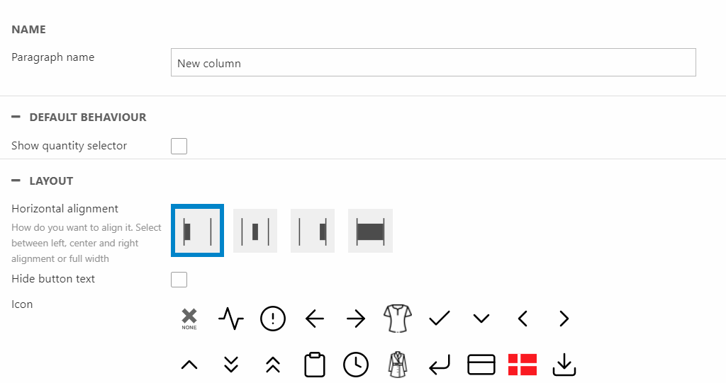
Add to Cart
The Add to Cart column supports Stock validation notification. This does require some configuration which has been documented here.
As Add to Cart also supports Purchase quantity step and Purchase minimum quantity it will do a validation, when products are added to cart. If a customer tries to add an invalid amount of products a modal will show explaining the error. Of course this does require a minimum quantity and/or step has been setup on the product. You can read more about this in our advanced configuration product fields documentation.
The add to cart column is used when you design either the product list card or product detail.
You have some design options for the add to cart column:
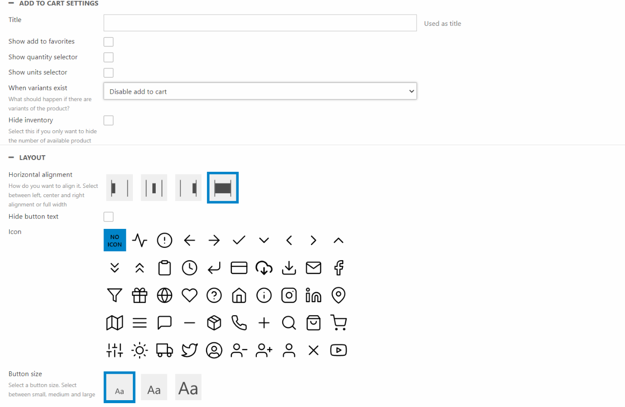
You can:
- Name the paragraph
- Choose the default behavior of the column
- Show/hide add to favorites
- Show/hide quantity selector
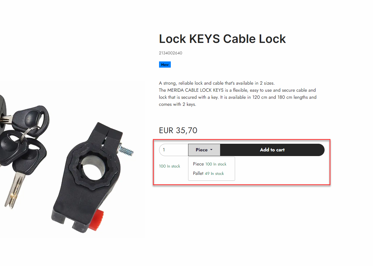
- Show/Hide Unit selector - Choosing this allows customers to add units to the cart, these are shown in a dropdown as seen on Figure 10.3. It also shows the stock status of the units. This does require that the product has Units created in the backend. You can read more about this in our PIM or Ecommerce documentation.
- Choose what happens when a product has variants - Hide, Disable or a modal selector. If a modal selector is chosen a section at the bottom will appear. Here you can link to a modal selector service page.
- Choose the horizontal alignment
- Show/hide the button text
- Choose an icon for the column
- Set the button size
Add to Download Cart
The download cart is a feature used for the Digital asset portal. Where the product files can be downloaded.
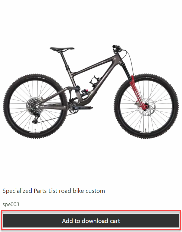
Just like the order add to cart columns you have some configuration options:
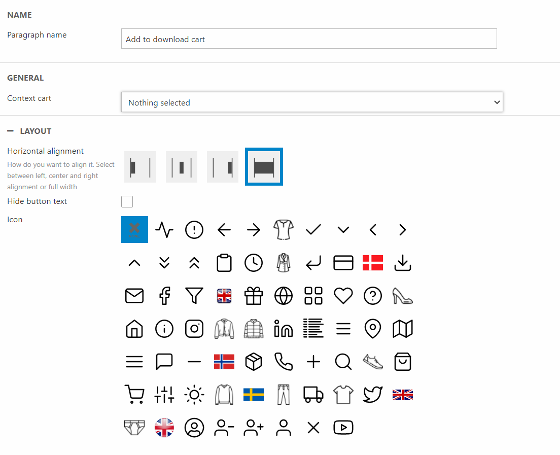
You can:
- Give the paragraph a name
- Choose the Context cart
- Set the horizontal alignment
- Show/hide the button text
- Choose the icon
Add to Favorites
The add to favorites columns are used when designing for products to be added to the favorites list.
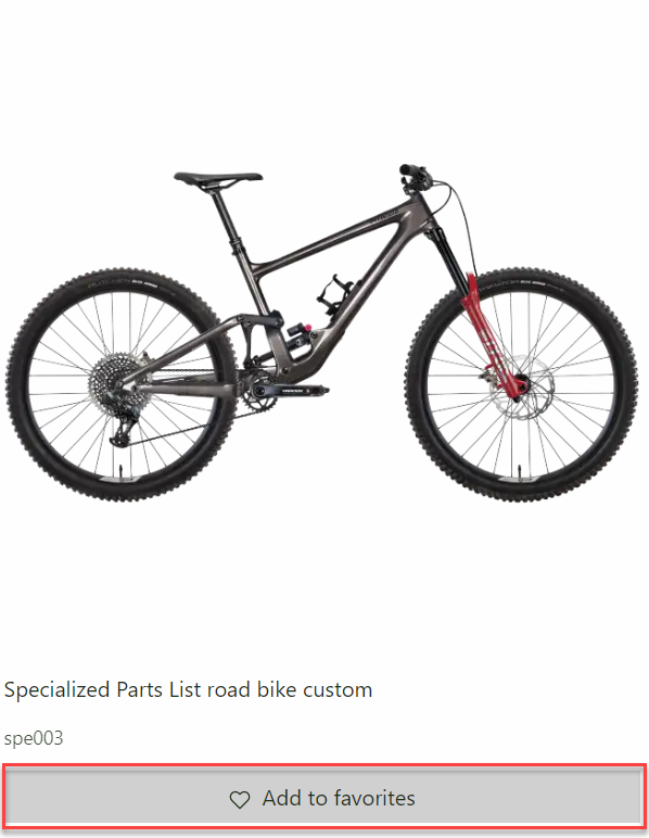
With this column you have some configuration options:
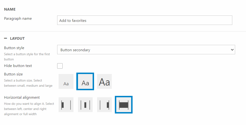
You can:
- Give the column a name
- Show/Hide favorites selector for master product
- Choose the button style and size
- Show/Hide the button text
- Set the horizontal alignment for the column
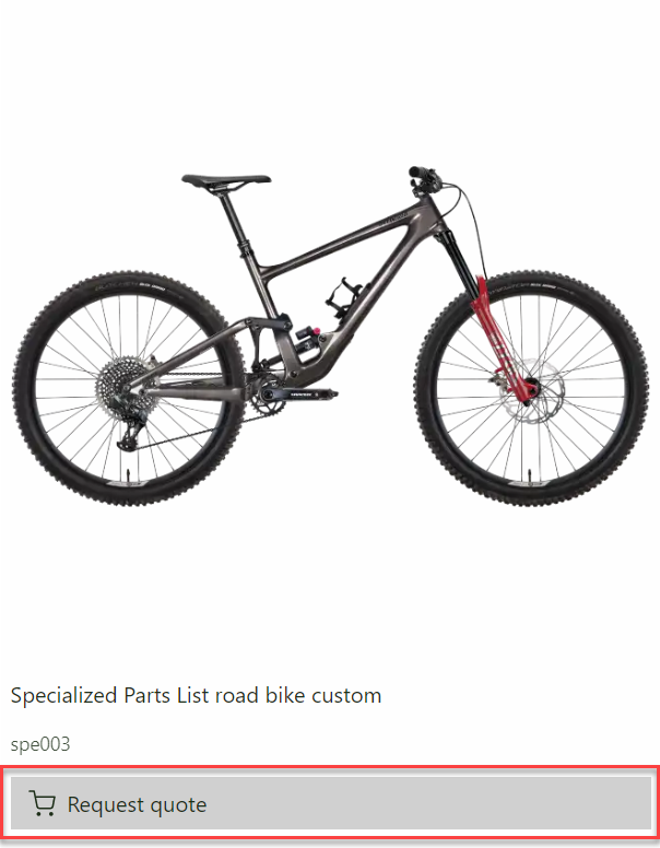
Add to Quote cart
The Add to Quote cart is used for our Quote request feature and will add the product to the customer Quote cart.
For this column you have some configuration options:
You can:
- Give the paragraph a name
- Choose the default behavior of the column
- Show/hide the quantity selector
- Set the horizontal alignment
- Show/hide the button text
- Select an icon for the button
The advanced section is optional as the fields have been configured by default. However you do have the options to specify some settings:
- Choose a context cart
- Select a Variant list service page
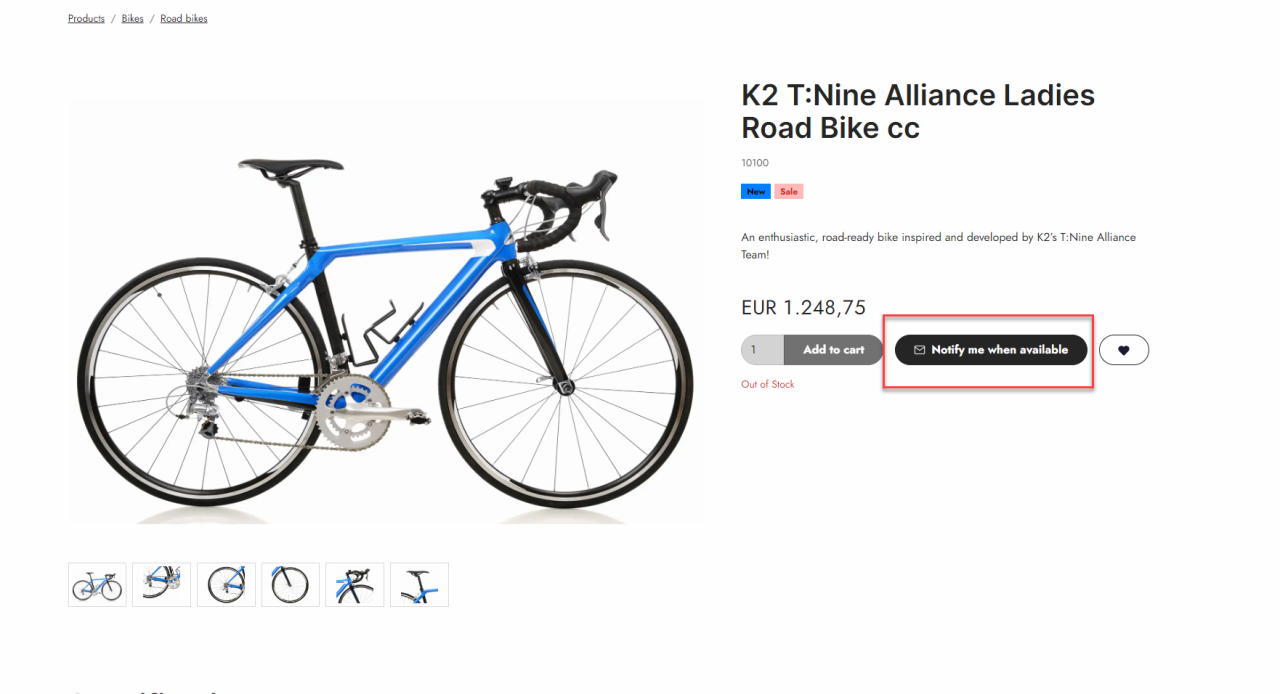
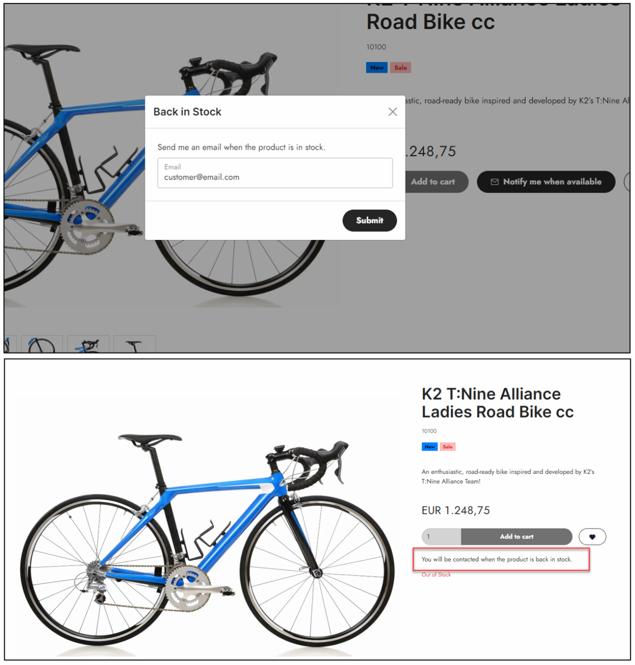
Back In Stock Notification
The product component column called Back In Stock Notification is using the Back-in-Stock notification marketing feature. This column will let customers sign up for email notifications to inform them, that the product is back in stock. As notification system is email based, we've created a column specificly for emails aswell.
This columns mainly allows styling options
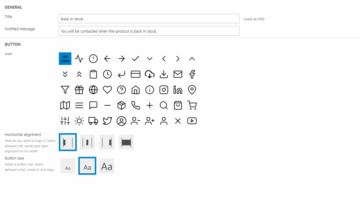
For configuration you have the following options:
- Give the column a title - this is not used anywhere on the column
- Write a notified message - this will show after the customer has submitted for the notification Figure 14.3
- Choose an icon for the button
- Set the horizontal alignment
- Choose the button size
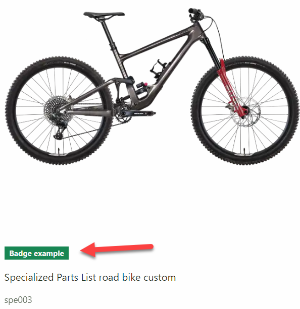
Badges
The badge feature is a tool to show the customer if a product is new, on sale or included in other types of campaigns. In ecommerce components badges have gotten their own column however the Default product image column can also display them.
The badges column has some different configurations:
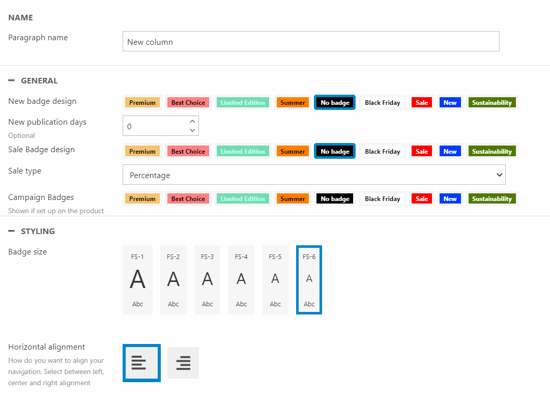
You can:
- Give the column a name
- For general settings you must configure the different campaign badges, you can read more about that here
For styling options have a few options:
- Choose the badge font size
- Set the horizontal alignment
Components
The general purpose of the component column is to create custom designed columns to be used however you want. This column is for example used when you have designed the product list card and want to include it on the product list area design. It can also be used, as shown below, to build more complex product list cards.
For the component column you only have to options:
You can:
- Name the column
- Choose the source for the component
Default product image
The default product image is a column that will display an image of the product. This could either be in the product list card and the product detail.
The default product image gives you a few configuration options:
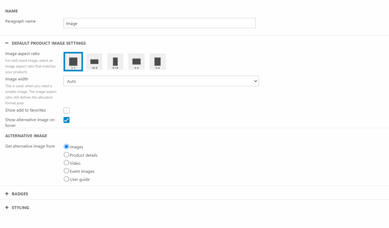
You can:
- Name the column
- Choose the image aspect ratio
- Set the image width
- Show/Hide an add to favorites button
- Show/Hide Alternative image on hover - If checked a section of where to get the alternative images from will appear. The alternative image is based on Assets categories
In the badge section you must configure your badges, you can read our badge documentation here.
For styling options, you can choose a theme.
Facets
The facets component has the same settings as the Product list facets column, which we've already documented. Have a look at it here.
Name
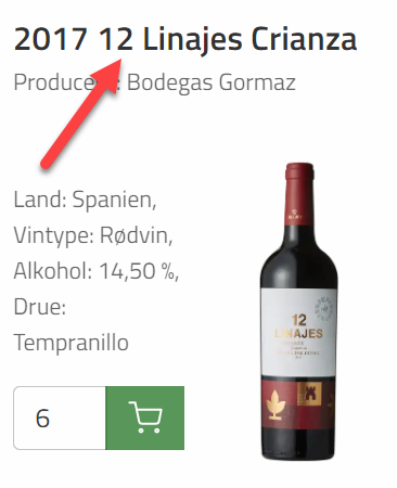
The name column displays the product name.
For configuration options you only have a few options:
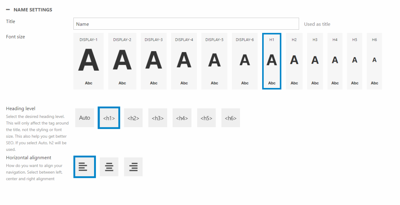
You can:
- Give the paragraph a name
- Choose the font size
- Choose the heading level of the tag around the title. This will help on your SEO. You can read more about this in our SEO documentation
- Set the horizontal alignment
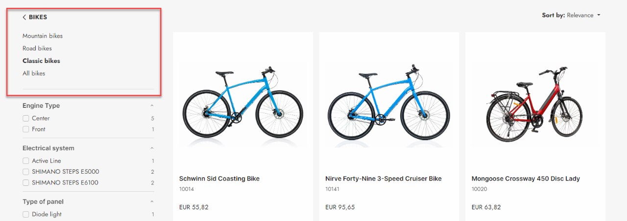
Navigation
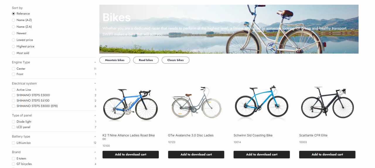
The navigation component is often used on the product list page. Here, it allows the customer to narrow down the displayed products based on product groups. Navigation can display nested product groups containing up to 9 layers.
On the example on Figure 20.1 we're displaying the product group Classic bikes which is a subgroup of Bikes.
The navigation component allows only a few configuration options.
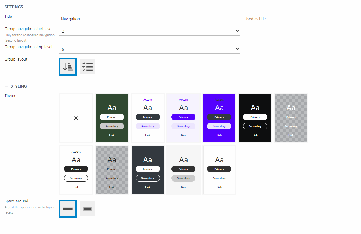
For configuration you can:
- Give the component a title
- Select a starting group navigation level - This is only for the layout type: "Collapsible"
- Set a stop level for the group navigation
- Choose the layout - "List" or "Collapsible"
For styling options the component has a few:
- Select a theme for the component
- Set the space around the component
Price
The price column will display the price of the product.
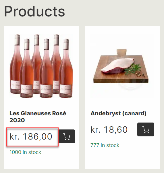
The price column configuration is mainly about styling:
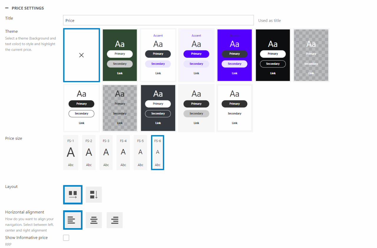
You can give the column a name.
For styling options, you can:
- Select a theme
- Choose the display size of the price
- Set the layout
- Choose the horizontal alignment
- Show/Hide Informative price - If ticked, the price component will show the Recommended Retail Price(RRP) if this has been configured in "Prices" in the product edit. You can read more about the configuration of informative prices in the Price matrix documentation.
Price table
Some products have different prices depending on the quantity of the product. You can read more about the price matrix here.
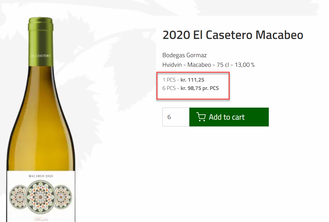
For configuration options you can:
You can give the column a name. For styling you can choose between a list or table for layout.
Product component slider
The product component slider is, as the name suggest, based on the product component tool to customize the design of the product slider. This means that you can design your own product slider cards, which then can be used in this product component slider; similar to how the product component list card works with the product list page.
As this is a product slider based on components a lot of the settings will be the same as the Product slider/Grid view.
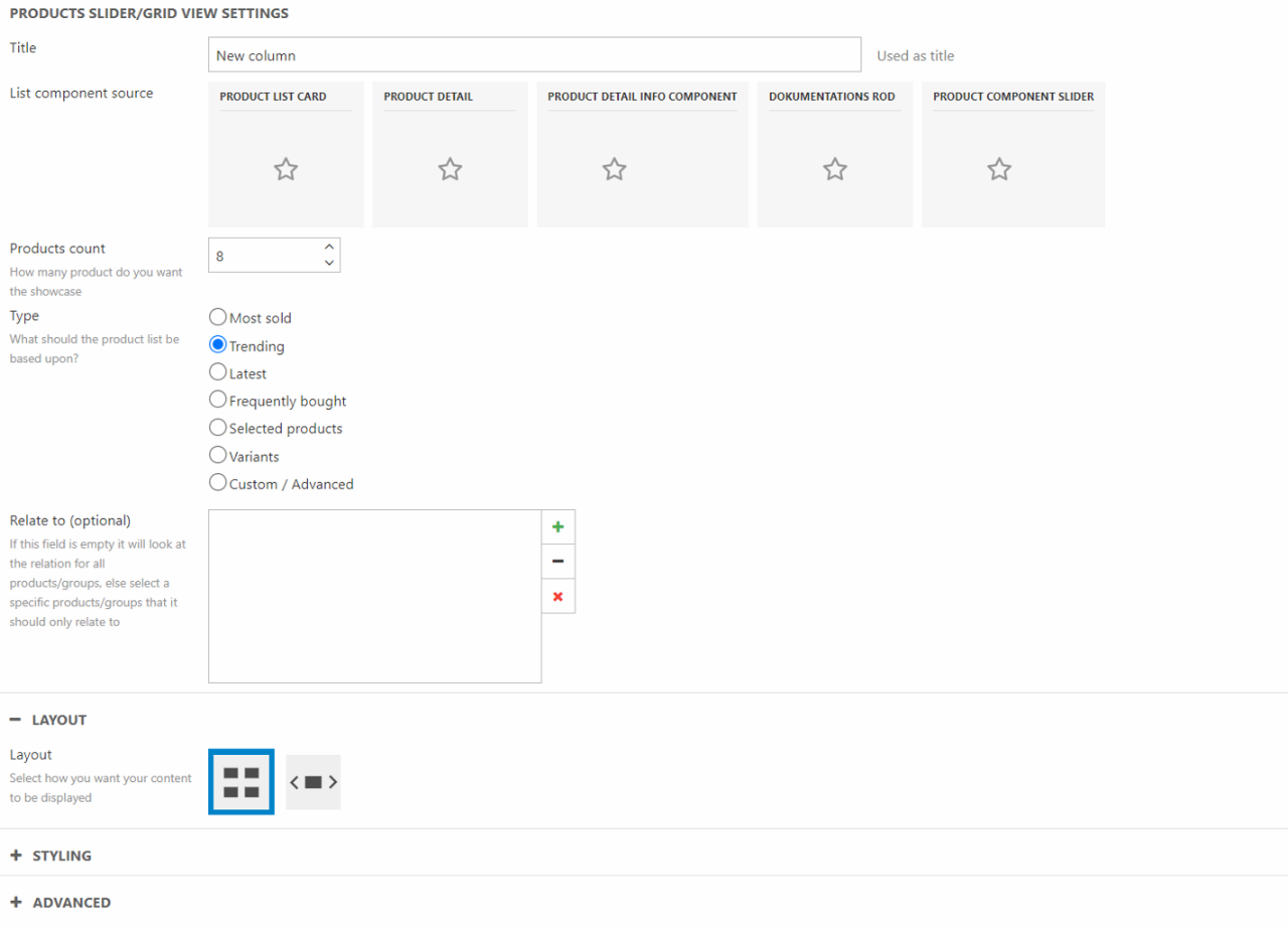
For configuration options you can:
- Give the column a title
- Choose the source of the components for the slider
- Choose how many products you want to showcase
- Select what type the products for the slider should be based upon – The different types have been descripted in our documentation on the Product Slider/Grid view
In the layout section, you choose how your content should be displayed. The choice made hear, will open new sections, where you can further style the chosen layout.
- Grid menu
- Choose the exact layout of the grid
- Slider
- Choose the number of displayed elements
- Set minimum height for lazy loading
- Choose whether to show slides before and after or not
- Choose the style of the arrow
- Set the arrow placement
- Choose the indicator style
In the Styling section you can choose the space around the object.
In the Advanced Slider Settings, you have a variety of different styling options to check or uncheck.
You can use the Advanced Settings to override which pages the product slider directs a user to see setting descriptions for default values.
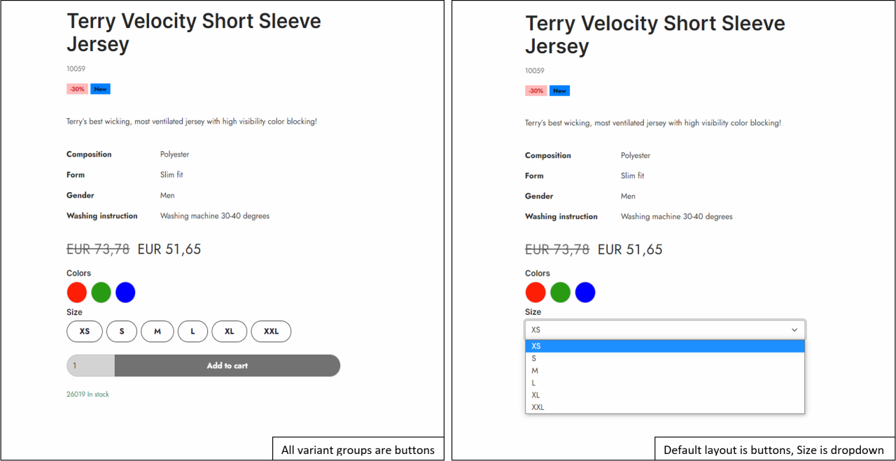
Selectable variant options
The selectable variant options column is for products with variants. As seen on the example below it will display the variant options for the product. This column is only usable when you are designing for the product detail page.
For configuration you can:
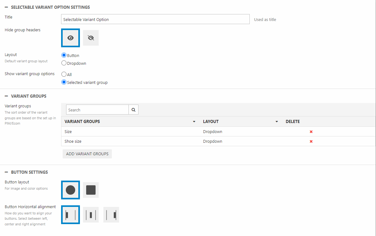
- Name the column
- Hide/Show the group headers
- Choose the default layout of the variant groups
- Button – Displays the variants as buttons. Choosing this layout will open a Button settings section. Here you can:
- Choose the button layout
- Select the horizontal alignment
- Show/hide the selcted option name - This setting is ONLY usable if the group headers are visible AND the selcted layout is buttons. When toggled, this will display a text next to the group header with the selected option name
- Dropdown – Displays the variants in a dropdown menu. This is especially useful when variant groups have a lot of options
- Button – Displays the variants as buttons. Choosing this layout will open a Button settings section. Here you can:
- Show variant group options – This is for styling options only. No variant group sorting set up can be changed here
- All – Choosing All will apply the default layout chosen above on all variant groups. Meaning no matter what type of different variant groups your products have they will all be displayed like the default design
- Selected variant group – Opens a Variant groups section where you can choose specific variant groups that should have a different layout than your chosen default. Adding new variant groups will open a pop-up where the specific group can be selected along with the layout of the specific variant group.
As an example, should you want all variant groups except from “Colors” to appear as dropdown menus, you choose “Dropdown” in the default layout setting. You then choose “Selected variant group”. In the Variant Groups section you add “Colors” and change its layout to buttons
- If you are using our Visual Editor to design, please remember that the example page only shows the variant groups belonging to the dummy product. If you are wondering why a specific variant group does not show on your example page, this might be the problem. Instead head to the actual page in frontend to see the changes.
- The order of the selected variant groups can not be sorted in these settings as it is based on the setup in PIM/Ecommerce.
- If you add the same variant group twice only the first one will be shown.
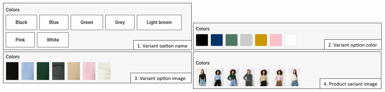
Choosing the button layout allows some further customization as the variant display type can be changed in the backend. This can be located at Settings -> Ecommerce -> Variants. From here you enter the variant group you want to edit.
In the Variant Display Type Select you have four options (Figure 26.1).
- 1. Variant options name
- 2. Variant options color
- 3. Variant options image
- 4. Product variant image
The output of this setting will depend on the variants setup. Most of the data is collected from the Variants table. Here you can enter information about the name, color and variant option image. The product variant image will, as the name suggest, show mini images of the actual variant product.
If you want to read more about variants check out our documetation about it here.
Sort by
You might know the sort by function from the Product List Facets column. Where sort by is just a part of the sorting mechanism in the Product List Facets column, the sort by component is an isolation of the sorting feature. This allows further design customization instead of relying on the default design.
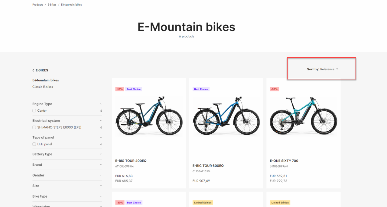
In the settings you have a few options.
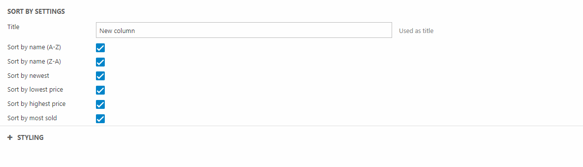
You can:
- Give the column a title - This will not be displayed on the site
- Choose which criterias you will allow the customer to sort by
- Sort by name (A-Z)
- Sort by name (Z-A)
- Sort by newest
- Sort by lowest price
- Sort by highest price
- Sort by most sold
The component also allows some styling configuration:
- Set at theme for the component
- Select a theme for the dropdown
- Choose the alignement for the text
- Set the space around the component
Static Variant View
The static variant view column can be used to display the variant available for each product. As the Selectable Variant Options is used on the product details page, for the customer to select a variant of the product, this column is meant for the product list page. The static variant view column allows you to display the different variants on the product list page as seen on Figure 28.1:
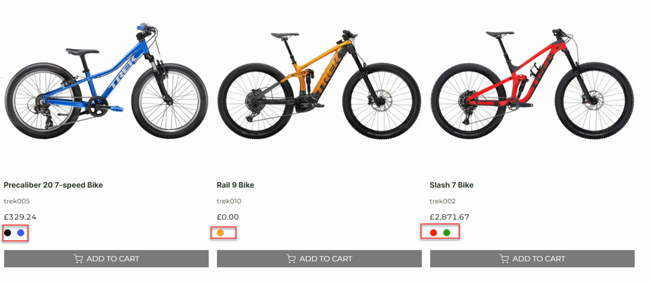
The static variant view you have a few configuration options:
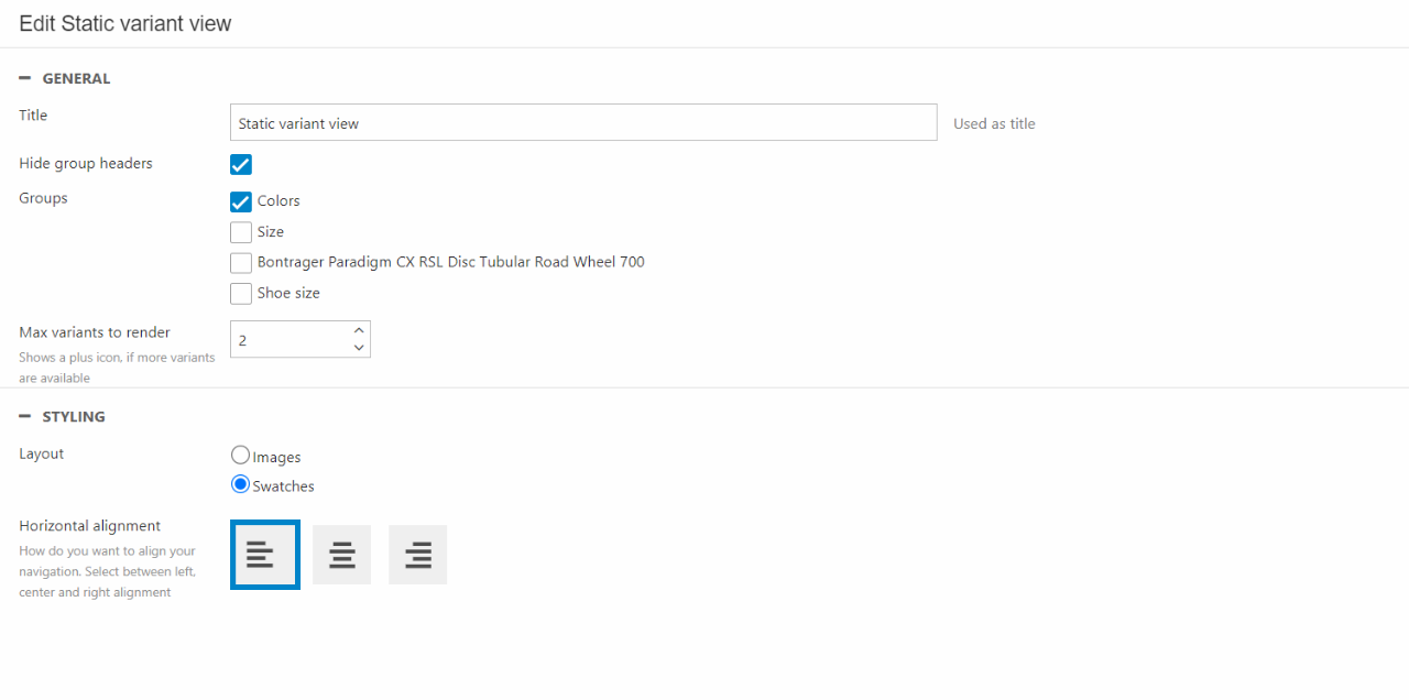
You can:
- Write a title for the column. This will not be visible in frontend
- Choose what group of variants to show and whether the group headers should be hidden or not
- Choose how many variants to render
In the Styling section you can:
- Choose the layout of the variants
- Set the horizontal alignment
Stock
The stock column will show the stock status of the product.
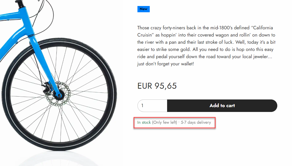
You do not have that many options when configuring the stock column:
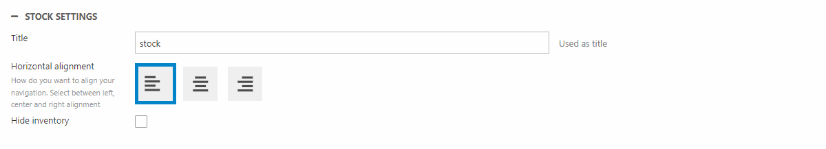
You can:
- Give the column a name
- Choose the horizontal alignment
- Show/hide the inventory - This will hide the exact number of products in stock. Instead only the stock state information is shown.
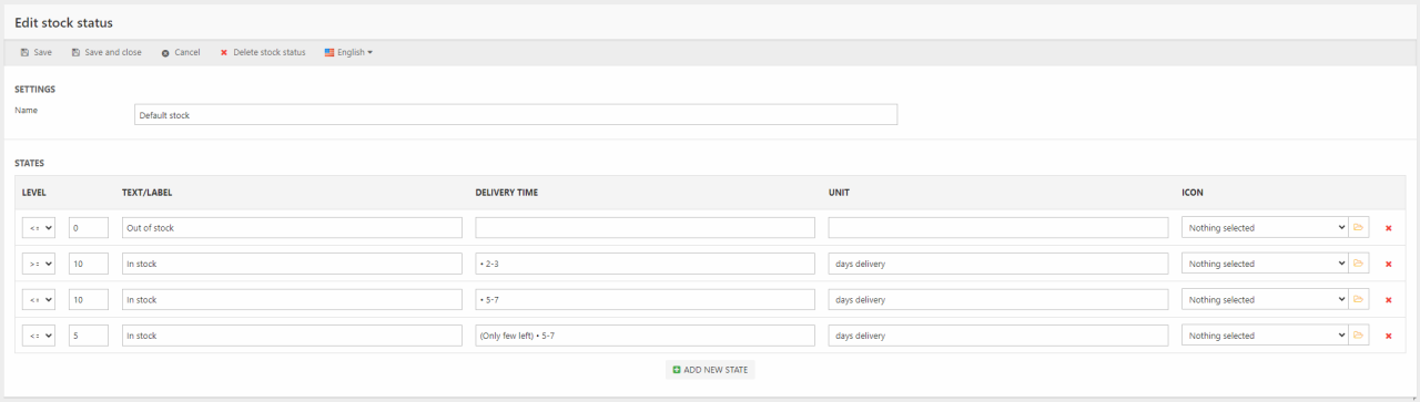
The stock component supports most of the stock state information. This means that the component can display:
- Size of the stock
- The associated text/label - e.g. "Out of stock" or "Few in stock"
- Delivery time
- The unit of delivery time - e.g. "days"
Naturally this does need some stock state configuration. A stock state collection needs to be created and the stock state collection need to be assigned the product you want it shown on. An example of a stock state can be seen on Figure 29.3. You can read more about stock states here.
Stock Locations
The stock locations column gives the customer information about stock status and location of a specific product.
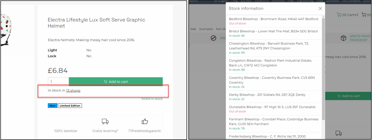
The column doesn't have a lot of settings:
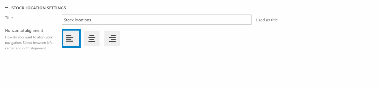
You can give the column a name. For styling you can shoose the horizontal alignment.
More importantly this column does need backend configuration to work properly.
- For this feature to work properly, you need stock locations configured. If you want addresses shown, you need to add a user with an address to the stock location
- Configure stock units on the specific product. This is used to show the stock status for different locations. This is done in the stock setting found in the ribbon bar on the product settings.
Examples
We have created some different examples to help visualize how the component tool can be used.
Product list area
This example shows the possibilities for the Product list design. This is just one example of how to include custom component columns in the design of product list pages.
For this example, we will create a custom component column containing a Group poster, Group navigation, Selected facets and the Product list item component repeater. This is done on the Product List area page in the component folder. The custom component column will then afterwards be implemented on the Product list page.
- Go to the Components folder in the Swift tools folder
- Click on the Product list area and enter the Visual Editor
As mentioned, the design will include several ecommerce columns.
- Add four 1 column rows to the page
- In the top row add a Group poster
- In the second row add a Group navigation
- In the third row add a Facets(selected) column
- In the last row add the Product list item component repeater. Make sure to choose the right product list card page as the List component source.
Now the Product list area component column is done. To implement it to your Product list page, you must add the Component column on the Product list page. It should be replaced with the ecommerce column used to display the product list (Product list: Compact view, Product list: Grid View, Product list: List view).
- Click on the Product list page in the content tree. Enter the Visual Editor
- Delete the ecommerce column used to display the product list
- In the empty column, add the Component column and select the Product list area as Component source
When that is done, your Product list page will now include the custom designed Product list area component column.
Product list card
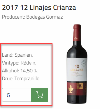
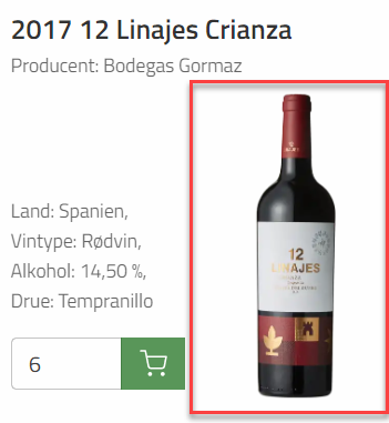
This example is based on products with long product images. To create a more balanced product list card you might want a design with info, product number, etc on one side and the product image on the other side as seen on {figurereg}.
For this example, we will have to create a custom component column containing the badge, specifications and add to cart. Later we will create a new custom component column containing the info custom component and a product image. Using the component tool this way allows us to build custom column inside other columns.
- Go to the Components folder in the Swift tools folder
- Create a new page in the components folder, choose the Product card component and name it something like “Product list card (left)”. Make sure it is public
- Go to the Page edit page and choose a dummy product.
- Let the Visual editor grid layout be one column
- Hit Save
Now we will have to design the left part of the Product list card.
- Click the Paragraph edit page and enter the Visual Editor.
- Add three 1 column rows to the page
- In the top column, add a Badges column
- In the middle column, add the Specification column
- At the bottom column, add an Add to cart column
Now we will design the actual Product list card. This is done on the Product list card. As this page is part of the manual setup guide, the Product list card page should already exist on your solution. Otherwise check the guide on how to set it up.
- Click on the Product list card page in the component folder and enter the Visual Editor
- Add two 1 column row and one 2 column row to the empty Product list card
- In the first 1 column row add a Name column
- In the second 1 column row we’ve added the specification column and chosen to only show the producer of the wine
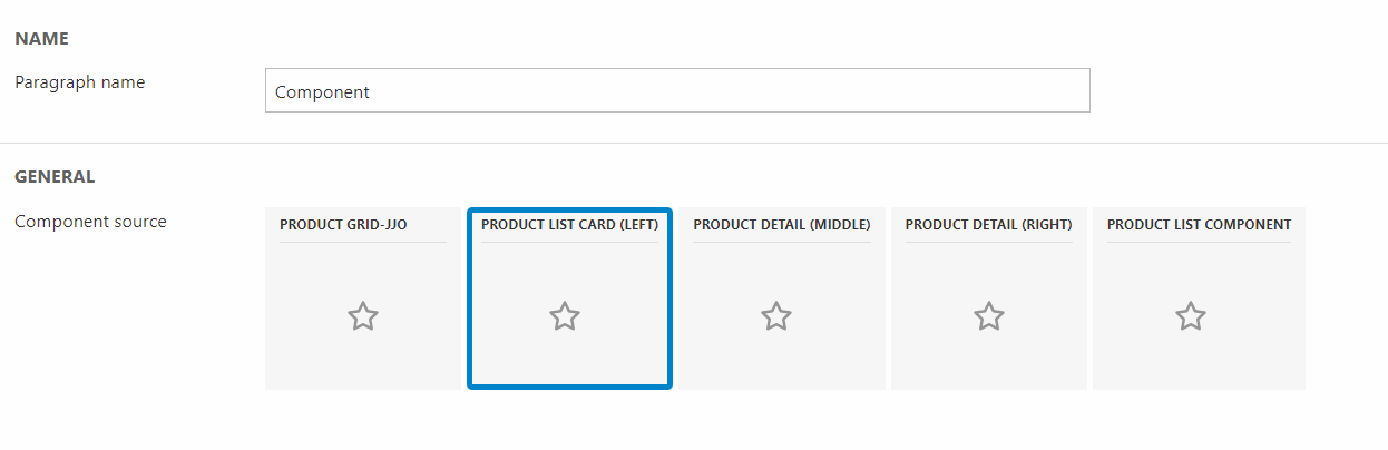
- On the left column in the 2 column row add the column called Component. When this is added you must choose what Product card component you want shown. Choose the “Product list card (left)” you have just designed
- On the right column in the 2 column row add a Default product image column to display the product image
When this is done you should have something like the Product list card shown on the image above. As mentioned in the setup guide at the top, you must use the component column on the Product list page to implement this newly designed product list card.