Menu and navigation
The menu and navigation give the user an overview of what the site consists of regarding pages and available product groups. Rapido provides 7 different top layout designs:
- The navigation and its contents is visible to both logged-in and anonymous customers
- The logo is placed on the left side or centered, and the search field is aligned either to the center/right or shown as a hidden icon
- The following page navigations are shown: Frontpage, Products, About, Contact, Latest news, Blogs, Events, and Downloads
- The following icons are shown for logged-in and anonymous customers: Sign in, language, and mini cart
- The sign in icon opens a dropdown where the customers can sign in with an existing account, create a new account, reset forgotten password and get an overview of what is available in the Customer Center
- The language icon allows the customer to change language on the website
- The mini cart allows the customer to see a summary of their cart and has a product counter
- The favorite icon is shown for logged-in customers
Read more about the configuration options for the top layout and navigation.
Top layout
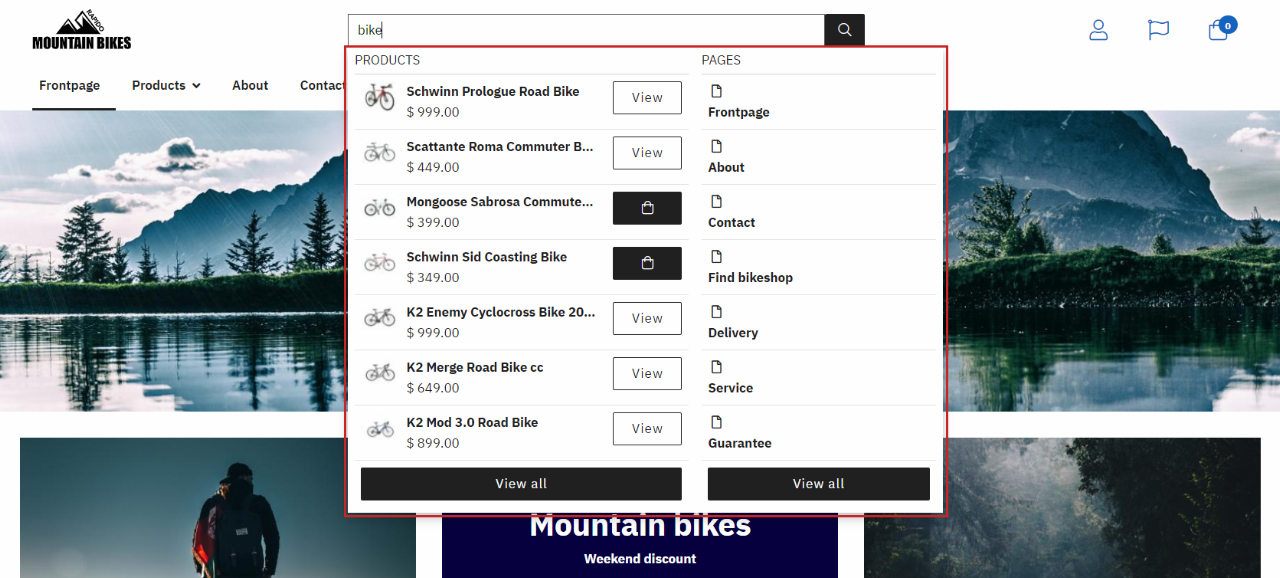
This top layout example shows that the search bar is centered, which makes it easy to find. This encourages the customer to use the search option if they want to find a specific product quickly.

The search bar has the following features:
- If a product number is searched, and it matches with an existing product on the solution, it will redirect the user directly to the product page
- If the user searches for an item e.g. ‘’ bike ‘’, the search bar will display all the options that relates to the term, there are 2 possible ways to go from there:
- Click ‘’ View all ‘’ and be redirected to the product list page
- Or click on a specific product and be redirected directly to the product page

Below the search bar, the content pages and products are presented.
Megamenu
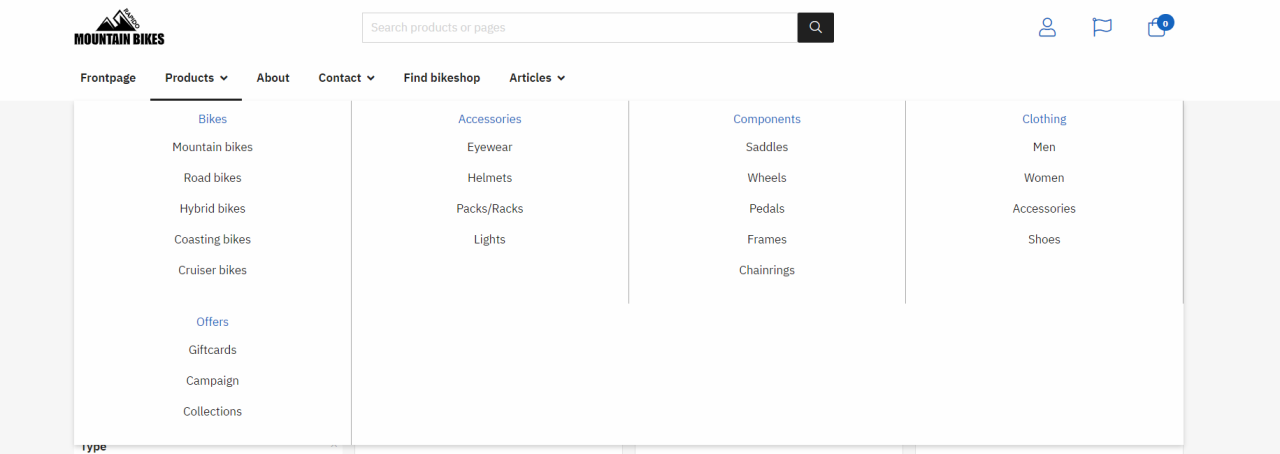
The megamenu is one of the navigation types provided by Rapido. It is ideal for websites with a lot of content e.g. product categories and subcategories - in those scenarios, a megamenu provides a great overview of the content and content hierarchy.
- The dropdown / megamenu and its contents is visible to both logged-in and anonymous users
- Provides users with a structural overview of pages and product categories
- The megamenu can show:
- Up to 3 levels
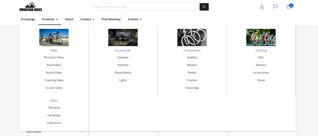
- The main product group images
- Promotion images
- The dropdown menu can show X levels

Product group images
Product group images can be rendered in the megamenu - this provides the customer with a quick visual clue to the contents of the product group.
Read more about how to add product group images in this article.

Product group promotion images
Product group promotion images are shown in the megamenu when Tools menu is enabled. This expands the product groups in the navigation bar. The megamenu for each group will then contain the associated subgroups (and their product group images) and the chosen product group's product group promotion image to the right.
The product group promotion image can be used for advertisement or if there are some images that need to be highlighted for the main product group.
Read more about how to add product group promotion images in this article.

