Swift CSS
Along side themes and branding, the CSS page is a way of customizing the design of your site. Like themes and branding the CSS page is located in the Design folder in the Swift tools folder. The CSS page is used for further design customizations in areas where branding and themes aren’t sufficient.
For now, CSS can be used on two levels:
- Rows – all rows allows further CSS customization
- Columns – As of now, only the text advanced column allows this feature
The CSS page consists of different CSS code collections – the Swift Demo site has three example collections. Just like themes can target specific elements, but is also used on a larger scale, these collections allows you to create custom CSS code targeting specific elements such as one specific column. It also allows you to create a more general CSS code, that you might want to use on multiple rows/columns.
When entering the settings of either rows or the specified column, you will find a CSS section. In this section you can choose which of the created CSS code collections you want to apply on the element. What happens is that the classes created in a selected collection will be assigned to the element you are working on. The custom CSS code for the collection is thus assigned for the specific element.
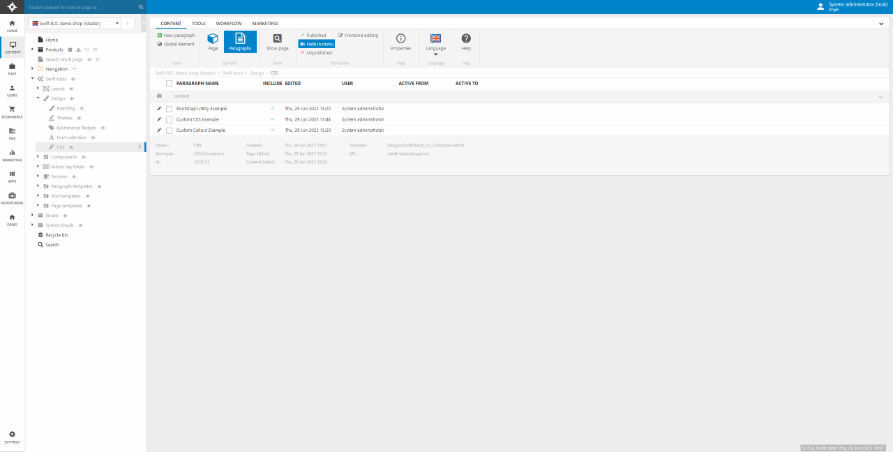
CSS collections are created from the Swift Tools area – Swift Tools > Design > CSS (Figure 1.1).
To link the CSS page with the website, please remember to link them in the website settings.
To create a new CSS code collection:
- On the CSS page, click New paragraph and select CSS
- Name the collection an appropiate name and click OK
- Add classes and write/paste your custom CSS
CSS Collection Setup
After setting up CSS collections or when creating new ones, you must preview the CSS page in frontend. Otherwise, the customization will not load properly as the CSS changes will not be saved. This is especially important after a deployment to a Staging site or a Live site.
- Go to Swift tools -> Design -> CSS
- Click Show page to view the CSS page in frontend.
- Do a hard refresh (Ctrl + F5 or Cmd + Shift + R)
When creating a new CSS collection you will be shown a page as seen on Figure 3.1.
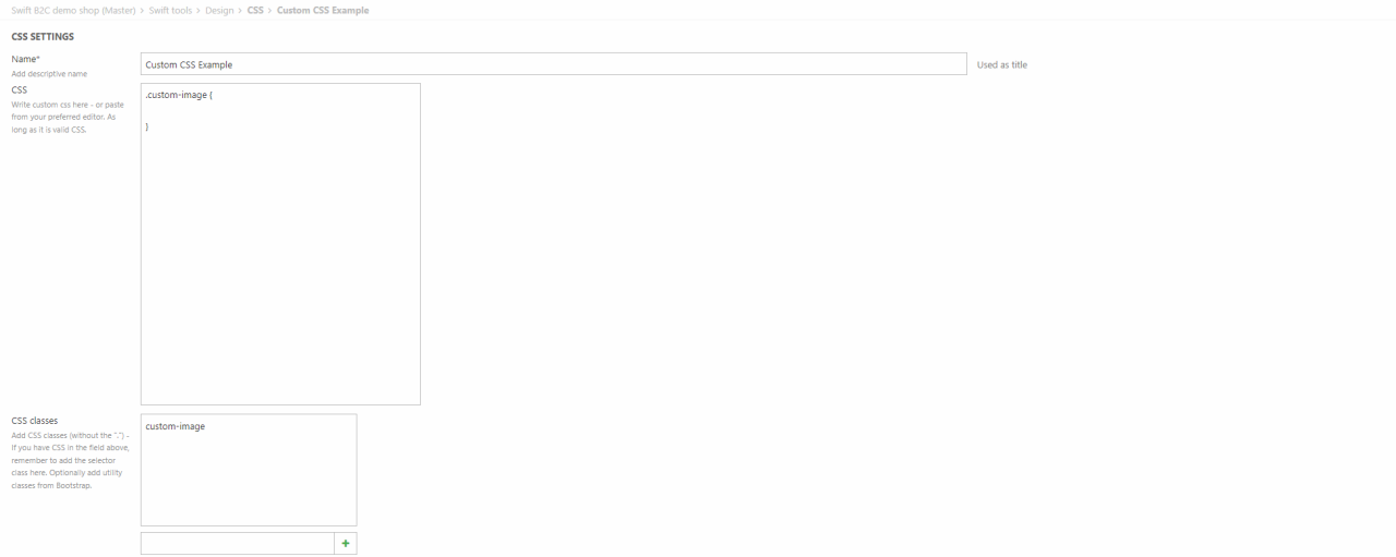
This page consist of three fields. Let's take them step by step.
- Name - The name field is for naming the CSS collection. The process of naming the collection should be done, when the collection is created, however this field can be used should you change your mind about the name, e.g. you want it to be more specific.
- CSS - This field is for actual CSS code. You can either write your code directly into the field or paste it from an editor. It just has to be valid CSS code. This field can be left blank intentionally, if for example you are using Bootstrap classes. The Swift Demo site has an example of this, which we will cover later on in this article.
- CSS classes - This is where you create the custom classes. Classes can be created by writing the names (excluding the ".") in the field at the bottom. Classes can be deleted by hovering them and clicking the red cross. Should you want to use utility classes from Bootstrap, this is where you add them.
Examples
The CSS collections can be used in different ways. Below is explained two of the three collections from the Swift Demo site. One using callout and one using Bootstrap utility classes.
Custom Callout Example
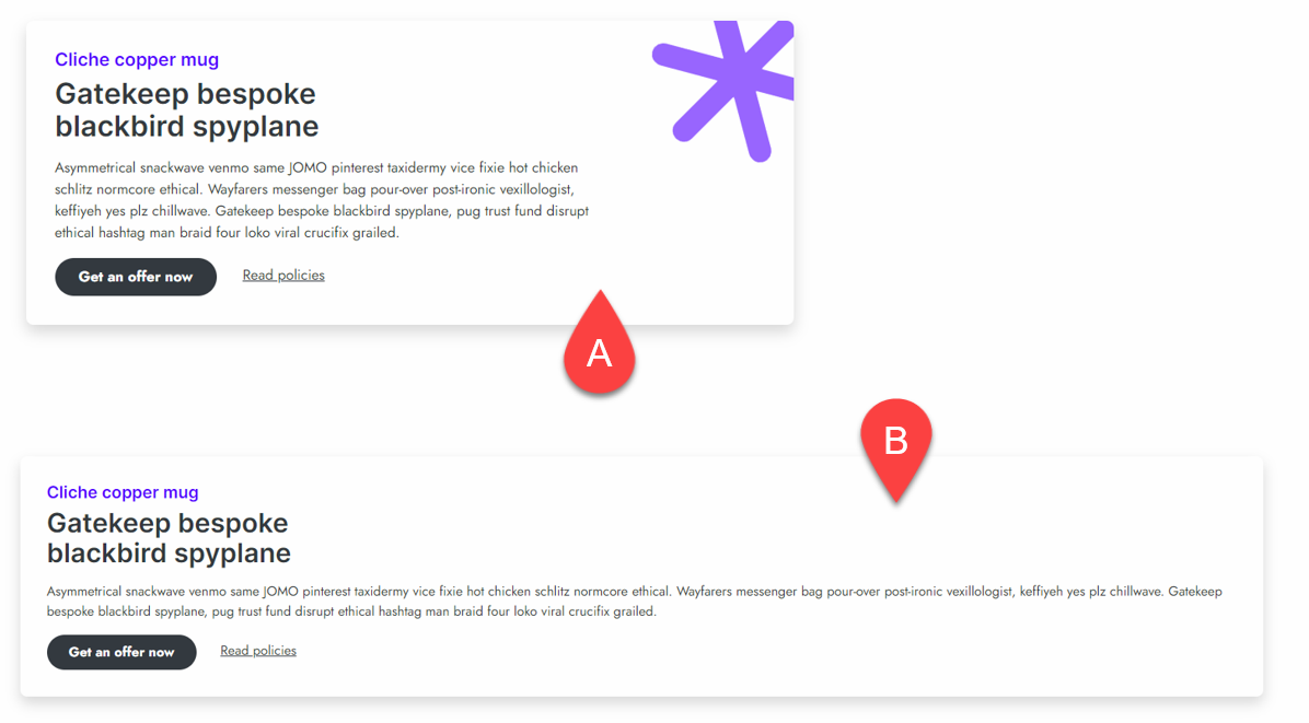
The CSS collections also allows for callouts like the purple star in the top right corner seen on A) on Figure 5.1.
Actually this example also uses the Bootstrap Utility Example collection. That's why it has rounded corners and a shadow. An explanation of that collection can be seen below.
If you want to replicate this example, you want your CSS collection to look something like this Figure 5.2.
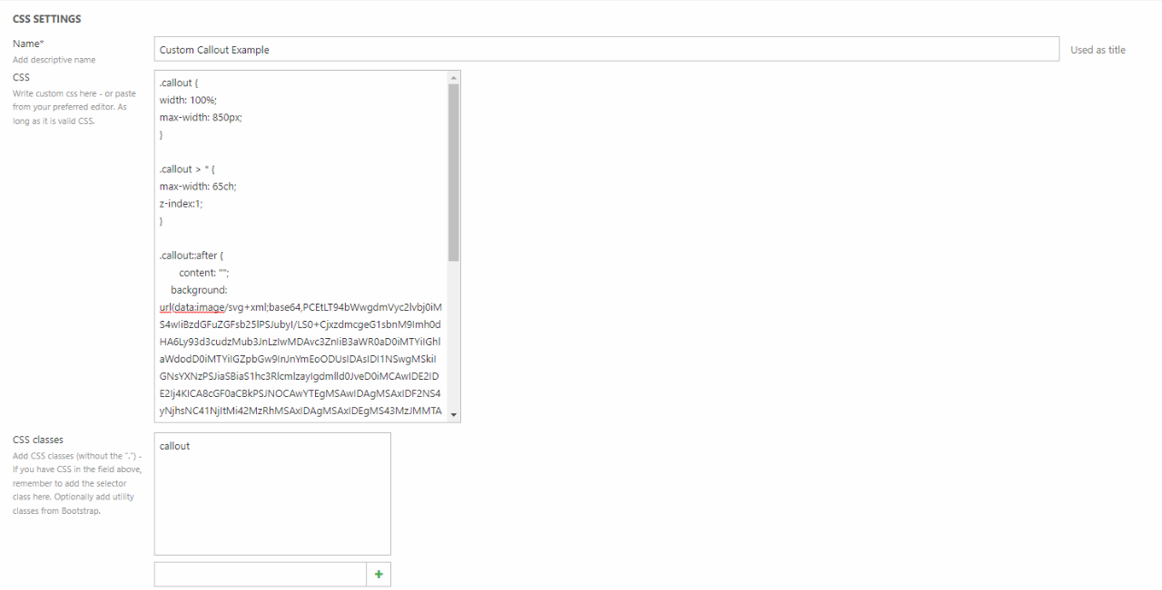
We've posted the CSS code below, should you want to check it out.
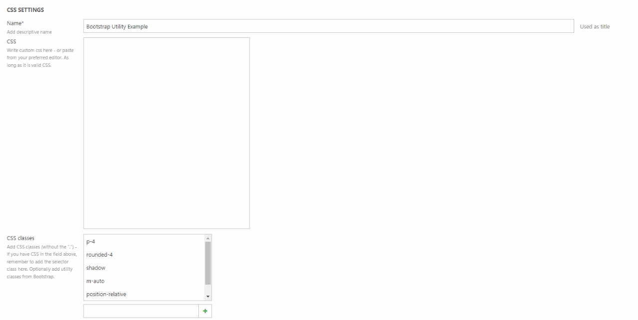
Bootstrap Utility Example
A way to avoid writing CSS code yourself is using the utility classes from Bootstrap.
As seen on Figure 6.1 we've used a lot of classes from Bootstrap to create a CSS collection. These doesn't need any custom CSS in the CSS field to work.
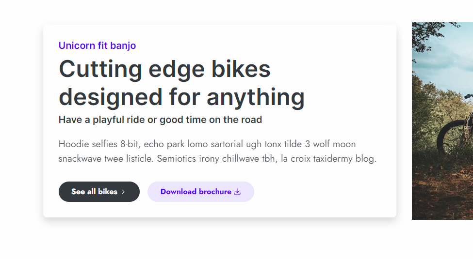
Using this CSS collection on a text advanced will look something like this: (Figure 6.2)