Branding
Branding is one of the key steps in designing a good-looking website. Branding is your visual identity and a reflection of who you are as a brand and how you want to communicate. The Swift branding settings control:
- Typography – which is to say fonts and all related settings
- Button design – primary and secondary
Together with themes this makes it easy for you to create brand uniqueness and consistency across the whole website.
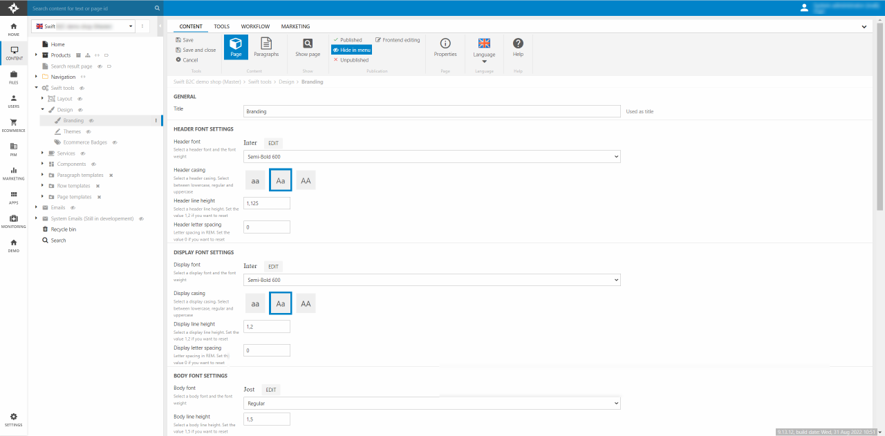
To access the Branding settings navigate to Content > Swift tools > Design > Branding (Figure 1.1).
To link the Branding page with the website, please remember to link them in the website settings.
When making changes on the Branding page or after a deployment to a Staging site or a Live site you always need to preview the Branding page in frontend. Otherwise, the changes will not be loaded as the CSS changes will not be saved.
- Go to Swift tools -> Design -> Branding
- Click on Show page to view the Branding page in frontend
- Do a hard refresh (Ctrl + F5 or Cmd + Shift + R)
Locally stored fonts
As of Swift 1.14.0 Google fonts are downloaded locally. When the branding page is previewed as explained above, the fonts are downloaded to the folder located at Templates/Designs/Swift/Assets/css/Fonts. This means that the branding css is written with relative paths to local files instead of google font URLs.
Please note that manual cleanup is needed from time to time. As the font folders are stored locally, they are not deleted from the folder when not used. This means that the website designer needs to manually delete a font folder if the font is not in use anymore.
Font settings
You have the following fonts available:
- Header font: Your usual heading.
- Display font: A larger and opinionated heading style.
- Body font: A font for paragraph text, buttons, and more.
First, you select a font and then make your preferred adjustments using the settings related to the font (Figure 3.1).
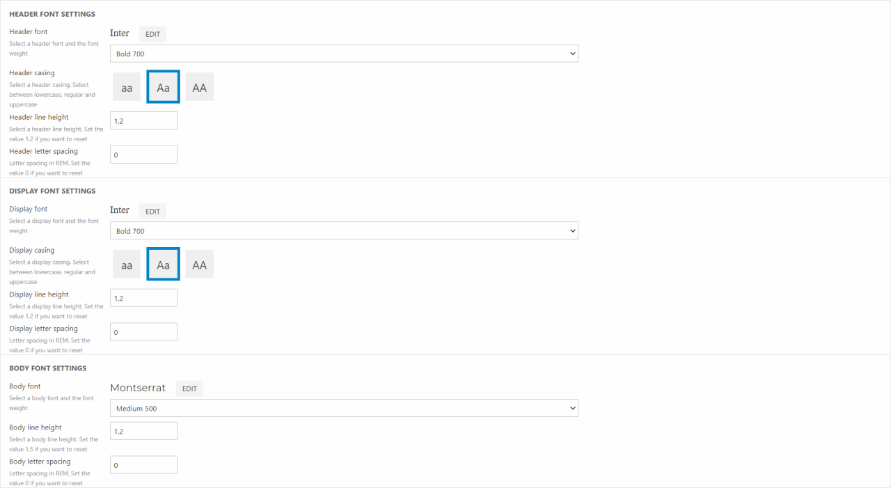
For each font you have the following settings available:
- Font weight: Select one of the available weights for the selected font.
- Casing: Select how you want the letters to visually appear. This setting is only available for header and display.
- Line height: Select the preferred distance between lines of text.
- Letter spacing: Select the preferred distance between letters.
Custom fonts in Swift
As default Swift is loaded with the Google Fonts. This gives a lot of different fonts to choose from, when designing the branding of the page. Should you want to use custom fonts this is also possible. Below is a guide on how to set it up and how to choose and use custom fonts on the Branding page.
To make your Swift solution ready for custom fonts, you have to create a new page in the design folder.
- Go to Swift Tools -> Design
- Right click on the Design folder and create a new page
- As page type choose Fonts Collection and name it “Custom fonts”
- Make sure to keep it on hide in menu
It is on this page, that your new custom fonts should be placed. We will show how to create one new font:
- On the new page “Custom fonts” create a new paragraph
- Choose Font as paragraph
- Name it according to the custom font you are adding and its weight. This could be “Satoshi – Regular”
Now you will have to give some information about the new font.
- Name – This field contains the information given when creating the paragraph. Make sure to give the paragraph a name that you can recognize as the name is what you will see in the Branding page
- Font family name – As fonts can have similar style with different weight, this is font families. To group multiple fonts in the same font family, make sure to name the font family exactly the same.
- Font weight and font style – The font weight and style fields are were you choose how the font will look. The weight field spans from Thin 100 to Black 900. In the font style field you choose either normal or italic.
- File – The last field is where you link the paragraph to the font file. Remember it is only .tff, .woff, and .woff2 file extensions that are allowed. You can either use the upload button to upload fonts or navigate to the folder and add it in the default font folder. The default directory is /Files/Templates/Designs/Swift/Assets/fonts. Most importantly you should remember that you cannot use spaces in the name for your font files.
When all the information has been entered remember to hit Save and close. Then you have added a custom font. Should you want to add more custom fonts, you just add a new paragraph.
Remember that you might need to do a hard refresh to see the new fonts.
How to use custom fonts in Swift
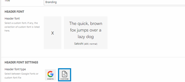
Custom fonts works a lot like the default Google Fonts. To select custom fonts you have to enter the branding page located in Swift tools -> Design. Here you select “Custom” in the Header font settings. After clicking on “Custom” all the custom fonts added will be displayed with name, weight, style and a little example of how they look, as seen on Figure 5.1.
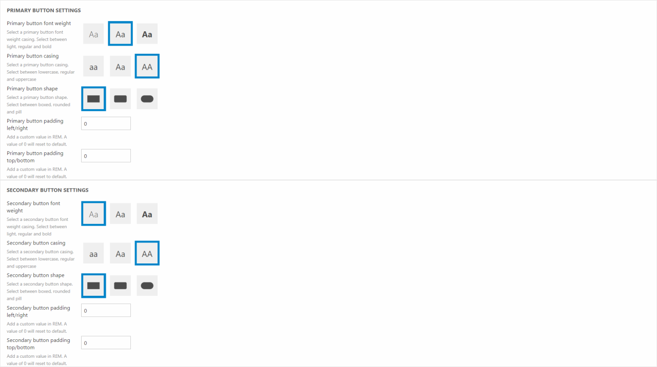
Button settings
Next, you set up your buttons' visual appearance. Our goal is to make it easy for you to create visually consistent buttons styles and distinguishable primary and secondary buttons. The available button settings are following:
- Button font-weight: Select between light, regular, and bold font-weight.
- Button casing: Select between lowercase, regular and uppercase.
- Button shape: Select between boxed, rounded, and pill.
- Button padding left/right and top/bottom: Set X(left/right) padding and Y(top/bottom) padding of the buttons. The default settings are sat to Padding X 0.75rem and Padding Y 0.375rem.
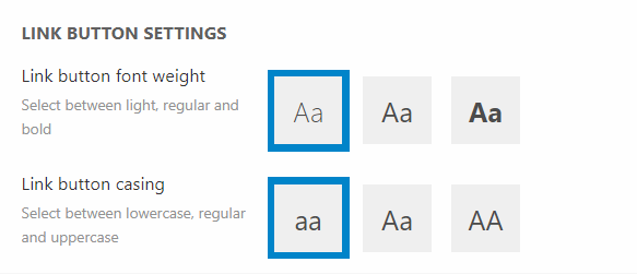
The settings of the link buttons are controlled in the Link Button Settings section. Here you can choose:
- Link button font weight: Select between light, regular, and bold font-weight.
- Link button casing: Select between lowercase, regular and uppercase.