
Example 10: Components
Components are small, reusable parts on a web page - buttons, checkboxes, stickers, etc. – which are available globally, in contrast to Block templates which must be defined in each blocks template and are typically used to solve a local problem.
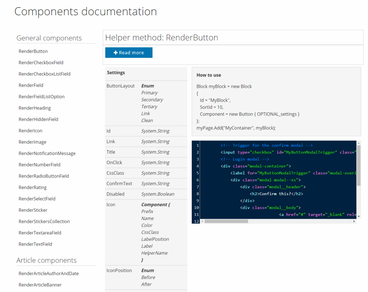
As of Rapido 3.1+, all components available on a solution can be found by adding /components to the solution URL, loading the component documentation for your version (Figure 1.1).
Components come in small “packages” which are found under /Templates/Designs/Rapido/Components – these are included in the Master template, and therefore don’t have to be included again locally in the Custom__Blocks.cshtml template where you want to use them.
To get code hinting for components include the following namespaces in the custom blocks template:
For an example of how we work with components see Templates/Designs/Rapido/DynamicArticle.cshtml – in the future, when you’re reading this, many other parts of Rapido will have been converted to using components.
Since Components is a feature still being developed and rolled out, we cannot guarantee that there will be no breaking changes – but you will of course be notified in the Rapido release notes. We also appreciate any feedback you may want to share in the developer forum; your input is highly appreciated.
In this example we will replace the Everything is on sale block you created during example 1 with a Button component instead of the Template parameter and a helper method (Figure 1.3).

Here’s how:
- Open the /MasterBlocks/Custom__Blocks.cshml template
- Open the /components documentation for your solution – www.yoursolution.url/components
- Define a new block and use a component instead of a template to create a button, e.g.:
In this example, I use a Button component with a number of properties; a title, a link to the products page, and a Base css class to make it full width, emulating the look of the previous SalesHeader block. I then add it to the MasterHeader extensibility point.
The result is almost identical to the original header (Figure 2.2) – to make it completely identical, with font size and button height, you could create a custom CSS class in the Ignite CSS project and use that on the component in addition to the Base class.

Using component helpers directly
If you want to use a component outside of a block you can call the Razor helper methods directly – this can be useful if you want to avoid adding complexity to the Blocks tree:
All components are designed the same way; helper methods all have the Render prefix, all have only one property set on the method, and that property is always an object with the same name as the component.
Field components
While there are many simple components available – e.g. Checkbox, TextField, and Number – the Field component allows you to quickly switch between field types using the FieldType property:
While the Field component is a little more restricted than the specialized components, it is a great alternative when switching between field types in an easy manner is a priority.
List components
All fields that contain a list of options – Radio buttons, Checkbox list and Select fields – are designed the same way and use the same FieldListOption object, which means that it is easy to switch between list types.
List options can be defined both outside and inside a block, as in the following examples:
Overriding Components
If you like to live dangerously, it’s possible to completely override a standard Rapido component:
- Open /Templates/Designs/Rapido/Components/Custom/Custom_Components.cshtml
- Write a Razor helper named Render[ComponentName]Custom and a single property named settings with the type of the component:
Write your new rendering code inside this helper. We recommend that you base the Component override on the code from the original component – don’t forget to do null-checks for each settings property.
Custom components
In addition to using the components delivered by us you can also create your own custom components. Before embarking on this, though, ask yourself whether you’re trying to solve a local problem or a global problem? If the answer is local – which means you will only need this component in one or two places – we advise you to instead use the standard Template property & a helper method way of rendering a block.
Let’s say you’ve been asked to create a Magical3DImageViewer component – this is a two-step process, since all components consist of a definition and a helper:
- Open Templates/Designs/Rapido/Components/Custom/Custom__Components.cshtml
- Write a simple definition like this:
Here are some basic rules to follow when writing a custom component (or overriding an existing component):
- Only one method parameter should be allowed
- Create the components consistently – always name the method property settings, etc.)
- If you create a property for a Component that is a type, like “Align”, it should not be of the type string but of type Enum. This makes it much easier to use the component.
- Consider what should be done to secure that it is easy to shift between similar components.
- Never render empty attributes – see TextField.cshtml “optionalAttributes” to get an example of how this can be avoided.
- Ensure that your component can be used without setting optional properties
- Make proper null-checks – it’s better to do this once too often than to never do it
- Keep things that relate to the particular component inside the helper. Do not make weird dependencies.
- Re-use General components inside other components, whenever it makes sense – like the Image component for all images and the Button component for all buttons.
Please note that the component MUST have a unique name – we recommend a name which will not collide with future standard components, e.g. YOURCOMPANYNAME_Magical3DImageViewer.