
T6.1 Concept & Layout
Welcome to the first of four tutorials which aim to get you up to speed with Dynamicweb Rapido – for an overview of the course look here.
But first, let’s look at Rapido in headlines:
- Rapido is a standard solution built on the Dynamicweb All-in-One platform – it features best-practice implementations of many (but certainly not all) of the features supported by the underlying platform
- Rapido is designed for rapid implementation and easy prototyping – this is because Rapido is highly configurable, allowing you to switch between many different layout options with only a few clicks
- Rapido is supported by a full implementation methodology which is a method for selling, scoping, and developing solutions based on Rapido. This methodology is available only to registered Rapido Partners – please contact us for more information.
During this tutorial, we will focus mainly on configurability – and you will learn how to:
- Change the top layout, navigation, and footer
- Change brand colors and neutral colors
- Change the fonts, size and colors of headers and body text
- Configure the mobile top and mobile navigation
- Change how emails are rendered, e.g. logo alignment, background colors, etc.
All these elements are configured using a set of (item-based) website settings.
As you’ve probably heard a few times by now, Rapido is built for versatility and configurability – we want you to be able to use Rapido to create high-quality prototypes in a fraction of the time it usually takes.
In practice, this means that you can use the Rapido website settings to control almost everything about a solution – for instance:
- The overall layout – page width, top layout design, navigation type, fonts, etc.
- The product list design – which views to include, what information to include, where to place facets, etc.
- The product page design – where to place which information, what information to include, etc.
And so on – we will dig into the details in tutorials to come.
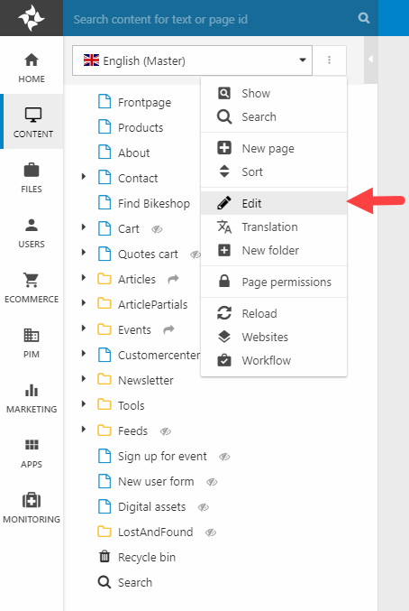
The website settings are an extension to the standard Dynamicweb website settings – to access them open the Content area, click on the context menu for the English (Master) website, then click Edit (Figure 1.1).
Scroll down a bit to see the tabs containing the Rapido settings (Figure 1.2).
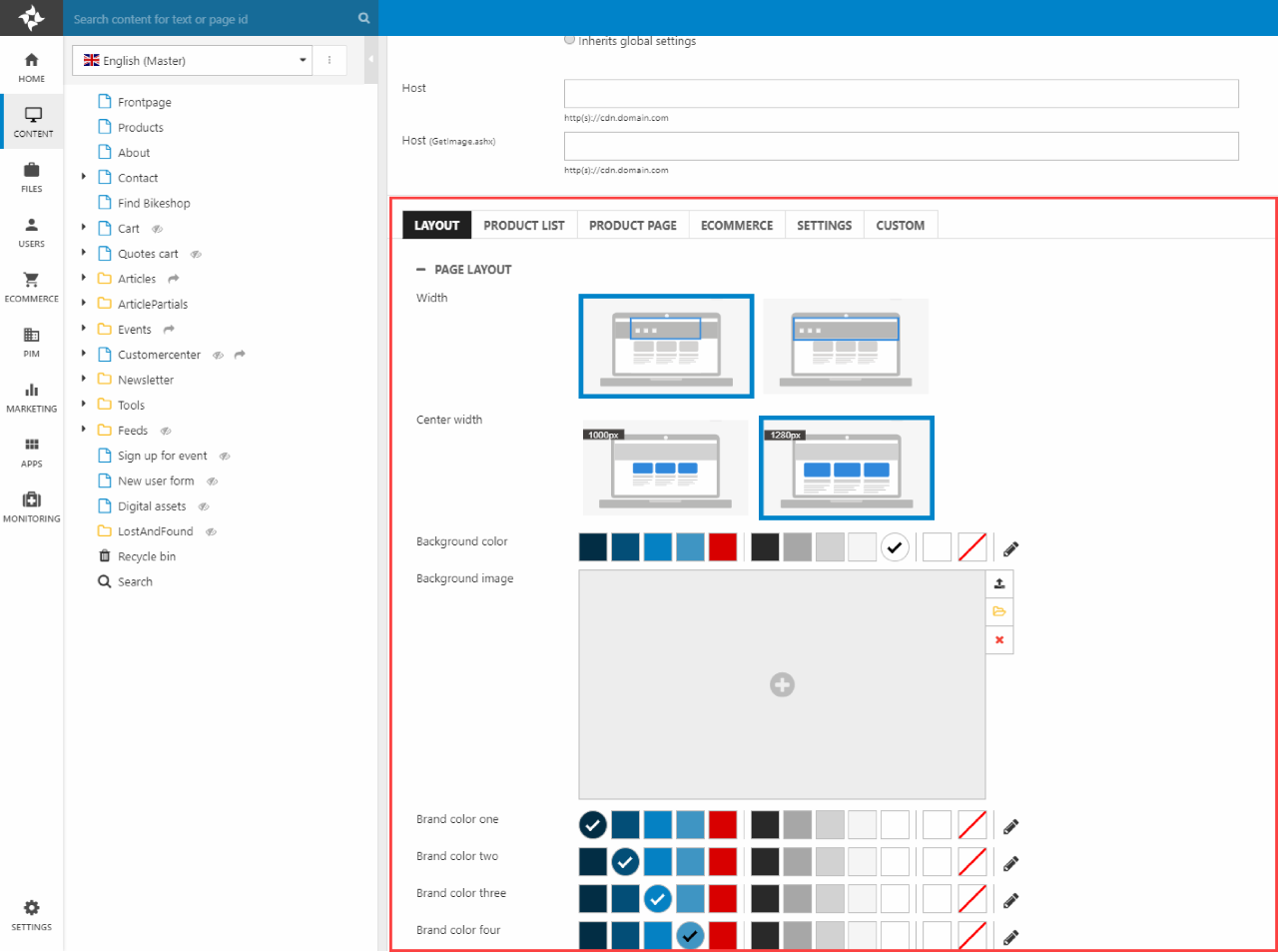
As you can see, the settings are grouped into tabs – Layout, Product list, Product page, Ecommerce, Settings, and Custom – with each tab containing settings related to a specific part of a solution.
To change a setting in Rapido:
- Find the appropriate field – e.g. Width or Background color
- Change the selected value
- Click Save in the ribbon bar – the top part of the settings page – or press Ctrl+S
As soon as a new configuration is saved, the change can be seen in frontend – try it out now. You can easily roll back to the ”factory settings”:
- Press Import settings in the ribbon bar
- Select the appropriate settings file – at the time of writing it's called ENG-Bike-summer2020.json
- Press Load
- Save
Easy as pie, right? Time for some exercises! :)
Exercise 1: Logo, Colors, & Page layout
In this first exercise, we will look at some of the more general settings found in the Layout tab:
- The Page Layout settings control e.g. the page width
- The Logo settings control everything related to the logo
- The Icons section controls the icons used globally on the solution
To configure these general settings:
- Read the documentation on the page layout settings, the logo settings, and the icons settings
- Then try it out on your test solution – here are some suggested changes:
- Change the center width to 1000px – don’t worry too much about whether there’s space enough in the navigation, this can be tweaked later
- Change the logo to something else, then change the logo height
- Select a different set of icons and observe how they change in the navigation – and elsewhere, e.g. in the Customer Center
The final ”global setting” I want you to pay attention to is the color selector (Figure 2.1).
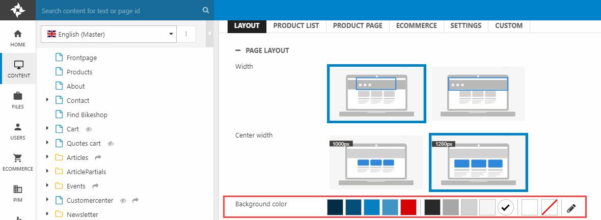
The color selector has three functions:
- You can select a color – brand or neutral – for the element in question
- You can select a custom color outside of the color scheme
- You can change the color scheme across the entire solution
The color selector can also be used to change the color palette across the entire website – read this guide and try it out.
As should be apparent, this changes the color scheme across the entire website but the configuration of each color selector persists – buttons are still set to brand color one even if the color is now different.
Save the website settings, then refresh the solution and review the results in frontend – don’t worry if the navigation looks wonky, this can be fixed in the next exercise.
Exercise 2: Header
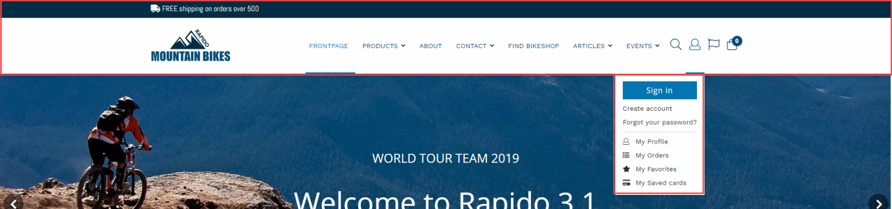
The Layout tab also contains a section called Header which is used to configure, well, the website header – including the top layout, navigation type and design, the sign-in dropdown, and so on (Figure 3.1).
To configure the Header section:
- First, read the Header section documentation to obtain an overview of your configuration options
- Then try it out on your test solution – here are some suggested changes:
- Try a couple of different top layouts
- Try setting a new navigation height and font – please note that some top layouts use the logo height as the minimum height, so you may have to make the logo height smaller as well
- Customize the sign-in dropdown
- Switch from a dropdown menu to a mega menu and
Keep in mind that not all combinations make sense – or look good! Once you’re happy with your changes proceed to the next section.
Exercise 3: Font & Buttons
In this exercise we will work with two new sections of the Layout tab settings – Fonts and Buttons – which are (unsurprisingly) used to control how fonts and buttons are styled on the solution:
- H1, H2, H3, and body text
- Primary, secondary, and tertiary buttons
Play around with both sections:
- First, read the documentation on the fonts & buttons sections
- Then try it out - define alternative fonts & change button layouts
Reload the frontend periodically and see how it looks in frontend. When you’re satisfied proceed to the next section.
Exercise 4: Footer
The Footer section is used to control content to the footer – add or remove content from footer columns, social links, supported card types, etc.
Try it out:
- Read the documentation on the footer section
- Play around with the footer content – add and remove columns, add or remove social links, etc.
When you’re happy with the results move on to the next exercise.
Exercise 5: Mobile
Two sections – Mobile top and mobile navigation – allow you to configure how the solution should look on mobile.
- Read the documentation for mobile top and mobile navigation
- Open the website on mobile and review the mobile top & mobile navigation – does everything look ok?
- Play around with the setting for a while, so you know what your options are
When you’re happy with the changes proceed to the next and final exercise.
Exercise 6: Emails
The final exercise of this course if a quick one; the Emails section allows you to change a few things in the email master template which is used for all emails in Rapido:
- Read the documentation for the Email settings
- Try it out – change the logo, the logo & footer alignments, and the background and font colors.
The easiest way to test out the modifications is by signing up for emails and receiving a confirmation email – at the time of writing this can be done from the footer of a standard Rapido. You can also fold out the Newsletters folder in the tree and open one of the example emails in frontend.
Summary
In this tutorial you’ve been exploring the Layouts tab of a standard Rapido solution, changing elements such as:
- Top layout, navigation, and footer
- Brand colors and neutral colors
- The fonts, size and colors of headers and body text
- The mobile top and mobile navigation design
- How emails are rendered, e.g. logo alignment, background colors, etc.
By now, you should have a better understanding of the kind of changes you can make to a Rapido solution with configuration only – which is a key part of delivering rapid prototypes.
In the next tutorial we will again focus on configurability, but this time focusing on Ecommerce:
- Product list
- Product page
- Mini cart
- Receipt