Working with Articles
Articles are a nice way to inform customers about news, recent events or create stories about your products (Figure 1.1).
Swift comes with item types for:
- Creating articles
- Creating article list pages (categories)
In this article we will explain how to create both articles and article lists. We’ll start by briefly explaining the structure of articles and how to create new articles in different categories (article lists). We will then move on to explain how to create new categories and how they and tags work. Finally, we’ve created a couple of examples to help you visualize some of the layout options you have when creating articles.
Creating an article
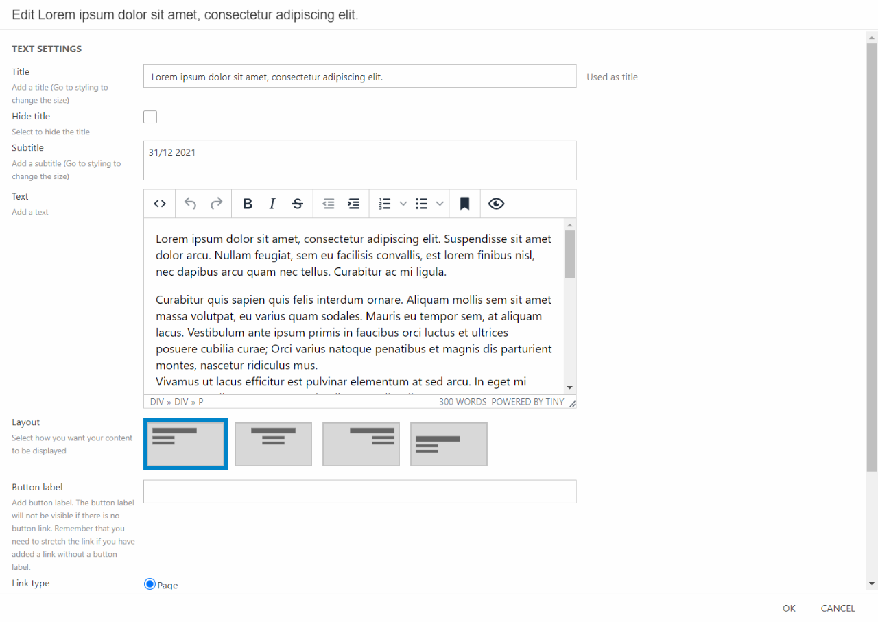
Articles are basically pages with an extra section for metadata. The content on article pages is built like any other content on pages: with the Visual Editor. This allows you to use presets and content columns to create the content you want on the page. In our examples, however, we will not be using presets – instead, we will show how you can use a combination of rows and columns to create different looks.
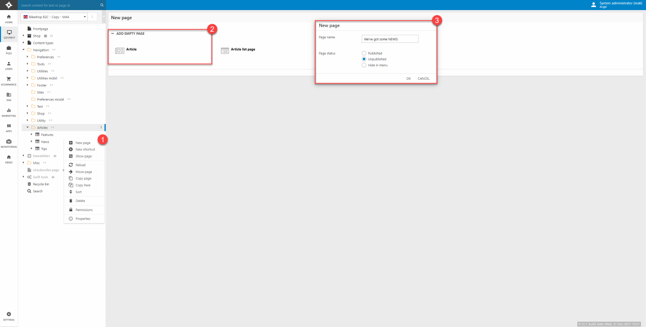
When you want to create a new article, you must first decide what category it should be placed in - let’s say you want to create a new article in a category called Stories:
- Locate the wanted category in the content tree – in this case the article list page called User stories. Right click on it. In the drop-down menu click New page.
- Choose Article as the new page
- In the modal, give the article a name (This can be changed later, you can read more about that here) and hit OK
The next thing you’ll be asked to do is fill out some general details about the article. All this information is used on the article list column as it consists of article items based on these details. Depending on what kind of article you’re writing you can leave different data blank. In this case were creating a story article, that means we’ll fill out:
- A cover image
- A title
- A short summary of the article
- The author and the published date
When you’ve filled out the needed information remember to hit save.
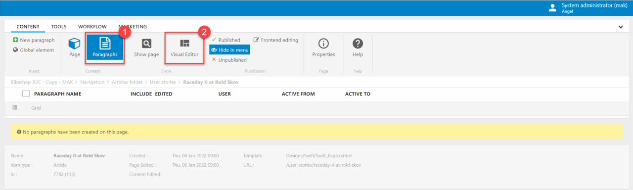
After saving, it’s time to create the content on your page – this is done using the Visual Editor like on any other page:
- In the toolbar click on the Paragraphs button.
- Now click on the Visual Editor to start creating content on your article.
You can see a couple of examples of how to create content for article in the Examples section below.
On live solutions, you will most likely have a variety of different presets available to create your articles – this could be rows with different column combinations, like an image and a text column side by side, or a product slider showcasing the products mentioned in the article. When building content on your articles we recommend using these presets. This guide’s examples, however will not be using presets.
Tags and categories
Tags and categories are a neat concept that allows you to further sort the articles you make. Categories has already been shortly explained in the guides above, but below will follow a more thorough explanation along with a comparison with the concept of tags.
The difference between categories and tags
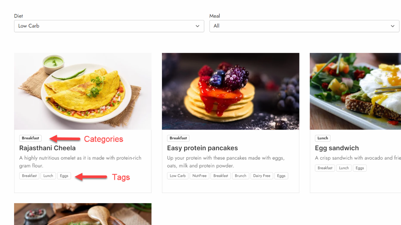
Categories are created in the structure of your article lists. Say you want to create an online cookbook full of recipes, you might want to divide your recipes into categories such as breakfast, lunch and dinner. In this case all recipes placed under the article list page called “breakfast” will have the category “breakfast”, everything under “lunch” has the category “lunch”, and of course everything under “dinner” will have the category “dinner”.
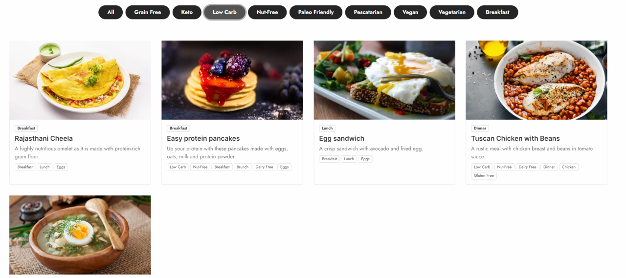
The tags you want to use on your articles can be structured in some different ways. You can either place all tags in one big container or, which will be preferable, place tags in collections based on their type. If we keep the cookbook example mentioned above, you could divide the tags into smaller collections, called “Diet”, “Meal” or “Protein”. Here, as an example, “Protein” could contain tags like “beef”, “chicken” or “eggs”. At this point this sounds a lot like the categories we have explained above. However, the big difference is that tags can be placed across categories. This means that if a user wants recipes with the tag “egg”, they will be shown recipes from across the categories, with the tag "eggs". This could be breakfast omelets, pancakes, or an egg sandwich for lunch.
Category structure
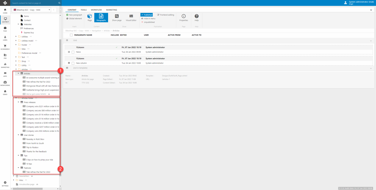
The structure of the article concept can be a bit tricky to understand. The article list column can only display one path of articles/article list pages. If you have divided your articles into three categories (e.g., news, tips, and features) you cannot mix and display all articles in one column. You would have to display the categories individually in different columns. You can see examples of two different article structures on Figure 5.1. Ideally you should stick to only one of the ways.
- All articles group in same article list page – You can display all articles in one column
- Articles divided into different article list pages – You can display articles based on categories
Tag structure
Before we start creating tags lets learn at bit about the structure needed to support the tags. Tags are located at the lowest level in a hierarchy starting from the “Article tag folder”.
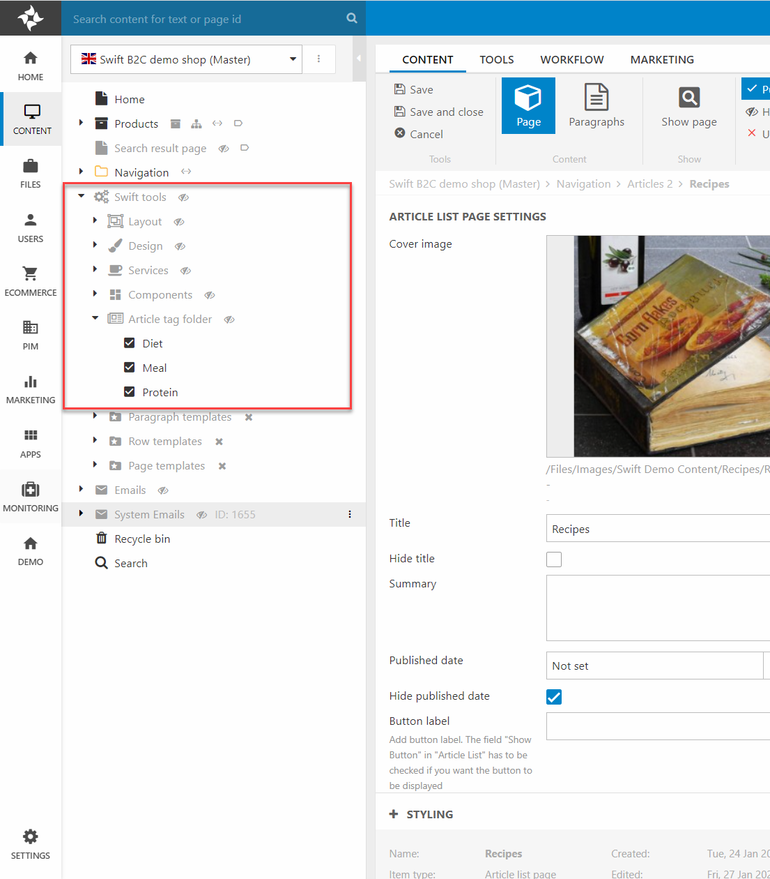
This folder is actually just an article folder page, but when placed in the “Swift tools folder” as shown on Figure 6.1 it only supports pages of the type “Article tag collection”. These collections are the groups explained above, in our examples they are “Diet”, “Meal” and “Protein”. It is in these collections that the actual tags are created.
Tags
Tags needs to be created before they can be used on articles. In the default Swift demo site the tags are located in the “Swift tools” folder as shown on Figure 7.1. If we keep the cookbook example and we wanted to add a new tag in the tag collection called “Diet” we would first locate the tag collection.
- It is located at Swift tools folder -> Article tag folder -> Diet.
- Create a new tag by clicking on “new paragraph” at the top of the page.
- Click on “Article tag” and give the tag a name. In this example it could be “low fat”.
Now the tag has been created. Please be aware that there might be small delay from when the tag has been created to them showing up in the tag section on the article pages. As there is no styling or configuration of the tags there is not much to do with the tags once they have been created. If you have created a wrong tag or for what ever reason want to delete a tag, you simple right-click the unwanted tag and click “Delete”.
If you want to use the new tag on older articles, you simply locate the article in the content tree and click on it. This will open a page where you can edit the meta data about the page. At the bottom of this page you will find all the available tags.
For users to start using the tags you will have to use the filtering columns. You can read more about them just below here.
Article columns
There are some columns that are created for controlling articles.
Article header
This column type renders the article name at the Article page.
Article list filter:
This column type filters the article lists/categories.
Article tag collection filter:
This column type filters the articles. You are able to select tags in the different tag collections. The filters are applied by AND so if you select PROGRAMMING and MACHINE LEARNING you get articles that are tagged with Programming AND tagget with Machine learning.
Article tag filter:
This column type lists ALL tags from ALL tag collections.
Read more about the different column types in the next sections.
NOTE THAT:
It is recommended that you only use only ONE Article list at a page with a filter (because the filter applies the filter on all lists - if you have more than 1 - on your page).
Article header
The article header is created for the article page type. It automatically renders image and texts from the article it is placed on. This means that the meta information written about the article when creating it will automatically be displayed on the article header. You can read more about our article concept here.
As mentioned, a lot of the functionality of this column will happen automatically, which means your configuration options are focused on styling:
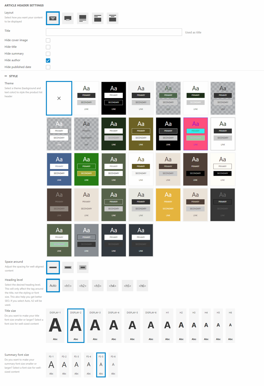
For the configuration you can:
- Give the paragraph a name
- Choose the layout of the column - We recommend using images with the aspect ratio of 32/9 as this is how the images are displayed
- Choose whether to show/hide:
- Cover image
- Title
- Summary
- Author
- Published date
For styling options, you can:
- Select a theme for the column
- Set the Space around the article header
- Choose the heading level of the tag around the title. This will help on your SEO. You can read more about this in our SEO documentation
- Choose the font size for title and summary
Article list filter
The article list filter can be used to filter articles displayed in an article list column. Say you are displaying all articles in a article list page containing most of your articles, but a user might only be interested in articles placed in the subcategory called “News”.
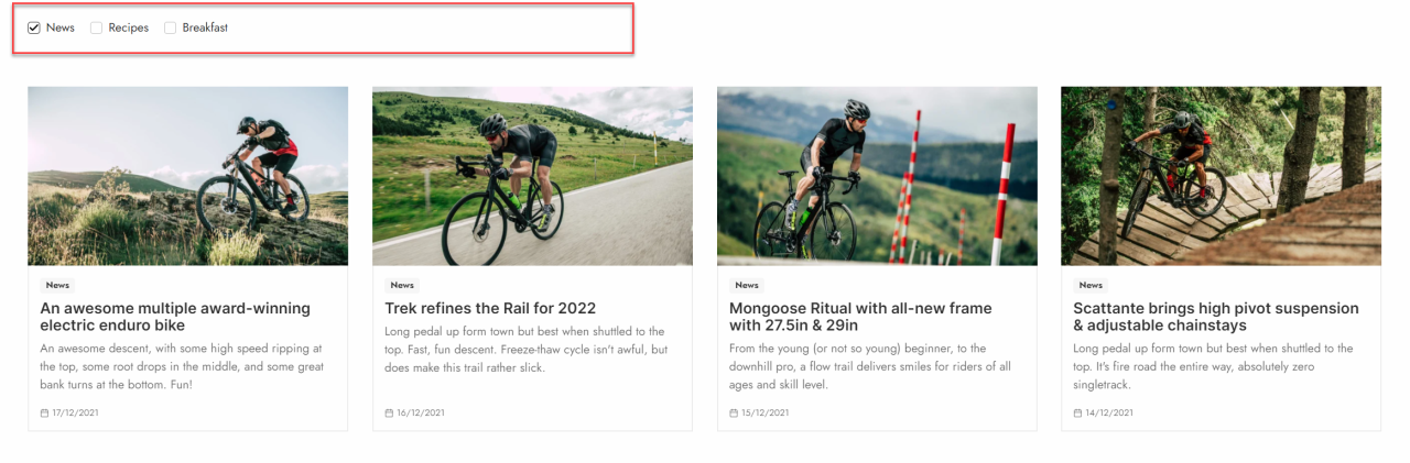
As for settings and configuration you can:
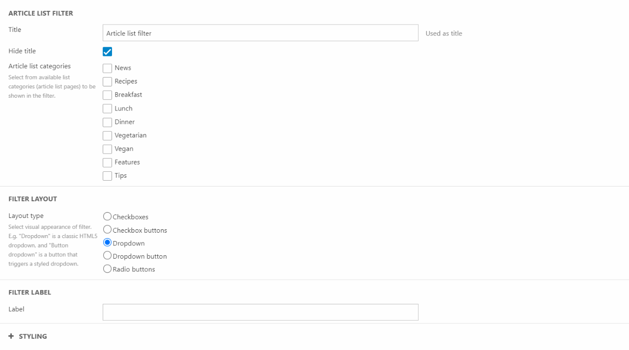
You can:
- Give the column a title
- Choose which article list categories to be shown
- Choose the filter layout type
- Give the filter a label – This is only if you choose a dropdown as the layout type.
Additionally you have some styling options. Here you can:
- Choose a theme for the column
- Set the alignment for the filter
- Select the space around the column
- Choose a button style and size
- Choose a heading level – this will help on your SEO. You can read more about this in our SEO documentation
Select the size of the title
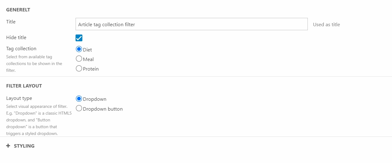
Article tag collection filter
The article tag collection filter is often used when users want to sort articles in an article list column by their tags. It allows you to specify which tag collection they can choose tags from. In the example below (Figure 11.1) it is a 3-column row containing three article tag collection filter columns, that way they can choose from all tags in the three tag collections “Diet”, “Meal”, and “Protein”. If you want to choose exactly which tags, even across tag collections, the user can choose from you should use the article tag filter instead.
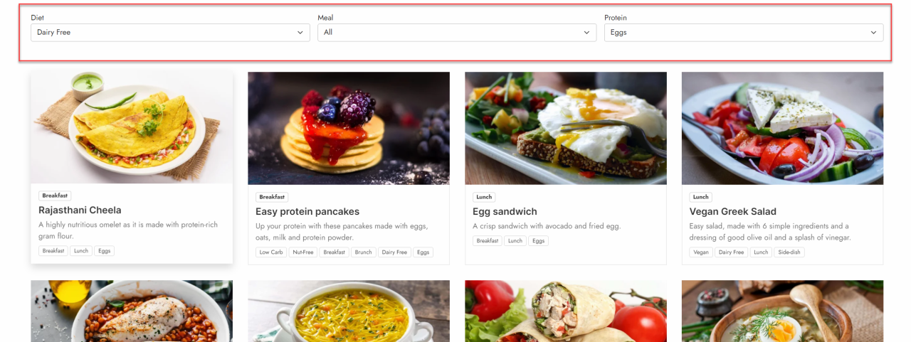
For configuration you can:
In this column you have the following configurations:
- Give the column a title and choose whether to show it or not
- Choose which tag collection to base your filter on – tag collection and tag structure has been explained above
- Choose the filter layout type
Additionally you have a couple of styling options. You can:
- Choose a theme for the column
- Set the alignment of the text
- Set the space around the column
- Choose the heading level. This will help on your SEO. You can read more about this in our SEO documentation
- Select the size of the title
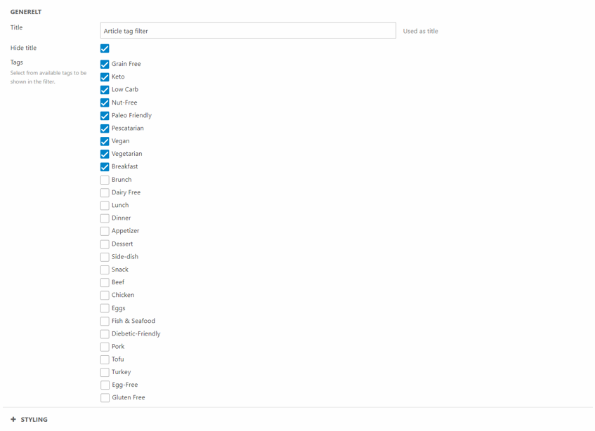
Article tag filter
If you want to allow users to have the ability to choose between a specific number of tags from different tag collections you should use the article tag filter. In this column you can choose exactly which tags you want to show in the filter.
In this column settings you can:
For configuration options you have a few:
- Give the column a title and choose whether to show it or not
- Choose which tags should be selectable for the user
In the styling section you have the following options:
- Choose a theme for the column
- Set the alignment for the text
- Select the space around the column
- Choose the button type and size
- Choose the heading level. This will help on your SEO. You can read more about this in our SEO documentation
- Set the size of the title
Examples
The content on article pages can be tricky to design properly. We’ve made some different examples to show how the articles can be used and how they are built. You can try to copy the example articles 1:1 or use elements from different examples to create the expression you want for your own articles.
User stories
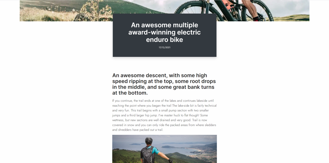
Articles can be used for User Stories. These are based on users trying out products and explaining their experience with the product. In this example, we’ve made a simple layout with some basic elements to give some inspiration.
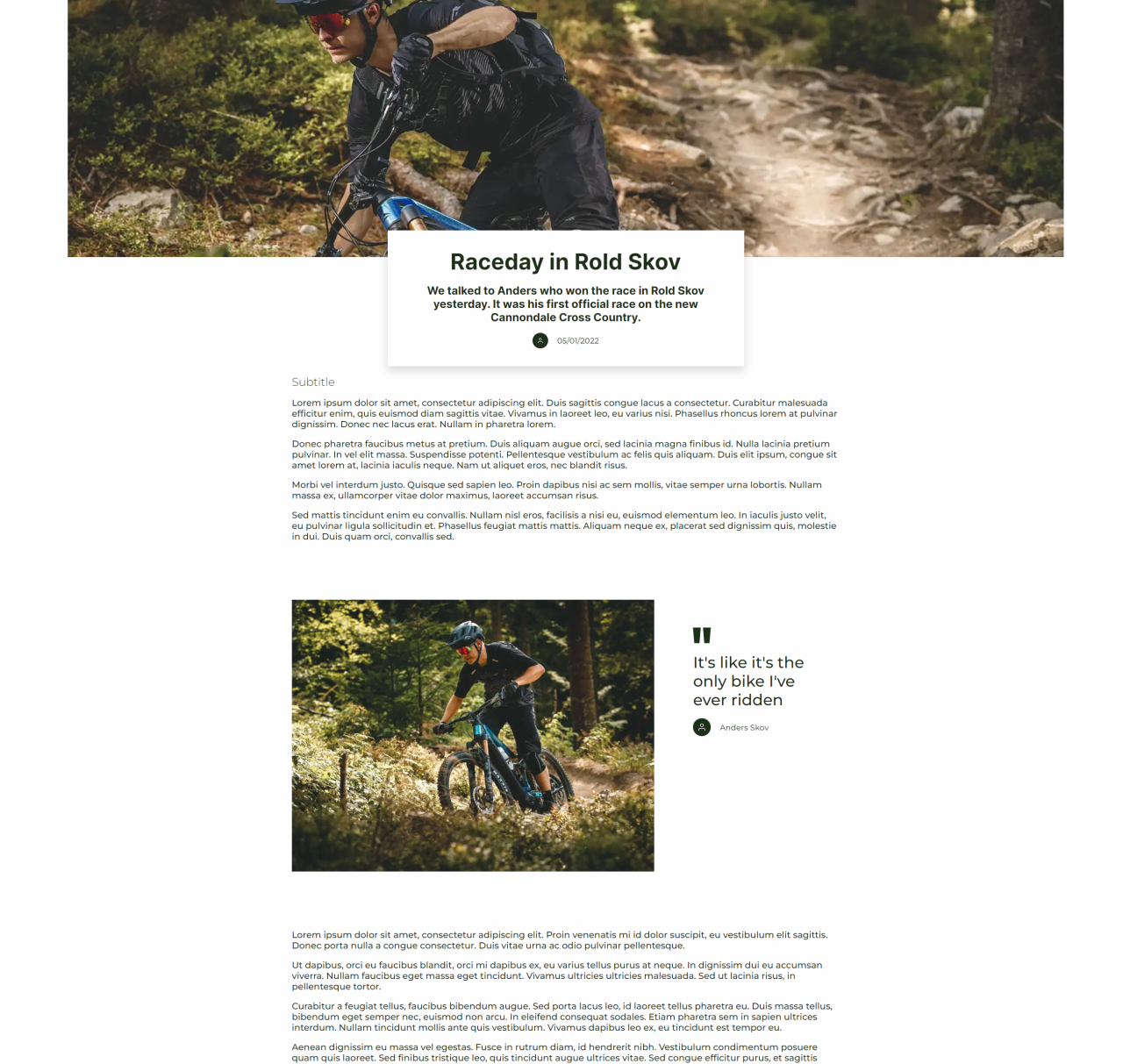
This example consists of a few different columns, where some of them are used a couple of times.
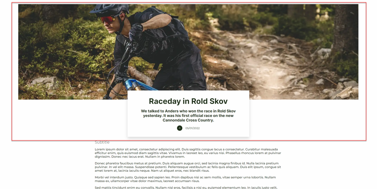
The first column used in this article is an article header. It’s placed on a 1-column row. You have some different styling options, both in terms of layout and font sizes.
Now the real content of the article will begin. First up is a text column. This is placed in a 1-column row with the narrowest width. You could use either the title or subtitle field in the column, to make small section headers for each text field. Most importantly for all text columns, we’ve changed the Text readability to Max width off. This is done in the styling part of the text column editor.
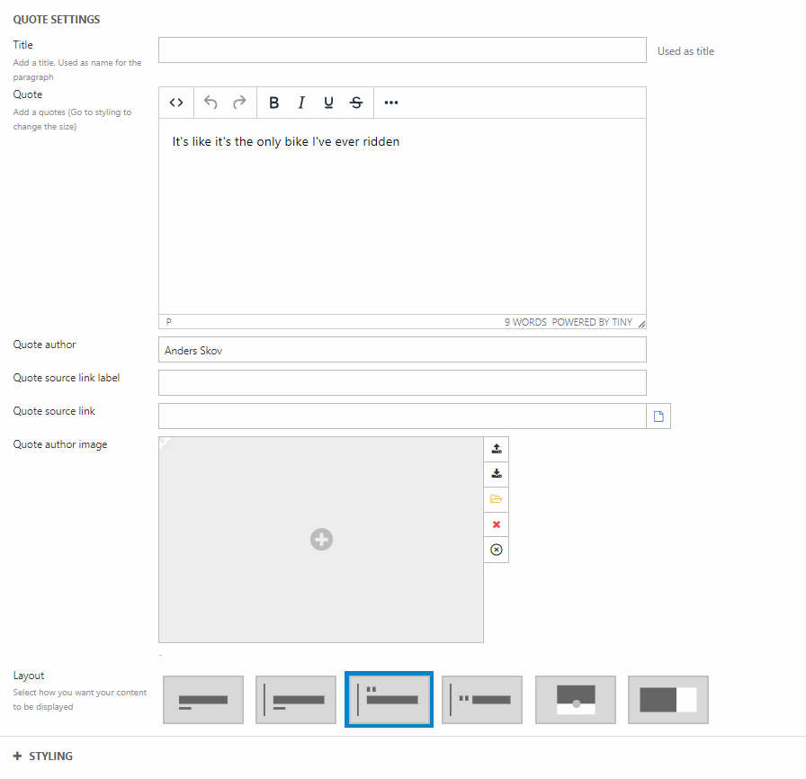
Instead of having all the text placed in one long text column, we’ve placed an image and a quote in between it. This is done with a 2-column row. To make the row stand a bit out, you could consider changing the row height.
On the first empty column we’ve placed an image. On the other empty column, we’ve placed a blockquote column and written the quote as the title of the column (Figure 14.2).
After the image and quote our article continues with text. Therefor we’ve added a 1-column row with a text column just like the first one.
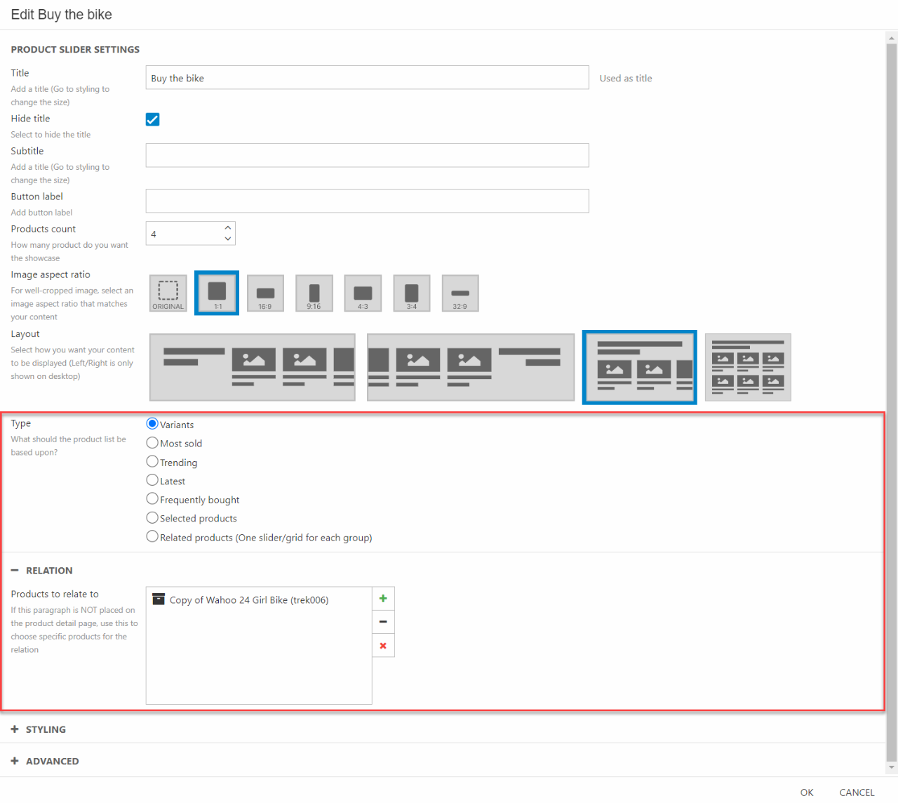
Again, to break the article into smaller pieces, we’ve placed a product slider. Depending on what kind of user story you’re writing you can pick what products to display. If it’s a story about a specific product, like a mountain bike, you could choose to display variants of the same bike (color, sizes, etc). Besides variants you can choose to display specifically selected products, related products or products based on criteria such as most sold, trending, latest, and frequently bought. In this example we’ve displayed variants of the bike used in the story. To do that, you have to toggle Variants in the “Type” section and choose the product to show variants of in the “Relation” section (Figure 14.3).
The product slider is followed by another text column. This is again placed on a 1-column row with the same settings as the other text columns.
The last element on the page is an article list column accompanied by a section header. We’ve changed the theme on the last two rows, to make them stand out a bit. This is done in the styling section in the row editor.
The section header is placed in a 1-column row.
The article list is also placed in a 1 column row. For the layout of the article list, we haven’t done anything crazy. The main thing we’ve changed is the maximum number of items in the list. As we only want the three latest stories, we’ve changed it to 3. You can combine these different layouts in a lot of different ways.
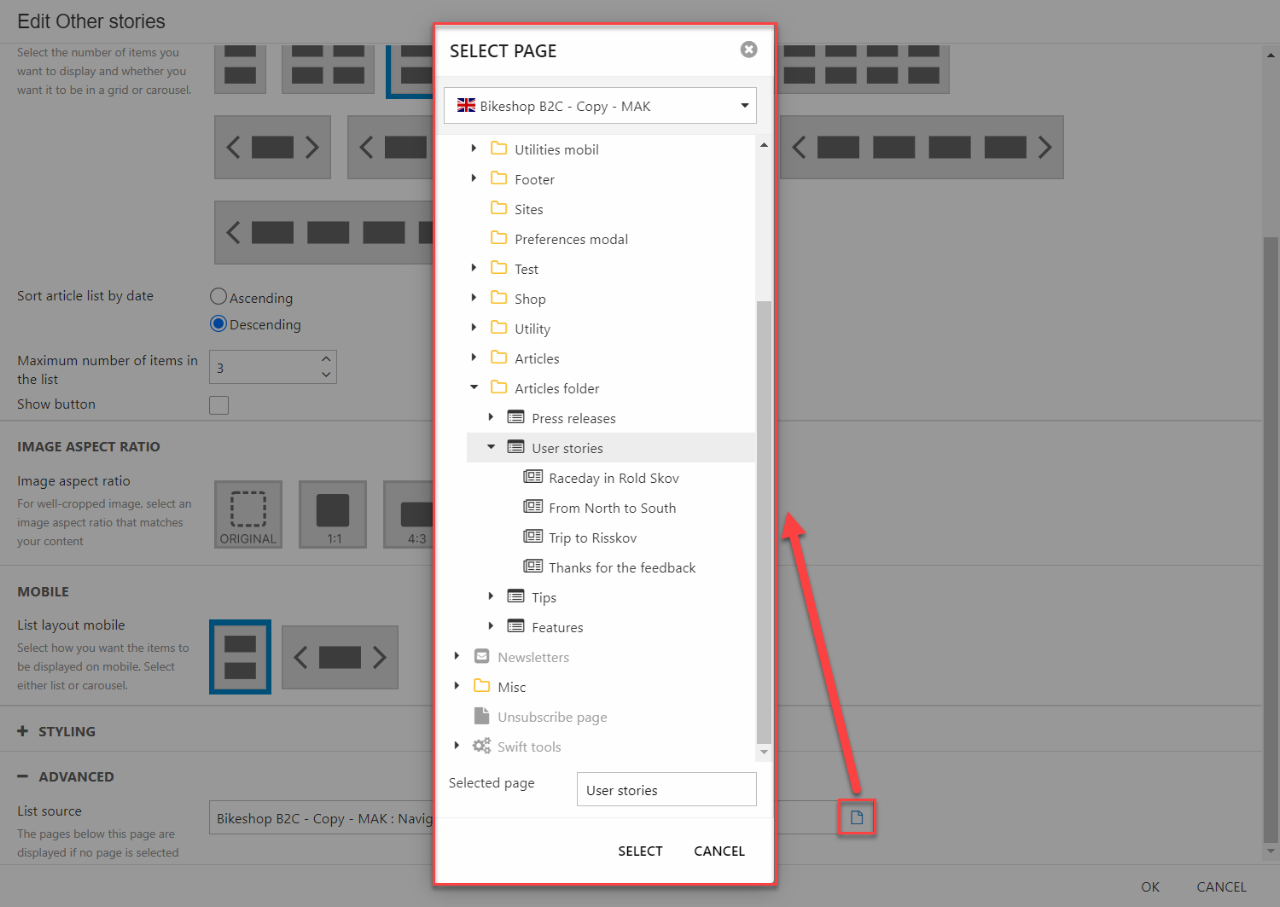
The most important thing to do when working with the article list column, is to choose what kind of articles you want displayed. This is done in the “Advanced” section. Locate the folder or article list page containing the stories you want displayed. In this case it’s the User stories article list page (Figure 15.1).
When you’ve added that, you should end up with something like our example.
Press releases
Articles can also be used as a press release tools. Press releases can vary in designs, with or without images. In this example we’ve made a relatively simple press release consisting of a section header and text columns as the main part of the page. At the bottom we have a “footer” with some general information about the company and links to social media pages.
As mentioned, it’s relatively simple to make this press release. The first things that’s added is a section header. The section header is placed in a 1-column row with a standard width.
All the other rows are sat at the narrowest width.
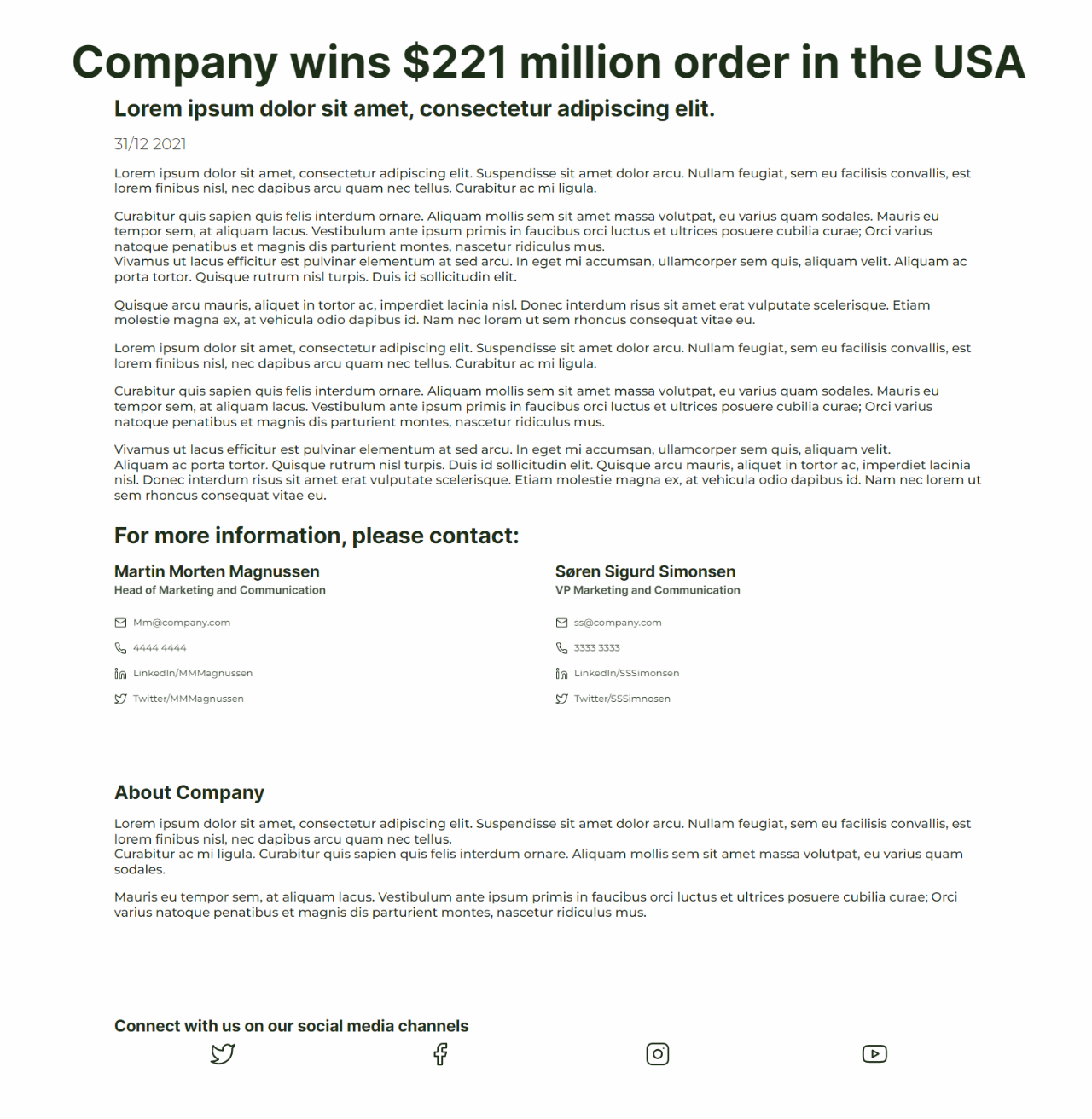
The next column is a text column placed in a 1-column row. In the text column we’ve used all the elements available in the text column. The title is used as an subtitle, and the subtitle is used as a date marker (Figure 16.2).
The next two rows are used as a company contact information fields. In the first row, a 1-column row, a section header is placed. The next row, a 2-column row, two employee columns are placed to give all the needed contact information to the reader.
The second element is an about the company row. This is used as a kind of footer, that’s placed at the bottom of every press release.
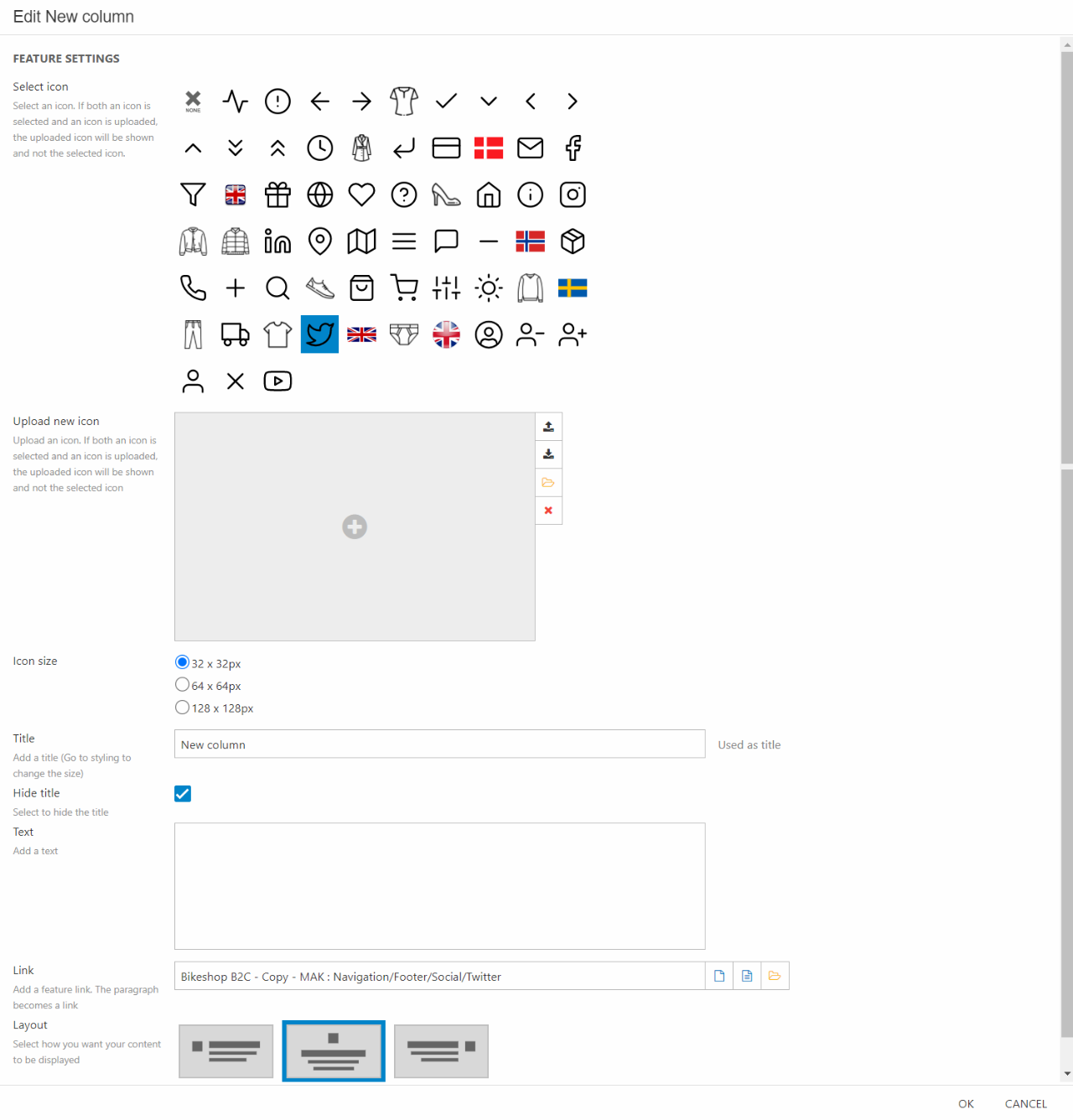
At the very bottom is a row with four features linking to different social media channels of the company.
First, we’ve placed a section header in a 1-column row. This will act as a header for the features below. The four features are placed in a 4-columns row. One in each column. The features are linked with our social media pages in the folder called social. This way clicking on the bird leads the reader to the twitter page of the company. As you can see on Figure 16.3 the settings are simple. It’s mainly about picking out the right icon (or uploading your own) and linking it to the right page.