
Swift Guide for Image Sizes
The sizes of your images can be tricky to get right without some general guidelines. Too large images compressed on smaller space will slow down the loading time of the page and too small images enlarged will make the image messy and grainy. This will both be critical for the user experience and the SEO ranking of the page as the loading time of the page is a factor in SEO ranking.
This guide will make some guidelines for creating content with images using Swift.
Swift automatically adapts content to both platforms
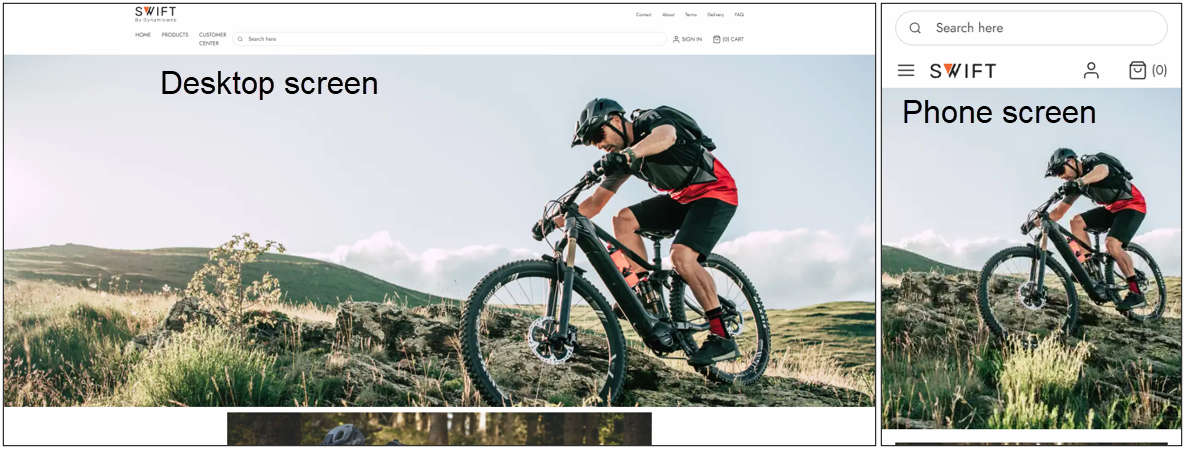
Swift works on both desktops and phones sized screens. This is possible because Swift automatically adapts your content to the size of the screen. This is also why you should use the image focal point cleverly, as some images will be cropped to fit the smaller sized screens on phones (Figure 2.1).
In addition to this if you want to shoot images for stuff like posters or max width images, we recommend that your images are shot a bit wider than usual as the widest part will be cropped in the adaption between platforms.
When you’re optimizing images to use on your site you should consider the purpose of the image. Will it be used as a giant poster on the landing page? Or a small icon? Or maybe something to be aligned with text next to it?
The purpose is important to consider, as you should size your image according to its purpose before uploading the file. If you want to use it as an on-page image with the width of around 600px your original image shouldn’t have a width of 2500px as this will take significantly longer time to load than it should.
Different image sizes in Swift
In Swift you can add images on your pages with various sizes, you do not need to size your image exactly the size of the column. Therefore, the following width measurements are guidelines and not exact measurements.
These guidelines are based on posters and images placed in a 1 column row. The section following this one will explain how to further specify the image sizes.
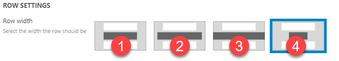
| Column width type | Width size in px |
|---|---|
| (1) Normal Width | Approximately 1800px |
| (2) Wide | Approxemately 2000px |
| (3) Max page width | Approxemately 2500px |
| (4) Narrow | Approxemately 1100px |
We also recommend keeping your images around 500 KB or less, as this will help your site load faster. If your image exceeds this limit, you could decrease the quality of your image to around 75%, as this will decrease the image file size without affecting the visual presence of the image in a noticeable way.
How to know the size of images/columns
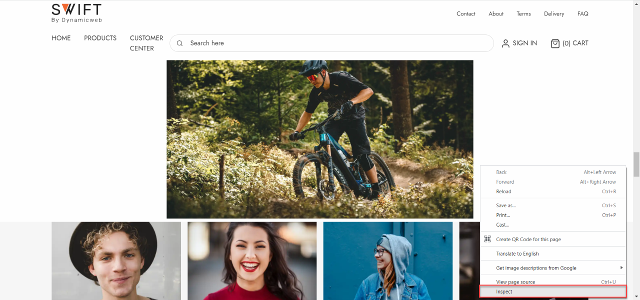
As mentioned, Swift has various ways to customize the width of the columns displayed on your page. This is also why the guidelines shown above are guidelines and not rules. If you want to be more specific about the size of your image, you have some different options. The one we’ll show is inspecting the page using the developer tool. We’ll show how to find the developer tool for Google Chrome.
After navigating to the page where you want your image to be on, right click and hit Inspect (Figure 4.1).
This will open the developer tools. Though it might seem a bit confusing you only need to click the inspection tool (1) and hover the image or object you want to measure the size of. A small box containing various information about the object will appear. At the top of the box, you’ll see the size of the image. In this case it’s 736 pixels x 259.6 pixels (2).
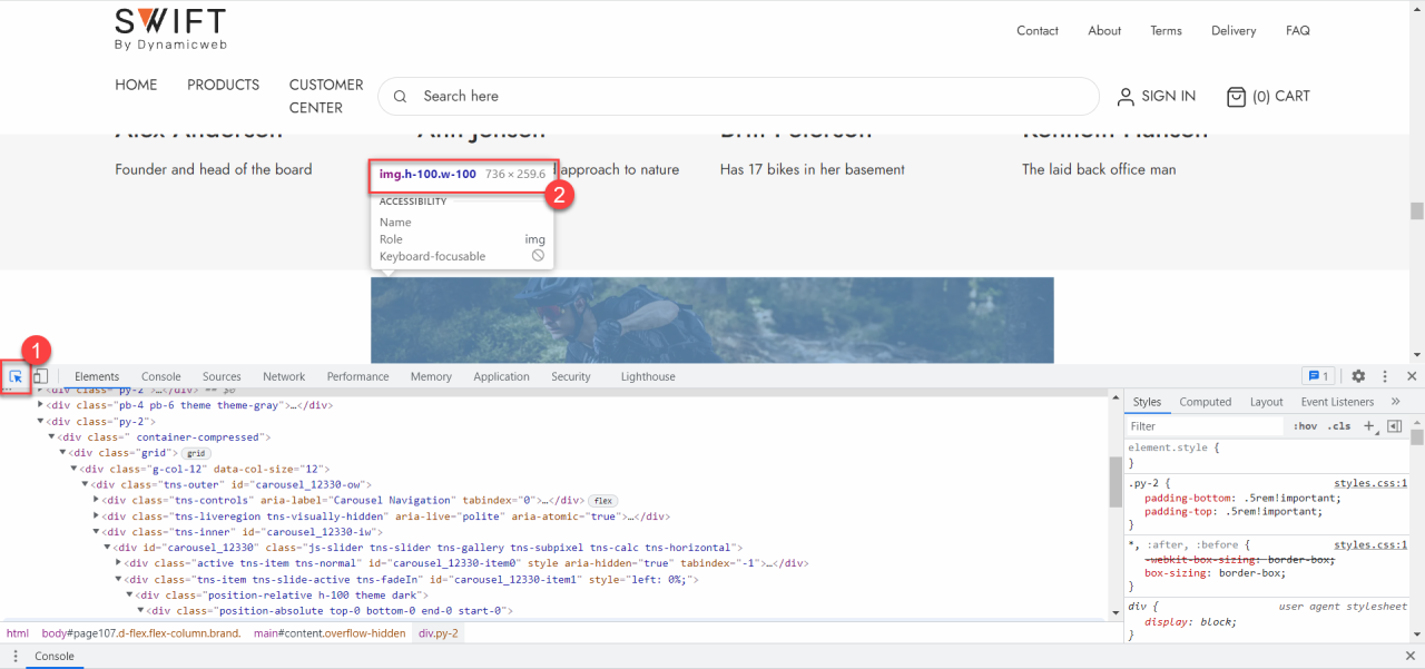
When designing for users with retina screens you should double the width size to keep the images crisp. So, in the example above, as the image is displayed with a width of 736px, the actual image width should be 1472px to keep the sharp finish of the image.