Product list
- List view
- Grid view
- Details view
- Tiles view
Read more about the configuration options for the product list in this article.
For a guide to set up the product catalog, see this article.
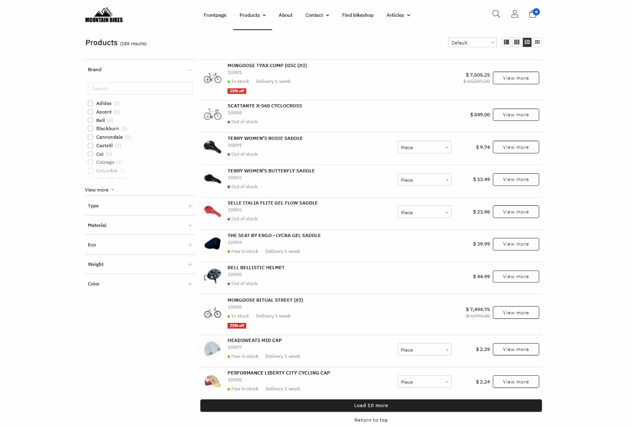
List view
The following information is default in the List view product list:
- Products are visible to both logged-in and anonymous customers
- A Favorites-icon will appear once a customer logs in, and can be clicked to add a product to the Favorites list
- List/Grid/Details/Tiles view is the default product list view when a customer views the product list
- The following product fields are shown: image or image placeholder, number, name, teaser text, units, variants and prices
- An add-to-cart button and a quantity selector (5 digits) can be used to add one or more products to the cart or configure it so it shows a view button instead and redirect to the product page.
- Prices, the quantity selector, and the add-to-cart button can be hidden from anonymous customers (read more here)
- The List View shows 30 products at a time and uses a load more button to load more products
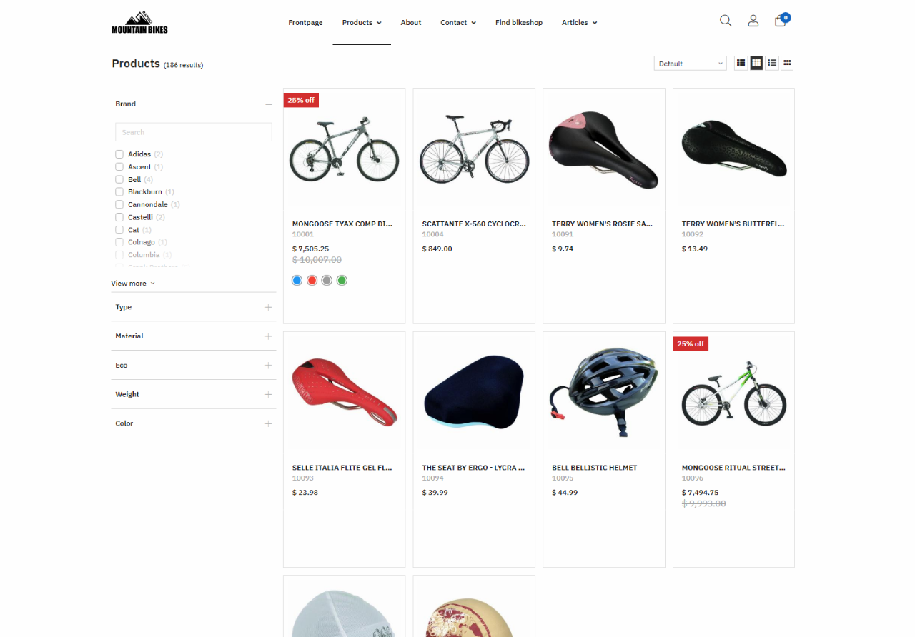
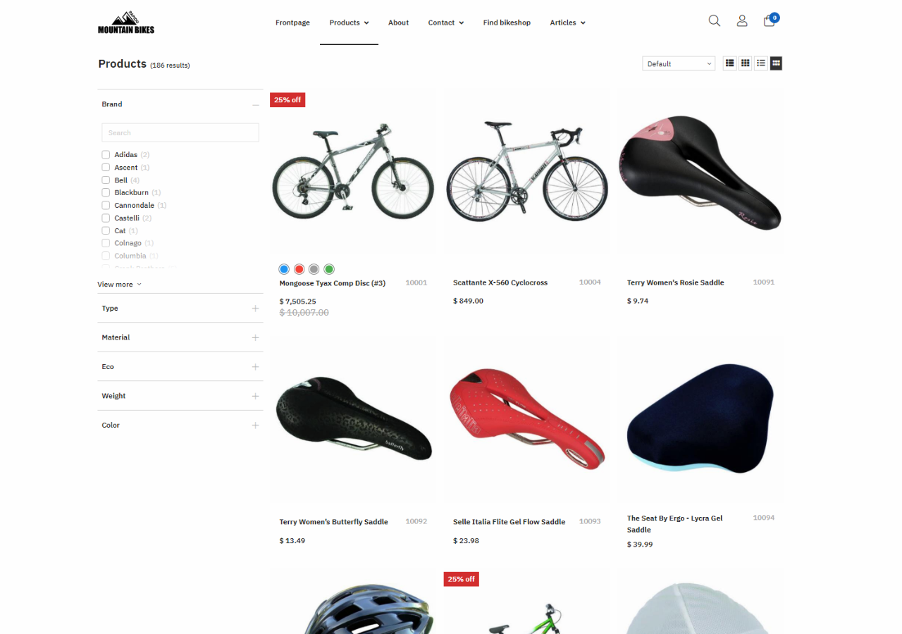
Grid view
The following information are default in the Grid view product list:
- Products are visible to both logged-in and anonymous customers, and can be shown as 2/3/4 columns.
- A Favorites-icon will appear once a customer logs in, and can be clicked to add a product to the Favorites list
- Prices can be hidden from anonymous customers (read more here)
- List/Grid/Details/Tiles view is the default product list view when a customer views the product list.
- The following product fields are shown: image or image placeholder, number, name, and prices
- A view button redirects customers to the product card, but you can also configure it to show a add to-to-cart button and a quantity selector.
- The Grid View shows 30 products at a time and uses a load more button to load more products
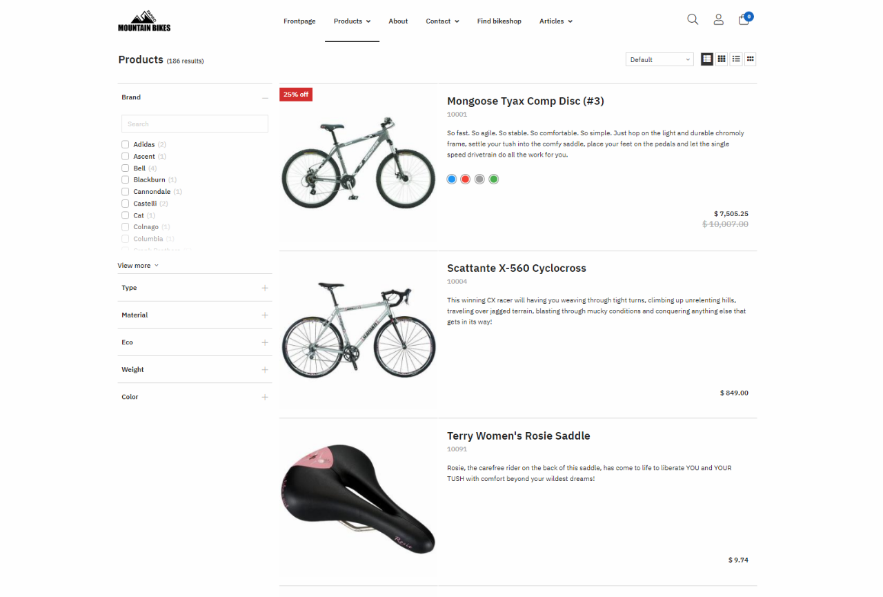
Details view
The following information are default in the Details view product list:
- Products are visible to both logged-in and anonymous customers
- A Favorites-icon will appear once a customer logs in, and can be clicked to add a product to the Favorites list
- List/Grid/Details/Tiles view is the default product list view when a customer views the product list
- The following product fields are shown: image or image placeholder, number, name, units, stock, delivery information, and prices
- Product stock availability is displayed using a red/green circle
- For products with variants, a view button directs customers to the product card
- An add-to-cart button and a quantity selector (5 digits) can be used to add one or more products to the cart, or configure it to a view button that redirect the to the product page.
- Prices, the quantity selector, and the add-to-cart button can be hidden from anonymous customers (read more here)
- The Details View shows 30 products at a time, and uses a load more button to load more products
Tiles view
The following information are default in the Tiles view product list:
- Products are visible to both logged-in and anonymous customers, and can be shown as 3/4 columns.
- A Favorites-icon will appear once a customer logs in, and can be clicked to add a product to the Favorites list
- Prices can be hidden from anonymous customers (read more here)
- List/ Grid/Details/Tiles view is the default product list view when a customer views the product list.
- The following product fields are shown: image or image placeholder, number, name, and prices
- An add-to-cart button can be used to add a product to the cart
- The Tiles View shows 10 products at a time and uses a load more button to load more products
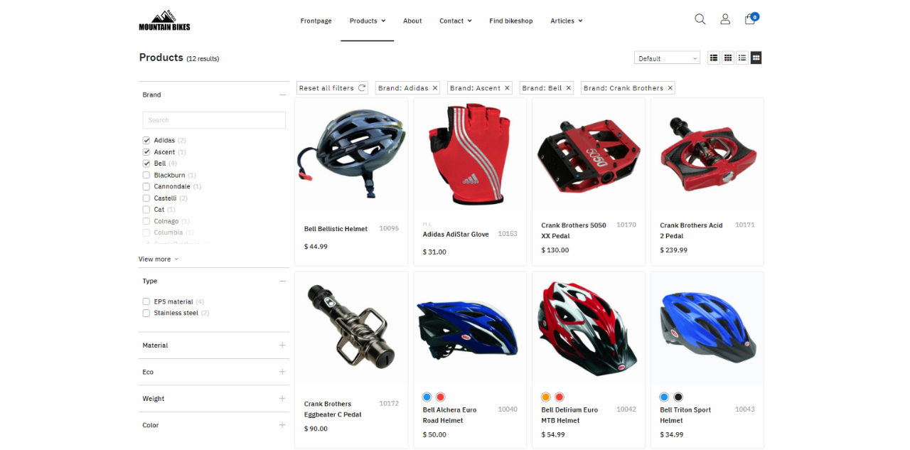
Facets
Facets help customers narrow down the search result by filtering products in different facet groups, so they can find exactly what they are looking for.
When products are filtered using facet options, a tag bar appears above the product list creating an overview of the current filtering. Here, you can deselect a single or all facet options.
Rapido features two types of facets for filtering product list data: horizontal facets and vertical facets. Apart from their position in the layout, they are functionally 100% identical.
Read more about the configuration options for facets in this article.
Vertical facets
With vertical facets:
- Facets are placed on the left side of the product list
- The filtering options will automatically adjust to the product attributes associated with the individual product groups
- When a facet option has been selected, the selection option appears as a tag above the product list, which can be deselected. A reset button will also appear beside the tags, when there are selected 3 or more options.
- The facets can be maximized and minimized
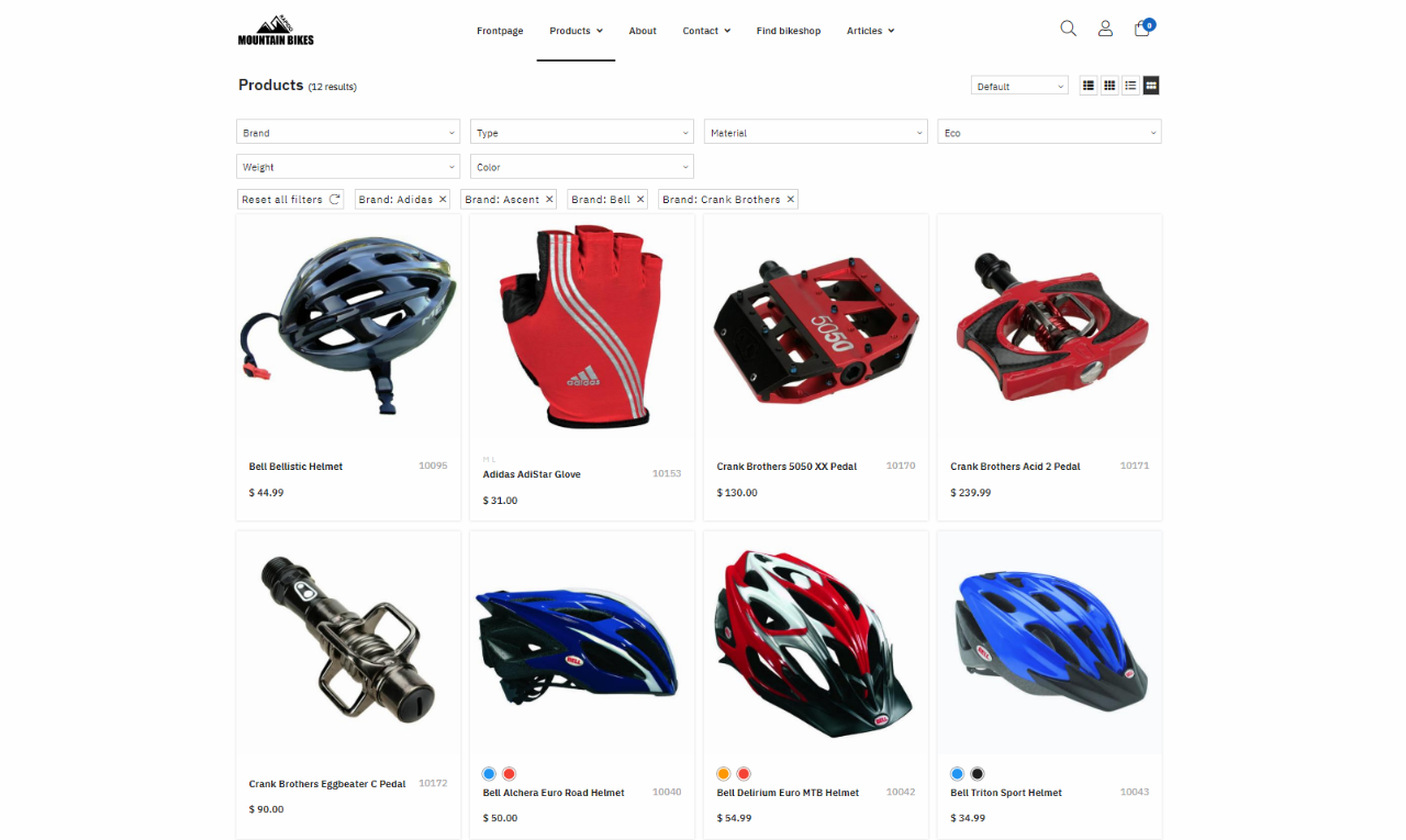
Horizontal facets
With horizontal facets:
- The Facets are placed above the product list
- The filtering options will automatically adjust to the product attributes associated with the individual product groups
- When a facet option has been selected, the selection option appears as a tag above the product list, which can be deselected. A reset button will also appear beside the tags, when there are selected 3 or more options
- The facets can be maximized and minimized