
Creating a desktop footer for your website
Having a well-structured and aesthetically pleasing footer can be crucial to the customer's experience of navigating a website. With Swift it does not have to be complicated to make one that covers your specific wishes.
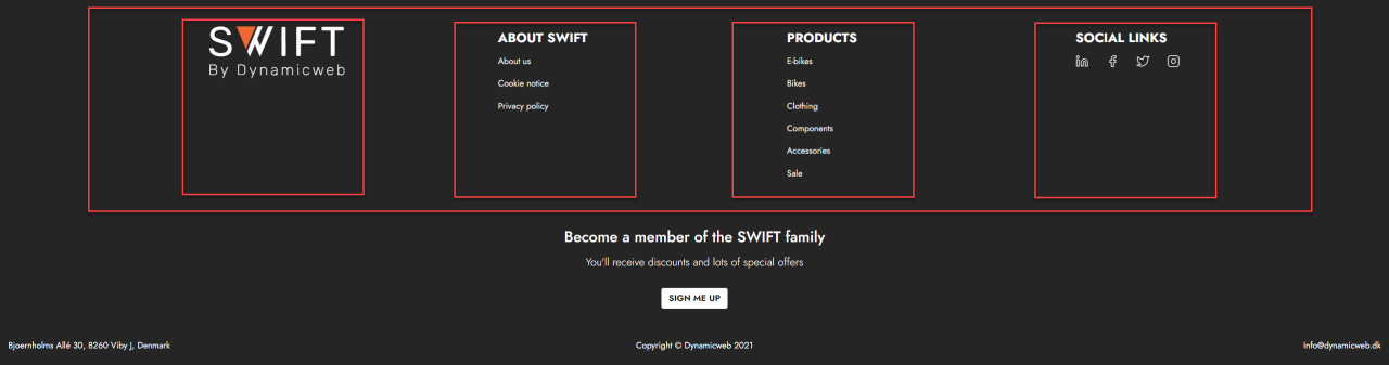
This guide will go through the steps for creating the example footer shown below.

In this guide you’ll be introduced to the following types of content:
The layout tool
Swift distinguishes between mobile and desktop versions of footers and headers so you can tailor them specifically to the customers type of device. Since this guide focuses on the desktop version, naturally this will be our point of departure.
To begin customizing your websites footer navigate to Swift tools > Layout > Footer > Desktop (1)
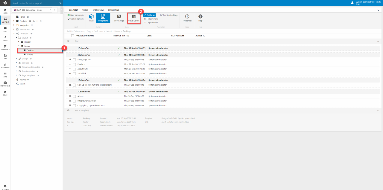
From here you can access the intuitive Visual Editor (2) to drag-and-drop content in the same manner as you would with the website's general content. In this example we’ll start from scratch with an empty footer to show the different features of the Swift Visual Editor.
Logo
The top row of the example footer consists of a 4 Column-flex row with a logo and three navigation columns where the last column is a list with social media icons.
The first thing we’ll add to the row is a logo, that will link back to the landing page. To match the logo styling from this example, follow these steps:
- Choose the preferred image to act as the visual logo.
- Change the logo width to 250.
- Make sure the Horizontal alignment is kept left.
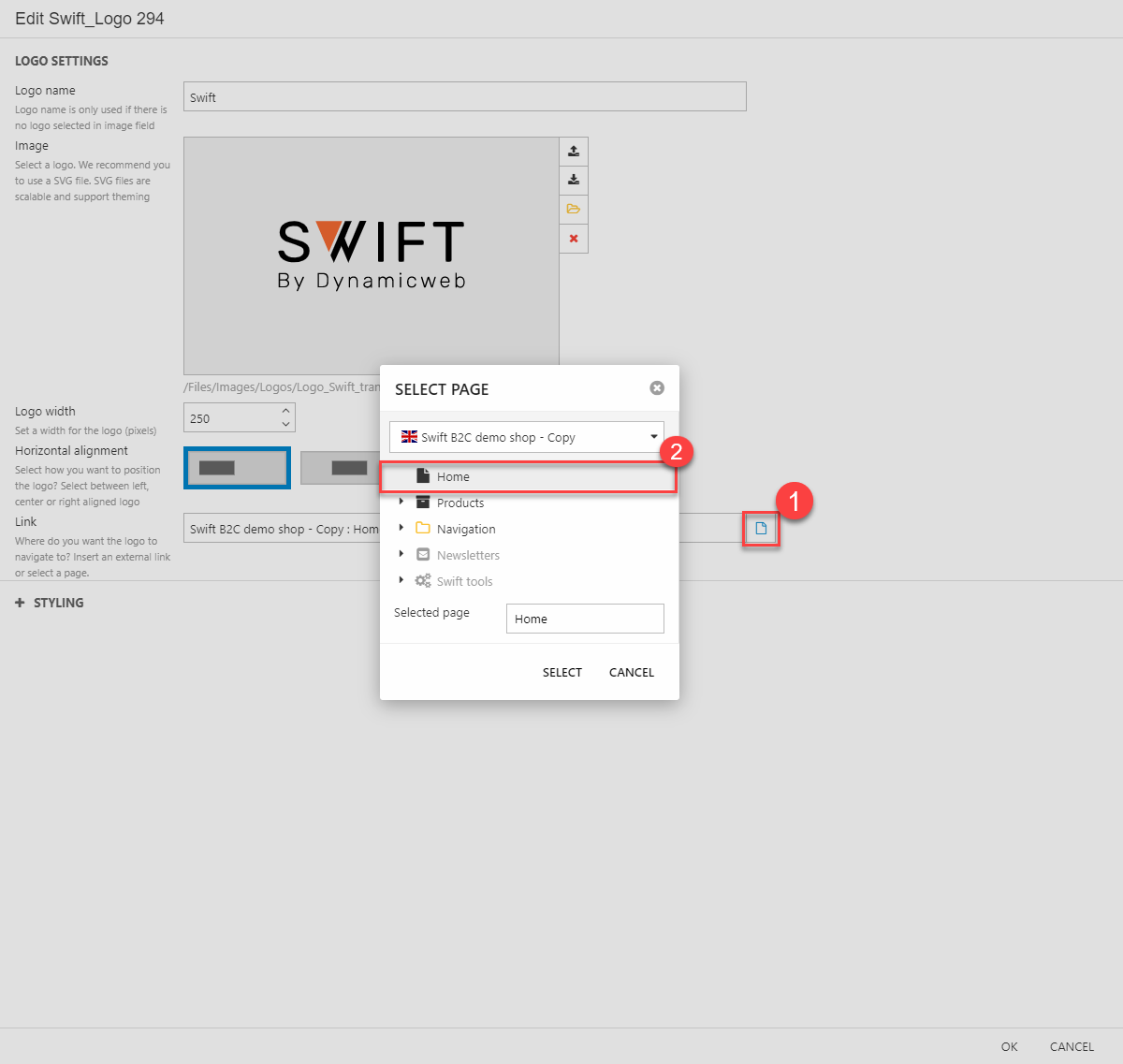
- Make the logo link to your landing page (Figure 3.2). This is done by clicking the small blue page icon (1) which will open a small menu. Click your landing page (2) and hit SELECT.
Navigation columns
For the next two columns we’ll add navigation columns. Dragging the navigation column onto the row opens the column editor where the navigation settings, link styling, navigation title styling and general styling of the column can be managed.
To make a navigation column like the one shown in the example footer follow these steps:
- Give your navigation column a title. This will be shown as a header to the list of navigation links of the column. You can check the box below the title field to hide the header.
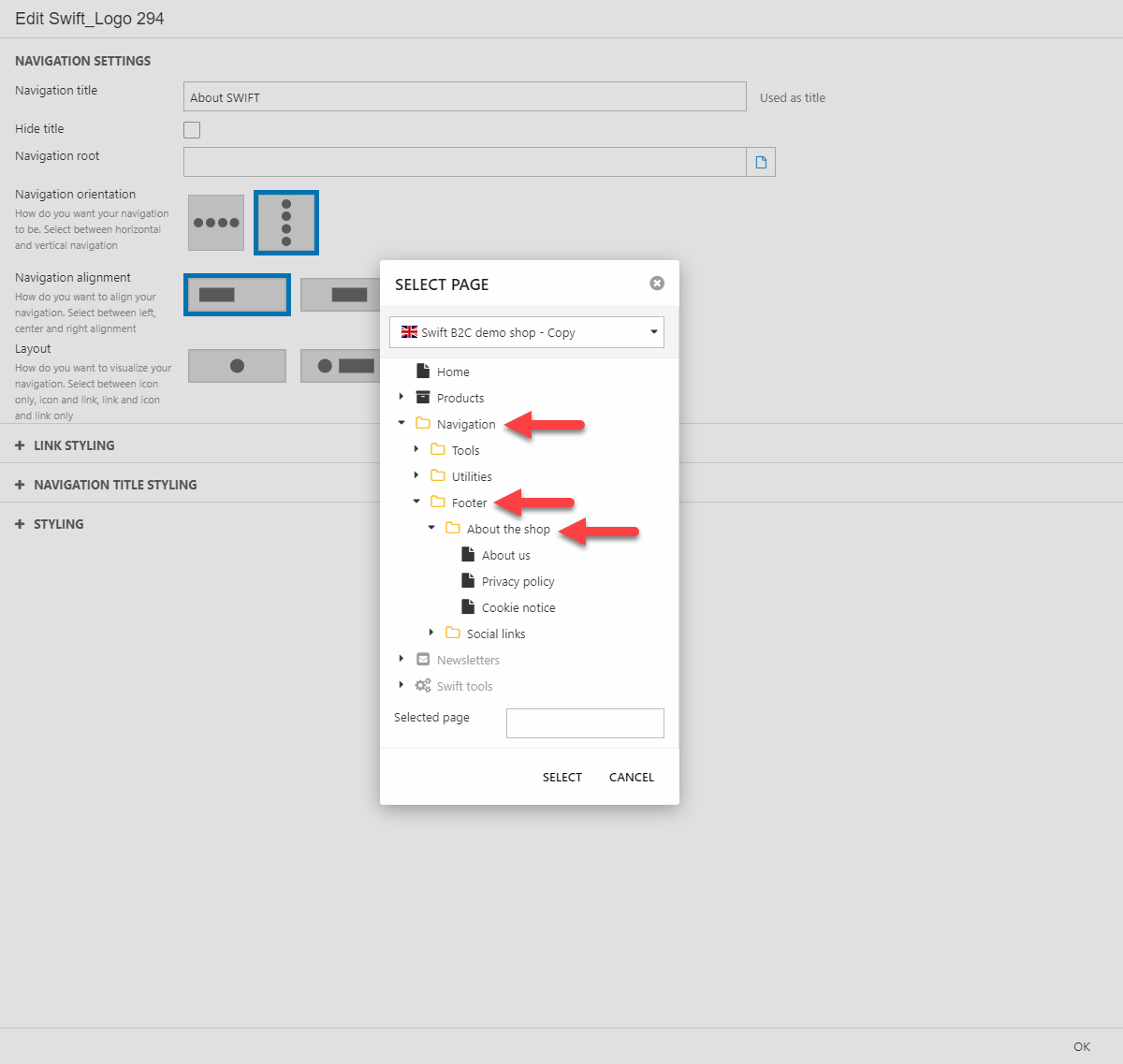
- Specify the navigation root. This can be selected with the small blue page icon to the right of the field. As you can see in (Figure 4.1), this website is organized into a navigation folder with subfolders containing the pages of the website. Select the folder in which the pages you want to navigate to are located - in this case "About the shop".
- Select your navigation orientation, alignment and layout. For this example the settings are vertical navigation orientation, left navigation alignment and text only layout.
- Optionally you can customize link and title styling to your liking, or you can simply select one of the predefined themes from the bottom Styling menu. In this example the navigation title styling font size has been changed to Large.
When displaying navigations like this, all the published pages in the folder will be shown on the page. To change this, you’ll either have to delete or hide unwanted pages. A guide to do this, can be found here. That guide will also show how to add new pages, should you want that.
For the next column the procedure is the same. We’ve chosen to show the different categories of bikes in the shop by choosing Products as the navigation root, but it could be whatever navigation you’d like.
Don’t worry about the different heights of the columns, we’ll change that when all four columns are placed.
Social media links
For the last column in the 4 columns flex row, we’ll add some social media links. This is done the same way as adding a navigation column. The main differences are the horizontal navigation orientation and the use of icons only as layout.
The most important thing to change when working with social media links is what they are linking to. This is done by closing the Visual Editor. In the backend content section navigate to the desired page (Navigation > Footer > Social links > Facebook). The pages should be empty, instead they’ll redirect the user to your different social media channels. Right now, it’ll either redirect to nothing or to Dynamicweb’s Facebook page. To change this, do the following steps.
- Click Properties to enter the properties of the page (Figure 5.1). Here you can change the icon of the page.
- To manage the redirection, go to Advanced and click Shortcut in the action bar at the top.
- Type the URL you want to redirect to and click OK to close the shortcut menu.
- When all this is done, remember to hit Save and close to save your changes
Do the same steps for all the different channels you want to redirect to.

Should you want to add other social media redirectors you’ll need to create new pages in the social media folder. A guide for that can be found here.
Styling the row
The 4-column flex row is now complete. The only thing left to do is styling the row. This is done by re-entering the Visual Editor of the footer. In here, hover the row and open the row editor by clicking the pencil in the small menu in the top-center.
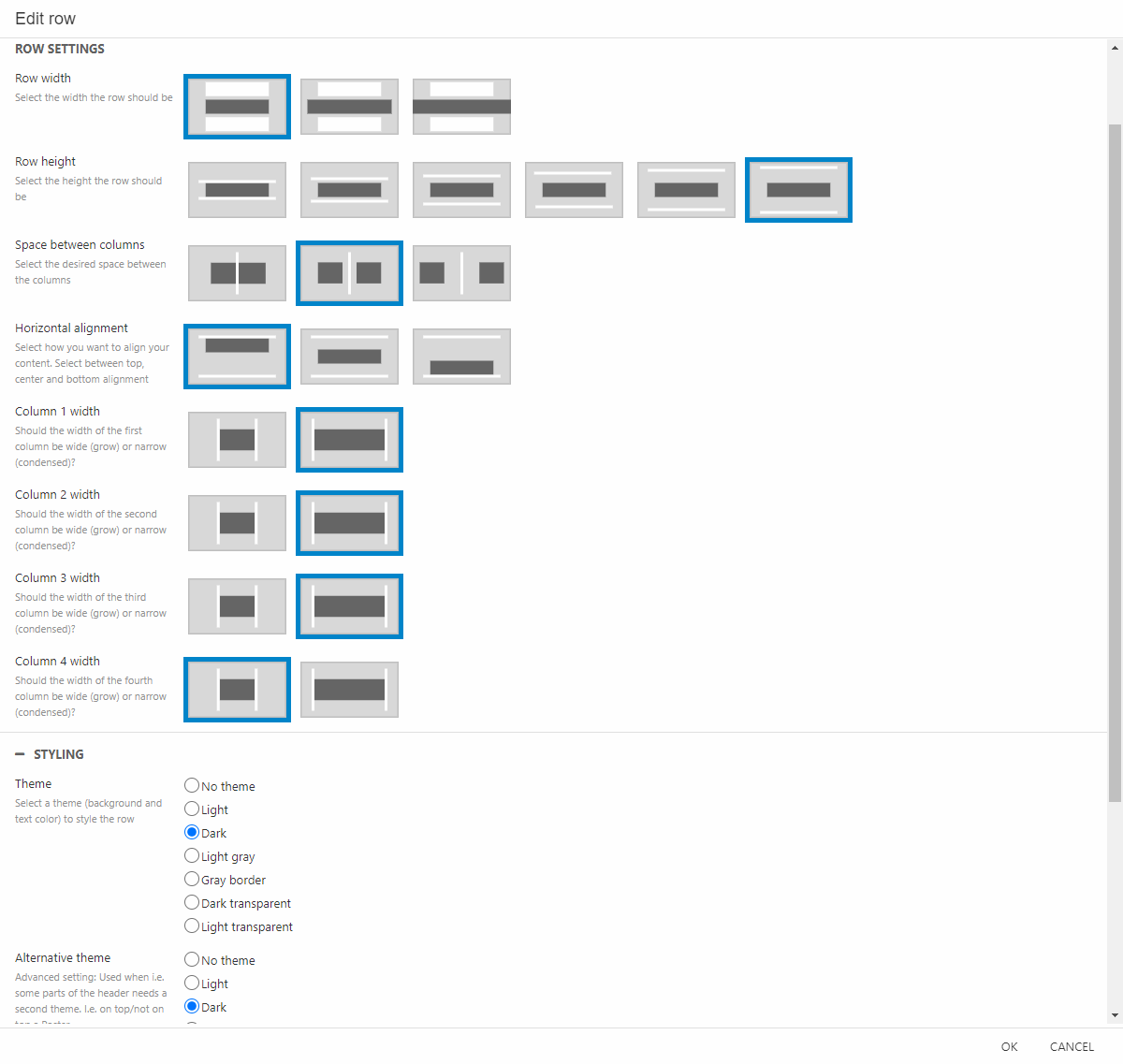
To get the style shown in this guide’s example choose the following settings (Figure 6.1):
Adding a text column with a button
The next thing we want to add to our footer is text with a button. In this guide the button will redirect to a user creation page for new users – but it could also redirect to an email subscription site, an event site or whatever fits your wishes.
This time we’ll use the 1 Column – flex as we only need one column in this row. Drag-and-drop the text column onto the empty row.
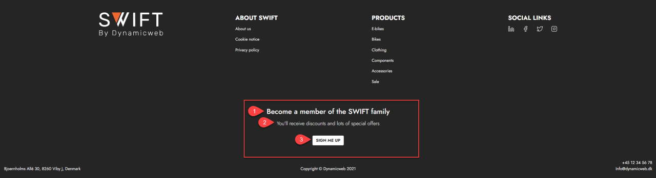
In the text editor add a title (1), subtitle (2) and button label (3) that suits your use of the button. As said, the button in this example will redirect to a user creation page, so we’ll write something about joining “the SWIFT family” and the benefits of doing so. Also make sure to center your content in the layout section of the editor.
Linking to the right page is done in the same way we linked the logo to the landing page earlier in this guide. Only this time, we’ll choose the customer creation page as the link.
The last thing we’ll do with this row is changing the theme to dark and adding some air above and beneath the row content. This is done in the row editor, just like we did with the other row.
Adding three text banners
The last thing to add to our footer is three text banners. In this example we’ll write the company address, something about copyrights and some contact information. As we want the three text banners to be placed nice and symmetrical, drag-and-drop an empty 3 Column – flex at the bottom of the footer. To each of these columns we’ll add one text banner column. We want these three columns to be positioned a bit differently. In the editor’s layout section make sure that the left column aligns to the left, the center column aligns to the center and the right column aligns to the right.
Lastly, to make the rows match each other change the theme of the row to dark. Optionally you can change the row width and row height for some extra styling.
And that’s that. This is one way to create a simple footer with different kind of features.