
Standard paragraph 3
The standard paragraph 3 item type is used to create a column with a classic image - text - button design (Figure 1.1). An image with smaller width than the column is placed above the text, and one or more buttons can be placed below the text.

The icon for the standard paragraph 3 looks like this (Figure 1.2).
With the item type, you have the settings in the Content section (Figure 1.3).
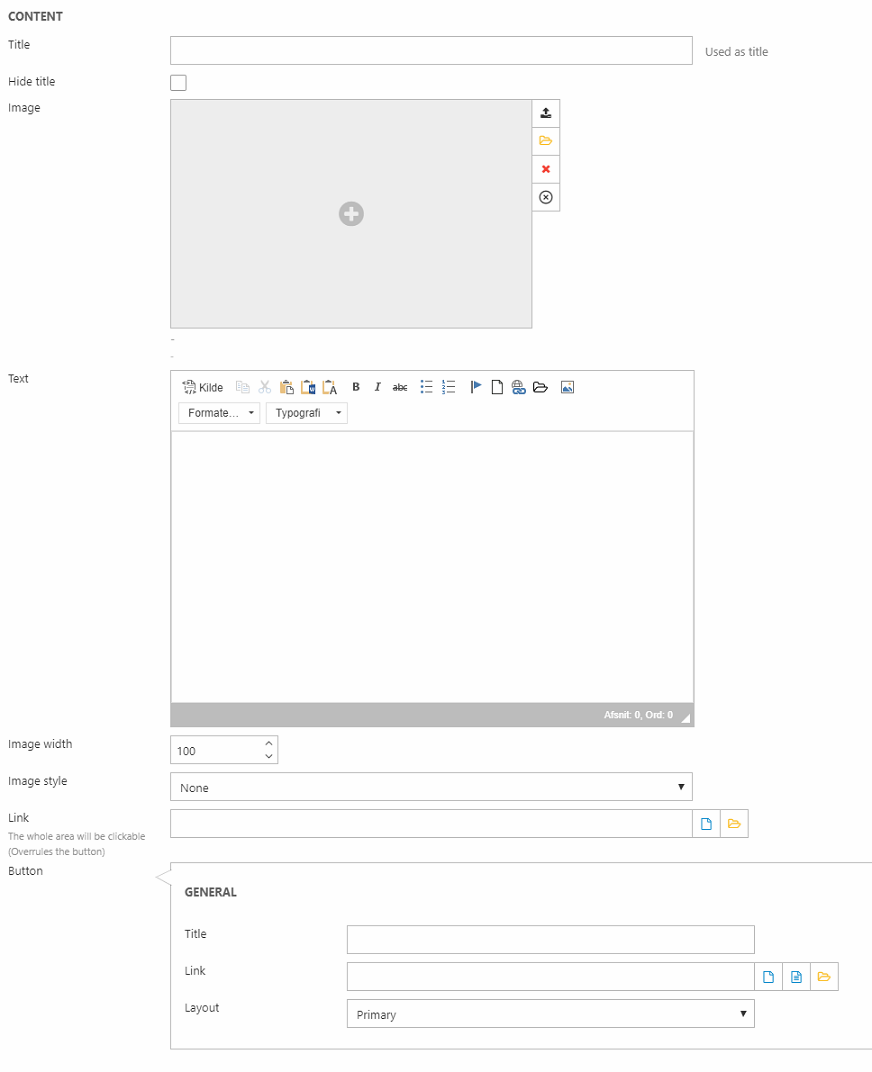
Here, you can:
- Insert a title (can be hidden from the frontend result)
- Select an image
- Insert the text of the column
- Change the image width (in px) and image style:
- None - keeps the form of the original image
- Ball
- Square / quadratic
- Triangle
You can also apply a link covering the whole area of the column - including any buttons - or create a button with a title/text, link, and button layout.
Below, you have the Style section (Figure 2.1).
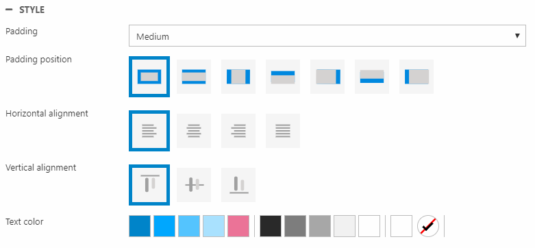
With these settings, you can change:
- Padding size and position
- Horizontal and vertical alignment
- Text color