Rapido Content model
Visual Editor is a tool in Dynamicweb empowering the user to create content in a visual way by having the page as the workplace and then dragging different building blocks (predefined rows and columns) onto it. That way the user can see the changes immediately and what the finished page would look like in frontend.
With Visual Editor, a page is divided into rows and columns. For each row, you add content in the form of columns.
In Rapido you can use Visual Editor, but instead of creating row and columns from scratch as you’d normally do with Dynamicweb, you work with the Rapido Content model. The Rapido Content model provides existing templates and presets for rows and columns.
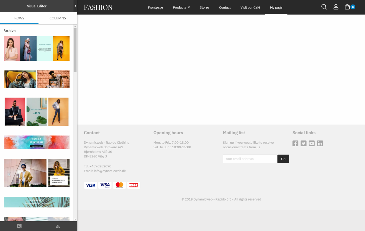
The Visual Editor interface (Figure 1.1) consists of a Rows tab (1) and Columns tab (2) in a left side panel, and the content editor area (3) in the right side. In the tabs, you can find and search for row and column templates and presets, which you can drag onto the content editor area. The content editor area shows the frontend view of the page, where you can interact with the content elements after you’ve added them from the Rows and Columns tabs.
At the bottom of the leftside panel (4) you can Show the page in frontend, Switch to another responsive preview or Select another page (switch to another page without exiting Visual Editor).

How to use Visual Editor with Rapido
With Rapido’s Content model, the user is equipped with existing templates and presets. The presets are a quick way of adding content to your page, where you can e.g. drag an entire row that is already enriched with demo content onto the content editor area. The content can then be changed afterwards.
There are two types of presets (Figure 2.1):
- A row preset is an entire row with already enriched columns, which you drag onto the content area.
- A column preset is a column enriched with demo content, which you drag onto an available area on empty row.
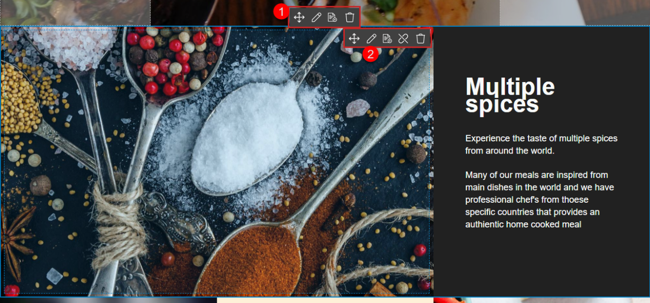
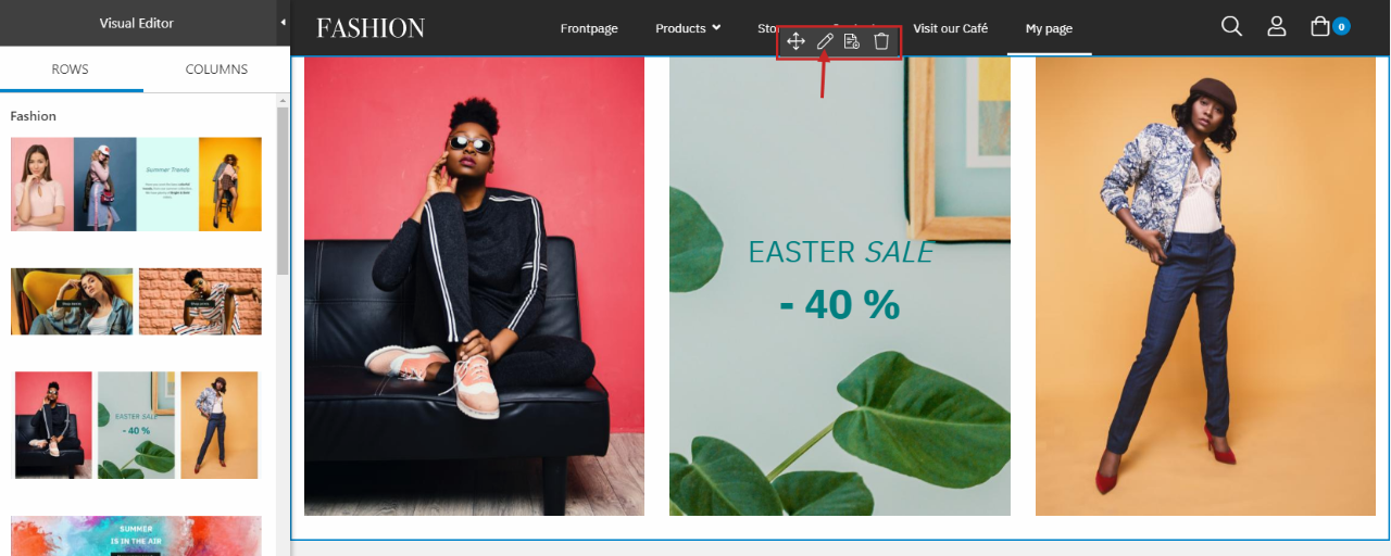
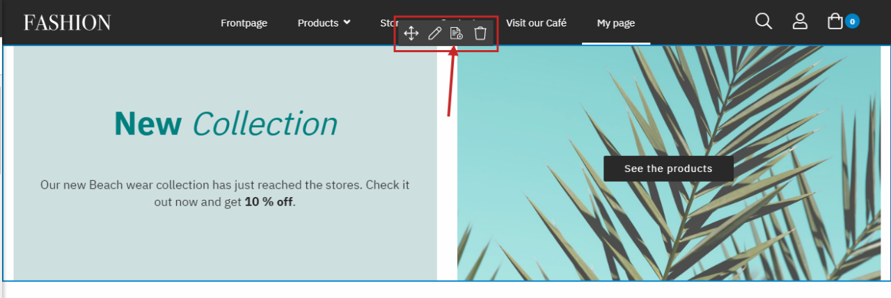
When you’ve dragged a row or column preset to the content editor area, you can interact with it and edit the content using the context menu (Figure 2.2). You can interact with the entire row (1) or with one of the columns inside the row (2), and have the following options for each: move, edit, and delete.
Presets are the main way of working with Visual Editor in Rapido, but you can also work with empty rows and columns, which are completely without content from the beginning.
Working with presets
In this section we will create a new page and fill it with content using row presets and column presets.
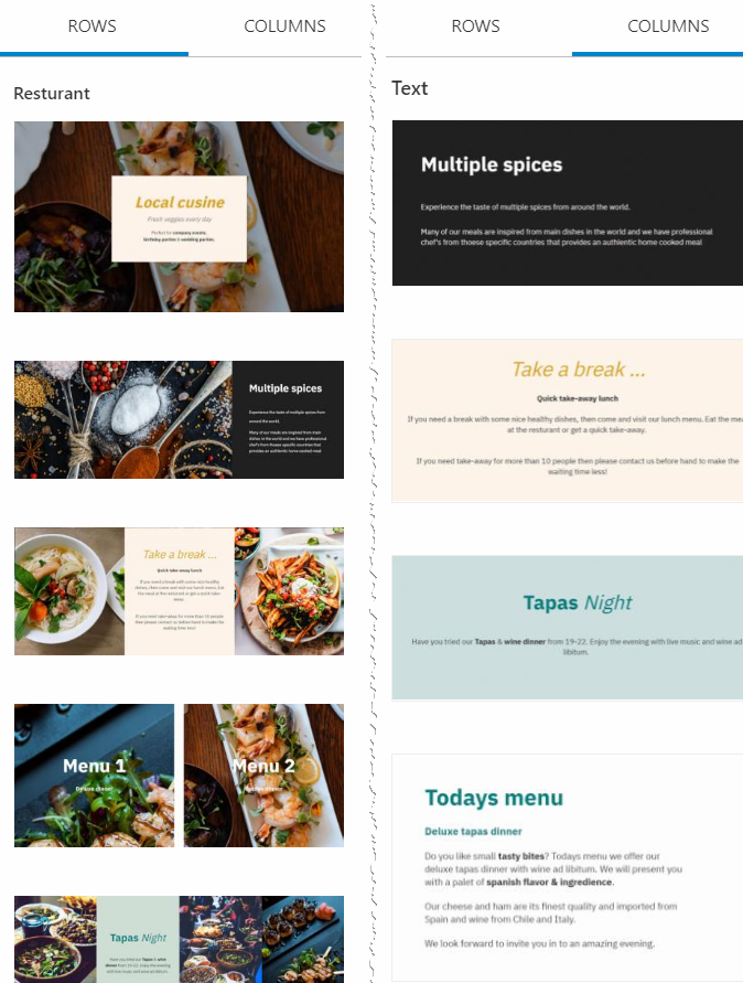
Row presets
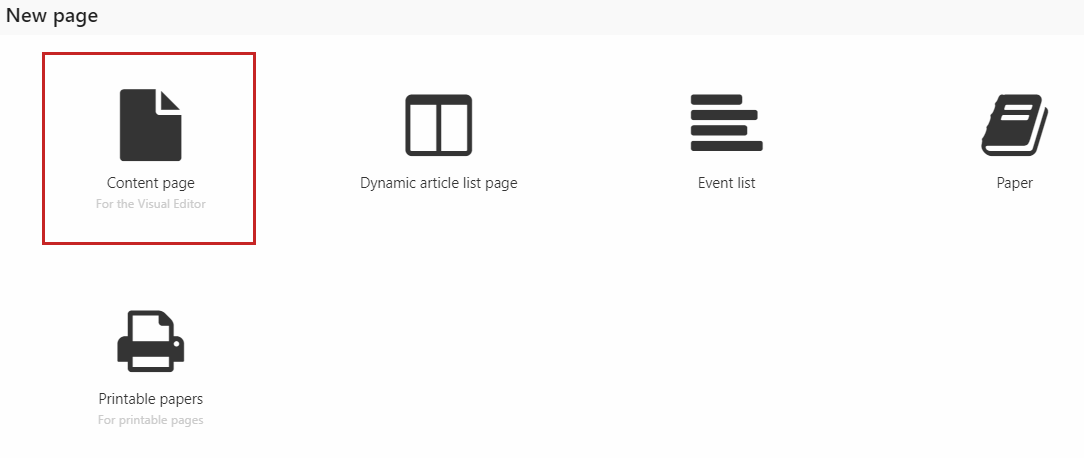
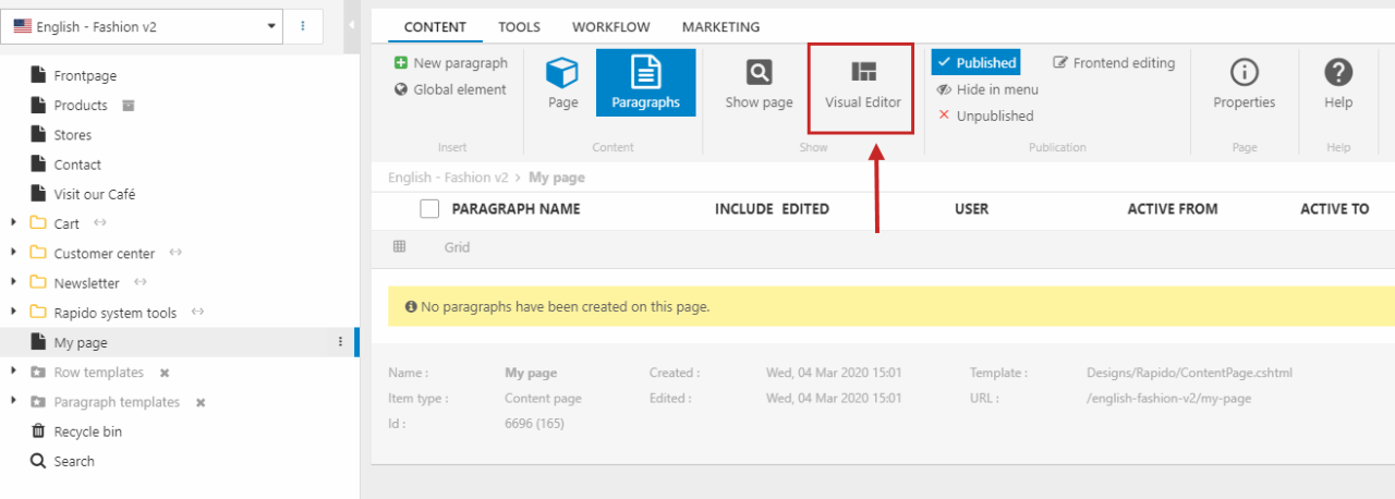
Start in the Content area of Dynamicweb and create a new page. Select the Content page item type (Figure 4.1).
Click Visual Editor in the ribbon bar to access the Visual Editor interface (Figure 4.2).
Right now, the page is empty except for the header and footer (Figure 4.3). So let’s add some content!
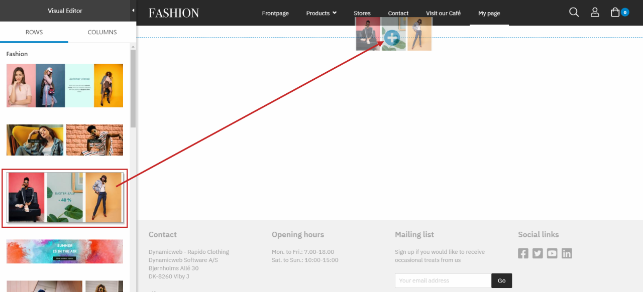
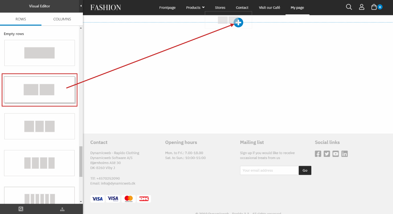
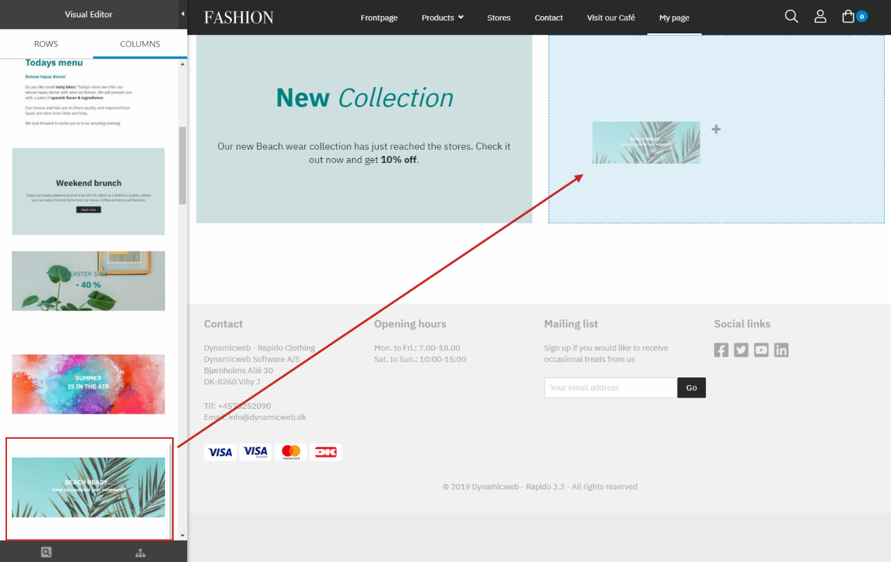
Go to the Rows tab and take a look at the existing presets. Drag one of the row presets onto the content editor area. Since the content editor is empty, you must aim for the big plus icon that appears, as shown in (Figure 5.1).
Now you can change the look of the row and its related columns – the images, text and colors. As mentioned before, you have settings for the row and then for each column inside.
To edit the layout of the row itself, mouse-over the row and the context menu will appear (Figure 5.2). Click the Edit icon to change the settings for the row (be sure it is the row context menu you click on – the row context menu will be centered and is constantly visible when mousing over the row)
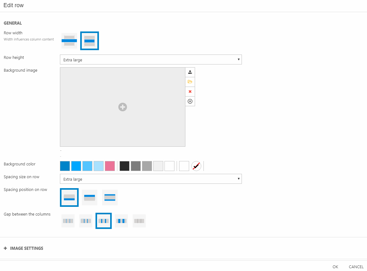
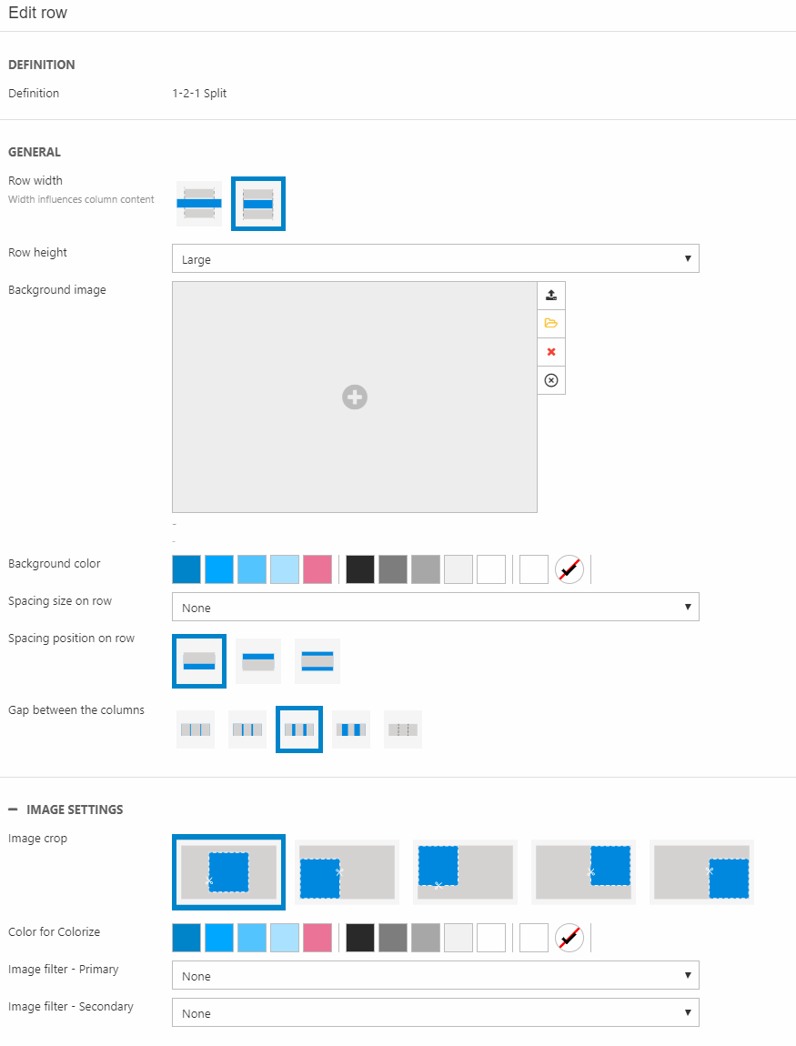
In the Row settings (Figure 5.3), you have the following options in the General section:
- Row width (also impacts the column content) and height
- Background image (can be further configured in the Image settings section below)
- Background color
- Set the spacing position and size around the row
- Set the gap size between the columns inside the row
If you choose a background image for the row, you can tweak it using the Image settings section (Figure 6.1).
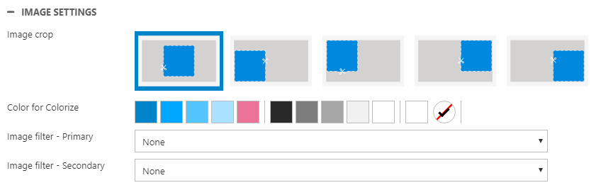
Here, you can:
- Choose a cropping method
- Colorize the image
- Apply image filter(s)
Now, onto the content: let’s edit the columns and their content. Mouse over the column in the content editor area and its option menu will appear (Figure 6.2). Click the Edit icon.
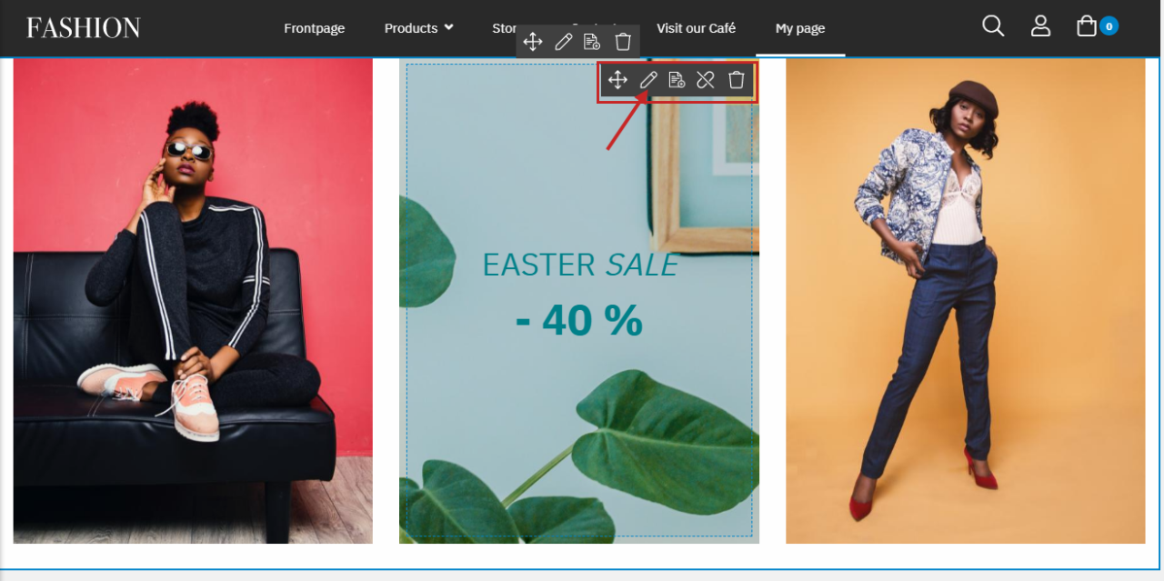
In the Edit column window, you have different sections of settings. Which sections are available depend on the type of column – for example in this case, the columns to the left and to the right are Image item types, while the middle column is a Standard paragraph two item type. The Image item type has far less settings than the Standard paragraph two item type.
In this guide, we will edit the Standard paragraph two column, but not go into detail with the settings.
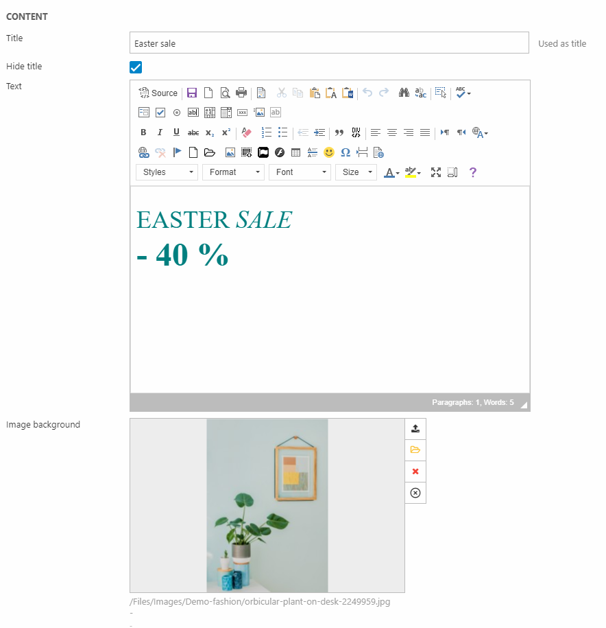
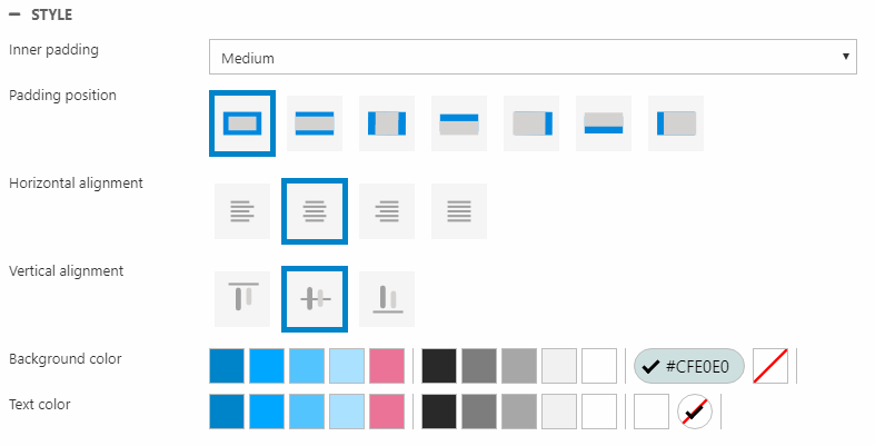
So, in the Content section (Figure 6.3), try to change the:
- Text in the rich-text editor
- Image background
Then play around with the Image settings (the cropping method, filters, etc.) and Style (alignment and padding) sections – maybe try to add a button using the Buttons section (Figure 7.1).
Continue to edit the content for the rest of the columns, and then that’s it! The first row is done. Now, you can continue to add more rows to fill the page.
Column presets
Like you have row presets with demo content, you also have column presets, which work the same way but are just smaller building blocks. Using an empty row, you can then fill it out with single column presets.
In the Rows tab scroll down to the empty rows. Find one that has the desired amount and layout of columns and then drag it onto the content editor area.
Switch to the Columns tab, and take a look at the different column presets. You can of course change the column as much as you’d like – add/remove an image, put a link or a button on it, change the colors, etc. The preset is just a base.
Drag one of the column presets onto the empty row and it will fill out one of the available empty areas.
Mouse-over the column to open the column's context menu and click the Edit icon. As said before, the settings that are available depend on the type of column (for information about the different types of columns and their settings, click here). In this case, we’ve added a column preset with the standard paragraph 2 item type.
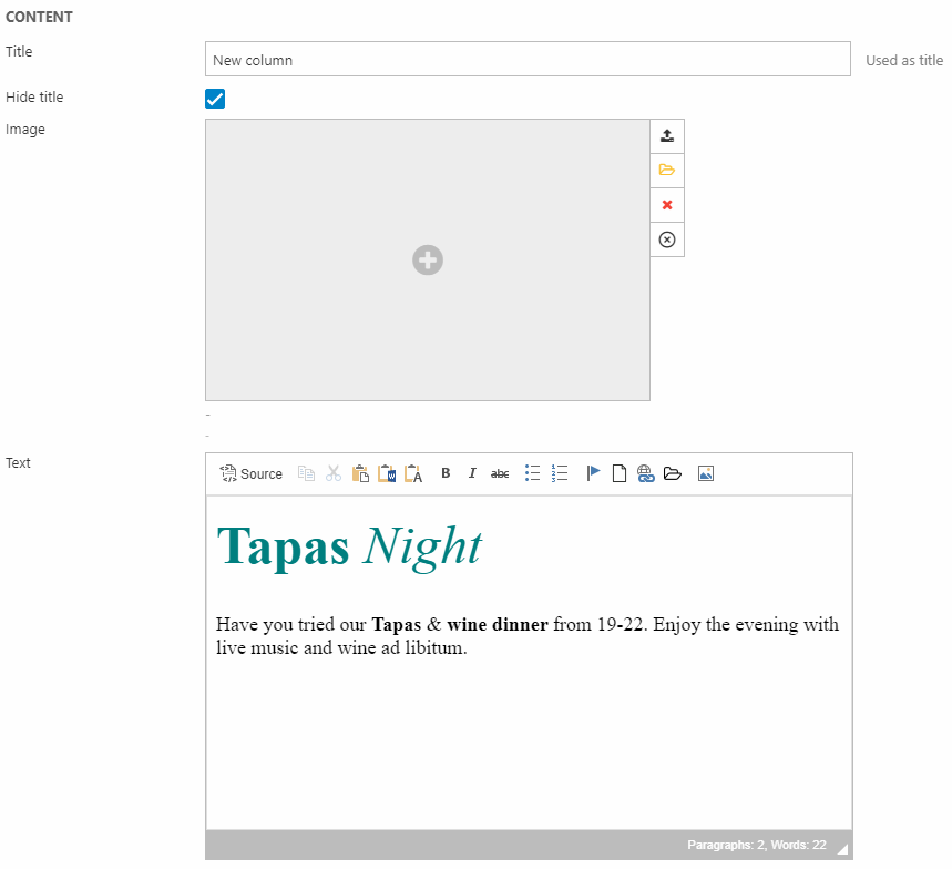
Edit the content using the Content section (Figure 8.3).
You can also play around with the other settings, e.g. the ones in the Style section (Figure 9.1).
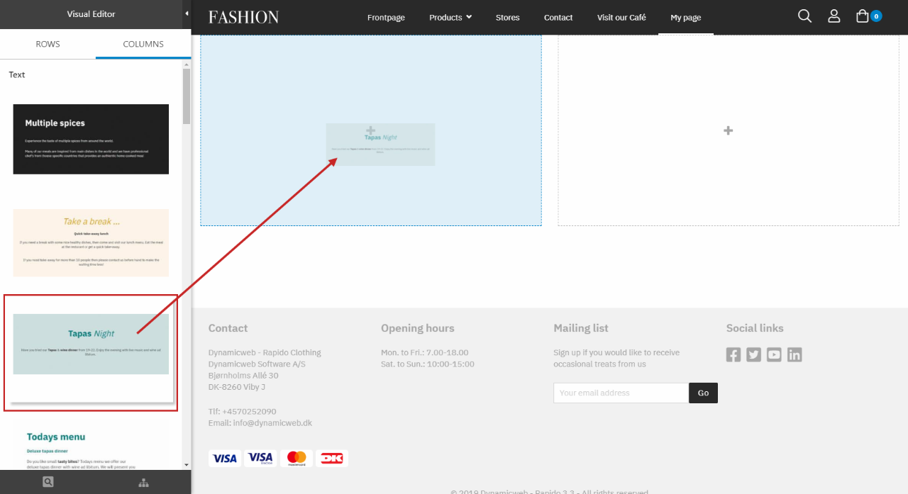
Now, let’s add the other column preset. Drag a column preset from the Columns tab onto the other empty area on the empty row (Figure 9.2).
This preset also has the standard paragraph 2 item type, so the same settings are available. Change the content for this column and then you’re done. A finished example could be Figure 9.3.

Creating your own presets
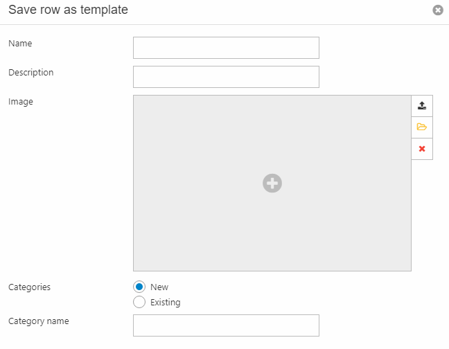
Admins and administrators have the option to create new presets based on rows and columns they’ve created in the content editor area. This option will show in the context menu for both rows and columns, where they can click save row/column as template (Figure 10.1).
In the dialog that appears, the template or preset must be named and added to a category – a new or existing one.
You can also provide a description and an image.
This will add the row/column to the panel of presets under the specified category in the corresponding tab (Figure 10.3).
If you added an image, it will be shown in the panel instead of the name, which can be seen when hovering over the image. If not, then the name will simply appear in the panel.
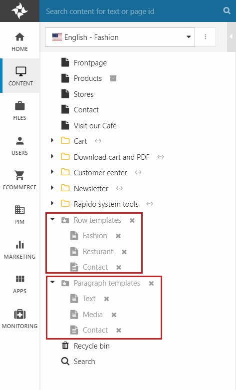
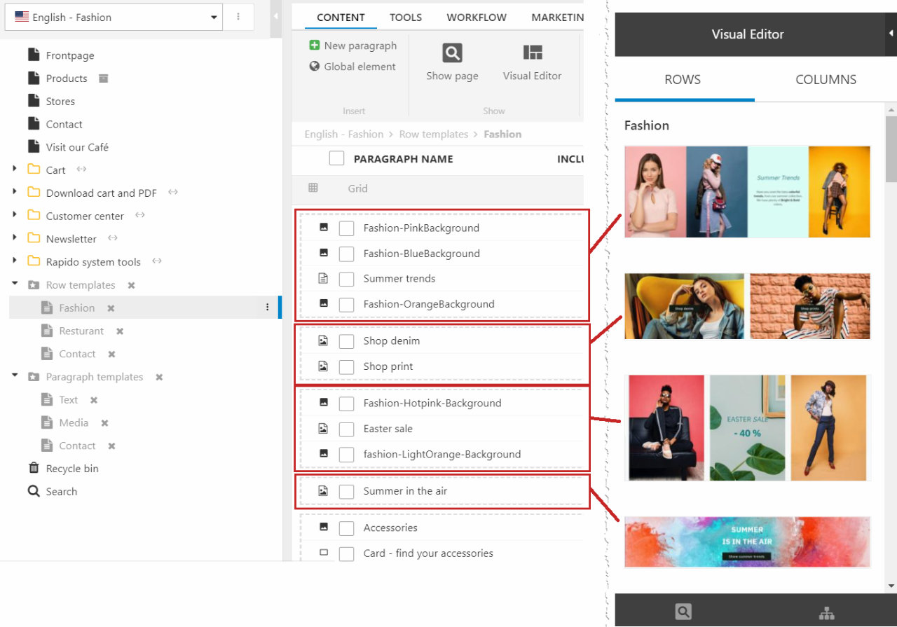
You can find all the existing presets in the Content area under Row templates and Column templates (Figure 11.1).
Here, the categories are shown as subpages and clicking one of them will show the presets in that category.
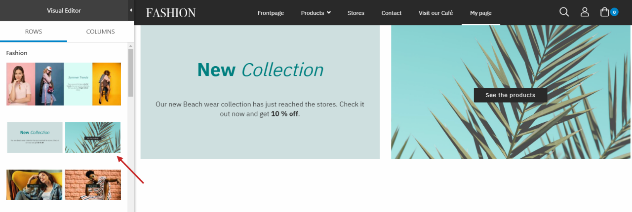
For the row presets: each row is shown with dashed lines around its columns (Figure 11.2).
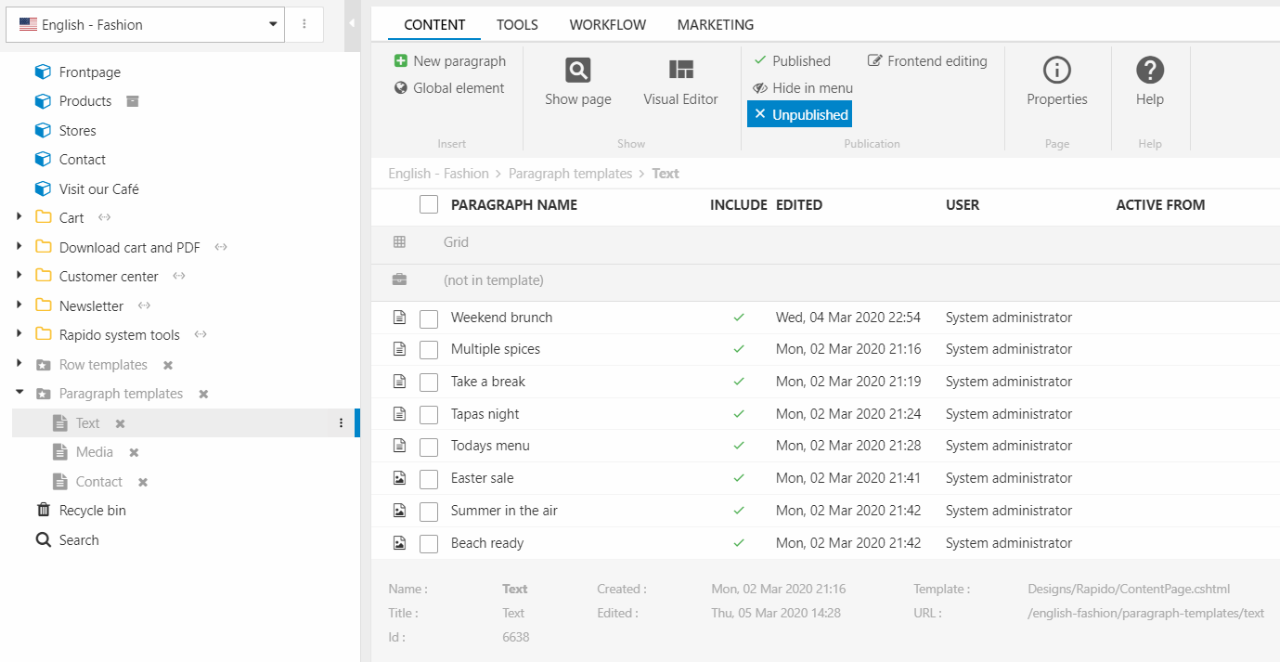
For the column presets: the presets are shown in the normal paragraph overview (Figure 11.3), placed outside the Grid template (that means you can't see the column presets in Visual Editor).
Editing or deleting a preset and its content is done differently between row and column presets.
- For row presets: go to the category page with the preset, right-click the row and select Delete row. To edit content in a row preset, just click the row's columns
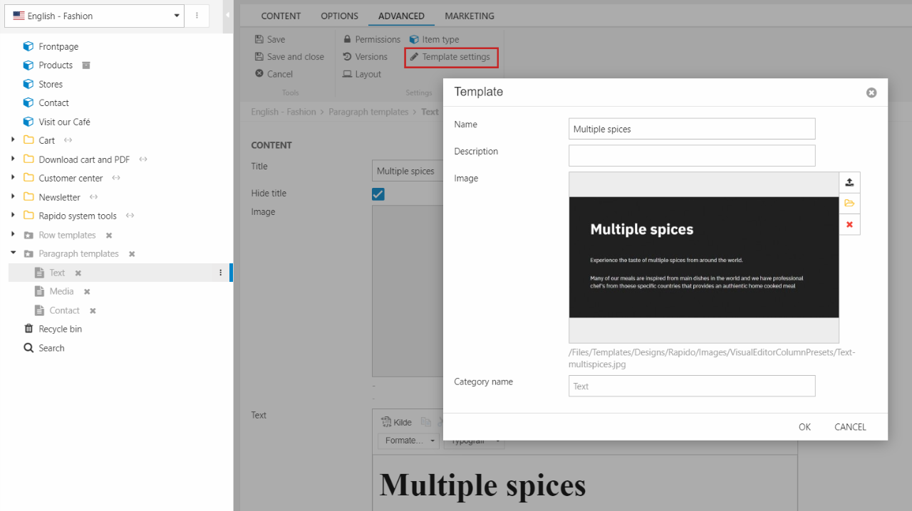
- For column presets: go to the category page with the preset, click the preset and edit the content/right-click the preset and click Delete
To edit the template settings (name, description, panel image, and category):
- For row presets: on the category page with the preset, right-click the preset and click row template settings
- For column presets: on the category page with the preset, click the preset, go to the Advanced tab and click Template settings (Figure 12.1)
Using empty rows and columns
As mentioned earlier, presets are the main way of working with Visual Editor in Rapido. Though, in some cases it is easier to start from scratch instead of changing all the settings for the row/column preset anyway.
You can therefore use empty rows to decide the amount and layout of the columns before content is added. Then, use empty columns to add content to the empty row. Below, you can read about both.
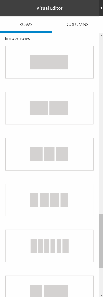
Empty rows
Empty rows are default row templates which contain a number of empty column areas. That way you can determine the amount and layout of the columns before the content itself is added. An empty row could for instance be a row split into 3 evenly sized columns, or perhaps a row split into one small and one big column.
The empty row templates are found in the Rows tab below the presets, and can be dragged onto the content editor area, just like the presets.
You can choose between the following types of empty rows (hover over an empty row in the list to see the name):
- Full
- 2 columns
- 3 columns
- 4 columns
- 6 columns
- 1-2 split
- 2-1 split
- 1-2-1 split
For each row, you have the same row options (move, edit, delete) and row settings (Figure 14.2) as for the presets.
You can also add your own empty row templates. The empty rows are based on .cshtml files which are located in the Templates/Designs/Rapido/Grid/Pages/RowTemplates folder.
Empty columns (item types)
If you want to add some specific content and none of the row or column presets matches your wish, you can use empty columns.
Empty columns are used to create content using different item types. They can be found in the Columns tab and are placed below any existing column presets, as shown in Figure 15.1. These empty columns are dragged onto available areas on a row.
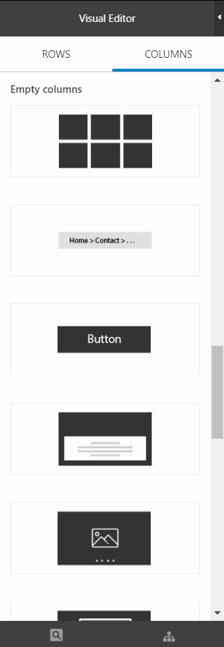
As you can see, each empty column has its own type e.g. image, button, and cards. That’s because for each empty column in the panel, a different paragraph item type is used. So, a row contains columns, and each column contains a paragraph. The item type of the paragraph is selected using these Empty columns.
You can read about each of the empty columns and their settings here:
- App
- Articles
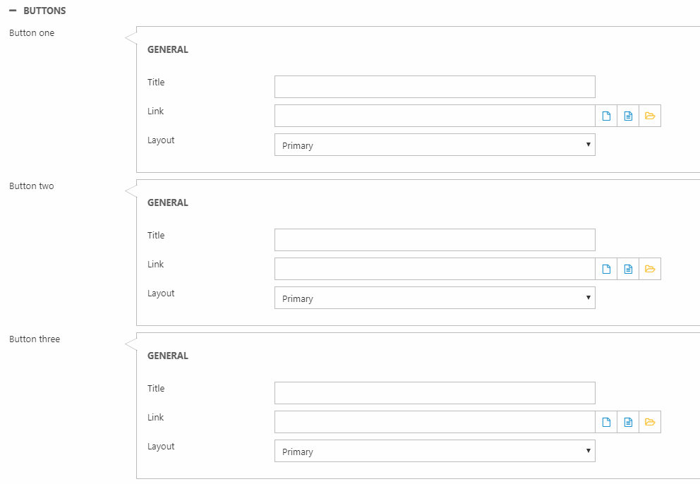
- Button
- Card paragraph
- Carousel
- Image
- Navigation
- Overlay
- Quote
- Search paragraph
- Separation line
- Simple map
- Standard paragraph 1
- Standard paragraph 2
- Standard paragraph 3
- Video
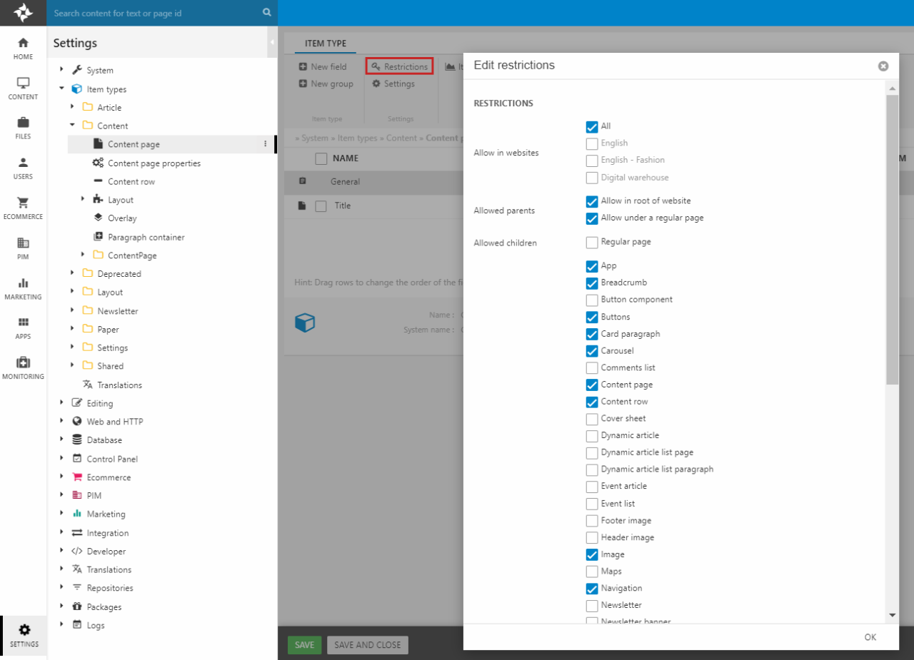
To hide/show some of the empty columns, go to Settings > Item types > Content > Content page and click Restrictions in the ribbon bar (Figure 15.2).