
Printable papers
There are many different scenarios where a brochure can come in handy. Rapido has incorporated a feature, that eases the process of creating one. This feature could be used to inform potential customers, and/or be sent out on email as a follow up, to keep them informed regarding the new products that have arrived. A possible scenario could be that you have some potential partners visiting, and you want to showcase your new collection, in a presentable manner.
Printable papers consist of four paragraph types, where each of them has their own function. Working with the different components together will enable you to create powerful brochures in no time. The different paragraph types are:
- Cover sheet
- Page sheet
- Product data sheet
- Product list sheet
Creating your Printable Papers
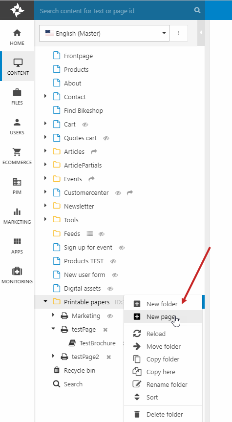
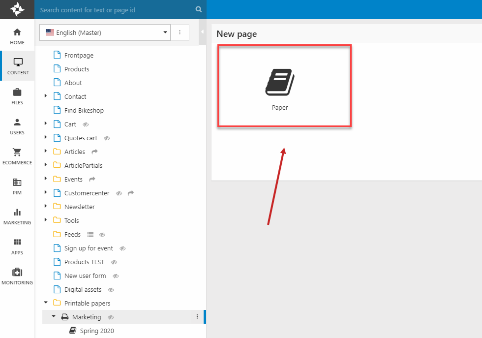
The different paragraph types will be covered later. Let’s start by setting up your own Printable Papers. Start by entering the content node, then scroll down until you locate the Printable Papers folder. Right-click the folder as shown on Figure 2.1 and click new page.
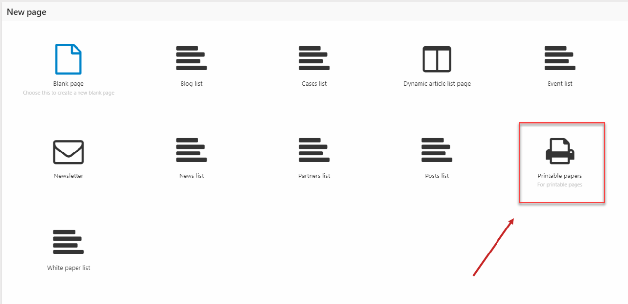
After clicking new page, choose printable papers as the page type.
Enter a page name and click ok.
The next step is configuring the settings for your printable papers.
Fill in the following fields in the page settings:
- Write a title for your printable papers
- Upload a logo
- Write a company name
- Choose A4 as the page size
- Stay with the default value of margin for now (10mm)
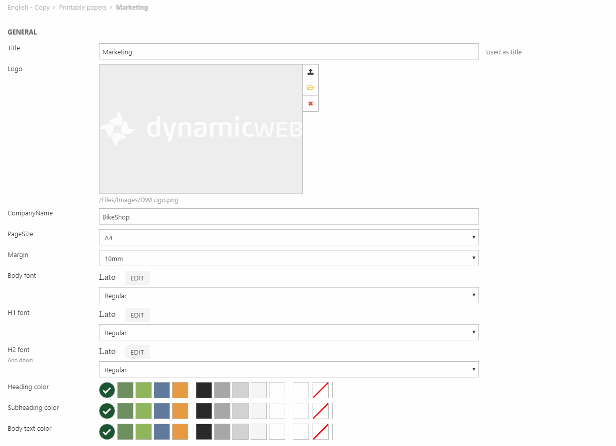
You can also edit the font of the following elements:
- Body
- H1
- H2 (and all headers below)
After configuring your printable papers, save it and let’s move on to the next part.
Let’s configure the page settings for your printable papers. Right-click your Printable Papers and click on New page. Select paper and input a page name.
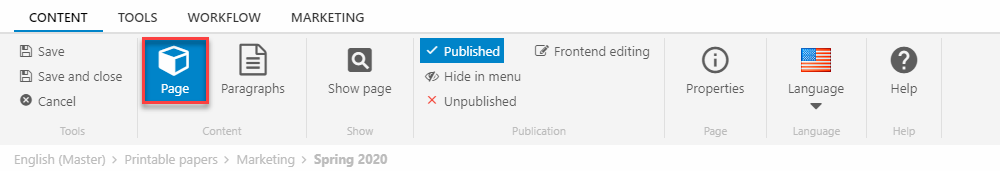
After creating the page, click on the page item from the ribbon bar as shown on Figure 4.3.
After entering the page settings, you will see the general settings, as shown on Figure 5.1.
The page settings is where you create your header and footer for your Printable Paperes, it makes the foundation for the overall design of your brochure.
The general settings have the following fields:
- Title
- PDF filename
- Head code (custom code to the header)
Type a title and PDF filename for your printable papers leave ‘’Head code’’ for now.
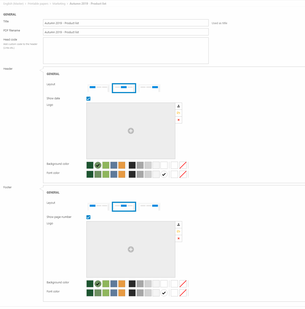
The header section is customizable as well, and contain these configuration options:
- Layout (Left corner, center & right corner)
- Show date
- Logo
- Background color & font color
For now, just enable show date, choose your preferred layout option and a background color for your header. That’s all for the header, let’s configure the footer now.
The footer contains these configuration options:
- Layout (Left corner, center & right corner)
- Show page number
- Logo
- Background color & font color
NOTE* the logo must be an SVG file for it to be scaled correctly. This goes for both the header and the footer
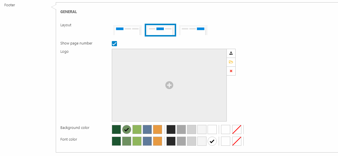
Pick a layout option for the footer, enable show page number, upload a logo and choose a background color for your footer. That’s It for the page settings
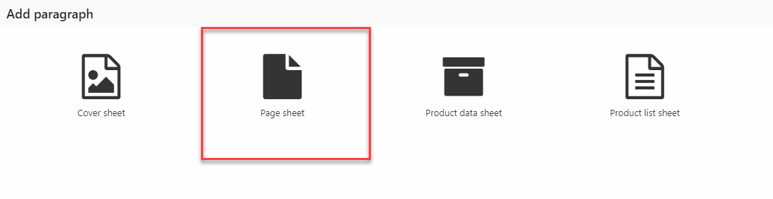
Now it’s time to make the different papers the brochure should consist of. To do that, click on the paper icon you just made and make a new paragraph.
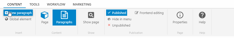
Now, you will see the different paragraph options available. We will start by working on the cover sheet, as it usually is the frontpage of the brochure.
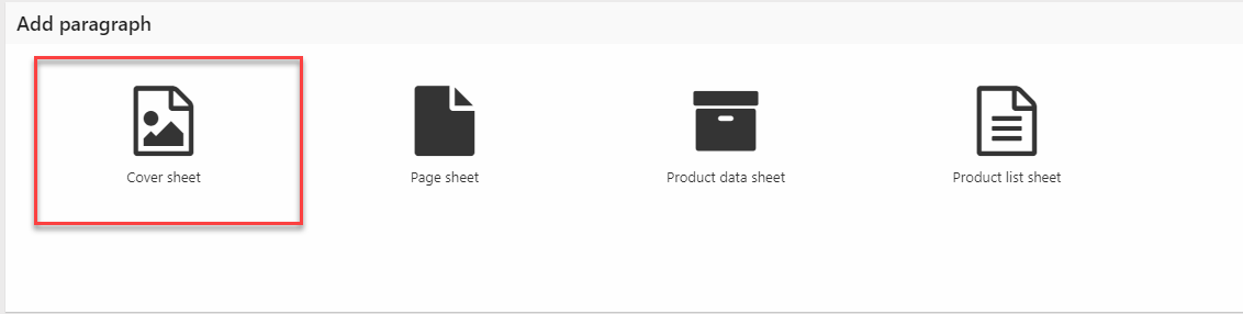
Cover sheet
The purpose of the cover sheet paragraph type is to create good looking frontpages/covers quickly, without having to configure a lot of settings.
Let’s start by looking at the general settings for the cover sheet, see picture below for demonstration (Figure 8.1).
The general settings contain the following configuration options:
- Title
- Hide title
- Subtitle
- Layout
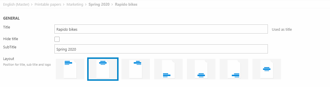
The title field will be rendered as a header on your cover sheet. If hide title is enabled, it will obviously be hidden on your cover sheet, and only your subtitle will be present if the field is used.
The layout controls the positioning for the title, subtitle and logo. You have the following options when configuring your layout:
- Upper left corner
- Upper center
- Upper right corner
- Left corner below
- Center below
- Right corner below
- Center
If the upper center is chosen as the layout, your title, subtitle and logo could be rendered like this Figure 8.3.

Now, let’s look at the customize section for your cover sheet. This section contains the following options for configuration:
- Logo
- Background image
- Margin
- Heading color
- Subheading color
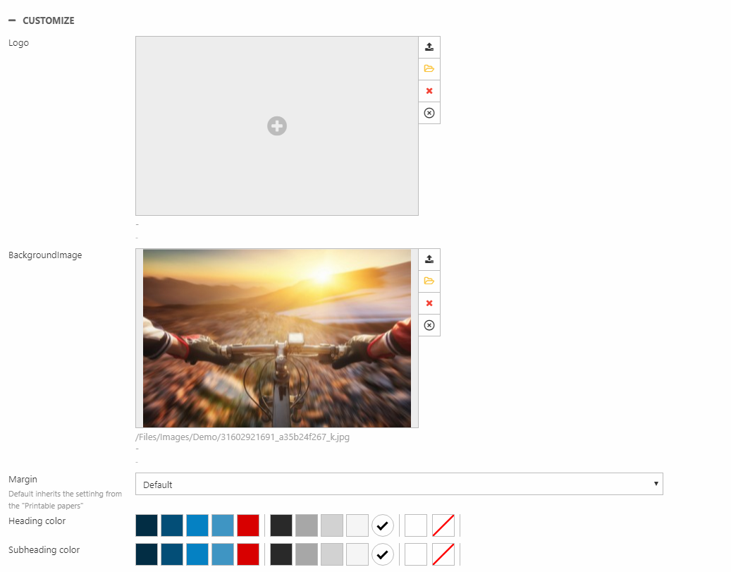
If a logo is uploaded on your cover sheet configuration page, it would override the logo from your Printable Papers’ settings (if you uploaded there before). The background image is self-explanatory, it just adds a background image to your cover sheet.
The margin property specifies the distance you want from the top of the document to where your logo, title and subtitle should be present. If the default value is chosen, it will inherit the margin specified earlier from your Printable Papers. If no value is specified initially, 10mm will be the default value.
The heading color sets the color of your title. The subheading color sets the color of your subtitle.
Enter and upload the different values you want for your cover sheet and click save afterwards. That was all for the cover sheet, now let’s move on to the page sheet.
Page sheet
The purpose of the page sheet paragraph type is to create informative pages to support your brochure in a quick way. Let’s say you have a new collection coming out, and you have a background story that adds value to your products. This is where the page sheet becomes useful. To create your own, follow these steps:
Click on your printable papers from the area menu, to enter the page settings. Then, click on new paragraph from the ribbon and choose page sheet (Figure 10.1).
The general settings for the page sheet contain the following fields:
- Title
- Hide title
- Subtitle
- Text
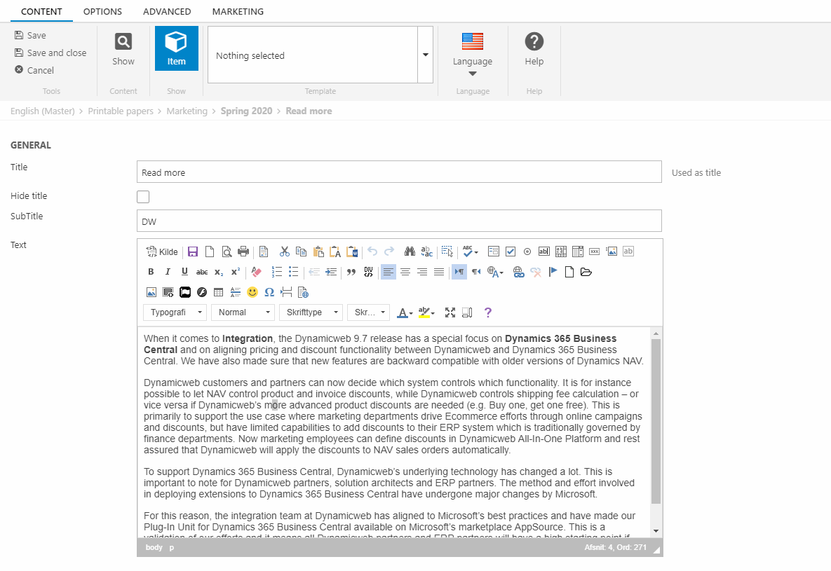
The title, hide title and subtitle, works as mentioned before, so further elaboration on it is not needed.
The text field is just rendered as a regular paragraph. The text will be present just below the title, and subtitle.
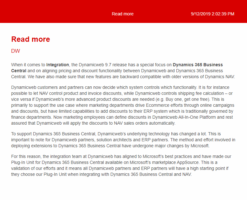
An example of a page sheet is posted below for illustration purposes, see Figure 11.1.
Let’s move on to the product data sheet now. Click on your printable papers page and create a new paragraph from the ribbon-bar. Pick product data sheet as shown on Figure 11.2.
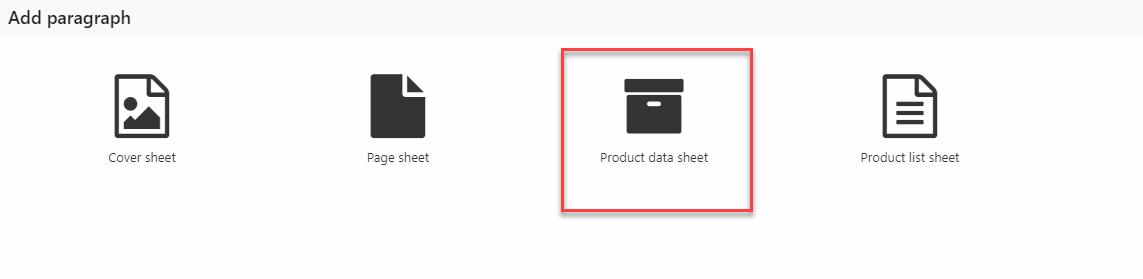
Product data sheet
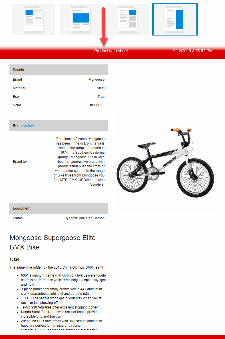
The purpose of the product sheet data paragraph type is to quickly present your chosen products, in a presentable way. All the relevant product information will be rendered along with the product image. This feature can be useful in scenarios where you want to showcase some of your products, in a detailed way.
Let’s start by looking at the general settings (Figure 12.2).
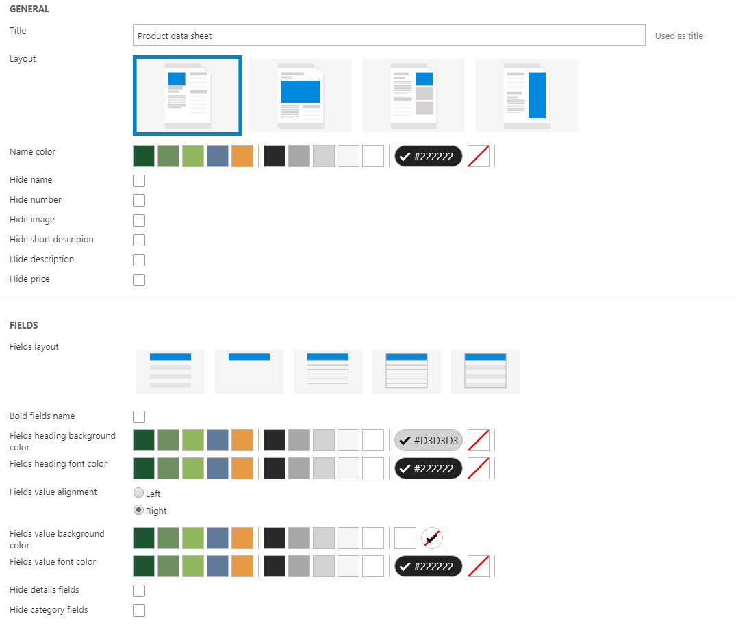
Start by inputting a title for your product data sheet.
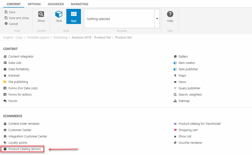
Then proceed to adding the products by clicking on the app selector (Figure 12.3).
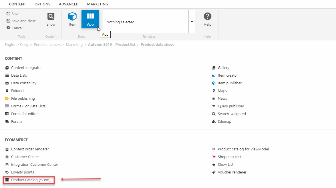
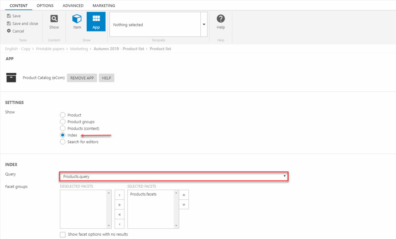
Choose the Product Catalog (eCom) app, then the configuration will be entered(Figure 13.1).
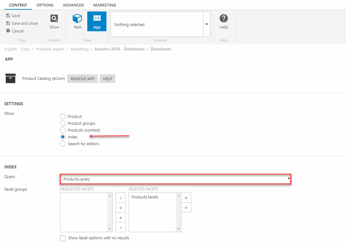
Select index from the show settings. Then scroll down to the index settings and pick Products.query from the Query dropdown as shown on the image below. After selecting the Products.query, you need to select the facet, from the Facet groups. Select Products.facets and leave the rest of the index settings for now.
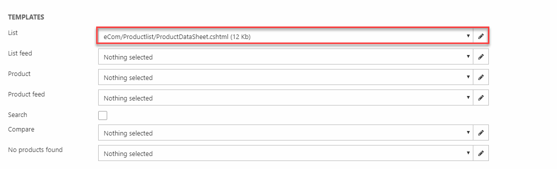
The next step is configuring the Templates section. Pick the ProductDataSheet.cshtml razor file for the list field and choose Nothing selected for the rest of the fields as shown on Figure 13.2.
Now, save the settings and return to the item settings as before.
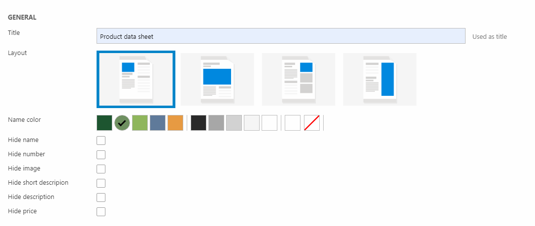
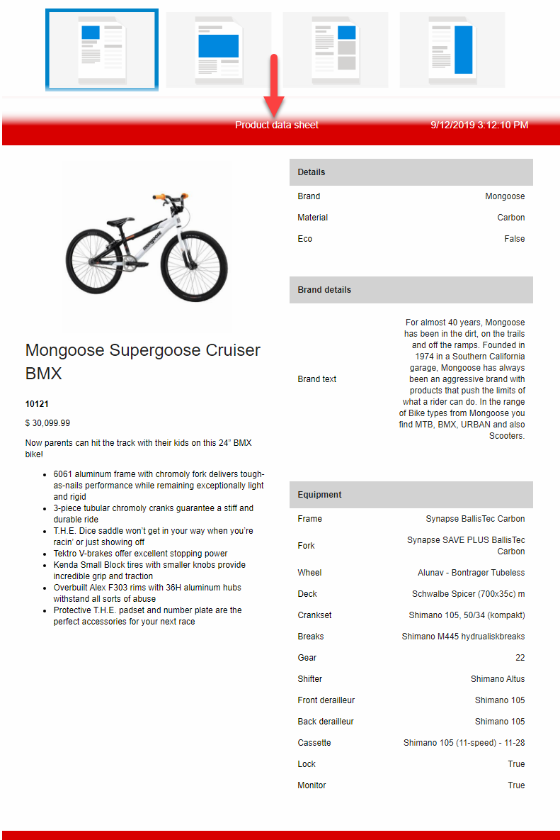
For the layout you have the following options for your product data sheet:
- Upper left product placement
- Centered product placement
- Upper right product placement
- Right product placement
For the first layout option a frontend example could look like Figure 14.1.
The centered product layout could look like Figure 14.2.
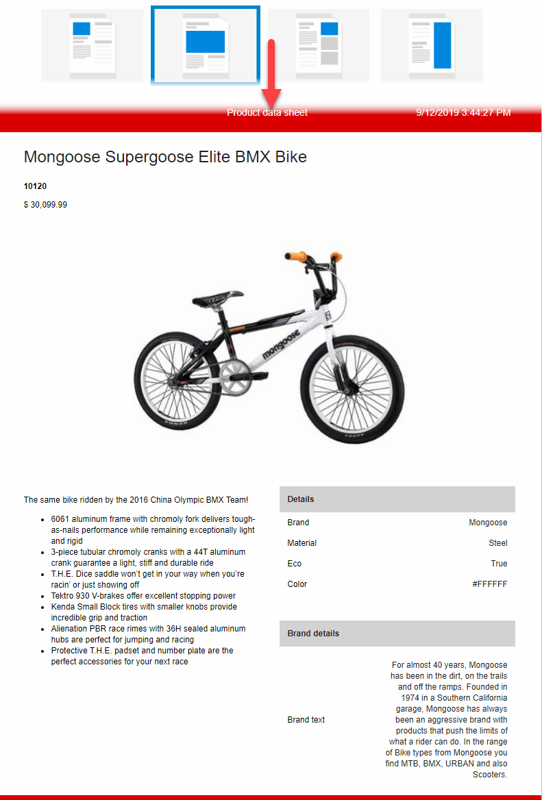
If you would like to use the upper right layout an example could be Figure 14.3.
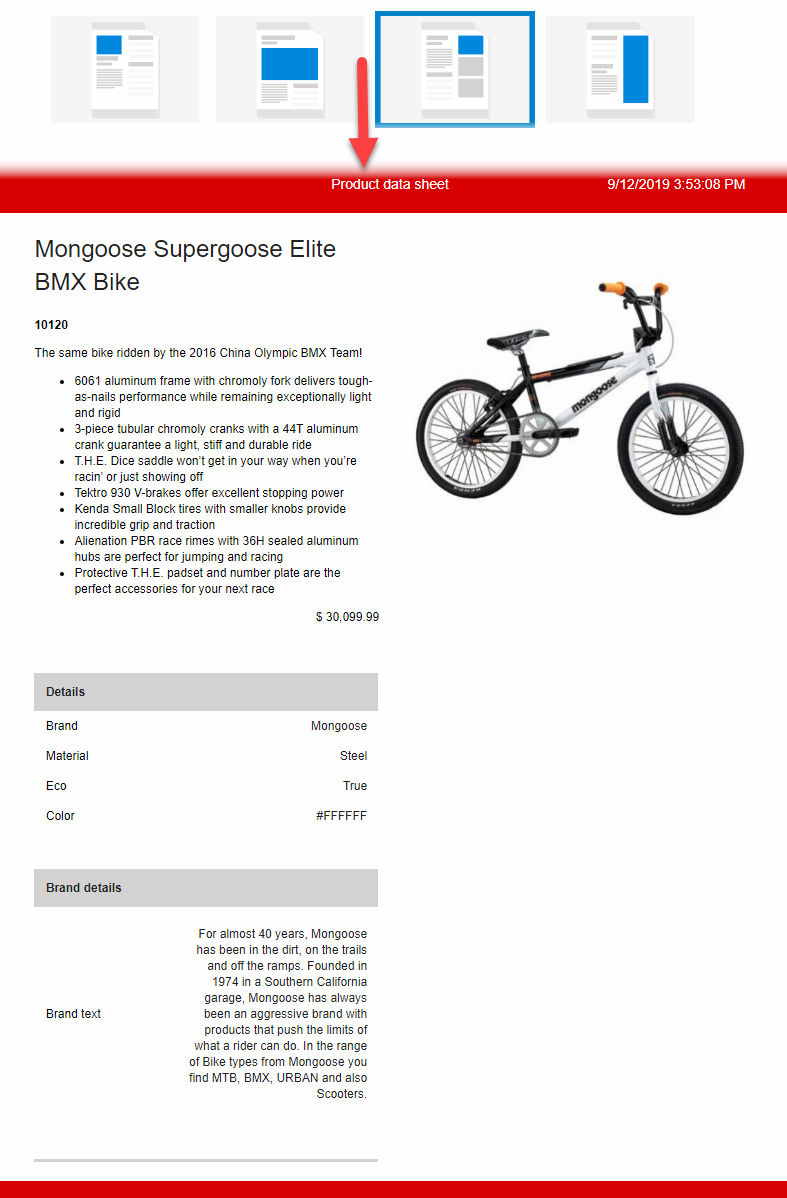
Lastly, an example of the right product layout, see Figure 15.1.
Try editing the color of the product name in your data sheet by choosing a color from the selector, as shown on Figure 15.2.

You can also choose to hide the following fields, from your product data sheet:
- Name
- Number
- Image
- Short description
- Description
- Price
That’s it for the general section, now let’s look at how we can customize the fields that are rendered.
We’ll start by looking at the fields layout as seen on Figure 16.1.
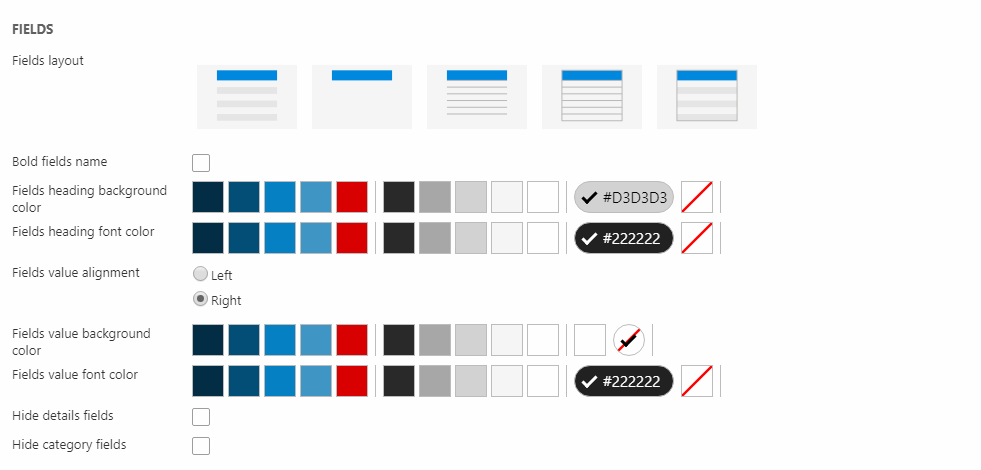
You can choose between five different fields layout:
- Every second field with a grey background
- No background color for the fields
- A thin underline separating each field
- A thin underline separating each field plus an outer line for the box
- Every second field with a grey background plus an outer line for the box
Play around with these options, until you find one that satisfies your needs.
Try enabling the ‘’ Bold fields name ‘’ and check the frontend, to see if it fits your data sheet.
You can also edit the color of the fields heading as shown on Figure 16.3.

Choosing the above settings could produce an outcome like this (Figure 17.1).
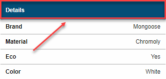
NOTE* The red box surrounding the header, is just for illustration purposes.
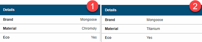
You are also able to modify the way your field values are aligned, and you have the following options:
- Left
- Right (default value)
Choosing the left value alignment will push your field values from the right to the middle. See example below (Figure 17.2). One is right alignment and two is left alignment.
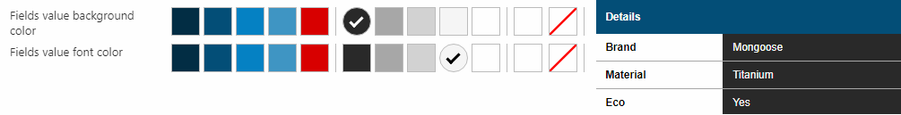
You can also edit the color of the fields value as shown on Figure 17.3. The default value is white for the background and black for the font.
Lastly, you can hide the following fields by enabling the checkboxes(Figure 18.1).

Now we’ve covered all the aspects of the product data sheet, if you followed the guide, you should be ready to create your own 😊
Let’s proceed to the last part of the Printable Papers, which is the product list sheet.
Product list sheet
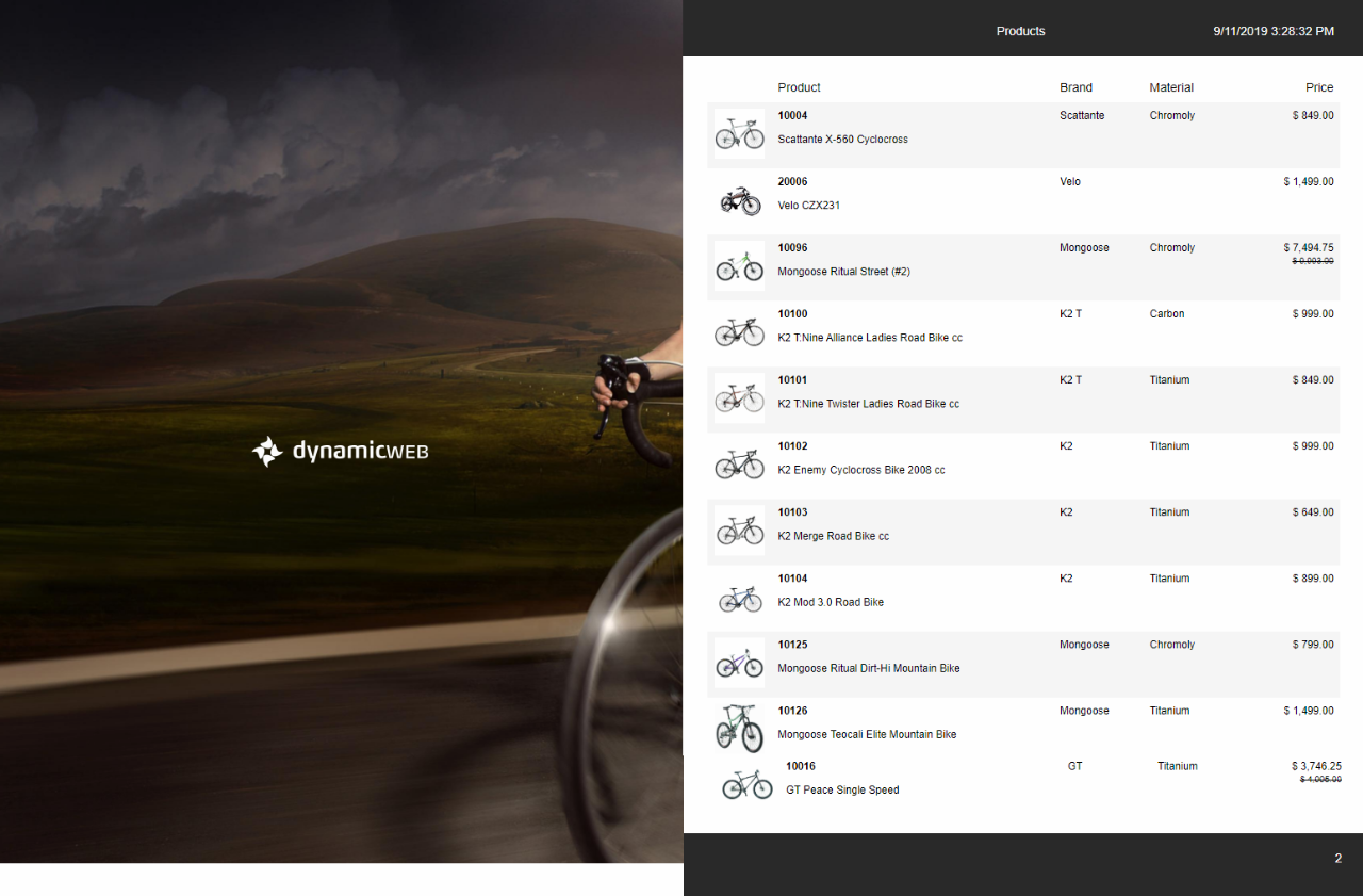
The product list sheet can be used to render multiple different products in a list view, where only the vital product information is displayed, unlike the product data sheet. There are many scenarios where this paragraph type could be useful. Let’s say you have a customer that wants to view multiple products from your solution, without detailed product information, this is where the product list sheet proves its worth.
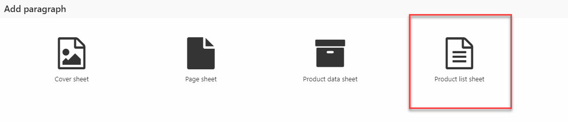
To create your own, click on your pages icon and create a new paragraph. See Figure 19.2 for demonstration.
After entering the paragraph type, the configuration will be present (Figure 19.3).
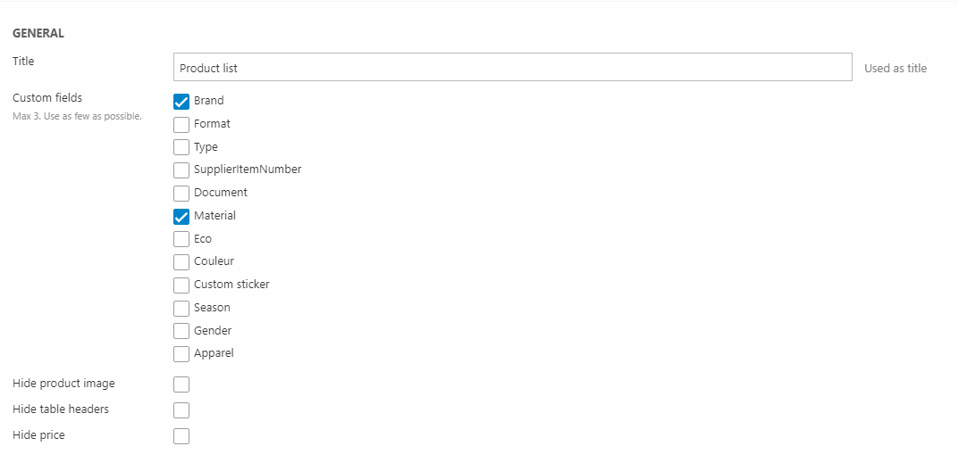
Input a title for your list sheet and fill in some products by using the app selector as before Figure 20.1.
Select the Product Catalog (eCom) app as shown above. Now, it’s time to configure the app settings.
Choose index from the show settings. Then scroll down to the index settings and pick Products.query from the Query dropdown as shown on the image above. After selecting the Products.query, you need to select the facet, from the Facet groups. Select Products.facets and leave the rest of the index settings for now.
The next step is configuring the Templates section. Pick the ProductListSheet.cshtml razor file for the list field and choose Nothing selected for the rest of the fields as shown onFigure 21.1.
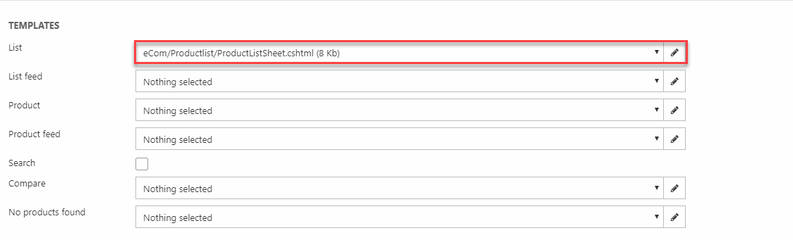
Now, save the settings and return to the item settings as before.
In the custom fields section, select the fields you want to include in your product list data sheet. Three is the maximum number of fields you should choose. The purpose of the product list data sheet is to present many products in a simple way, so therefore we shouldn’t overcomplicate it with too many fields, only choose the vital ones.
You can hide the following from your list sheet:
- Product image
- Table headers
- Price
Choose two fields and save.
After you are done settings up, check the frontend to see if you are satisfied with the result.
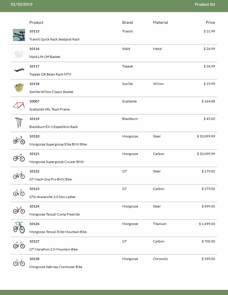
See Figure 22.3 below for inspiration.
That was it for the Printable Papers – now you are ready to setup multiple brochures in no time!