Notification Overlays
This item is only compatible with Rapido 3.2 or earlier versions.
You can use the Rapido Content Model to create similar types of content.
In Rapido, you can use the Overlay item type when creating paragraphs. This item type allows you to create an overlay or a pop up for sales or highligthing an event. You can also use it to get conversions or leads when a user enters the site e.g. a "sign up for newsletter" overlay.
It is possible to add different elements to the notification overlay. You can switch between overlay and pop up designs, and you can also attach an app to the notification overlay (following the usual procedure of attaching an app to a paragraph).
When you create a paragraph with the Overlay item type, you have the following options (Figure 2.2).
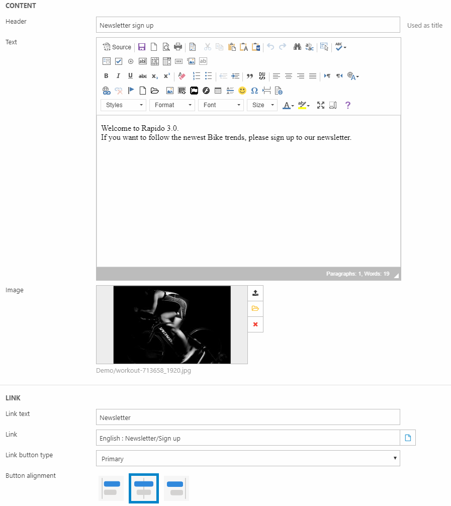
Here, you can:
- Write a header and some text
- Add an image
- Add a button with a link, button type and alignment
Then come the Design and Animation settings (Figure 2.3). With the Design section, you can configure the following:
- Overlay position (overlay or one of the pop up options)
- Image position
- Alignment (vertical alignment controls the text and button and text alignment controls the text only)
- Width and height of the overlay
- Font and background color
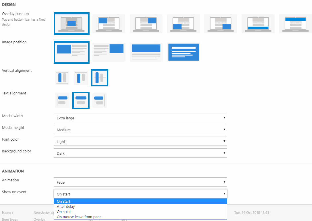
The Animation settings control the way the overlay appears and the conditions for it to show up. You can:
- Change the animation between fading in or sliding in from a direction
- Set the conditions for the overlay to appear – on start, after delay (in milliseconds), on scroll, or when the mouse leaves the page
At the bottom, it is possible to change the frequency at which the overlay appears (Figure 3.1).
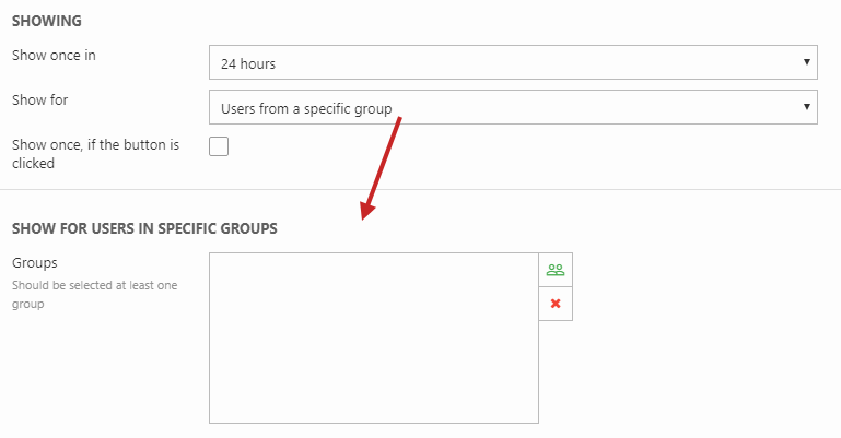
You can choose to show the overlay:
- Once in every 24 hours, 15 days, or 30 days
- For all visitors or only:
- Anonymous users
- Logged-in users
- Users that are either in or not in specific user group(s) - a section is rendered below to select the specified user groups
If you check Show once, if the button is clicked, the overlay is not shown again once the user clicks the button in the overlay.
Overlay
The first selection in Overlay position, will center the notification overlay and add a greyed out layer on top of the website in the background.
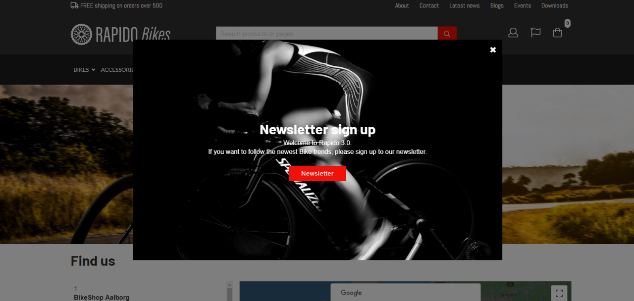
The following example has a header, text, button, and image, and the Design section is set up like Figure 4.1.
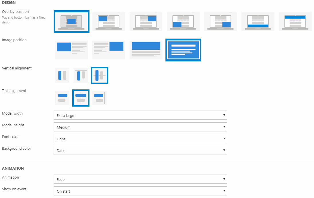
It will result in a notification overlay as the one in Figure 4.2.

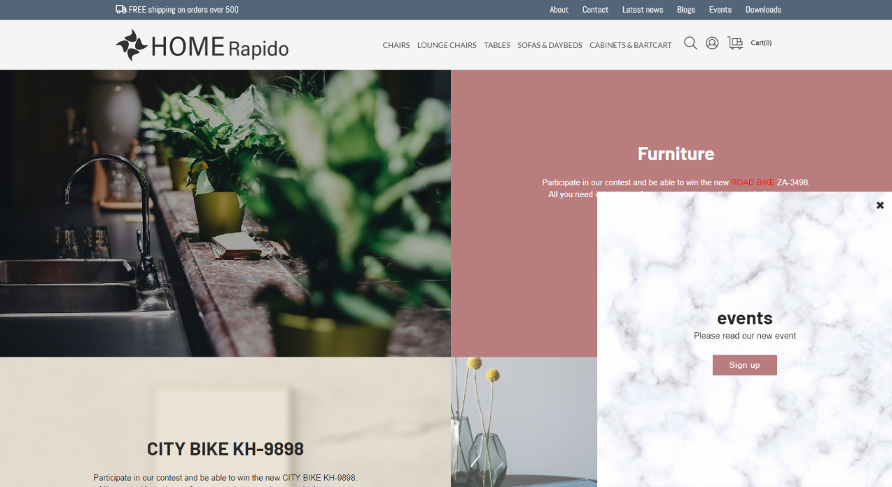
Pop up
The rest of the options in Overlay position (apart from the first) will present the notification overlay as a pop up. The following example has a header, text, button, and image, and the Design section is set up like Figure 5.1.
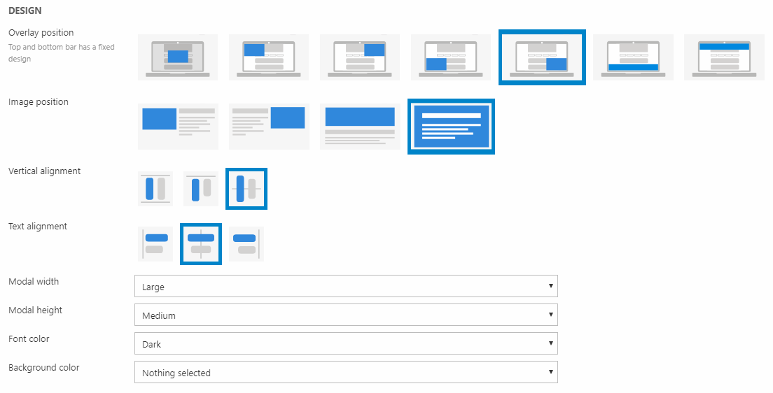
It will result in a notification overlay as the one in Figure 5.2.
Apps
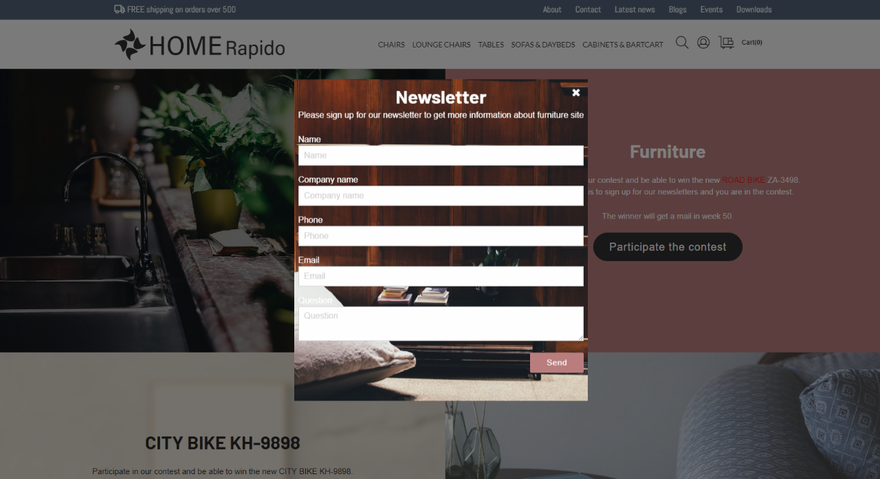
As with normal paragraphs, you can attach an app to paragraphs with the Overlay item type. In the ribbon bar, select App. In the following example, the Forms for Editors app (Figure 6.1) has been attached to a notification overlay.
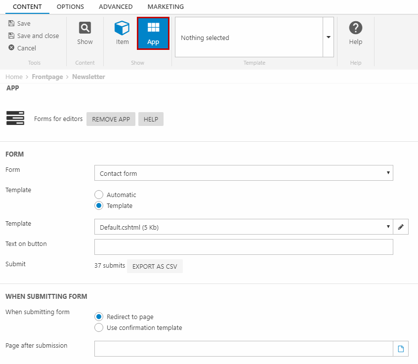
In this example, the first option under Overlay position has been chosen. So, the setup with the Forms for Editors app will result in a notification overlay as in Figure 6.2.