
Ecommerce Columns
Just like content pages, Ecommerce pages like the product list and the product details page are created using the visual editor to add rows, preset and columns in the standard manner – but since Ecommerce pages have specific functions on a solution, special ecommerce columns are also used to create content.
In this article we will take a closer look at the columns available to you for creating the following ecommerce pages:
On both pages you can also use some of the standard content columns – they are documented here.
The Product Components tool is also available on both pages. This tool allows you to build custom ecommerce columns as you can combine different columns into one. This gives you a lot of design opportunities when design for the product list or product detail page. You can read more about the product components tool here.
Product List
This section covers the ecommerce columns used to create a product list page:
- Product catalog app
- Product group list
- Product list header
- Product list facets
- Product list group image
- Product list group poster
- Product list info
- Product list selected facets
- Product list grid view
- Product list - compact view
- Product list - list view
You can find the documentation on how to setup the product list in three different ways here.
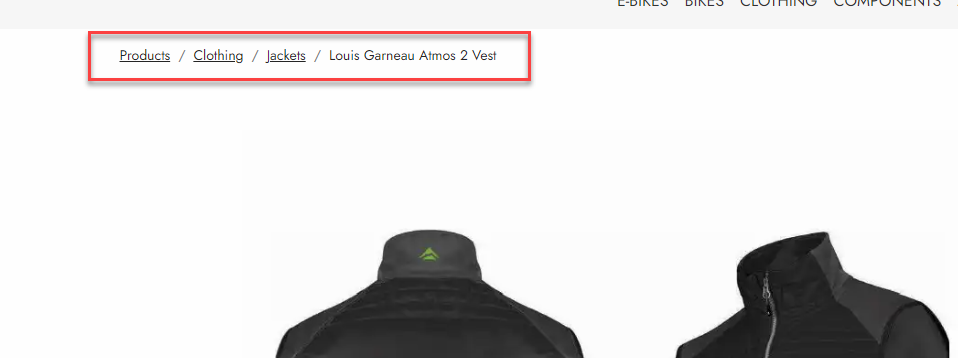
Breadcrumb navigation
The breadcrumb navigation is both usable as a content and ecommerce column. If you want to know more about the setup, read our documentation here.
Product Catalog app
The Product catalog app column is a special column which is used on all product list pages to make product information available to the other columns on the page.
It consists of a two parts:
- A set of settings (Figure 4.1)
- An attached Product catalog for ViewModel app
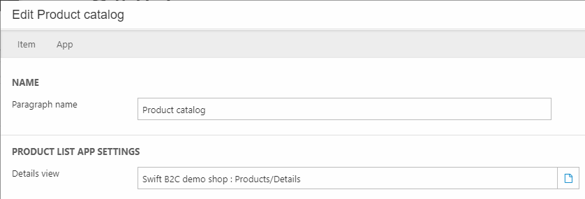
Since most of the heavy lifting is done by the app, the setting simply allows you to select a details view page – this is the page used to display the product details view when a product in the product list is clicked.
On the app tab you will find a Product Catalog for ViewModel attached – this app is used to expose the ProductListViewModel to the other paragraphs on a product details page. Nothing is rendered in frontend when this app is added to a page – but it is essential none the less. Read about how to add this app manually in the product list article.
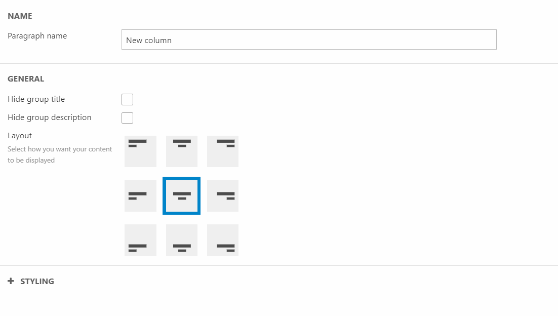
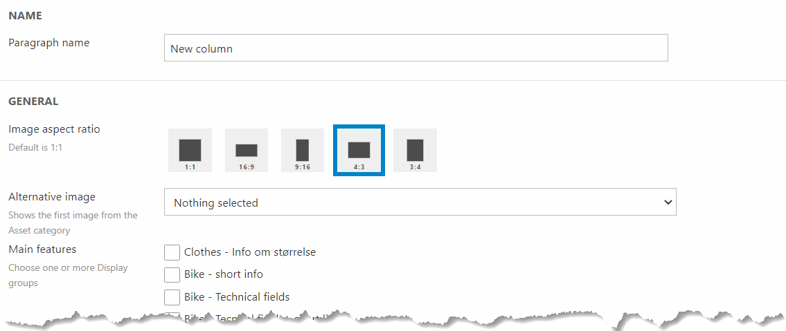
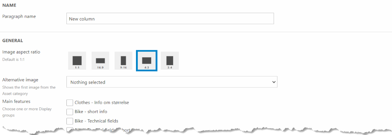
Product Group List
Often products are sorted in product groups with further subgroups. With product group list columns, it is possible to display the subgroups to your customers while they are browsing products. This column does require some configuration in the backend. You can read more about how to configure it here.
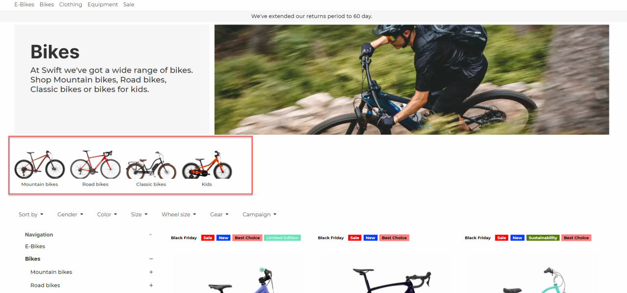
In the editor you have some general settings alongside the styling options.
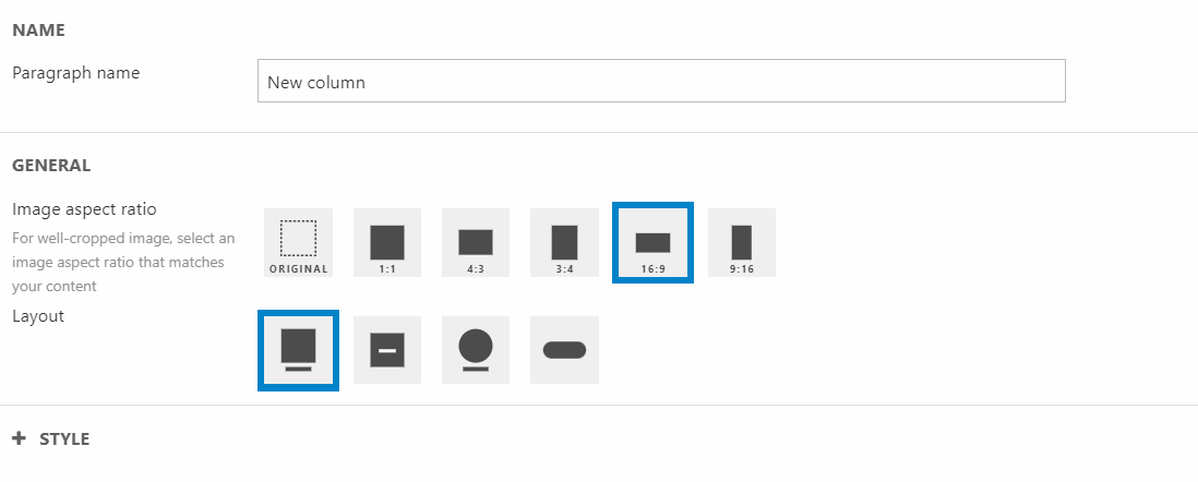
You can:
- Name your paragraph
- Choose the image aspect ratio
- Select the layout of the image
For styling options, you can:
- Choose a general theme for the column
- Choose a theme for the groups displayed
Product List Header
The product list header column is used to add a dynamic header to a product list page – in this case dynamic means that it will show:
- The subgroup being show - the parent group will not be shown
- The total number of products returned by the query used to publish products to the list
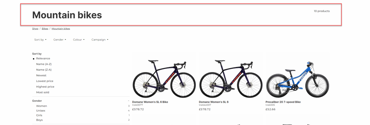
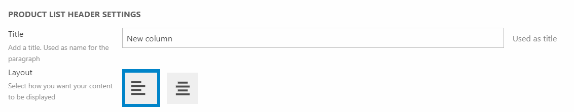
When you add this column to a page you will see the settings in Figure 6.2 – they allow you to specify a layout (left-aligned vs centered).
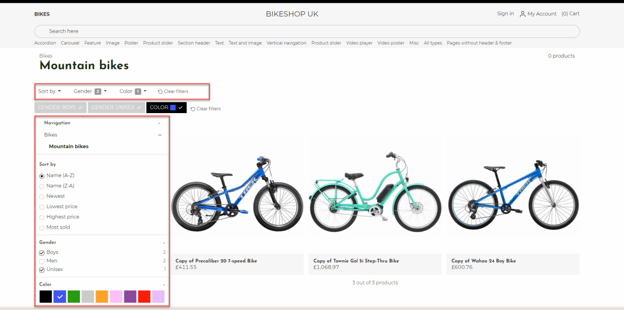
Product List Facets
The product list facets column is used to render facets – filters to most people – on a product list page (Figure 7.1). Filters make it possible for the customer to refine a product list or search result, which helps improve conversion rates and are generally a great help to customers. In Swift, facets can be displayed both vertical or horizontal. On Figure 7.1 we've shown both options, but really you should use only one.
This column comes with the following settings (Figure 7.2):
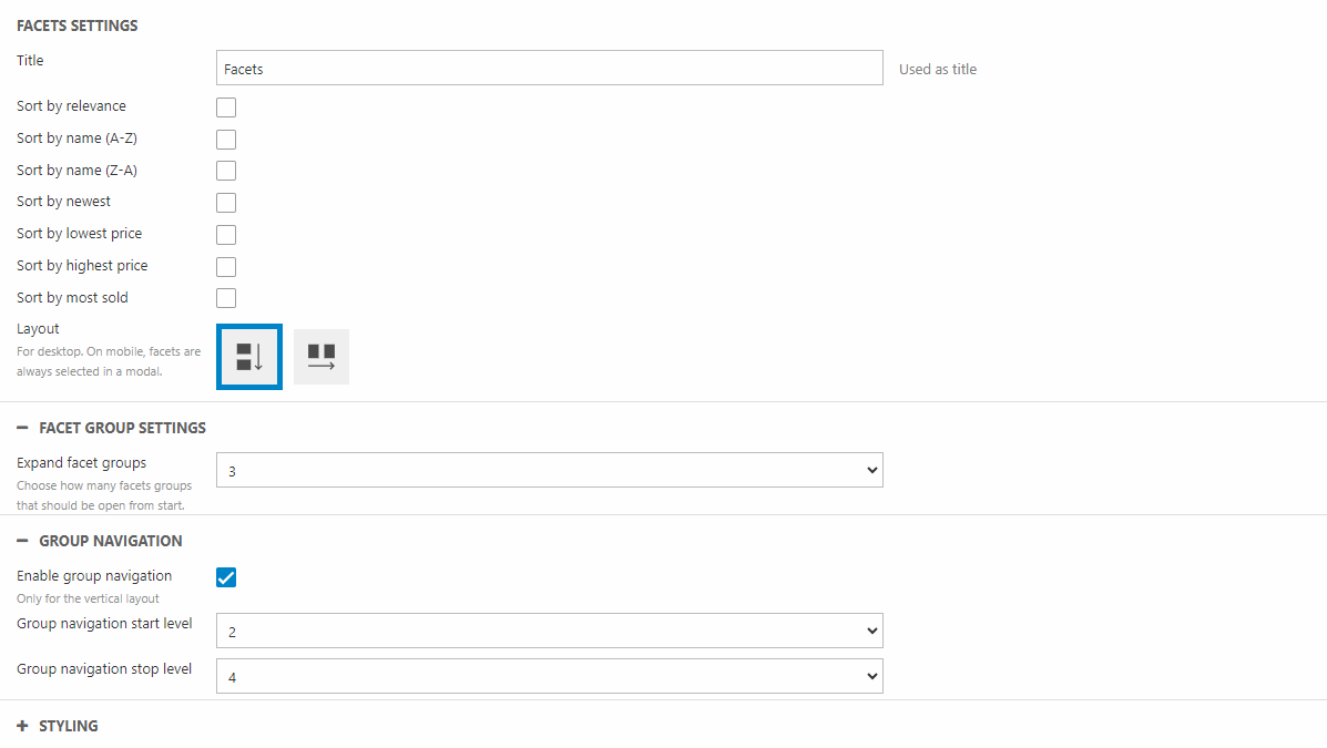
Using the settings you can:
- Add/Exclude some of the default sort options on the column
- Choose a vertical/horizontal layout
In the Facet group settings section you can choose how many facet groups that should be open from the start.
In the Group navigation section you can control if you want a group navigation and how it should look. This section is only relevant for when the vertical layout has been chosen.
- Enable group navigation - this adds a group navigation to the facet column, which is useful if the top navigation is configured to not include product groups.
- Choose a start and stop level of the of the group navigation. This way you can control what product groups that should be rendered
In Styling you can choose themes and the space around the column.
As you can see, you don’t actually select any facets on this column – to control which facets are rendered you must add/remove them from the product catalog app column, which has an Product Catalog for ViewModel attached.
Product List Group Image
The product list group image column is a column that can display the product group image. Unlike the product list group poster, this column is separated from the product group description.
You can read more about how to change the image here.
The product list group image column doesn’t let you do much:

You can:
- Change the title of the column
- Set the image aspect ratio
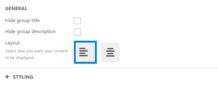
Product List Group Poster
The product list group poster column is a column that displays the product group image. The poster also allows you to show/hide the product group title and description.
You can read more about how to change the image here.
The product group poster column comes with the following settings:
You can:
- Hide/Show group title
- Hide/Show group description
- Choose the layout of the text content
In the styling section you can:
- Choose the theme of the column
- Set the image filter off/on
- Select the poster height
- Select the space around the column
- Choose the title and description sizes
- Set the text readability on/off
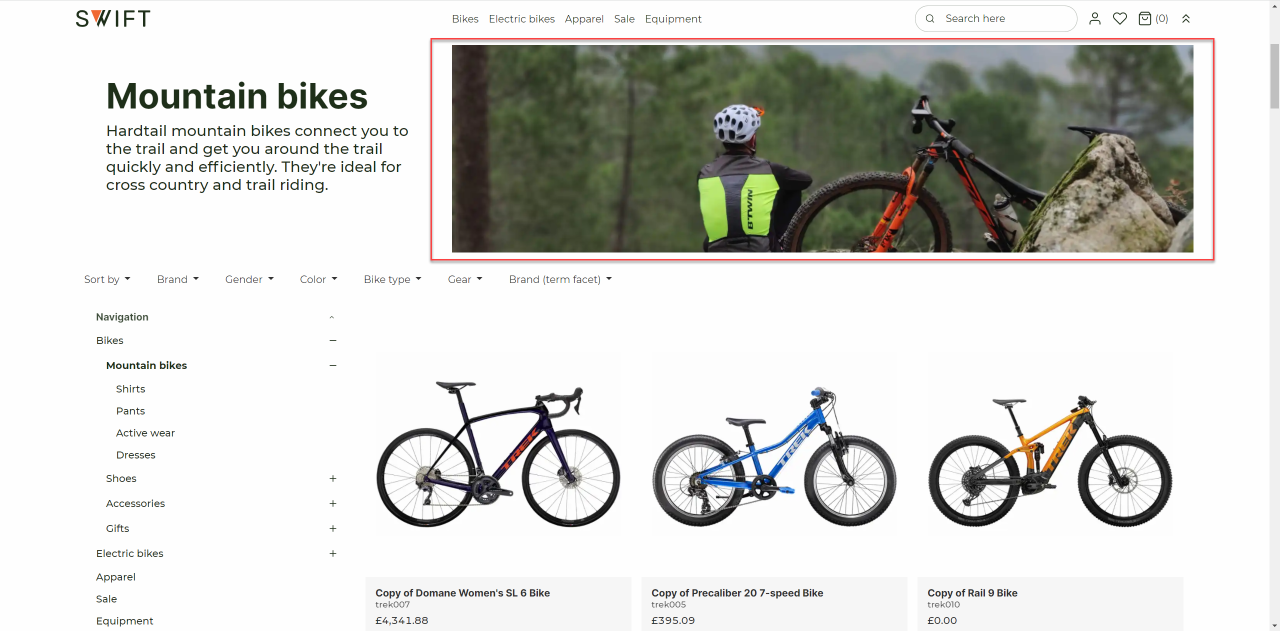
Product List Info
The product list info contains a title and description about the product group displayed in the product list.
You can read more about how to change the description here.
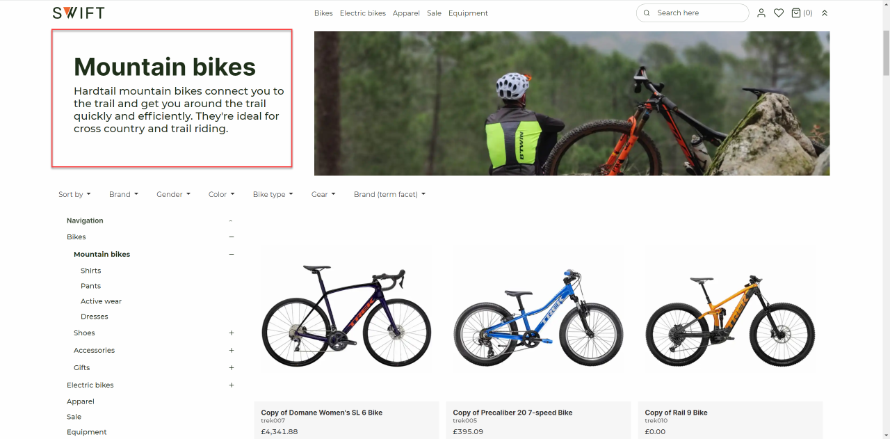
As for the settings of the column, you have a few options:
You can:
- Hide/Show the group title
- Hide/Show the group description
- Choose the layout
In the styling section you have the following options:
- Choose a theme for the column
- Set the space around the column
- Select the title and description sizes
- Toggle the text readability on/off
Product List Selected Facets
The product list selected facets column is used to show the customer which facets are currently selected (Figure 11.1). As such it must be combined with a product list facets column to make sense.
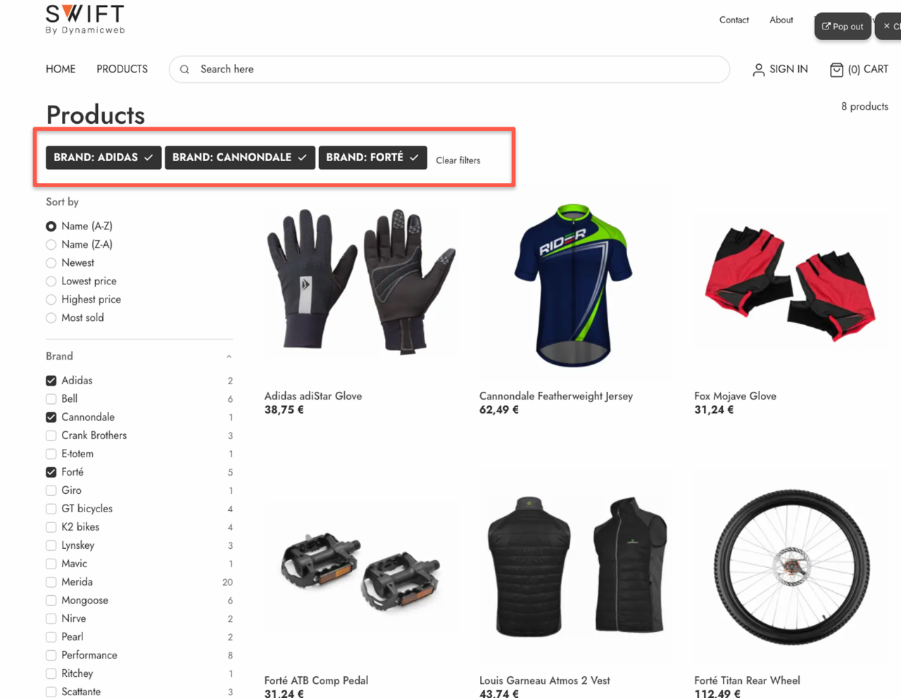
This app doesn’t have settings that allow you to configure anything – you can give it a name, but it will not show up in frontend.
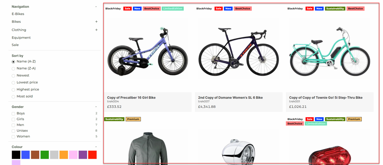
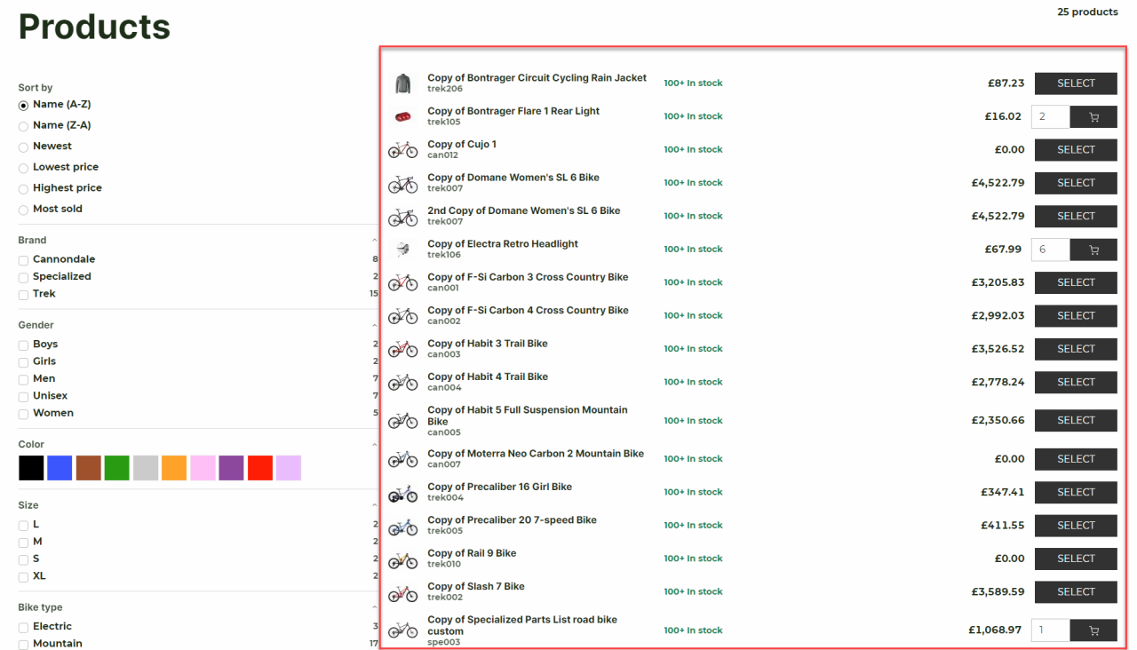
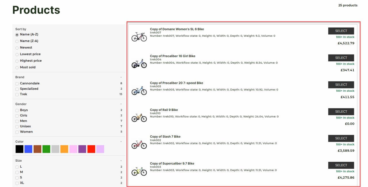
Product List - Grid View
The product list - grid view column is used to render the product data exposed by the product catalog app column – as the name implies this happens in a grid (Figure 12.1).
This column comes with the following configuration options (Figure 12.2):
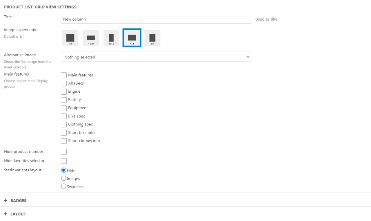
You can:
- Set the image aspect ratio
- Choose Alternative images from the Assets Category
- Choose which Main features to display
- Show/hide the product number and the Favorites selecter
- Set the static variant layout - if the product has any variants, this is where you choose the behaviour
In Badges section you can control which badges to display on the column,
In the Layout section you can choose themes for Product, Image or General.
As you can see, this column does not control which products are rendered – this is handled by the query set on the Product catalog app and the context the customer is in.
Product List - Compact View
As standard on Swift the product list is displayed in a grid view. If you want a more B2B based product list, the product list – compact view column might be ideal. This allows you to list your products and lets the customer add products to cart without entering the product details page.
When the product list - compact view column is added to a row, the following settings are available:
The settings allow you to:
- Set the image aspect ratio
- Choose where to generate an Alternative Image from - this will be based on the first image in the chosen Asset category
- Choose one or more features to be displayed
- Select the layout of the features
- Hide/Show the
- Image
- Product number
- Add to cart
- Stock state
- Favorites selector
- Inventory
- Quantity Selector
For layout you can choose themes for the column in general, the individual product, and the modal. You can also set the space around the column.
In the advanced settings you’re asked to select the variant selector service page, this is needed for the modal to work. If it isn’t already created, you can read how to set it up manually here.
Product List - List View
As standard on Swift the product list is displayed in a grid view. Much as the compact view column the product list - list view column is a B2B looking alternative to the standard grid view. The difference is the more compact look compared to the list view column – other than that the columns works in the same way.
After adding this column to a page you’ll have the following settings options:
The settings allow you to:
- Give the column a title
- Set the image aspect ratio
- Choose where to generate an Alternative Image from - this will be based on the first image in the chosen Asset category
- Choose one or more features to be displayed
- Select the layout of the features
- Hide/Show the
- Image
- Product number
- Short description
- Add to cart
- Stock state
- Favorites selector
- Inventory
- Quantity Selector
For layout you can choose themes for the column in general, the individual product, and the modal. You can also set the space around the column.
In the advanced settings you’re asked to select the variant selector service page, this is needed for the modal to work. If the service page isn't already created, you can read how to set it up manually here.
Product Details
This section covers the ecommerce columns used to create a product details page:
- Product catalog details app
- Product details info
- Product details media
- Product details media gallery
- Product details media table
- Product long description
- Product specification
- Related product list view
You can find the documentation on how to setup the product details page in three different ways here
Breadcrumb navigation
The breadcrumb navigation is both usable as a content and ecommerce column. If you want to know more about the setup, read our documentation here.
Product Catalog Details app
The Product catalog details app column is a special column which is used on all product details pages to make product information available to the other columns on the page.
It consists of a two parts (Figure 17.1):
- A set of settings
- An attached Product catalog for ViewModel app
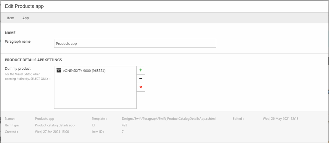
The settings are simple:
- Specify a paragraph name
- Select a dummy product – this product will be used as an example product when editing the product details page via the visual editor
On the app tab you will find a Product Catalog for ViewModel attached – this app is used to expose the ProductViewModel to the other paragraphs on a product details page. Nothing is rendered in frontend when this app is added to a page – but it is essential none the less.
Read about how to add this app manually in the product details article.
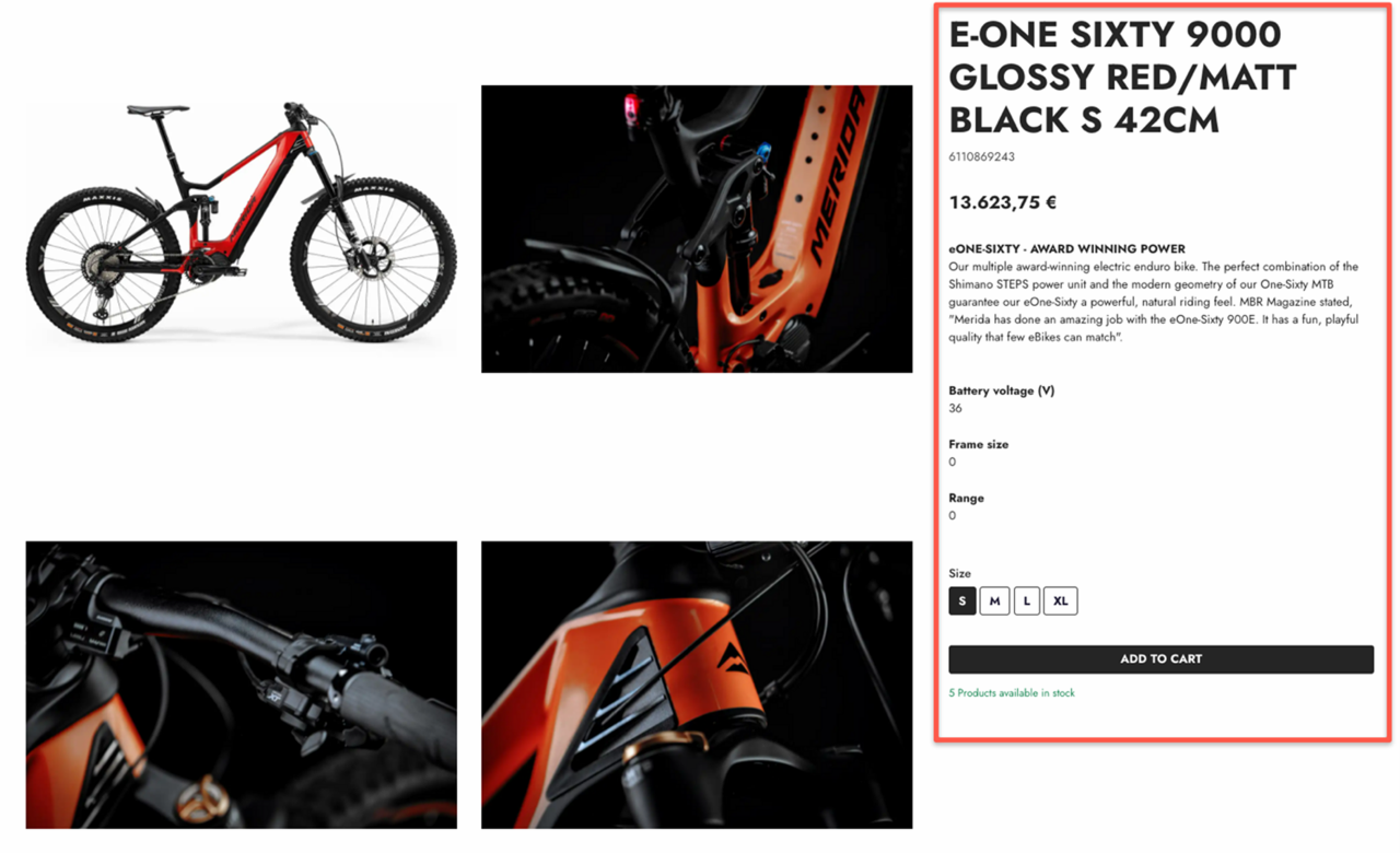
Product Details Info
The product details info column is used to present the customer with the most relevant product information and call-to-action buttons on a product details page – for instance:
- Name
- Product number
- Short description
- Quantity
- Add-to-cart button
- Etc.
This makes it easy for the customer to see immediately whether they are interested in the product – and to act on it (Figure 18.1).
When you add this column to a page you will see the settings in Figure 18.2.
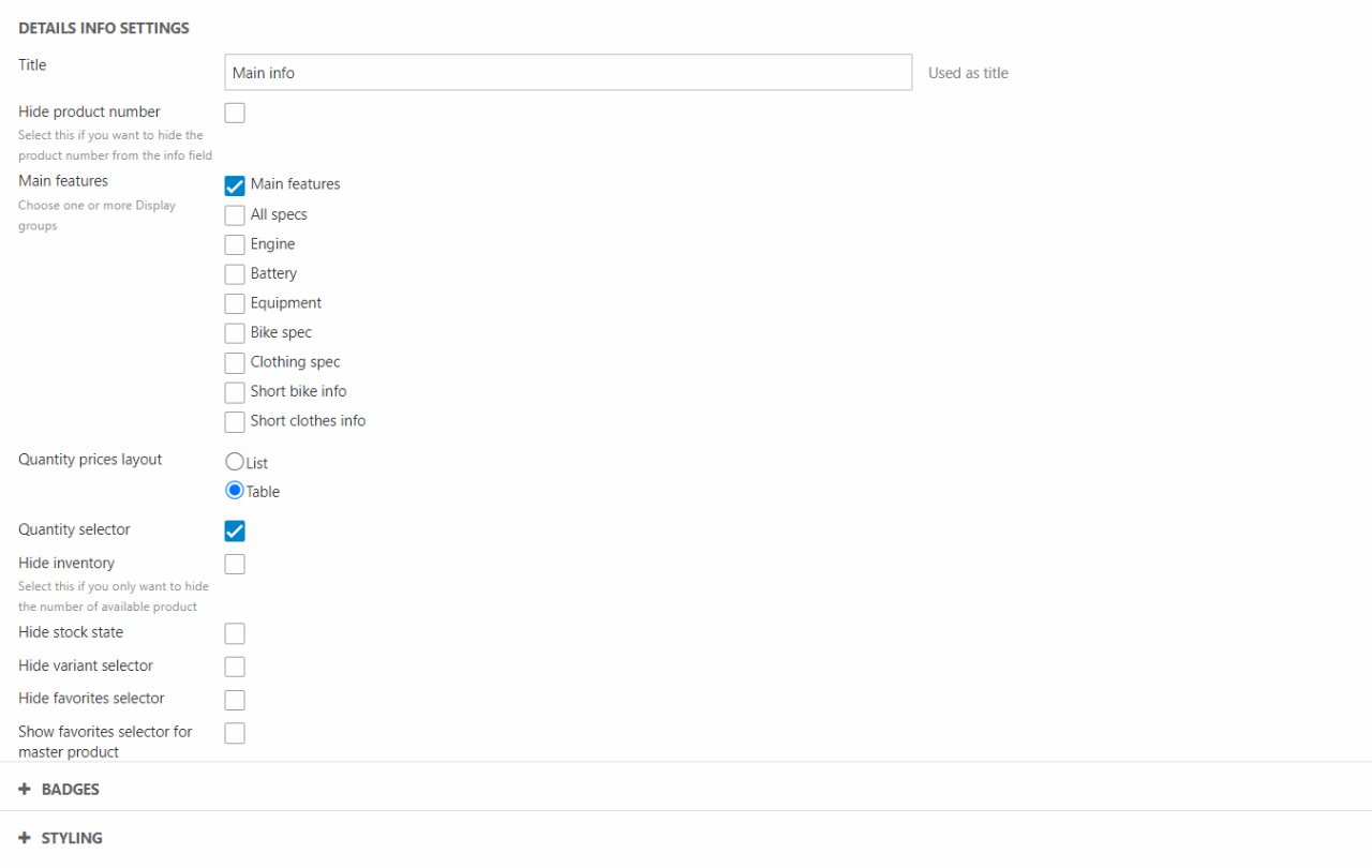
Using these settings you can:
- Show/Hide the product number
- Select one or more field display groups to display in the panel
- Choose the layout for quantity prices - Quantity prices can be controlled in the price matrix, you can read more about it here
- Show/hide a quantity selector
- Check hide inventory if you want to show a quantity selector but hide the number of products available
- Check hide stock state if you don’t want to show stock states in the panel
- Check hide variant selecter if you don't want to show variants in the panel
- Check hide favorites selector if you don't want the customer to favorite the product
- Check Show favorites selector for master product if you want customers to be able to add master products to favorites
For styling you have the following options:
- Select a theme for the column
- Set the space around the column
- Choose the size of the title
It’s possible to control both the purchase quantity steps and the minimum quantity the customer is able buy. This is done in the Ecommerce section. We’ve already written some documentation about how to do this, you can find it here. Creating rules for minimum quantity and quantity steps will affect both the product details page and the check-out process.
On the product details info column, the stock-status is shown. You’re able to control the displayed information in the backend. You can display products as:
- In stock – this will be shown if the stock is larger than 0
- Never out of stock – This makes sure that no “Out of stock” label is shown, even if the stock is 0 or below
- Expected delivery date – Shows the customer when to expect the product to be back in stock
The stock status also affects whether the buy-button is active or not. If “Never out of stock” is enabled the buy-button will always be active. The button will be inactive if the product is out of stock.
We’ve written about stock-status before, you can find the documentation about the stock here.
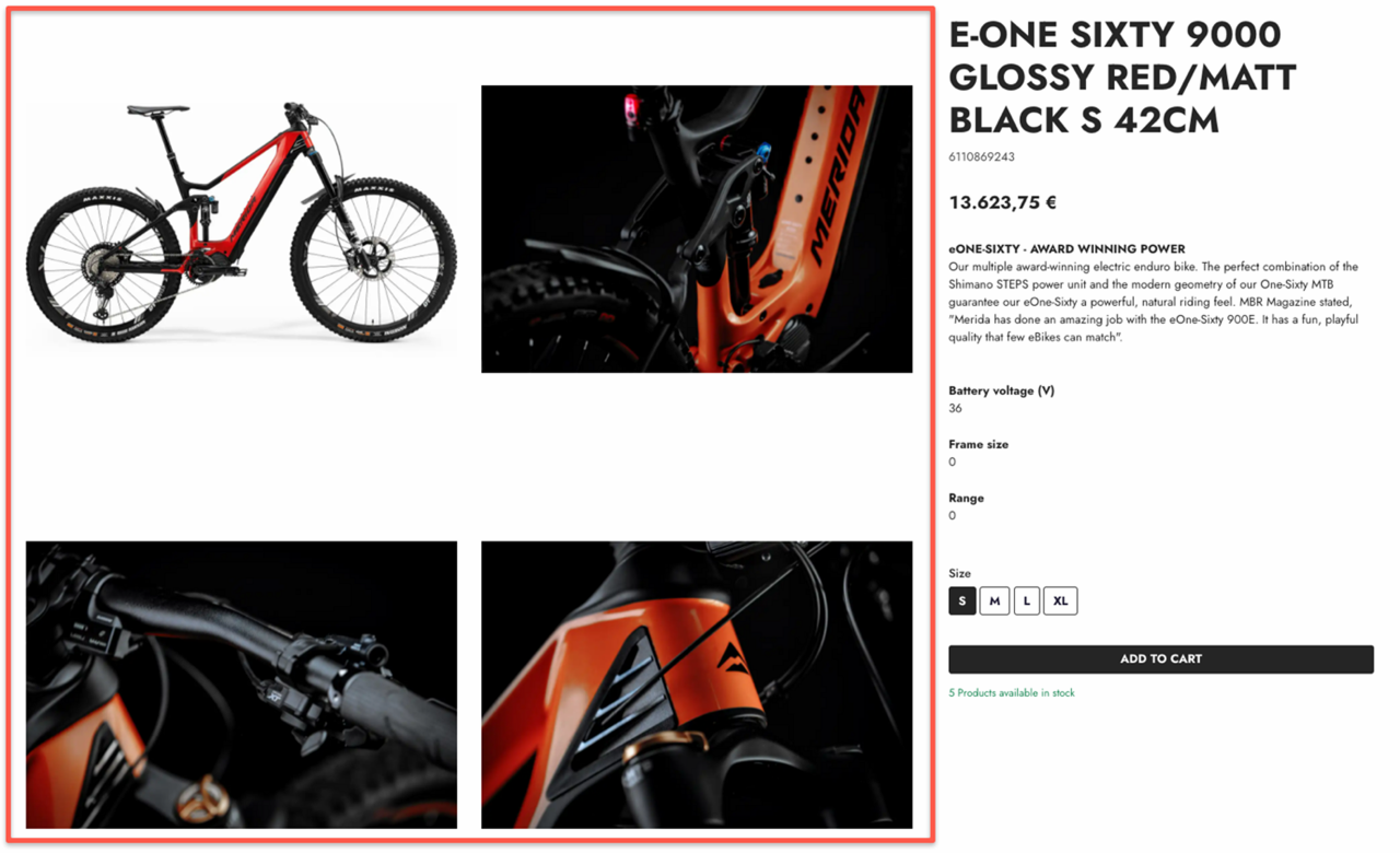
Product Details Media
The product details media is, like the product details media gallery, a way to display images, videos or other files about the product on the product details page. The difference being the layout of the columns. The product details media column display one large image/video and the rest of the files as thumbnails.
When the product details media column is added to a row, the following settings are available:
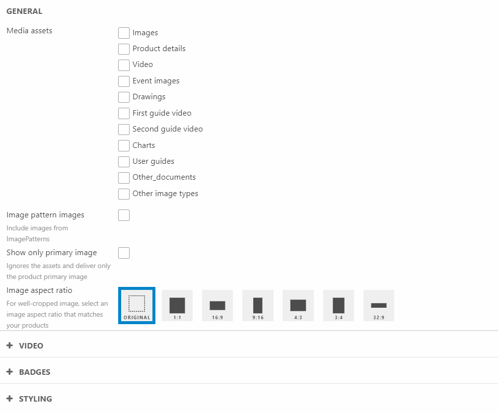
This allows you to:
- Select which files to include – any asset category and image pattern images on the solution
- Choose to show only the primary image
- Set the image aspect ratio
For videos you can choose to open them in modal or not and if they should auto play.
Styling lets you choose the theme for the column and invert the color of the modal arrows - by default the modal arrows are white, clicking the box will make the arrows darker.
Product Details Media Gallery
The product details media gallery column is used to select image or video assets and present them on the product details page (Figure 20.1).
When you add this column to a page you will see the following settings in Figure 20.2.
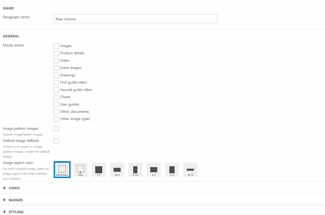
Using these settings you can:
- Select which images to include – Any asset category and image pattern images on the solution
- Toggle the default image fallback
- Set the image aspect ratio
For videos you can choose to open them in modal or not and if they should auto play.
For styling you have the following options:
- Choose a theme for either the column or the images/files
- Invert modal arraws color - by default the modal arrows are white, clicking this box will make the arrows darker
- Choose the layout of the content
- Set the spacing aorund the content
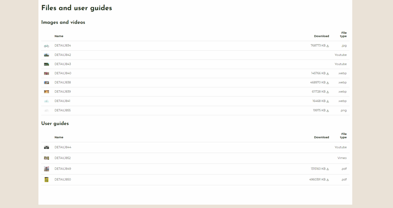
Product Details Media Table
The product details media table is a column that allows you to make product relevant files available for the customer to download. This can be used for manuals, instructions or other relevant files.
The column creates a table informing the customer about the file (Figure 21.1). It shows:
- Thumbnail
- Name of the file
- The size of the file
- The type of the file
The Products Details Media Table supports the same file types as the Digital Assets.
When you add the column to a row, you’ll see the following settings (Figure 21.2):
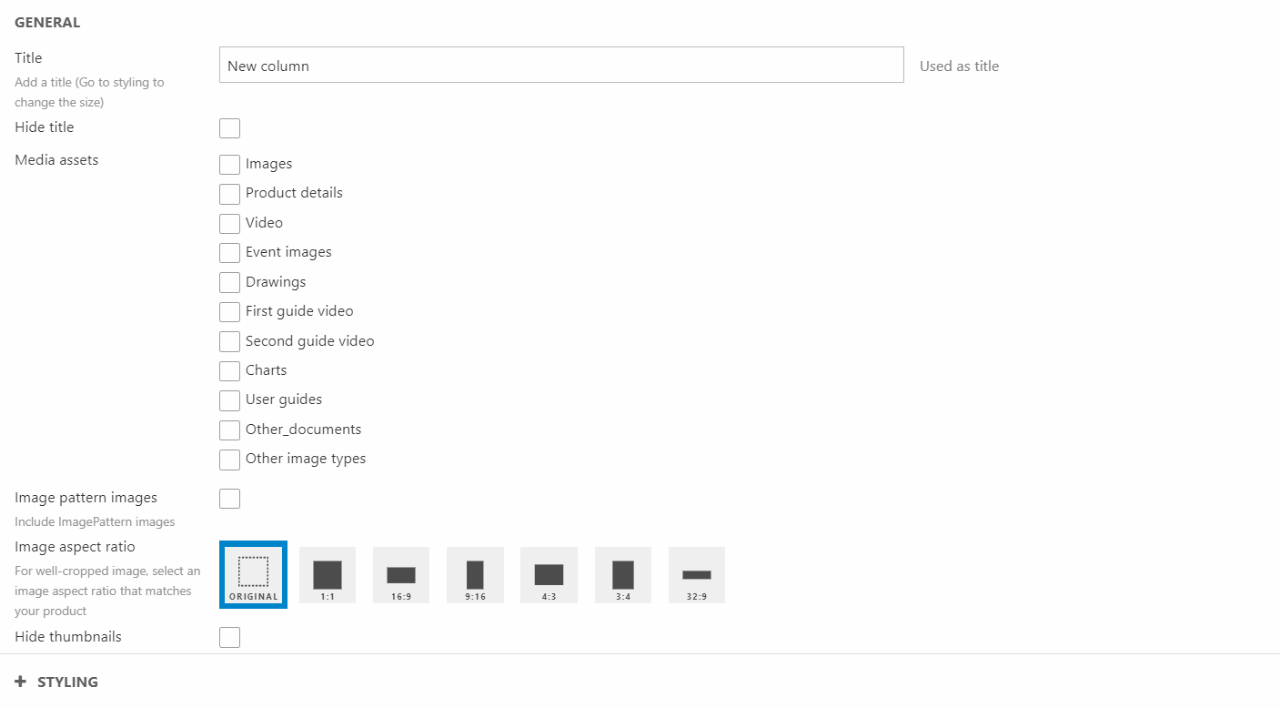
In the settings you can:
- Give the table a title and show/hide the title
- Choose which media assets you want the table to contain
- Choose to include image pattern images
- Set the image aspect ratio (for the thumbnails)
- Show/Hide the thumbnails
If you have added a name to the product file in PIM, the name will overrule the filename. If you want to add or delete files available for customers, we recommend that you enrich your products through PIM. You can read more about product enrichment through PIM in our documentation about Assets & Images.
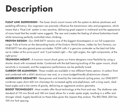
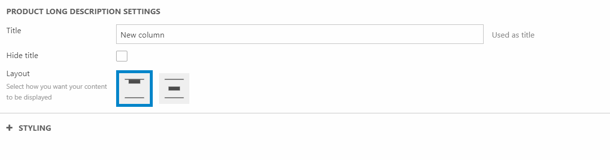
Product Long Description
The product long description column is used to render the product field called description on the product details page (Figure 22.1). This field is typically used to provide a longer description of the product than the teaser text product field.
This column is very simple – the settings allow you to hide title and choose between two different layouts and that’s what it does and all you can do, really (Figure 22.2).
For styling you have the following choices:
- Set a theme for the column
- Toggle/Untoggle text readability
- Choose the space around the column
- Choose the size of the title
Product Specification
The product specification column is used to render detailed information about a product – from either product fields, product category fields, or field display groups.
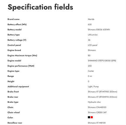
When you add this column to a page you will see the settings in Figure 23.2 – they are used to configure what data is rendered and in which manner.
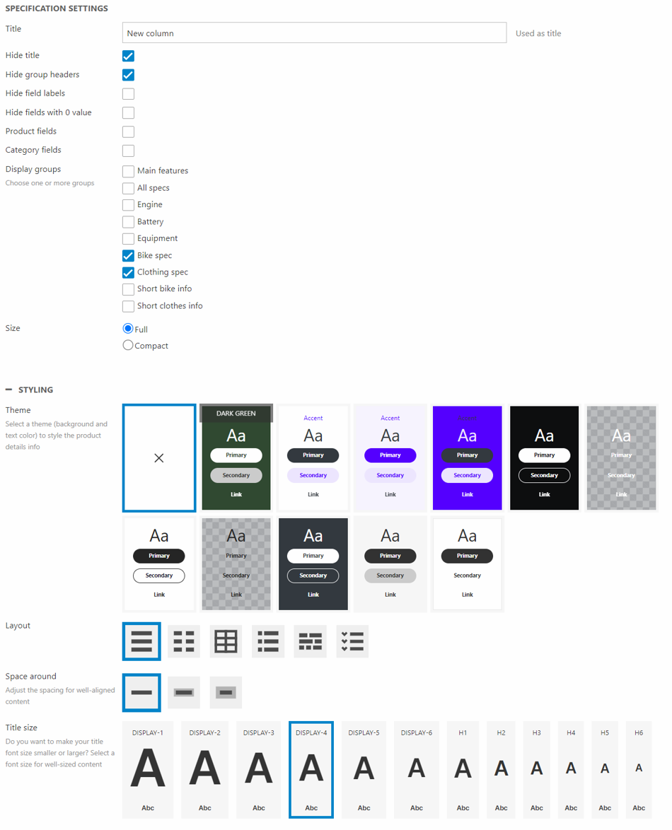
You can:
- Specify a title
- Check or uncheck Hide title and Hide group headers
- Hide/Show Field labels and/or Product fields with 0 value
- Specify which fields you want to render:
- Product fields
- Category field
- Display group fields
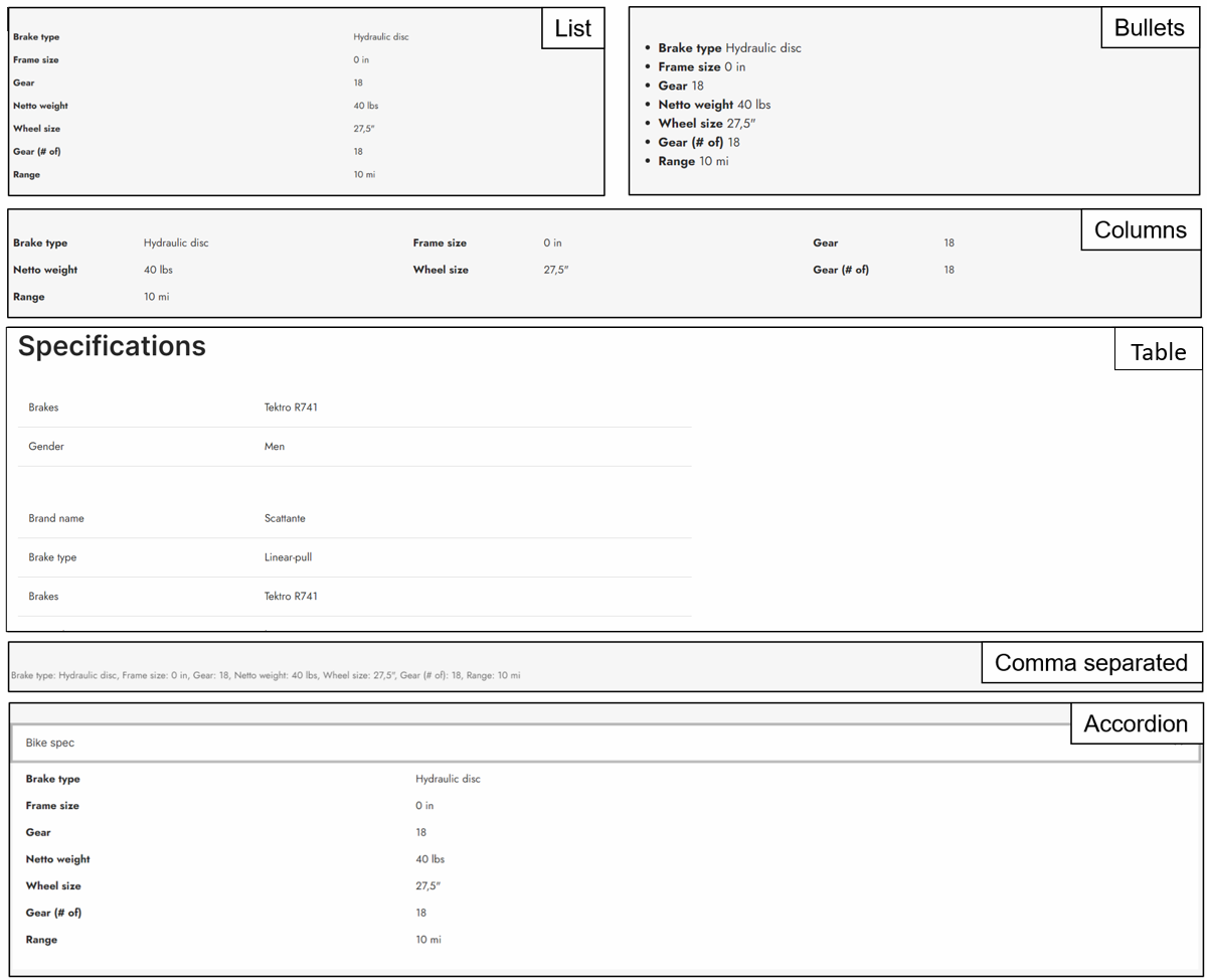
For styling you have the following options:
- Choose between the six different layout styles (Figure 23.3)
- List, Columns, Table, Bullets, Comma separated, and Accordion
- Select the theme
- Set the space around the information
- Choose the title size
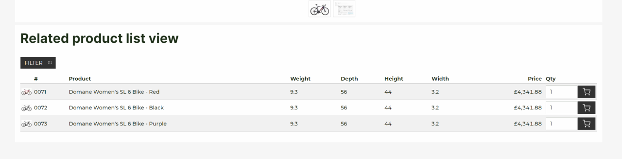
Related Product List View
The related product list view column allows you to display e.g., variants of the master product in a list.
In the editor you have a lot of different modification options:
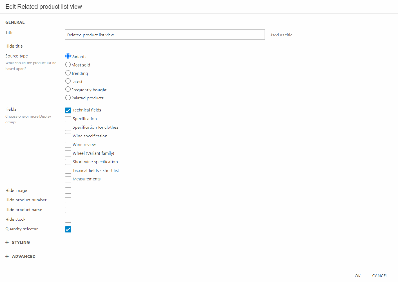
You can:
- Give the column a title
- Choose the source type:
- Variants
- Most sold
- Trending
- Latest
- Frequently bought
- Related products
- Select what fields to display. This is based on your product details in the backend
- Choose to hide different information
- Image
- Product number
- Product name
- Stock
- Show a quantity selector
- Show/Hide the favorites selector for the master product
In the styling section you have the following options:
- Choose a theme for the column
- Choose a theme for the modal
- Set the space around
- Choose the title size
By default, the column will link to the service page with the navigation tag “RelatedProductsListService”. Should you want to manually choose a service page, then you’ll have to do it in the advanced section.
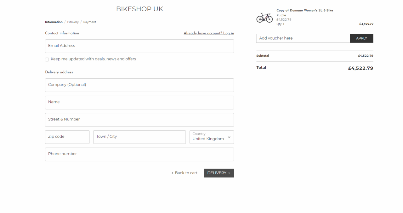
Checkout page
This section covers the ecommerce column used to create the checkout page. The checkout page shown to the customer depends on the content of their cart and whether they are logged in or not.
- Checkout App
You can find the documentation on how to setup the checkout pages in different ways here.
Checkout App
The Checkout App column will handle all the different phases during the checkout process: Information, Delivery and Payment.
When you add the checkout app to an empty column you get the following settings:
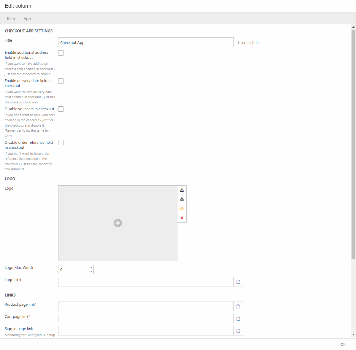
This allows you to:
- Enable/Disable:
- An additional address field
- A delivery date field. This will open a new section in the settings
- Vouchers - For now, Swift only allows Order Discounts as vouchers. You can read more about discounts & offers here.
- Order reference field
- Add a logo to the checkout page – and choose the size of it and where it’ll link to
- A list of various mandatory links to make the app work
For styling you can choose the theme and the space around the content.
As this column is an app, you have to fill out this section as well:
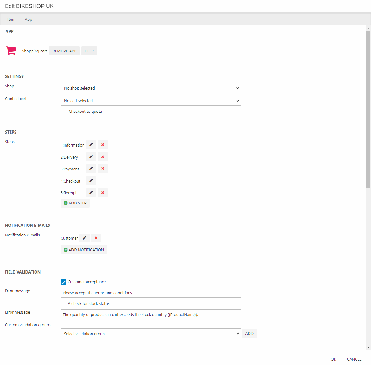
In the app section you can:
- Choose which shop this checkout app should concern
- Set the steps for the checkout process
- Setup a notification email to the customer
- Set error messages if something is wrong during the checkout
- Choose what to do when the cart is empty
- Consider the user management, payment & delivery, and general settings