Overlay
The overlay item type is used to create notification overlays or pop ups (Figure 1.1).
The icon for the overlay item type is shown in Figure 1.2.
Attach it to a full empty row, and set the row height to Auto to hide the row itself from the frontend result (the overlay is shown, but the empty space from the row is hidden).
It is possible to add different elements to the notification overlay. You can switch between overlay and pop up designs, and you can also attach an app to the notification overlay (following the usual procedure of attaching an app to a paragraph).
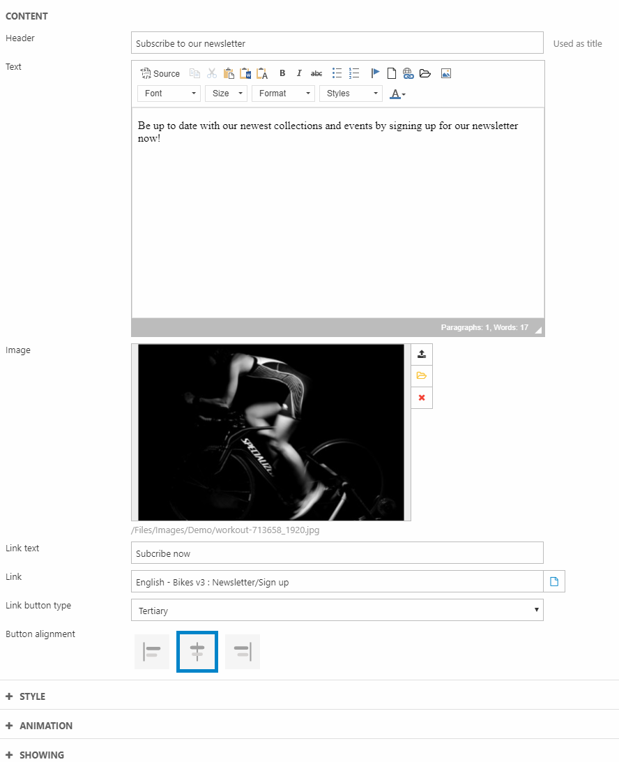
For the item type, you have these settings in the Content section (Figure 1.3) where you can insert:
- Header
- Text with the rich-text editor
- Image
- Button - provide a title/text, link and button layout for each.
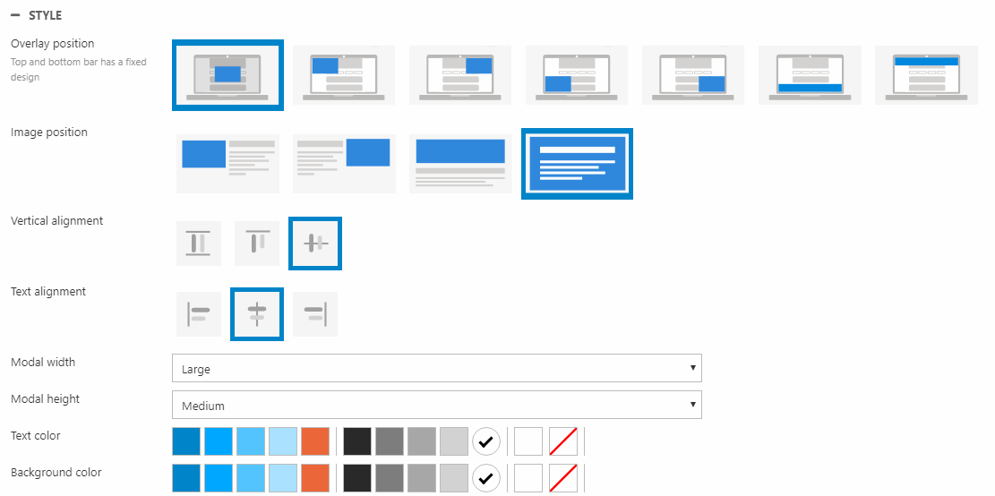
In the Style section (Figure 2.1), you can configure the layout with the following options:
- Overlay position (overlay or one of the pop up options)
- Image position
- Alignment (vertical alignment controls the text and button and text alignment controls the text only)
- Width and height of the overlay
- Font and background color
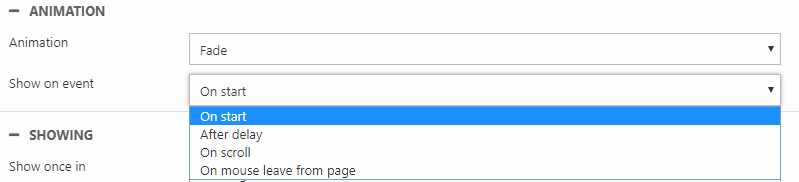
The Animation settings (Figure 2.2) control the way the overlay appears and the conditions for it to show up. You can:
- Change the animation between fading in or sliding in from a direction
- Set the conditions for the overlay to appear – on start, after delay (in milliseconds), on scroll, or when the mouse leaves the page
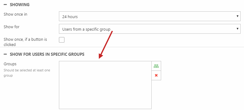
Finally, with the Showing settings (Figure 2.3) it is possible to change how often the overlay appears and for whom.
You can choose to show the overlay:
- Once in every 24 hours, 15 days, or 30 days – select Nothing selected to always show the overlay at every page visit
- For all visitors or only:
- Anonymous users
- Logged-in users
- Users that are either in or not in specific user group(s) - a section is rendered below to select the specified user groups (Figure 2.3)
If you check Show once, if a button is clicked, the overlay is not shown again once the user clicks the button in the overlay.
Overlay
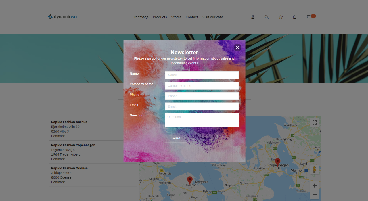
The first selection in Overlay position will center the notification overlay and add a greyed-out layer on top of the website in the background.
The following example has a header, text, button, and image, and the Style section is set up like Figure 3.1.

It will result in a notification overlay as the one in Figure 3.2.
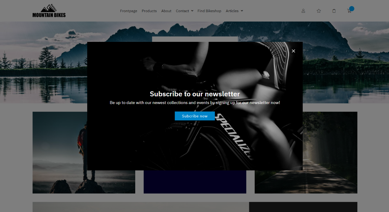
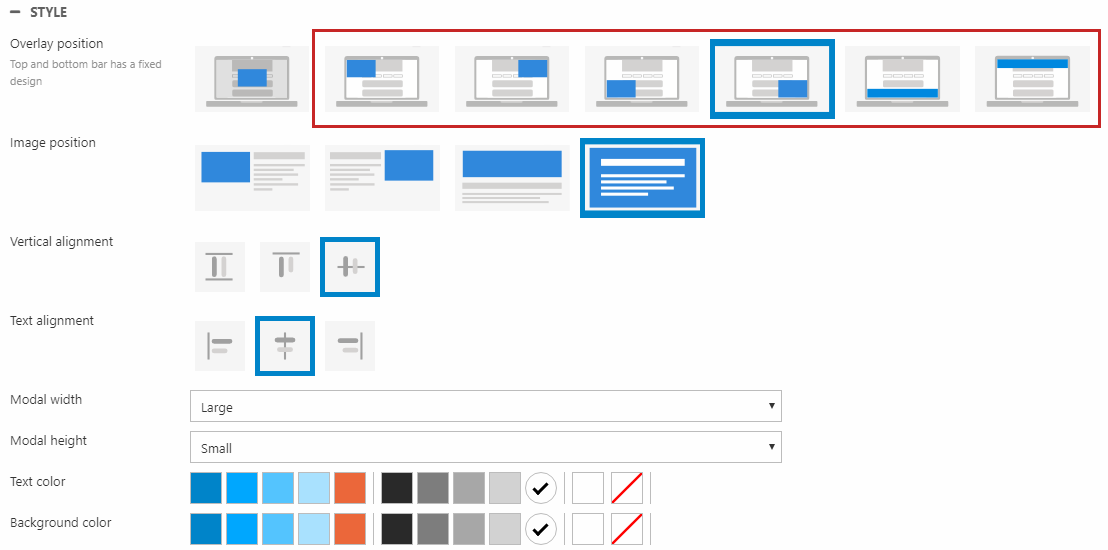
Pop up
The rest of the options in Overlay position (marked in Figure 4.1) will present the notification overlay as a pop up. The following example has a header, text, button, and image, and the Style section is set up like Figure 4.1.
It will result in a notification overlay as the one in Figure 4.2.

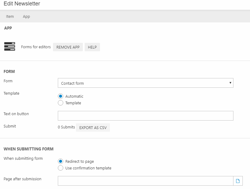
Apps
You can attach an app to columns with the Overlay item type. In the ribbon bar, select App. In the following example, the Forms for Editors app (Figure 5.1) has been attached to a notification overlay.
You can choose between the automatic template or the template Rapido has made by selecting Template > Default.cshtml.
In this example, the first option under Overlay position has been chosen along with the automatic template. So, the setup with the Forms for Editors app will result in a notification overlay shown in Figure 5.2.